As in, how does it look when run from a Nintendo 64? The size of the bubble and ratio of the screen change depending on which core I use.
Mupen:
Parallel:

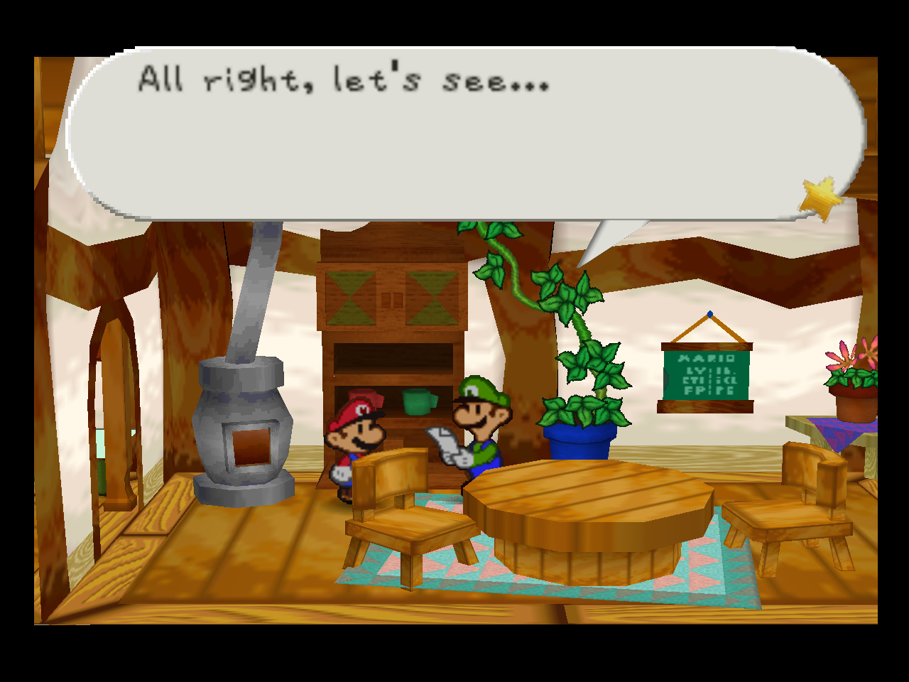
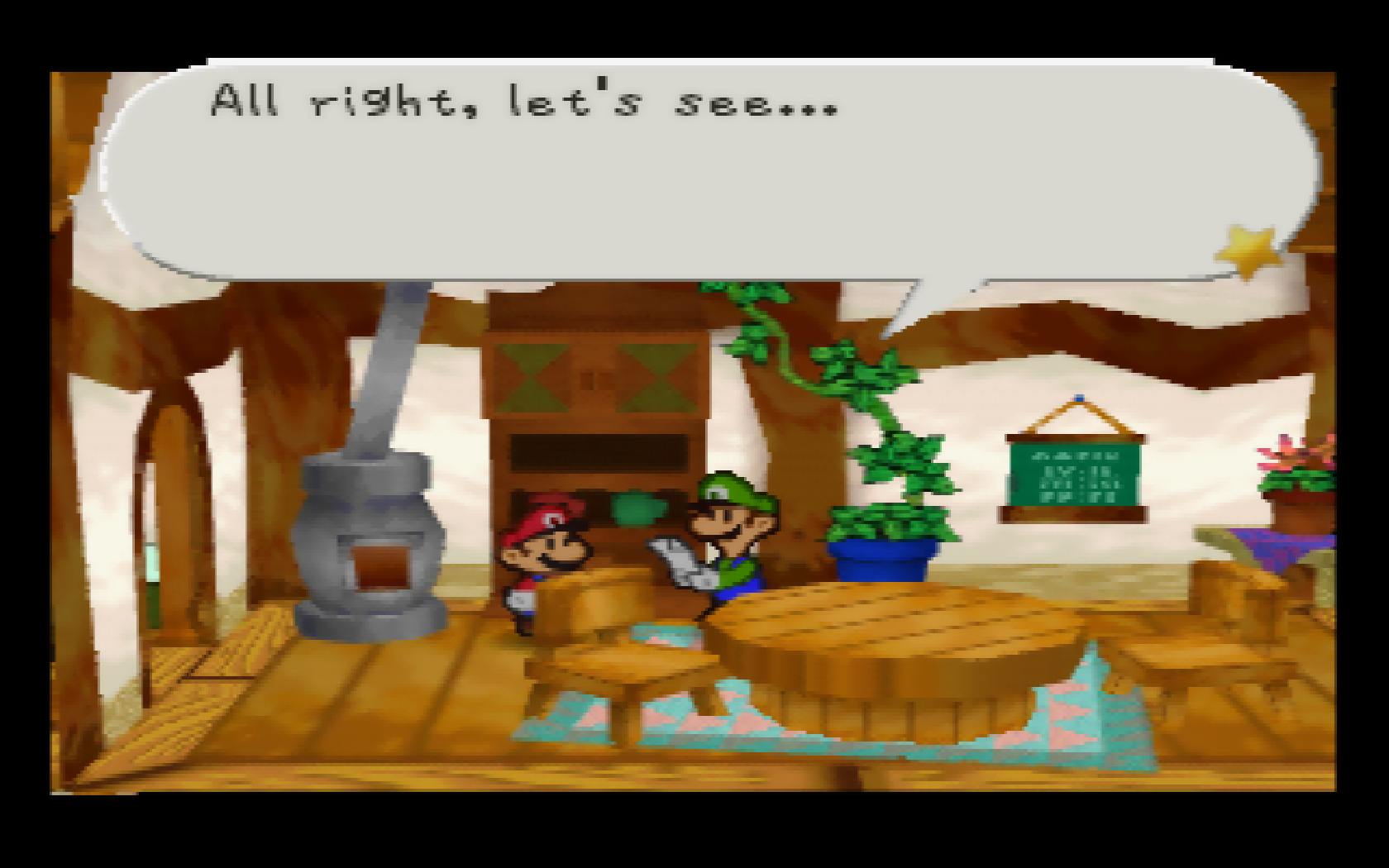
As in, how does it look when run from a Nintendo 64? The size of the bubble and ratio of the screen change depending on which core I use.
Mupen:
Parallel:
Just judging by the text, it looks like ParaLLEl-N64 may be squishing it vertically. I would try loading it up with Angrylion, even if it’s not full speed, as it should indicate how it’s supposed to look.
It’s been ages since I’ve played it but the 2nd one looks more correct. Especially when you look at the speech bubble. It’s popping off ‘the page’ is part of the games art style.
Never thought of it as pop-out effect, really makes sense now. I just thought that bit was meant to be cut somehow.
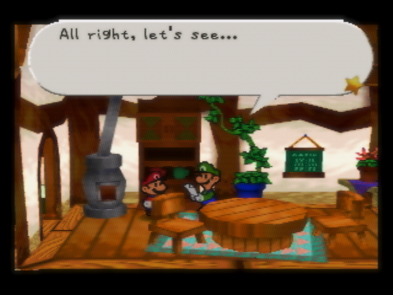
This is Parallel with Angrylon for reference.
Looks like Mupen64plus-libretro is the one that’s doing it wrong.
Always use parall 64 Mupen64 sucks
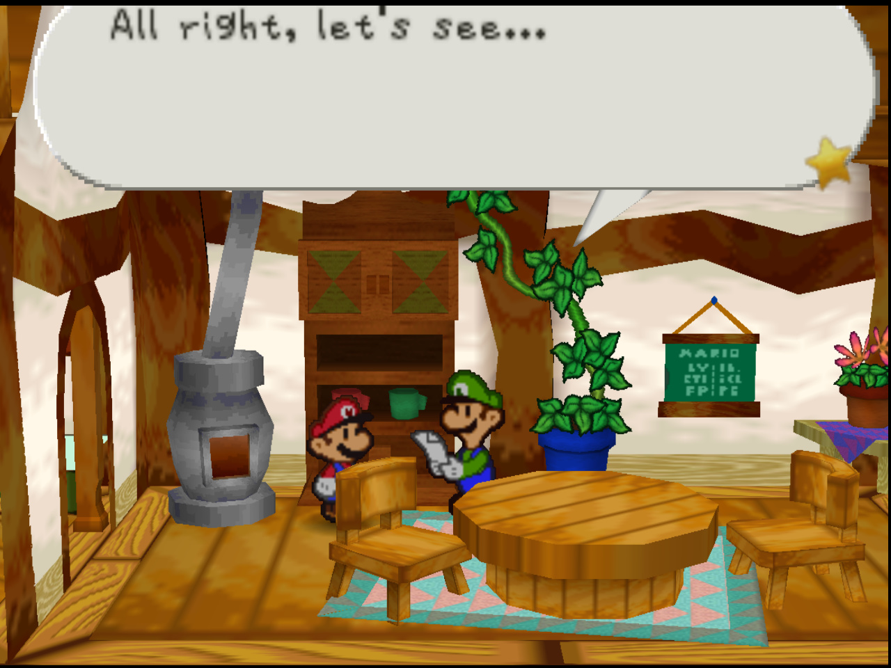
This is not true (Mupen64 does not suck). I checked this and the bubble is popped out with Mupen64-Next core with the Parallel plugin:
Edit: Sorry, I didn’t notice this topic was from 5 years ago.
Well IDK But mine sucks
We have the same cores. If mine does not suck, yours won’t too.  What I mean is, it’s all a matter of settings, unless it is the platform you are running on not well supported. As you can see it is accurate and the default to recommended by me.
Ok mister Ok ok ok ok
Yeah, a lot has happened since 2019. The “new” mupen64plus-next core has the same accurate plugins as ParaLLEl-N64 core but it’s built on a more recent, more accurate Mupen codebase.
Judging by the looks of it, it’s look kinda neat from those screenshots, well, except one.