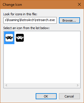
The RetroArch icon ( For Windows ) has a sharp edge in the top left corner which looks really weird TBH! Is the sharp corner intentionally there or is it some strange error?
I made a little fix! Please use it! I spend quite a bit of my time editing it!
I also don’t quite get why the logo is in a square, It looks better without it in a task bar and start menu so that’s something!


