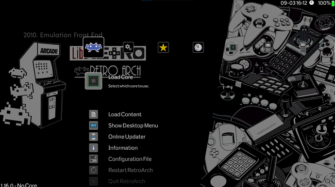
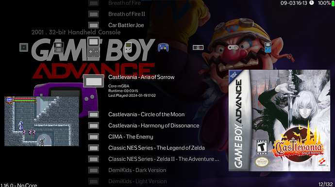
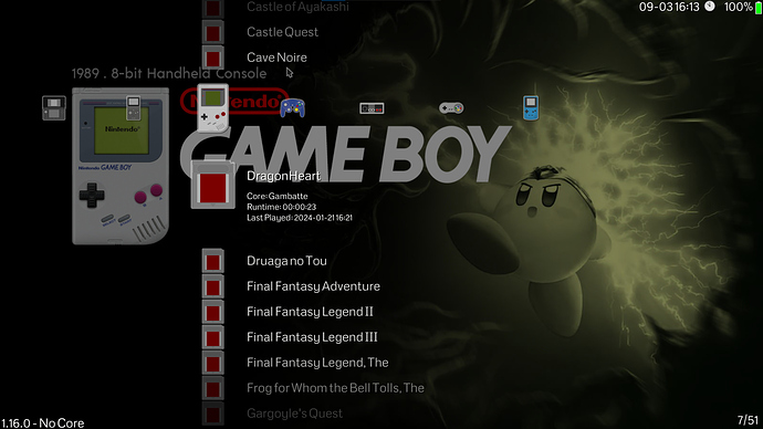
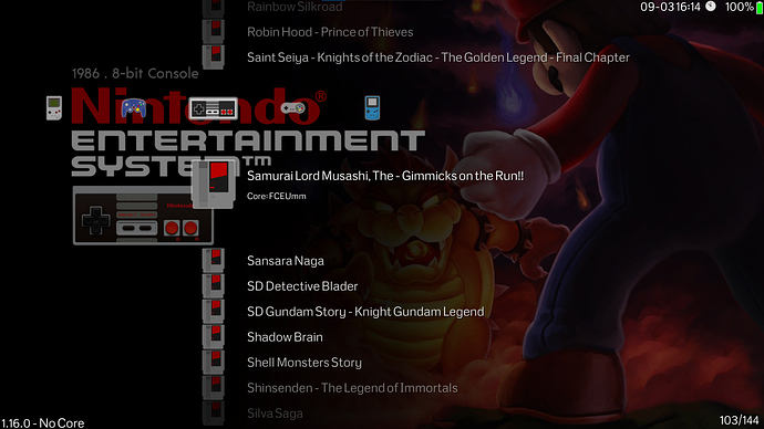
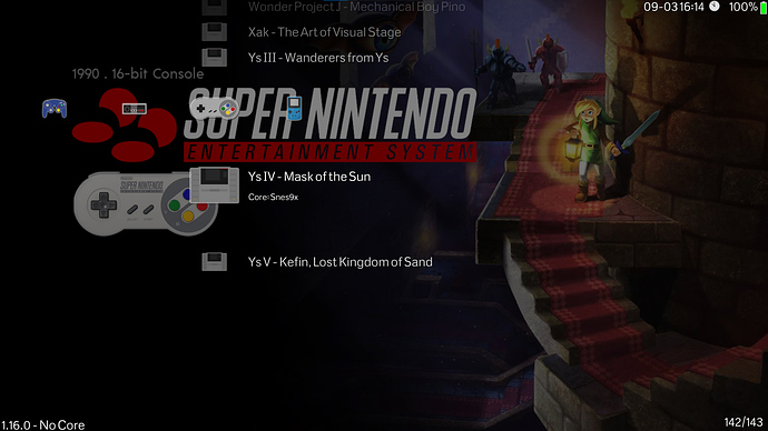
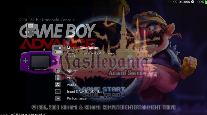
The default look of Retroarch can be muted, but due to the granularity of UI control available to the user, we can easily modify RetroArch to look more modern & minimalistic. This is done by simply utilising Dynamic Backgrounds and using good image sets
To start off, we need to use the images from the Wallpaper pack “Epic Retro Noire” which can be found through Github here: https://daijishou.github.io/Gallery/wallpapers_pack#EpicRetroNoir
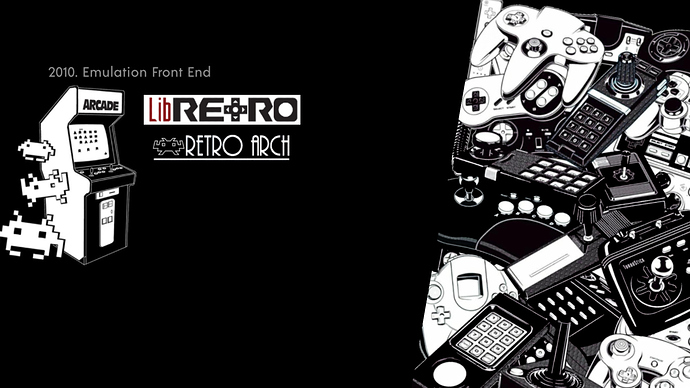
With these background images, we can overhaul RA to look a lot more like other Front ends or Daijisho. We also need an additional image that is consistent with our theme pack for navigating the settings Menu. I have made one myself trying to match the aesthetics of RetroNoire, feel free to make your own or use the one below
You can simply extract the Epic retro noire pack, add the additional image I have uploaded (or make one yourself) and copy them over to your Retroarch Directory -> Assets -> Wallpaper -> Extract here
At this stage, you want to rename the downloaded wallpapers and associate them to Retroarch. This can be quickly done by going to your Retroarch Directory -> Playlists -> system name.lpl and copying the exact system information and then renaming the downloaded wallpapers in ->assets ->wallpapers->RetroNoire. You can use a batch renaming software such as Advanced Renamer that can be found here: https://www.advancedrenamer.com/
The Actual settings inside Retroarch is fairly straightforward, for starters you must be using XMB for this. I will briefly list all the settings required to pull off this look:
- Settings - User Interface - Menu -> XMB
- Settings - User Interface - Show Advanced Settings -> Toggled On
- Settings - Appearance - Background Opacity - 0.500-0.700 (start at 0.500 use what looks best)
- Settings - Appearance - Shader pipeline -> OFF
- Settings - Appearance - Color Theme -> Background Image
- Settings - Appearance - Background Image -> Whatever you wish (not too bright for visibility)
- Settings - Appearance - Dynamic Background -> Toggled On
- Settings - Appearance - IconTheme -> RetroActive (Looks best with Epic Retro Noire)
- Settings - Appearance - Primary Thumbnail -> Boxart (Whichever you like, can be screenshot etc)
- Settings - Appearance - Secondary Thumbnails -> Screenshot (Whatever you like)
As usual, you can clean up the playlists by simply going to: Settings - Playlists - Manage Playlists - Sytem name - Label Display Mode - Remove () and []
If you wish to get rid of some of the options like “play online” and make it even more streamlined, you can adjust all of that under:
Settings - User Interface -> Menu Item Visibility
The rest is upto taste. I tend to only keep recently played, my systems and the battery indicator. I also particularly like this wallpaper set as it has System Release and System name on the top left of the images. The visibility is also excellent within the quick menu and system menu. This setup works really well on handhelds like Ally/Deck or small emulation boxes. Here are some pictures of what the end results should look like:

