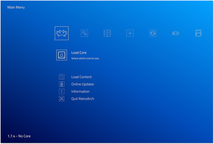
You may have noticed that there’s a new theme called Automatic that has been added to the mix. It’s based on the Systematic theme, but it has outlined icons, similar to the Super Famicom box art.
I’d like to get your opinion on the square borders on many of the icons in the theme as you can see in the screen cap below. Do you like the borders or should I remove them in a future revision?


