
Yeah that’s not blur actually but it’s like 10-20% opacity of the original raw image moving here and there like convergence or something. The Amiga can do pretty sharp composite too, blending dithering but still sharp.
1 Like
The CRT shots look sharper than the raw captures, which leads me to believe that it’s something to do with how the CRT works that makes NTSC output on a CRT look sharper compared to any of the shaders I’ve seen.
Alas, here’s GDV at horizontal sharpness 15.00 and subtractive sharpness 1.50, NTSC blend mode = 2.
It seems like the CRT is still sharper, or am I crazy?
(also, my god that red  )
)

4 Likes
Probably too low contrast too, due to mask darkening bright areas too much. Makes the image flat.
1 Like

3 Likes
The Wii palette was obviously a suboptimal choice, it’s the “PAL” one, afaik the only one not with an NTSC origin. Don’t know what the story behind it is, the process behind palettes is often useful to know. That FCE palette on the PS2 also very much benefits from TV adjustments though, especially for NTSC with my other TVs. I’m going to do some other tests with the 2006 set in the next days.
Anyway here’s something related concerning the possible effects of filtering when dealing with a non-standard signal. Great Hierophant had a writeup on his blog concerning the Apple II, which I recommend to read in full of course.
But here’s the part with illustrations I found most interesting:"The notch filter was about as sophisticated a filtering method as encountered in most composite color computer monitors and TV sets up to the late 1980s. The Apple ColorMonitor IIe a.k.a the AppleColor Composite Monitor IIe and the AppleColor Composite Monitor IIc as well as the Commodore 1084s use notch filters.
The next innovation in luma/chroma composite signal separation was the delay line. With the two line delay system, the monitor would store one line of a signal, extract the luma and chroma from it while the next line was being sent. Because two vertically adjacent lines tend not to have wildly varying colors, when the mostly inverted phases of the color carriers of the two lines are combined they will reduce or cancel each other out leaving much less affected luma than by just using a notch filter.
The two-line delay system was an improvement but it was not perfect and some systems improved on it a little by using a three-line delay system. High frequency horizontal color detail can bleed into the luma channel, leading to “dot crawl”. Additionally, sharp changes in luma can lead to rainbow artifacts and color bleed. To reduce these unsightly artifacts, a more sophisticated adaptive two-dimensional (2D) three line adaptive system was invented to vary the color comparisons over three lines as they were being drawn to best reduce dot crawl. Finally, three-dimensional (3D) motion adaptive comb filters compare the lines of the previous frame with that of the current frame to virtually eliminate dot crawl.
Comb filters work by assuming the signal follows the NTSC rules. Of course, the Apple II signal does not follow the NTSC rules in several respects. First, the Apple II video signal is progressive rather than interlaced. Second, the Apple II does not invert the phase of every other line, the phase starts at the same point in time on every line. This tends to make comb filters behave a little strangely on the Apple II. Because comb filters have to combine the color signal of every pair of lines, they tend to cause a loss of vertical detail. In the Apple II, this detail can result in the blending of alternating single color lines.
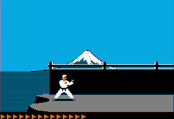 Karateka with Notch Filter
Consider this screenshot of Karateka. The ground is being drawn, in canonical Apple II colors, as alternating blue and orange colors. The black and white image (quite commonly seen on the green screens of the day) shows a checkerboard pattern.
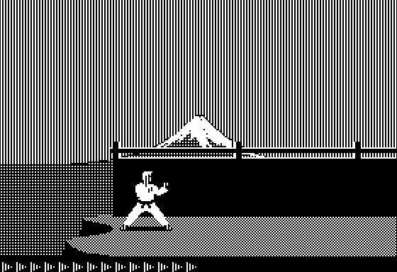 Karateka in Monochrome (raw pixel)
Now consider the pattern through a typical two-line comb filter :
 Karateka with Delay Line Comb Filter
As you can see, the lines have been blended together to show a gray which would not ordinarily register to the eye as gray. Perhaps the crappiest vintage color TVs may blend these lines together to make a solid gray, but that TV would make for a crappy computer monitor. As blue and orange rely on pixels which are vertically adjacent to each other by one pixel, when you combine them you could get a white signal but due to luma being off over 50% of the line, you get gray instead. The same thing would happen for alternating green and purple lines. However, you can get different colors by mixing colors which are not 90 degrees out of phase with each other.
Finally, let’s consider how a 3D adaptive motion comb filter would handle this image :
 Karateka (Side B) with 3D Motion Adaptive Comb Filter
As you might note, the sophisticated comb filter has done its job too well here, eliminating virtually all the color, which it sees in this instance as a rainbow artifact to be canceled out. In fact, we have come full circle to reproduce, as well as a capture card can, the original dots making up the video signal! The lack of evenly sized pixels and the resulting scaling artifacts is a symptom of composite/s-video capture cards which only sample composite video at 13.5MHz. As the pixel clock is 7.19MHz, you would need a sample rate of 14.318MHz to fully capture all the pixels without scaling artifacts.
If you look at the back of the box in which Karateka was sold, you should see a gray color to the ground, suggesting that comb filtering was not unknown in the 1980s. But this is not the only example of probable reliance on comb filtering. Consider the title screen to the Bard’s Tale :
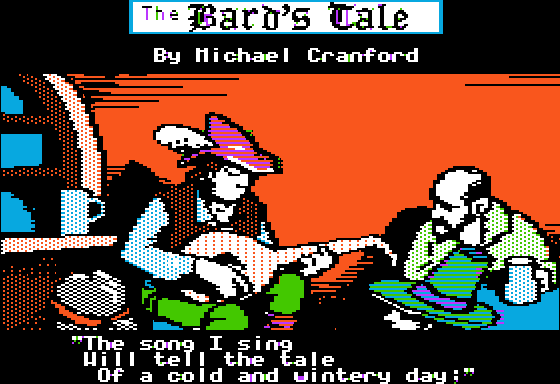 As you see, the hat of the bard and and of one of the listeners has alternating bands of color, orange/purple, green/blue and purple/blue. But consider how a comb filter blends these color bands :
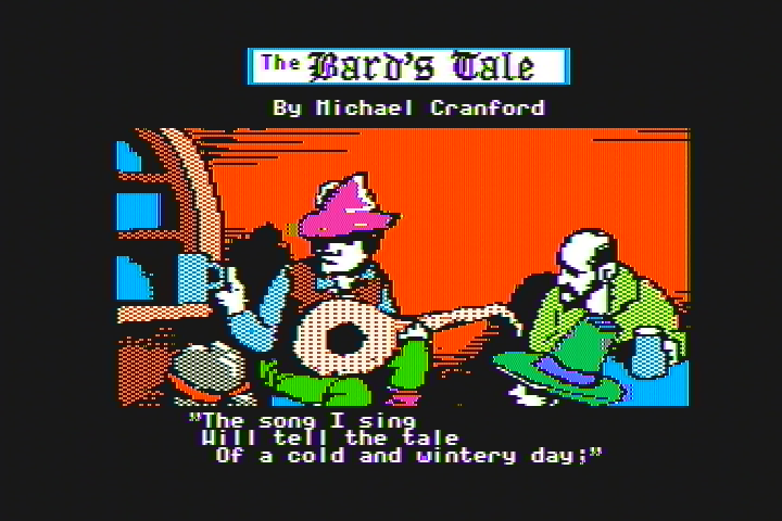 The Bard’s Tale - Delay Line Comb Filter
Now the Bard’s hat is a solid color pink and the listener’s hat has a green color that is different from the normal green (see the Bard’s pants) and a purplish-blue-ribbon that is not the normal purple or blue hue. If you used a display with a motion adaptive 3D comb filter, you would see dots instead of lines or solid color, something that is definitely not ideal. "
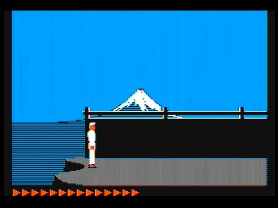
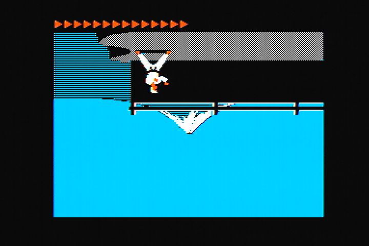
From the comments re: that upside down Karateka pic: “It is not a mistake. It displays upside down relative to the normal way the game is played, but if you look closely, the elements are not mirrored as they should be if I had flipped the image 180 degrees…”
6 Likes
Here’s something else this time from my 2006 set, PS2 composite vs VGA-RGB Scart with some filters/shader on top. FCE Ultra/FCEUMM default palettes.
PS2 NTSC:

PS2 PAL:

VGA-RGB:

With core composite filter activated:

with Blarrgs SNES composite filter instead:

with NTSC adaptive shader default settings:

5 Likes
Comparing the PS2 NTSC vs the NTSC Adaptive shader, it seems the shader is blurrier horizontaly. On the other hand, the PS2 NTSC seems to have some sharpening artifacts to the left and right of Mario.
I don’t know anything about how the TVs decoded NTSC, but could it be that TVs applied sharpening to composite signals?
EDIT: I see some artifacts here on the PS2 NTSC over the black line too:

1 Like
That’s probably more exaggerated by the cam, compression or whatever, other shots have this as well. The 2006 set does have a sharpness control which affects composite, but seems unlikely it’s noticable like that unless I turned it way more down or up.
1 Like
Hi Jamirus, could you get some close up shots (as close as you can without losing focus) of your screen with PS2 NTSC and PS2 PAL. I’d like to understand a bit more about what is going on at the phosphor level of the Mario title screen above. If you are willing to do that, can you take them with ISO 200, 6500K white point and 1/60 aperture speed.
2 Likes
I’m really looking forward to you tackling NTSC video, I think there’s some room for improvement with what we currently have.
I think NTSC video is sharper on every CRT I’ve ever seen compared to the NTSC shaders, but afaik the actual NTSC emulation IS accurate, so there’s something going on with the CRT itself that’s making it look sharper compared to the shaders/filters.
1 Like
Here’s something. Aperture speed for PAL 50, otherwise it’s very hard to see on the phone. NTSC:


PAL:


5 Likes
Ah perfect! Thanks Jamirus this is exactly what I’m after.
1 Like
Here’s my first stab at NTSC - to be fair this is basically NTSC-adaptive (something both @hunterK and @HyperspaceMadness have been saying to me to do for quite sometime!) fed into my shader with a few tweaks along the way but I’m learning stuff. I’ve not got the pronounced ringing either of the photos exhibit.

Let me know what you think?
EDIT: that’s something by the way I’ve taken the LCD photo above at 1/30 to get a more representative photo of what you see because of the two alternating phases. Maybe we could get another close up photo at 1/30 to see whether that ringing softens?
7 Likes
I’d love to see what you come up with tweaking the NTSC Resolution Scaling and NTSC Blend Mode on 2 combo, according to guest it’s possible to come out with something nice but it’s tricky. I tried messing with it but just couldn’t come up with anything that I liked
2 Likes
Hi Sonkun, so sure I could play around with them (in fact I did yesterday) but what exactly is the target youre after? More fringing? More accuracy to the above image? (If so what details in particular?) Something else?
1 Like
@Jamirus just to confirm the above photos are of your AEG CTV 4800 VT? One thing I noticed is the odd resolution scaling going on in both NTSC and PAL images - note pixel doubling in the black line of the hill. This is easy to simulate but I’m wondering where this is coming from in the original setup? Are you feeding an emulator output into the CRT for instance?
Should’ve mentioned earlier but that combination is just for a sharper image. I couldn’t get it to look the way I wanted on my presets so I left the resolution scaling alone but kept the blend mode on 2 then just started sharpening in other ways. Curious to see what you could come up with if you’re interested in a sharper image
2 Likes
It’s still from the same emulator as before running on a Playstation 2 console. Some limitations are dictated by the hardware, others because of how things were developed. There are likely going to be differences to an original NES no matter what.
If you haven’t done it yet, check out that link I posted earlier in this thread (you weren’t around here then). This features grabs from various consoles, the Neo-Geo composite output is extra special bad: https://www.chrismcovell.com/gotRGB/rgb_compare.html
2 Likes
That looks VERY good.
We need some more reference shots with high-contrast edges (eg., black borders around sprites) as it’s the high-contrast edges that get blurred too much by most NTSC shaders IMO.
3 Likes
Ah good to know we’re in the ball park of what’s expected! The one thing I’m really noticing is the very distinct ringing effect on the CRT. No matter what I’ve tried so far I can’t really reproduce that distinct dark then light ring around Mario say.
I’ve made the halo more pronounced and added a bit of deconvergence that I think the above CRT has - it’s probably a bit more accurate but still missing that particular ringing. I’m also wondering if that ringing is visible in person as much @Jamirus? (As in is it because we’ve captured one of two phases and in person you’d see both)
2 Likes