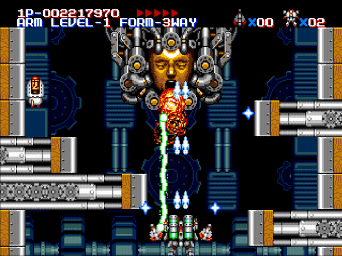
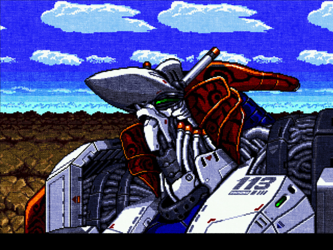
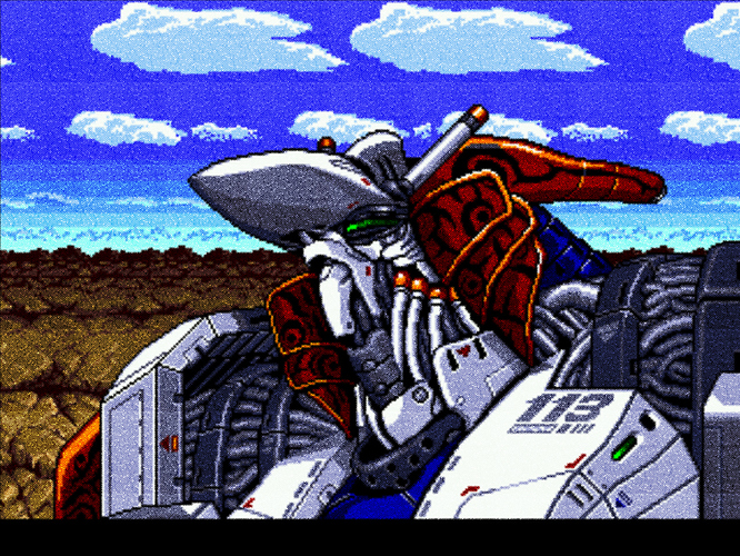
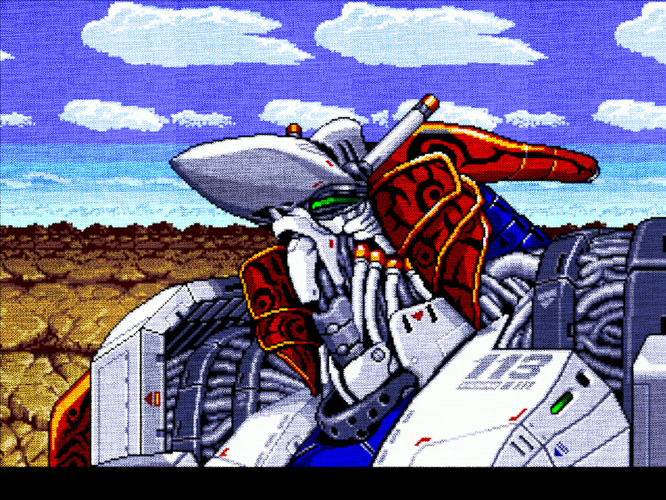
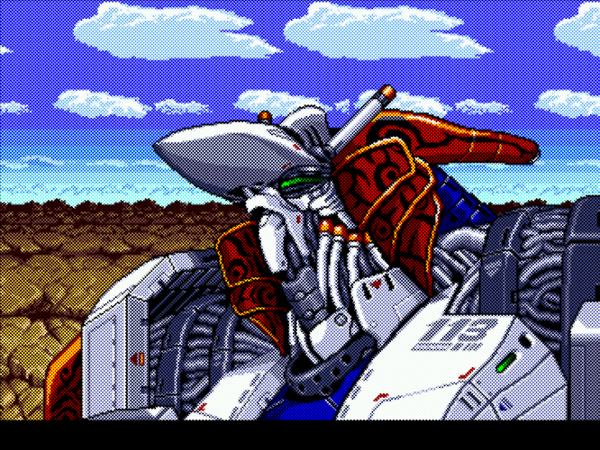
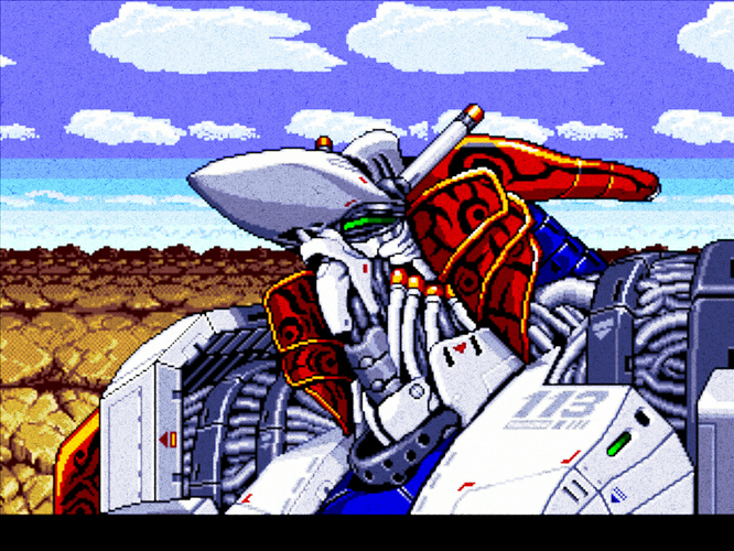
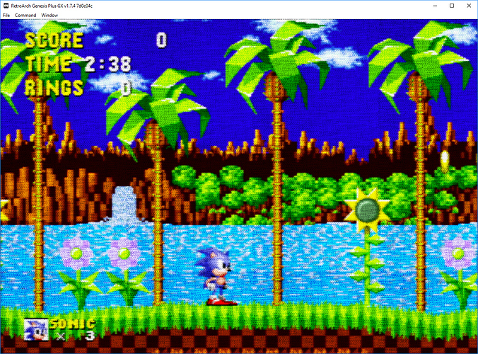
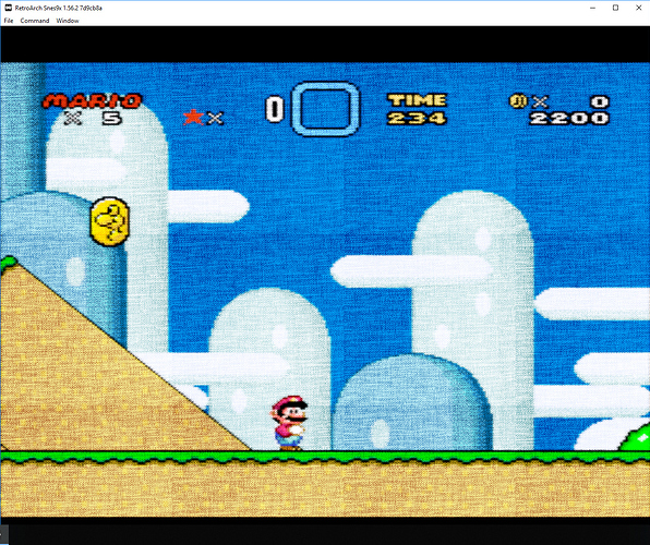
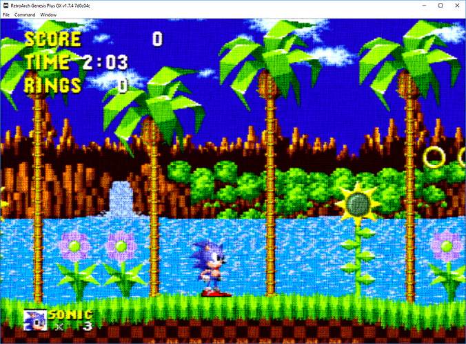
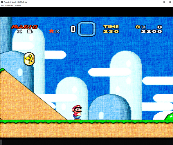
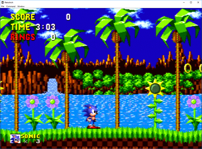
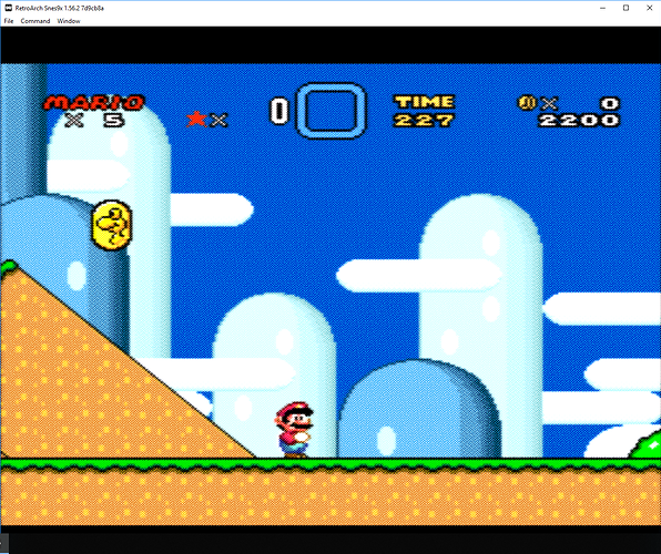
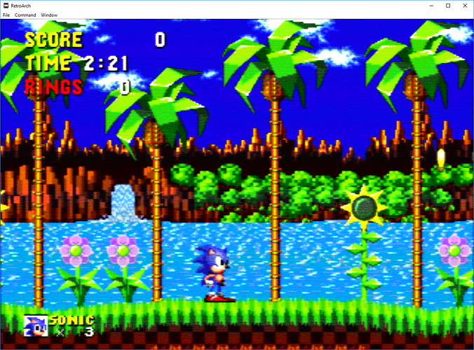
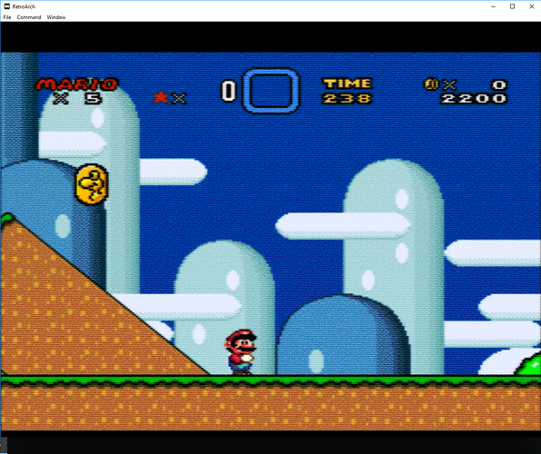
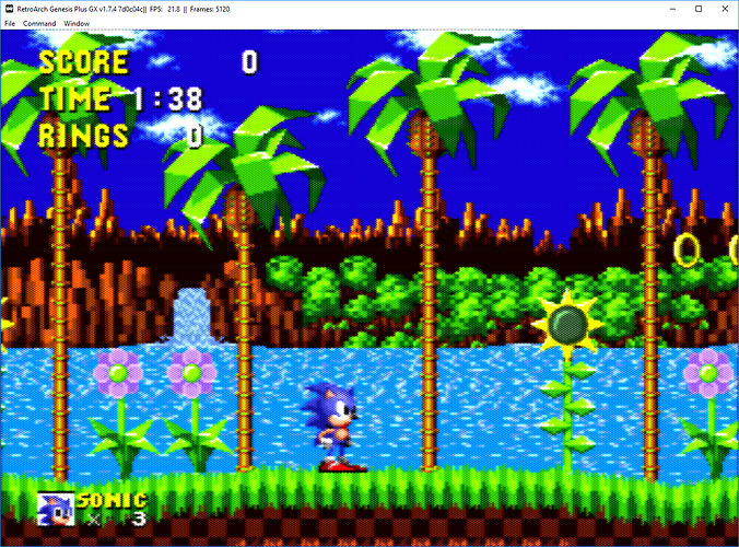
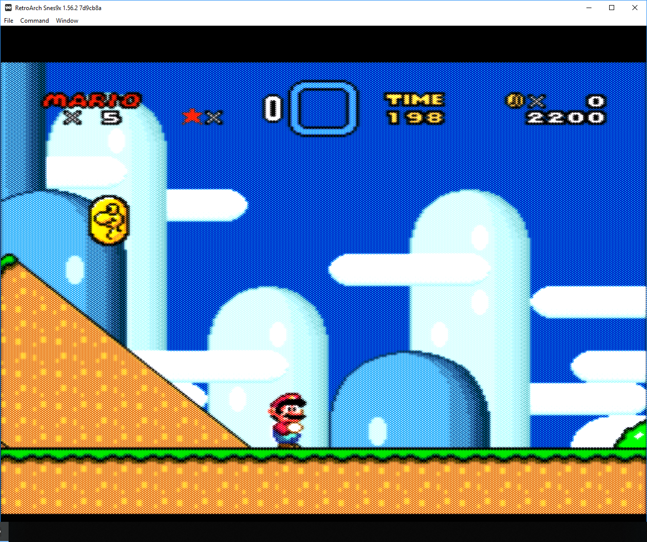
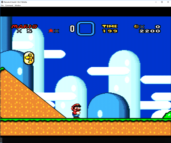
Ah, I think I found it. Give it a few minutes/hours to populate down to the online updater and give it another shot.
just tested it, appears to be working fine now! Thanks!
-
I’d like to try stacking this with the aperture grille effect from the dotmask shader, but it always turns into a rainbow smear when combined with the “stock” shader (which you need for the preset).
-
Also, am I correct in thinking that setting gamma correction to 1.20 is the same as setting input to 2.2 and output to 2.4?
-
I’m getting some pretty bad banding with this shader; any idea how to correct this?
This is with no changes to the params:
Banding is unavoidable with it, AFAIK, because of the way it works. That is, depending on the luminance value, it makes the scanlines thicker/darker or thinner/lighter. So, as you move down the line, it’s going to have plateaus that manifest as banding.
Didn’t fix it here sadly 
I changed both GritsScanlines.slang and GritsScanlines.glsl to read:
// Don't let it exceed 1.0
// luminance = clamp(luminance, 0.0, 1.0);
luminance = clamp(luminance, 0.0001, 0.9999);Oh hey! I tried this too with my zfast crt shader for the rpi3. You can see the texture I used for the scanline profile here: https://github.com/ghogan42/common-shaders/tree/rpi/shaders/zfast_resources
I ended up not using the texture for the scanline profile. I can’t remember exactly why. I think it wasn’t faster than the polynomial scanline profile I had. In my zfast_crt_standard shader, I just lerp between skinny scanlines and fat ones based on pixel brightness. But I did use a texture lookup to copy Inigo Quilez’s “Improved Texture Interpolation” http://www.iquilezles.org/www/articles/texture/texture.htm
which you can see the effect of here (not implemented with a texture lookup on shdertoy though): https://www.shadertoy.com/view/Xl2czV
I use the LUT in this shader: https://github.com/ghogan42/common-shaders/blob/rpi/shaders/zfast_crt_curve.glsl
@torridgristle Amazing work my friend. Have seen your posts in the other thread Please show off what crt shaders can do!
As you are pretty handy with developing shaders utilising LUTs that are potato friendly I was wondering if you had spare time if you could come up with a shader that can create a mask effect similar to what is shown in this video https://www.youtube.com/watch?v=_CmqeejFLgk and https://www.youtube.com/watch?v=Rl1Y1ruwosI. The user has provided the presets here: https://pastebin.com/u/Birm
The Sonic and Mega Man screen shots posted by @Great_Dragon in this post Please show off what crt shaders can do! (link will take you direct to post) are close but I think think the dot effect is a bit too thick and “square”, hopefully that makes sense!.
Zooming in to the screen shot of the YouTube I cannot make out any scan lines but the mask effect makes it look like a VGA/CGA monitor from the early 90’s. I have tried presets provided above but my system struggles with the intense shader chain. Also, with them being in .cgp format they are not compatible with all cores.
I believe it’s the dotmask shader that does the mask effect, I tried to create my own shader chain in GLSL format, however after messing about for days with parameters, scaling combinations nothing worked. On its own I find the dotmask shader “dots” are too small and making the scale bigger you can see the RGB colours in the mask. In the videos the mask dot pitch looks bigger, smoother with little or no RGB.
I even tired to create an PNG overlay combined with gtu-v050 shader (my fave shader for smoothing and blending) to recreate the mask effect but I don’t think it quiet works. Below is a photo using my mobile phone camera of the screen with the overlay and gtu-050, looks okish but I feel it would look even better if the shader could handle the effect.
With your skills and experience with LUT based shaders I was wondering maybe you could load the PNG file which fills the screen and using parameters one could adjust transparency, blending, glow etc??
For reference below is the PNG file I used in Photoshop to create the overlay mask effect:
Actual size 6x4 pixels:
![]()
Zoomed 1000%:
![]()
It would be cool to have a shader where you can load any small/big PNG file which fills all the screen, then have some simple parameters to change PNG size, opacity and other cool stuff. I have gone through almost all the current shaders utilising LUTs but if you load a custom PNG file it breaks everything e.g. crt-potato loads a PNG file for scanlines but if you replace the PNG it has to be the same size which is very limited.
Apologies for the long post and turning this in to a polite request!
Thank you for reading! 
Well I can make a Quark formatted shader for what I reckon you want.
https://mega.nz/#!sh11VI6a!86Un9jAaMv78KnebEcK1ps1Z2zPBDyl_-Yyui2Ubo2w
Wow @torridgristle thanks so much, that actually works really well, exceeded my expectations! I could only run the shader .fs file in the test.exe program included in the zip and it looks as good as you can get using a LUT PNG.
Love the fact you can change the opacity of the PNG. Very clever the way you’ve handled the screen brightness, if you increase the opacity of the PNG the screen brightness increases too to compensate for the darker overlay.
This is how it looks with one some of the example images included in the test program (this type of effect looks better when viewing from a 6ft plus distance):
Screenshots are best viewed at 100% by clicking in to them and then right clicking on the pop up image and selecting “View Image” in your browser right click menu.
Just a couple of questions, if you don’t mind?
Are you applying any of the effects (e.g. you mentioned something about GTU in your orignal post) from your Gritscanlines code or is it just plain loading the PNG file and filling the screen?
If not, Will this shader be friendly with other shaders when combined in a chain? E.g if I was to load up GTU-V050 preset with disabled scanlines or crt-easymode-halation for bloom and add this shader as the final pass to get the overlay effect?
Finally, is there a limitation (size, colour palettes etc…) with the PNG the shader can load in? The real winner with this shader will be the ability to change the external PNG, this way you could create your own custom pattern dot/mask effect in an image program, load PNG file via the shader to fill the screen file and giving you the desired effect, giving you endless possibilities.
The official MAME has something similar called “effect” in it’s config, you can specify a .png file and it will fill the screen with the pattern, however it’s has no parameters to adjust so you can’t change opacity, size etc… those adjustments need to be done an image editing program. MAME also has the shadow_mask_texture under HLSL, again you can specify a PNG file and it fills the screen, but with this you can tweak size, opacity/alpha settings etc…
This shader has the potential to take the techniques of what MAME does with PNG patterns and take them to a whole new level.
Again, thank you so much for taking time out to do the initial coding. 
I assume to use it within RetroArch someone with developing GLSL shaders skills (@hunterk  ) will need to convert it to GLSL?
There’s nothing from GTU, it’s just the PNG filling the screen. It should be friendly with other shaders. There may be issues with indexed PNGs and alpha channels are ignored but typical 24-bit PNGs should work fine, though changes in dimension have to be entered into the shader for the LutCoord section where there’s LutCoord = vec2(fract(texCoord.xtargetSize.x/6),fract(texCoord.ytargetSize.y/4)); 6 is width, 4 is height.
And yeah, someone else will need to convert it to GLSL. I’ve looked at GLSL shaders formatted for RetroArch and I can’t wrap my head around all the replacements and multiple version supports and whatnot. You might be able to look at the existing version of Grits Scanlines in the GLSL Shaders repository and edit to match the new effect though.
Converting to slang from quark is pretty painless, so that’s what I usually do first.
I really wish the uniforms for LUT sizes (i.e., LUTNAMETextureSize in GLSL or LUTNAMESize in slang) worked consistently, but I think they’re hit-or-miss.
Also try this pattern. ->
![]()
You’ll need to adjust the shader to use 4 width and 2 height for the texture like I explained in the previous post.
This should be better for closer viewing, like on a laptop.
Yes this pattern works really well too, especially when you sit closer - makes it look like a late 90’s VGA monitor with a finer dot pitch. Like you suggested I had to change the sizes in the shader file to LutCoord = vec2(fract(texCoord.xtargetSize.x/4),fract(texCoord.ytargetSize.y/2));
Could the shader autmatically work out the size of the PNG from the file and use that to fill the screen? That would remove that extra step in the config where you have to specify the size.
Thanks for your work so far.
It’s still a proof of concept but I believe if this type of shader did ever come to life with an addition of a few more parameters to adjust the loaded PNG (you’ve shown opacity can be set) for example size, sharpness (make PNG softer?), adjust colour palette of PNG (greyscale, RGB), plus maybe some others etc… it could be a pretty powerful shader with endless possibilities to create custom masks. 
I’ve been playing around with shader concept I requested from @torridgristle.
I just grabbed some texture patterns from Google images, made sure they were .pngs, grayscale and entered the size in the shader file. Outcome was pretty interesting, granted you would not probably play games with these settings but still pretty artistic (thinking of Yoshi’s Story on the N64 or Yoshi’s Woolly World visuals). Impressive results are achievable and still very lightweight.
Below are some screen captures using the shader test.exe that runs the concept code by @torridgristle.
Screenshots are best viewed at 100% by clicking in to them and then right clicking on the pop up image and selecting “View Image” in your browser right click menu.
Canvas texture
Carpet/old magazine texture
Fabric texture
Weave texture
Noise texture
With a few more parameters mentioned in my earlier posts this could be a lightweight yet powerful shader.
I had a look at converting the code to GLSL or SLANG but could not get my head round it as I’m not a coder 
Looks nice, indeed. I’ll get it ported over soon.
EDIT: I just pushed it up to the slang repo. It’s called blendoverlay in the reshade subdirectory. I added parameters to change the size of the mask LUT, either for using larger/smaller LUTs or for changing the size of it on the image.
Woooohooooo and the legend, that is @hunterk, has done it again! 
As well as custom textures/patterns/masks this could be used as an alternative option for those who rely on Overlays for their scanlines, a small scanline texture can be created and loaded via the shader to fill the screen with the desired look, this leaves the actual Overlay option in RetroArch for decorative bezels and touch based inputs.
Really appreciate your quick turnaround on this @hunterk and thanks to @torridgristle for the original work. 
The size parameter will be very useful. Going to have a play later, hopefully I can link it with other shaders to get some cool effects.
Okay, had a quick play with the blendoverlay shader within RetroArch using some unorthodox textures and so far it works a treat.
In the examples below I’m combining the blendoverlay.slang as the 4th pass after loading gtu-v050 (but it can be used on it’s own). I always use the passes from gtu-v050 in some form or another as I find they blend and smooth the pixels the best for my taste. One thing to note when you manually create the shader chain the .png file is not included in the preset, after saving the shader chain I had to open the .slangp file add the following lines:
textures = "overlay"
overlay = ":\location\of\image.png"
I also update changed the LUTHeight and LUTWidth within the preset to match the image file size (you can enter bigger widths and heights by editing the preset file, the GUI has a max limit!).
Again, these are just showing off the artistic effects that can be achieved with this type of shader, games are not meant to be played with these visuals, although nothing stopping one from doing so, or if you want to just show off to others (if they are in to this kind of stuff)! You also could just add simple masks or scanlines to get crt effects too (integer scaling might be better on for this though).
Screenshots are best viewed at 100% by clicking in to them and then right clicking on the pop up image and selecting “View Image” in your browser right click menu.
Fabric 1 texture
Fabric 2 texture
Fabric 3 texture
Yarn texture
Dot pitch texture
Effects look better in a running game than static shots
They look awesome. I will play with them soon.
The Dot pitch texture looks great, however I spotted some white dots at some places, don’t know if it should be like that or not (i.e. around the white and yellow text).
Yes, I noticed the white dots too. they appear more exaggerated when black and white of the game image blend into each other as a gradient. Seems worse on the dot pitch texture that the others.

