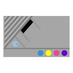
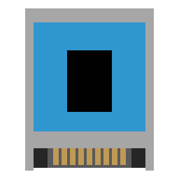
@CafeteroCordoba Working out from an existing icon is a great place to start. But with the XEGS, you picked a difficult icon to start with. So let me teach by showing my quick rendition and give you some quick tips that might help out.
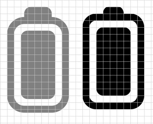
When I design an icon, I like to start by looking up the console dimensions online and make the outer box proportional, but rounded to the nearest grid point. I begin drawing with black, white and gray in 5% increments. Make sure you do your best to make sure all the points on the shape align to the grid. For the XEGS, the diagonals make this impossible for all the points on the cartridge slot and character lines to align, so you just have to live with with it and know you did your best. Lastly, feel free to play with the grayscale to simulate highlights and shadow, even when they don’t really necessarily appear that way on the console.
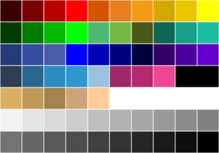
After that, I add colors only from the palette. I realize the palette is fairly limited and does not have pastels, which once again makes the XEGS a challenge. But it brings uniformity to the set. As you create other icons in the system family, do your best to coordinate the colors so they look like they go together.
There are more tips over on the Guide to Making Themes post. I had intended to contribute to existing themes, but I kept making more and more icons and it eventually became a standalone theme! If you want to contribute to an existing theme, that’s great too. The FlatUI and Pixel themes are missing icons and could use some more contributions to “complete the set” if you’re interested.


