
I wanted it to look like a CRT, like on the Astro City, but I think there’s still a lot of work to do.


4 Likes
I Know I’m almost there, but there’s something I can’t figure out what is missing… I’m still fighting to achieve what my new CRT looks like, I always find there’s half notch missing. I won’t stop until I’m satisfied. I know there’s still work to do.
Real Philips CRT.

My settings…

5 Likes
in real life the image looks clearer than the one on retroarch
Beforehand, we should test something like this. I also notice that Ryu’s colors are lighter on the TV than on RetroArch. That said, it’s just my personal opinion; we don’t all have the same screen, and that can vary from one screen to another.
2 Likes
I know, but it’s not only about that, it has to do with brightness, gamma, and contrast. I can make it sharper, but in some ways there’s something not matching, there’s something that I have to figure out, that looks blurrier than other settings, when I think I’ve got it, after a while I find there’s a notch I still can’t find what it is, and I haven’t yet found it yet. I know is not going to look like a real CRT, but I’m convinced that will look amazing if I find what it is. All I do is by eye, I don’t have any knowledge of image or photography.
2 Likes
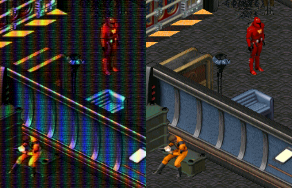
You can notice that the sub-pixels are not visible in the image on the right, which removes part of the natural look that a real CRT screen provides. There’s also a loss of nuance in the colors and brightness, making the image less vibrant. To improve this, adjustments should be tested to make the pixel grid more apparent and simulate the sub-pixels as well as the physical structure of CRT screens. This could help recapture the realism and detail seen in the image on the left.

4 Likes
Yes, I know, that’s what I’m trying to do, but I don’t know which options I have to touch. I think that could be one of the reasons I still can’t find. Any Ideas?
Philips CRT screens, known for their marked brightness and slightly saturated colors, often used a slot mask or a fine dot mask, creating that effect of visible sub-pixels (red, green, blue). The scan lines of Philips CRTs were well-defined, especially in low resolution, often having a slight curvature and slightly blurry edges. They had a very fine mesh that gave the image a particular texture. These are the memories I have of my old television.
1 Like
Increase the color saturation in the shader menu to make the colors more vibrant. Add a soft “bloom” effect to simulate light spilling slightly around bright colors.
Enable fine scanlines in the shader and adjust their intensity so they are visible without darkening the image too much. Activate the screen curvature option to mimic the curved effect of CRT screens.
Add subtle blur on the edges to simulate the limitations of a physical screen. The fine mesh pattern of Philips CRTs, in particular, gave the image a distinct texture. Adjust the pixel mesh or “mask strength” in the shader and experiment with different settings to achieve this tactile effect. After, I’m not an expert, I can only tell you what I know about this screen.
1 Like
Which option is this? It would be easy if I know whick ine is it, I’m Using Guest NTSC advanced
2 Likes
My recent presets including ntsc always include increased mask boost and lowered mask gamma.
Depending on which mask mitigation technique (bloom, mask bloom, halation…) is used it’s also worthwile to adjust the technique’s mask strength.
Halation is good for this, but might require to use fine bloom sampling at like 3.0. It’s also nice to tweak bloom pass settings for the effect height and width.
3 Likes
Imho it’s perfectly fine in terms of sharpness. If you increase it to much, it begs the question of what the difference to high TVL monitors is supposed to be in this regard.
The target display you’re using it on has presumably also a totally different size, affecting perception of the content.
1 Like
This is so true. It’s really interesting how much better a preset can look just by dropping it down a few notches on the integer scale with all other settings remaining equal.
Try playing around with the NTSC Resolution Scale and NTSC Chroma/Bleeding values. That’s one way you can get more subtle blending without blurring everything else.
I’d say they’re quite close already, maybe you can try different phosphor settings and maybe experiment with the White Point a little.
After adjusting either of those parameters be sure to normalize Saturation because they are tied to Saturation to some extent.
Would be nice to have an independent setting for this because Saturation is something that once dialed in correctly, gives that CRT-like pop and vibrancy in the colours but when pushed too far, can cause clipping, loss of detail and a posterized look.
Just remember when fine tuning like this, adjusting a setting by just 1 or 2 notches can make a difference. Try not to go overboard just to be able to “see” the effect.
Some effects are only meant to be seen from very close up or in a photograph where exposure is not necessarily the same as the human eye.
Also, sometimes tired eyes have a way of seeing what they want to see.
1 Like
This is why I also often decline to crop borders fully or blow up handhelds to the maximum possible size, it looks odd to me and I’d find it annoying to always adjust my viewing distance.
1 Like
What bothers me is how ‘wrong’ old games look in terms of contrast on modern displays. So I’ve been working on improving that with the use of custom LUT. Issues are that it sometimes looks oversaturated, or too dark on a low-light scene. Perhaps a dynamic solution somehow would be best. And yeah, I realize someone probably figured all this out a long time ago : )
Download: https://github.com/frankschoeman/kyubus-shader/releases
2 Likes


Colours look good, also the image in general, but I think focus needs to improve I find it blurry, needs more focus. I have te same problem, the main problem with shaders is to improve focus. I can manage colour, brightness and all that stuff, but I’m stuck with the same thing. Good work though.
1 Like
- Beam Spot Power
- Beam Min Shape
- Beam Max Shape
- Cubic Sharpness
- Gaussian Sigma
- AA Subpixel R Offset X :
- AA Subpixel R Offset Y :
- Geom Distance :
- Geom Curvature Radius :
- Mask - Triad Size Desired :
- Number of Triads Desired : I adjust these settings for sharpness
2 Likes
I’m almost there but I’m stuck with image looking a bit blurry trying to find what I’m missing, I also have the same problem. Colours look good, also blacks and brightness and contrast, but missing more sharpness to pop out, it’s hard to explain, but it’s just a notch up I can’t find, I improved fine glow and halarion thanks to @guest.r. but I’m still working on the setting I’m missing. Sharpness needs to pop out, to make the characters be closer to the screen or something like that.

2 Likes
