
This is why I also often decline to crop borders fully or blow up handhelds to the maximum possible size, it looks odd to me and I’d find it annoying to always adjust my viewing distance.
1 Like
What bothers me is how ‘wrong’ old games look in terms of contrast on modern displays. So I’ve been working on improving that with the use of custom LUT. Issues are that it sometimes looks oversaturated, or too dark on a low-light scene. Perhaps a dynamic solution somehow would be best. And yeah, I realize someone probably figured all this out a long time ago : )

Download: https://github.com/frankschoeman/kyubus-shader/releases
2 Likes


Colours look good, also the image in general, but I think focus needs to improve I find it blurry, needs more focus. I have te same problem, the main problem with shaders is to improve focus. I can manage colour, brightness and all that stuff, but I’m stuck with the same thing. Good work though.
1 Like
- Beam Spot Power
- Beam Min Shape
- Beam Max Shape
- Cubic Sharpness
- Gaussian Sigma
- AA Subpixel R Offset X :
- AA Subpixel R Offset Y :
- Geom Distance :
- Geom Curvature Radius :
- Mask - Triad Size Desired :
- Number of Triads Desired : I adjust these settings for sharpness
2 Likes
I’m almost there but I’m stuck with image looking a bit blurry trying to find what I’m missing, I also have the same problem. Colours look good, also blacks and brightness and contrast, but missing more sharpness to pop out, it’s hard to explain, but it’s just a notch up I can’t find, I improved fine glow and halarion thanks to @guest.r. but I’m still working on the setting I’m missing. Sharpness needs to pop out, to make the characters be closer to the screen or something like that.

2 Likes

Are you using deconvergence? I spot red bleeding to the right; it certainly defocuses.
2 Likes
This looks superb to me, congrats!
3 Likes
Can you post the preset here? I’m sure i could help you getting a more sharp appearance.
1 Like


I don’t find they looked too blurry in the screenshots viewing them on my cellphone. I found these looked great! Maybe they might work better for near field vuewing and probably they might look slightly out of focus if you increase your viewing distance beyond a certain point.
You should consider keeping them at least for near field purposes because when you start focusing solely on sharpening, you can lose other pleasant side-effects of pixel and colour blending.
2 Likes
This can be improved by cutting back on things that blur the image and dilute the Mask. I’m talking about Halation, any type of Bloom, Glow and only after that you can fine tune your NTSC Resolution Scale, Chroma/Bleeding and Subtractive and/or Adaptive Sharpness and Horizontal Filtering settings to achieve a sharper look.
As @guest.r suggested if you posted your preset, it would be much easier to assist and troubleshoot.
You can also go back to the days and posts when I was trying to assist you in getting things sharper as you’ve gradually moved away from those types of settings over time.
1 Like
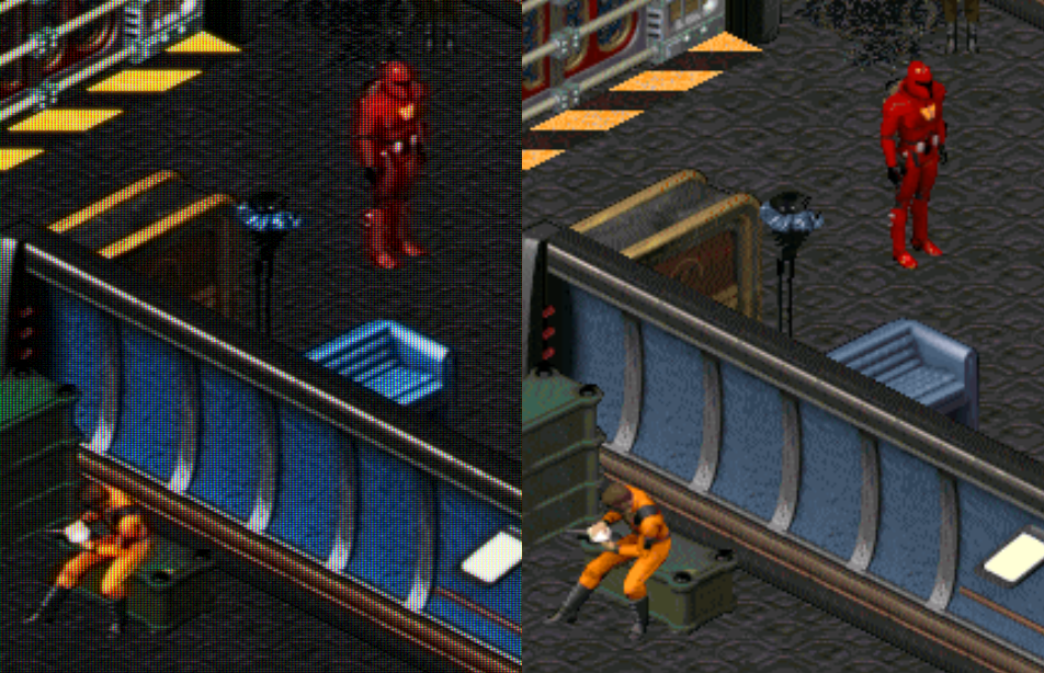
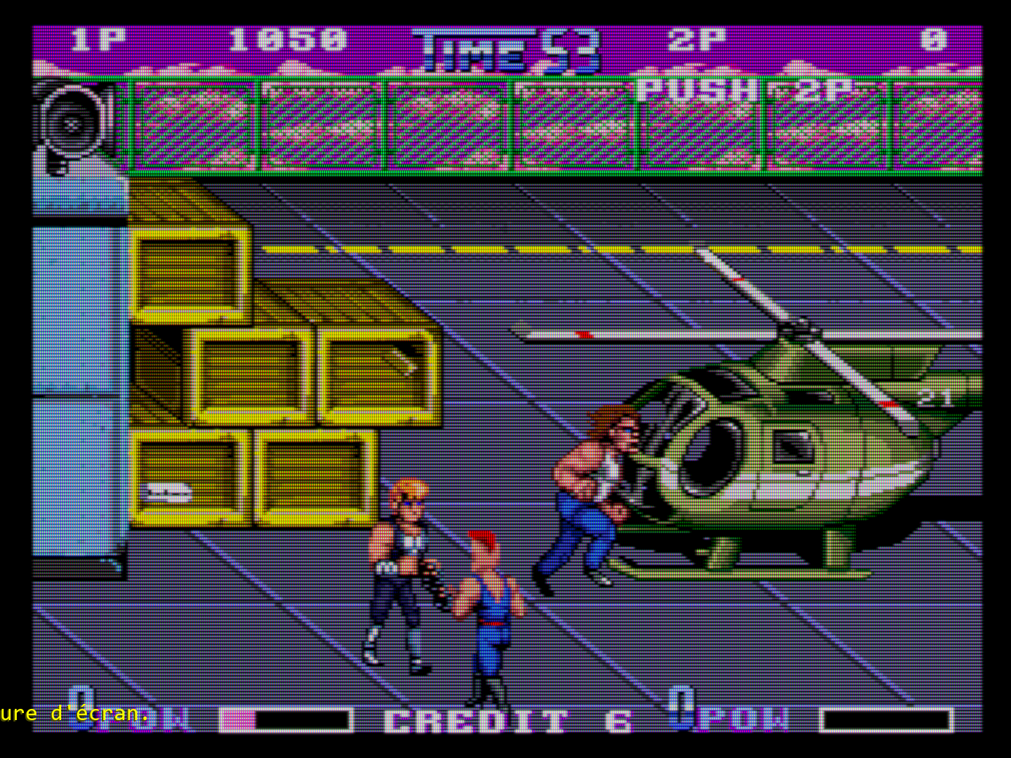
Sometimes looks a bit strange with the Slot Mask height in this screenshot. Not sure if it’s intentional.
1 Like
Thanks for the advice, I’m going to leave it as it is on my first images for now. I’ll probably fine-tune the brightness or colors, depending on my mood, but for now, I like it as it is."
1 Like
Yes, it’s honoring the “original” preset. I used reduced slotmask height (1) regularly in my 1080p days.
1 Like
Yes, I do. Maybe shouldn’t use it at all? I would love others opinion, I’m open to improve my settings, but I feel I’m stuck and I can’t advance. Maybe I have mania in some settings I must change.
1 Like
Yes, well done! something similar I’m looking for. Any ideas? What do you think I’m missing? I think one of the reasons coult it be what @kokoko3k mentioned?, I use deconvergence X & Y 75, 75 and 2.00 intensity. Maybe I shouldn’t use it at all. Maybe that could be doing the squeeze blurry thing?..
2 Likes