
Wow this is an amazing new look here, looks like you’re taking things to the next level.
2 Likes
Here there are some more screenshots…


7 Likes
They wont show here, but I can see them in the other thread.
1 Like
That was weird, I just uploaded them again. 
2 Likes
Excellent. High accuracy without going overboard. I think it can please a lot of people who had access to a better connector than composite; perhaps even LCD-only users. Congratulations for your effort, you’re really nailing it. Just don’t lose what you have by tinkering too much.
1 Like
I’m learning new things, and I keep improving the image, I was doing something wrong with gamma correct, taking it to the other opposite side, also I’m learning with the feature “raise black level” and I’m loving it. Here is the result.


7 Likes
Great job! The magic glow seems to be a tad too high in the first screenshot. It doesn’t look so severe in the last pic. The scanlines in general look a little blurry when zoomed in. Could be due to too much bloom/halation. Also the Mask Strength is a bit low.
Just by pushing the Mask Strength and Scanline Darkness alone will have a side effect of increasing the apparent sharpness and contrast.
At the end of the day it is you preset and you would know best what type of look you’re going for…
Don’t be afraid to push the Mask Strength and lower the Mask Mitigations a bit for a richer look.
If you’re concerned about brightness loss just raise Gamma_C or Bright Boost and Saturation but you can use a test image, even if it’s from a game to know if you’re boosting too high till the point of whites or colours clipping - which is when they appear burnt, harsh, and you lose details like creases in clothes and different shades of colour appear as one shade.
Once you’ve found the maximum you can push the brightness/gamma/saturation, if it’s not bright enough, you can then start to back off slightly with Mask Strength and add other mask mitigations.
If adding things like bloom, halation and magic glow, try adding only just a tiny dash of each, rather than pushing one high enough until you or “everyone can see it”.
Sometimes it’s the sum of the subtle effects that we can barely make out with the naked eye that add up to making the image something really special in terms of character.
3 Likes


Is this Better? I’m still learning…


2 Likes
Those screenshots look fantastic  , which game is it?
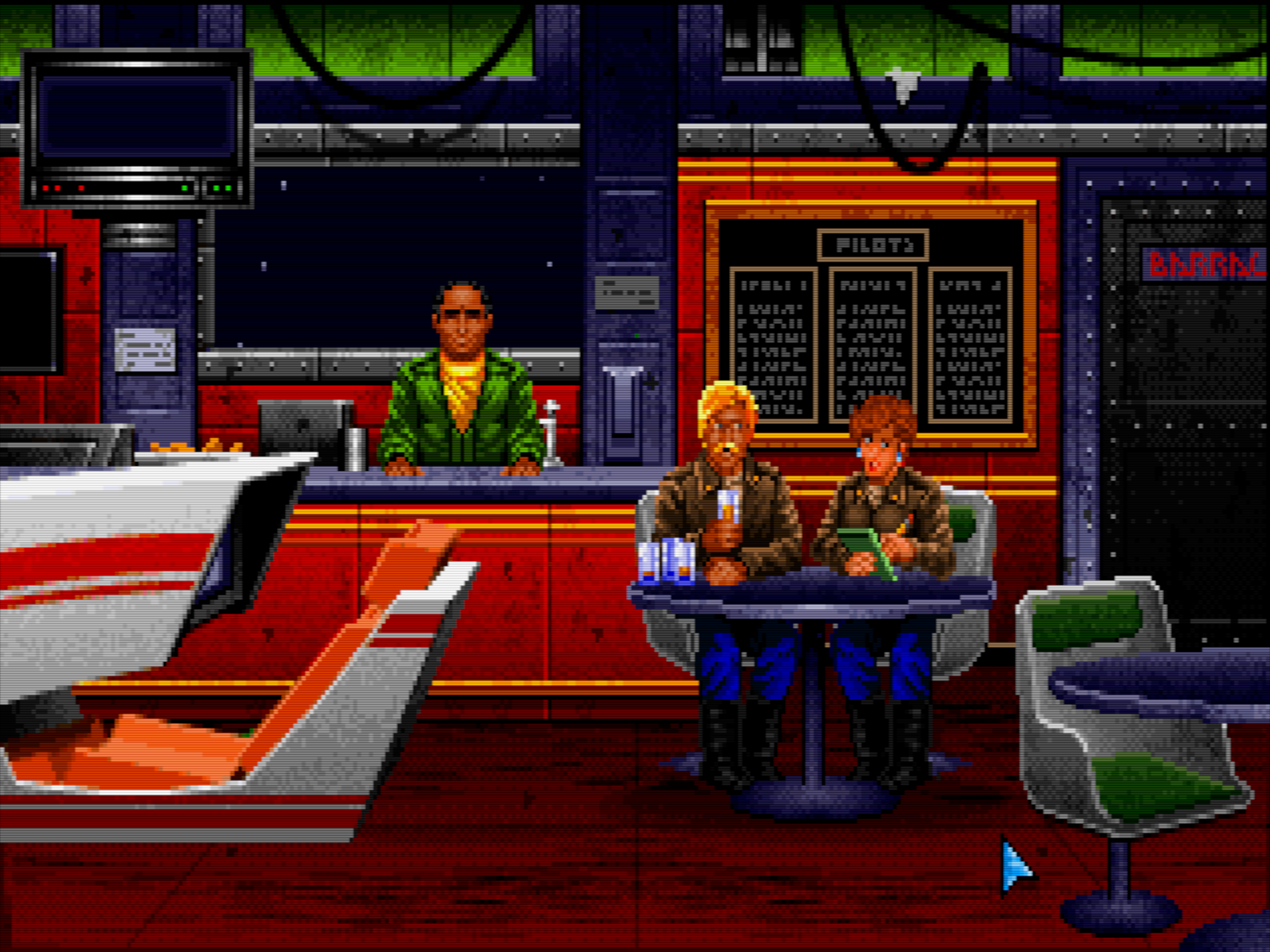
It’s the glorious Wing Commander. If you wanna try it, my personal preference would be the CD32 whdload version, like the PC one, but with better sound/music.
2 Likes
For me yes, it’s definitely a step in the right direction. It’s easy to see the improvement even before zooming in. Everything is clearer with better contrast.
Aren’t we all?
I get the feeling like you used to be more aggressive back in the day, when it came to pushing mask strength and getting the preset to look almost identical to your Sanyo CRT.
I prefer when the Mask is used as much as possible to do its job, unaided by mitigation techniques because for me, that’s part of the essence of a CRT.
There’s nothing wrong with your approach though. Don’t forget you can add HDR on top of all of this to squeeze even more excitement and brightness into these presets!
1 Like
That is because there was another old mask clipping that Guest removed, and I can’t make it clip the masks triads that are not lit, I haven’t found yet how to do the same effect without it.
1 Like

It’s DOS Wing Commander with that shader i wrote before about (never uploaded) tweaked a bit more. SNES Wing Commander has much inferior graphics imo.
Trying to look like how i remember the 1084S-P (mine is dead in storage room lol, flyback gave up the ghost).
3 Likes
Triying Mask strength as I use to do it before, I’m trying without the old mask clipping, I think it was something like this.

2 Likes
It’s all about practice and trial and error. If you come out of your comfort zone there’ll always be a learning curve before you perfect a different way of doing things.
In the Mortal Kombat II image with the higher Mask Strength, I think the colours look a bit less saturated as well as there’s a posterized look. Lastly, the Gamma is not as dark compared to the previous Mortal Kombat image with the many mitigations. It does seem a bit more accurate though from a CRT emulation perspective. You just need to tweak things some more like the colour, gamma and saturation to the point of Nirvana.
Another thing I’ve noticed and I’m sure you’ve noticed too is how chunky the phosphor triads are now that you can see them more clearly. I know you’re trying to model your real CRTs but you can also try using Mask 10, Size 1 in order to get finer phosphors and you might see that is doesn’t look as jarring and might actually be closer to what you’re accustomed to but just more accurate.
1 Like
I think Wing Commander would have been double-scanned on VGA monitors (like other mode 13 games). Something like this:
That’s a bit more difficult to pull off at 1080p, though:

2 Likes
I love wing commander how it looks , thanks to you it was easier to configure my settings, I tried this game on my Philips CRT, so I could copy the image, and this is the result. 
 Thank You!


And this is a real photo of my Philips CRT. 

3 Likes
Hey man, you definitely learn fast!! Your preset definitely looks more like your real CRT now compared to the diluted version. Based on the photo, I might lower the Base (black) Mask probably by one or two notches to closer match the CRT even if it means it can hardly be seen except in a zoomed in photo or screenshot.
To my eyes, I think you’ve nailed it!
I would love to see what you can do with some HDR added into the mix! Doesn’t your display get even brighter when you enable HDR?
1 Like