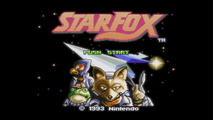
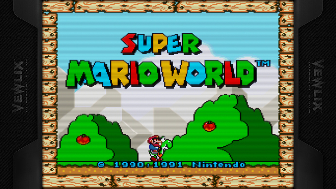
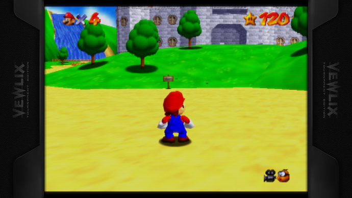
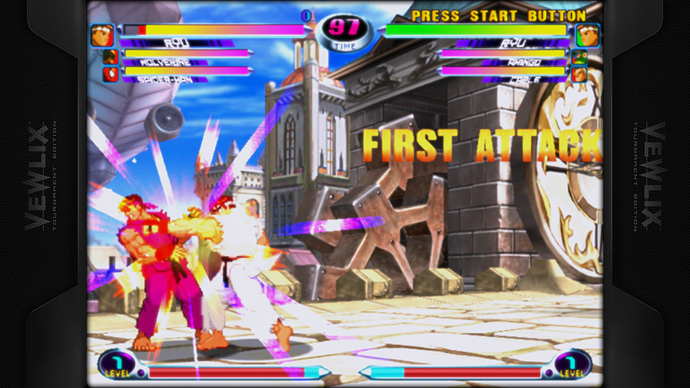
That PVM shot looks fantastic. Makes me want one so bad. It be great if we can replicate it with a shader. The current PVM shaders on retroarch are nice but they are often way too sharp, starts to bother me eyes after a while.
How does this look?
This was my attempt to edit crt-easymode-halation to look more like a trinitron I have. (CRT-Royale slows my computer down)
@Arviel - yeah that’s why I keep insisting in the use of linear filtering and/or AA. Just like in photography and video (my profession), too sharp is ugly.
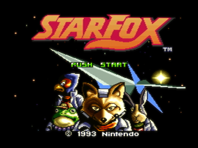
@Slimy - I’m a big fan of easymode, so I like it. But I see a few issues. High contrast and saturation are crushing the shadows and clipping the whites. Also I think the mask is a tad too obvious. For reference, this is what I get from the Starfox title screen.
I’m surprised nobody is using crt-aperture, which looks pretty close to my PVMs. I also like crtglow_gaussian for its beam dynamics, crt-hyllian for its easy vertical scanlines (for vertical shooters) and GTU for its ability to blur dithering (and just all around looking awesome all the time; it also has a great composite video color-smearing option).
@hunterk - good to see you here.
Aperture is amazing, I like it a lot. But I had a really hard time trying to get even, well placed scanlines from it at 720p+non integer. It looks beautiful at 1080, but at that resolution my laptop gets too hot. I also remember its scanlines being a bit too prominent and dark for my taste.
Hyllian (whose phosphor option is just a toggle, I wish it had more tweakable settings for that) gave me similar headaches, mostly horizontal scaling artifacts. Still, I use it all the time via reshade both on retroarch (reshade+hyllian works great with increased IRs) and standalone emulators. Through reshade’s gui, I can more or less easily configure its scanlines and grill independently, which allows me to fix the scaling problems I have with it on RA.
Both glow_gauss and GTU, amazing as they are in many ways, don’t provide any kind of shadowmask/aperture grill options, and those have become as important to me as scanlines themselves.
720p and non-integer are indeed tough nuts to crack. There’s just not enough pixels there to do most mask effects justice, and non-integer scanlines are always going to be uneven.
For mask effects, you can always do crtglow/GTU first and then follow it up with a pass of the dotmask shader.
Not always… look at all the screenshots I’m posting here ;). Easymode deals with non integer 720p wonderfully. That is in fact the main reason why it has become my to-go shader for 240p content.
glow/GTU + dotmask sounds like a good idea though, I will give it a try!
By the way, you are a guru around here, so would you mind posting some captures of your best/favourite configurations? I would love to see what you can come up with.
I don’t actually spend much time tinkering with parameters. I usually just load up the base preset for whichever shader I deem the “right tool for the job” at the moment. Usually, the older the system, the grungier I like it 
However, I did take a little time this morning to play around with crt-royale settings to try and reproduce the look of my NEC XM29+, which uses a slotmask and is a little less sterile than my PVMs (which crt-aperture already captures well, IMO), let alone one of the high-line-count PVM/BVMs that kurozumi’s preset is based on.
It looks okay at 1080p but looks a lot better/closer at 4K:

If anyone wants to try it, just take the kurozumi preset and replace the parameters down at the bottom with this batch:
beam_horiz_filter = "0.000000"
beam_horiz_linear_rgb_weight = "1.000000"
beam_horiz_sigma = "0.555000"
beam_max_shape = "2.000000"
beam_max_sigma = "0.250000"
beam_min_shape = "2.000000"
beam_min_sigma = "0.075000"
beam_shape_power = "0.250000"
beam_spot_power = "0.330000"
bloom_excess = "0.335000"
bloom_underestimate_levels = "1.20"
border_compress = "2.500000"
border_darkness = "0.000000"
border_size = "0.005000"
convergence_offset_x_b = "0.000000"
convergence_offset_x_g = "0.000000"
convergence_offset_x_r = "0.000000"
convergence_offset_y_b = "-0.200000"
convergence_offset_y_g = "0.000000"
convergence_offset_y_r = "0.200000"
crt_gamma = "2.400000"
diffusion_weight = "0.075000"
geom_aspect_ratio_x = "432.000000"
geom_aspect_ratio_y = "329.000000"
geom_mode_runtime = "0.000000"
geom_overscan_x = "1.000000"
geom_overscan_y = "1.000000"
geom_radius = "3.000000"
geom_tilt_angle_x = "0.000000"
geom_tilt_angle_y = "0.000000"
geom_view_dist = "2.000000"
halation_weight = "0.000000"
interlace_1080i = "0.000000"
interlace_bff = "0.000000"
lcd_gamma = "2.400000"
levels_contrast = "0.750000"
mask_specify_num_triads = "0.000000"
mask_triad_size_desired = "3.000000"
mask_sample_mode_desired = "1.000000"
mask_type = "1.000000"
aa_cubic_c = "0.500000"
aa_gauss_sigma = "0.500000"
aa_subpixel_r_offset_x_runtime = "-0.333333"
aa_subpixel_r_offset_y_runtime = "0.000000"Imo, when I stare closely at my CRT the closest shader I’ve ever seen in my life is Royale at 4K.
The masks on other shaders look too grid like and over simulated. I am in no way a videophile either; just going by what looks the closest to my consumer NTSC TV. It’s a shame it’s resource heavy.
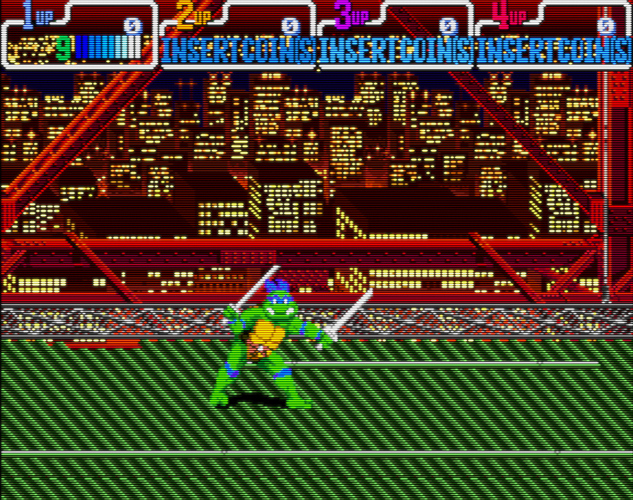
Looks like the Electronic Gaming Monthly folks back in 1992 did see scanlines, and the aperture grill type to boot. Perhaps they were running PVMs in their offices though!
Definitely has visible scanlines, but it looks like a slot mask to me in this bigger shot:
I would guess it’s a shot from a typical RGB arcade monitor from the era, as it looks just like my neotec.
Haha hardcore cover, cool.
@hunterk - that looks great indeed. That NEC monitor was reviewed by phonedork on youtube. The levels in his videos are all over the place, usually horribly overexposed, but he definitely knows his onions when it comes to crts and the like. I tried your suggestion and added dotmask to glow and GTU, and got good results. It also runs fast. But I still prefer easymode. That one really is my cup of tea.
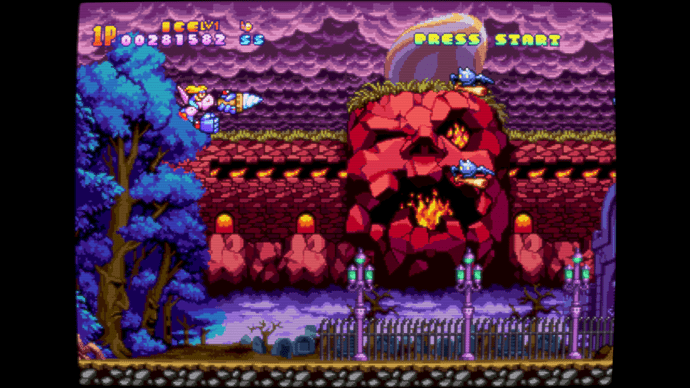
@Squalo, Apologies for the noob question and slightly de-railing the topic, what is the game in the very first screenshot? Thanks!
That´s “Harmful Park” (PSX). It was only released in Japan.
Ahh cool, I have that in my collection, just never booted it up. Looks fun and colourful, will have a go later. Thanks for the input.
Yeah it’s a wonderful little hidden gem, with the loveliest art style ever and fantastic music! It’s also a lot of fun. I really like how the ps1 does 2D. It’s obviously not Saturn but still. It’s a shame that it was almost forbidden to make sprite based games for it if you were not Capcom.
Screenshots are best viewed at 100% by clicking in to them and then right clicking on the pop up image and selecting “View Image” in your browser right click menu.
2D CONTENT
3D CONTENT
480 CONTENT
Nice!
Do you mind sharing your presets? I really like the clean look of them and would love to test them out on my set.
Do you consider the PSX under 3D content or 480 content?
Thanks!
Yes, I can post my presets later if you want them, I don’t have access to my PC at the moment.
The PSX, Saturn and N64 are all under 3D content but I force 240 scale on the y axis in my shader chain, this helps with the consistent scanlines.
I will also try and post some more screenshots later too.

