I agree, they did have good taste. And you’ve given me a few I need to add to my short list 
Armed Police Batrider 4k Vertical Overlay
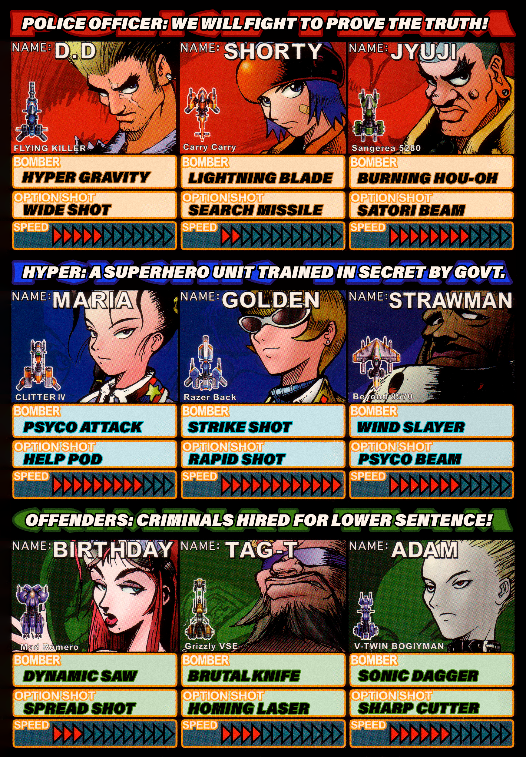
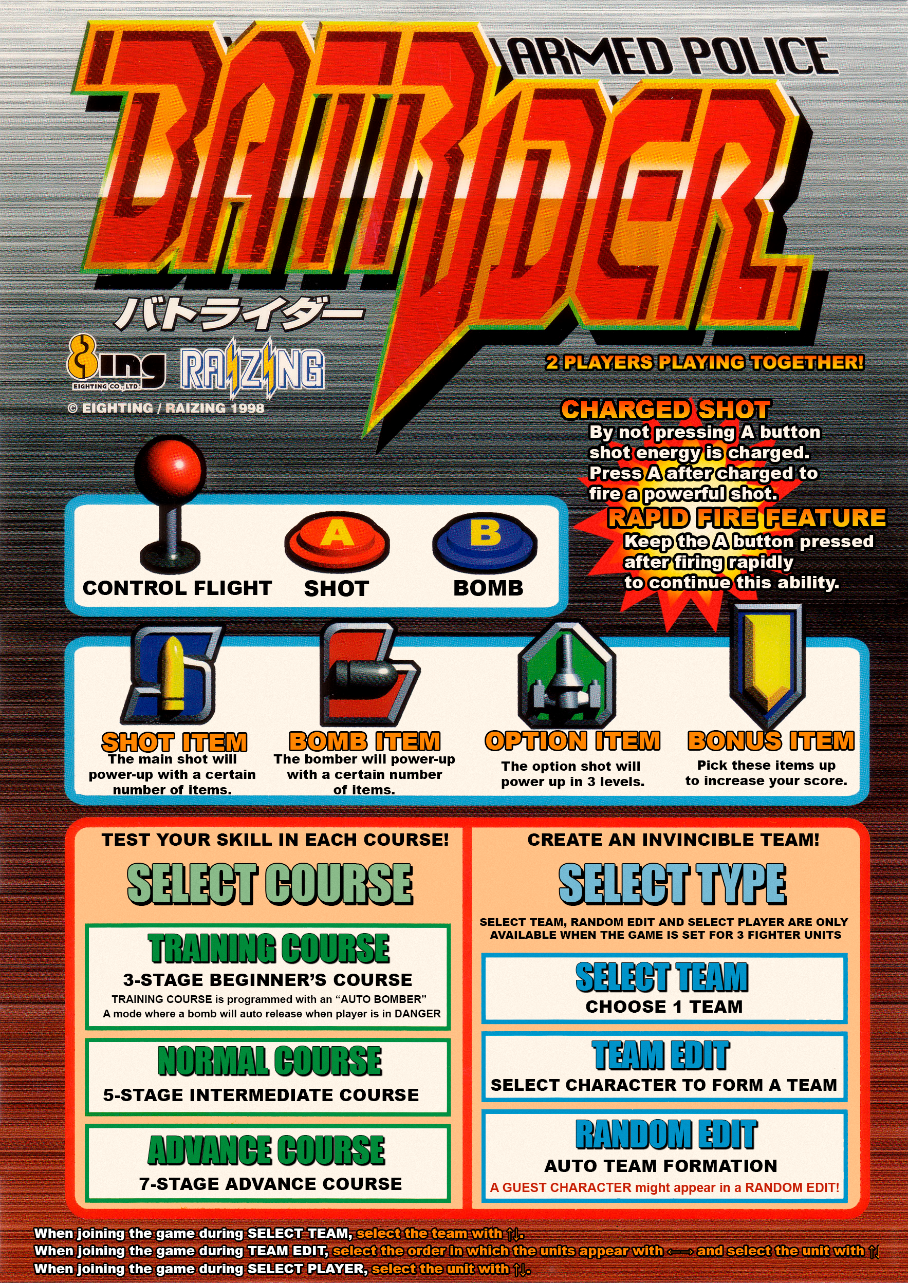
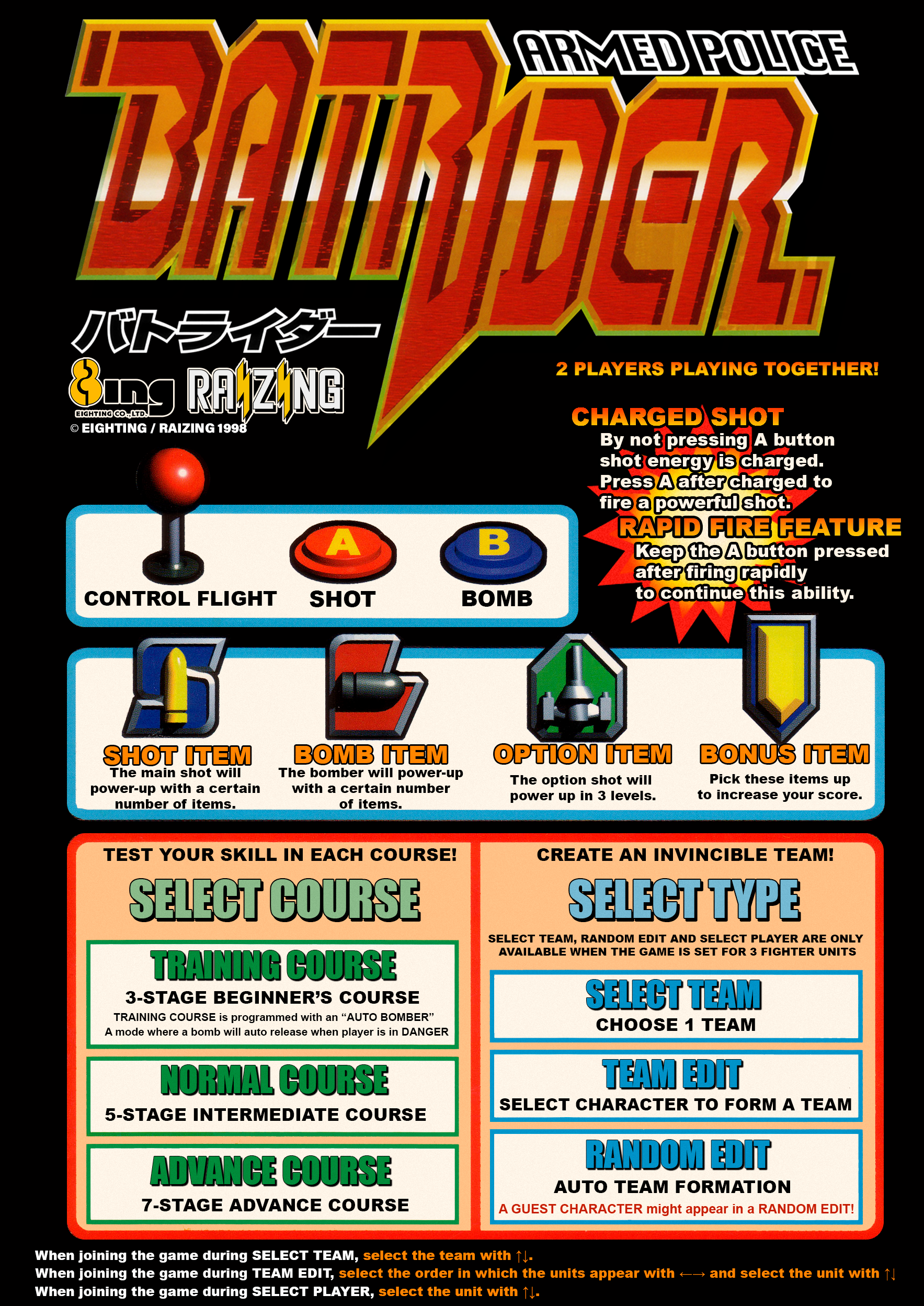
This one was a 3 day project. I did a lot of custom work on this, marquee, bezel and instruction cards. I will post the links to them separately.
I created custom marquee, bezel and instruction cards for Armed Police Batrider and for the instruction cards I did translations of the original Japanese instruction cards into English. Keeping the original format for the cards but swapping out the text. Everything is at 300dpi.
Black version of Card 1:
Wow! Your work is always amazing and then you unleash masterpieces like that, Street Fighter III one! Congrats on such fine work!
Thanks @Orionsangel, I’m guessing most people who see this stuff don’t realize the extent of the work that goes into making these things, but I’m sure you do. Thank you for the appreciation!
Battle Garegga 4K Vertical Overlay
I reworked my old Garegga overlay to fit the vertical format and created a custom marquee for this one.
Primal Rage 4K Vertical Overlay
This one holds a ton of nostalgia for me, I loved the graphics and sound in the arcade, and it was one of the few games I had on the SNES back in the day.
The backlighting effect on both of those marquees looks especially nice. Good job 
I can only imagine the amount of work and time you devote to this project, but thank you very much.
Mars Matrix 4K Vertical Overlay
I thought I’d share some of the process I go through to create these here. I wasn’t able to locate a clean hi-resolution scan for this marquee, so if anyone knows where i can get one let me know and I’ll swap this out. But in this case (and I followed the same process for Primal Rage as well), I took a low resolution scan and fed it into a neural net image upscaler that does a great job.
I’ve been very impressed with what AI can do with upscaling and if the source is reasonably clean then it almost seems to create detail that didn’t exist in the original in a very convincing way. In fact, I’ve found that in many cases, upscaling it with this tool, then scaling it back down a bit, creates an image that appears sharper and cleaner than the original source.
Then I took that upscaled image, cleaned up the colors and blacks a bit, then applied a minimal blur to reduce the digital noise (the source in this case was unfortunately fairly noisy). I then photoshopped out the original text, logo and violence stamp, replacing it with clean logos and actual text fonts. For the “Hyper Solid Shooting” text, I found a clean copy of that in a scan of the original arcade cabinet manual and colorized it.
Anyway, the final result is not 100% authentic, but looks much better than the scan available and works well enough for this overlay. Here is the marquee file:
Thank you! It’s a healthy outlet for my OCD 
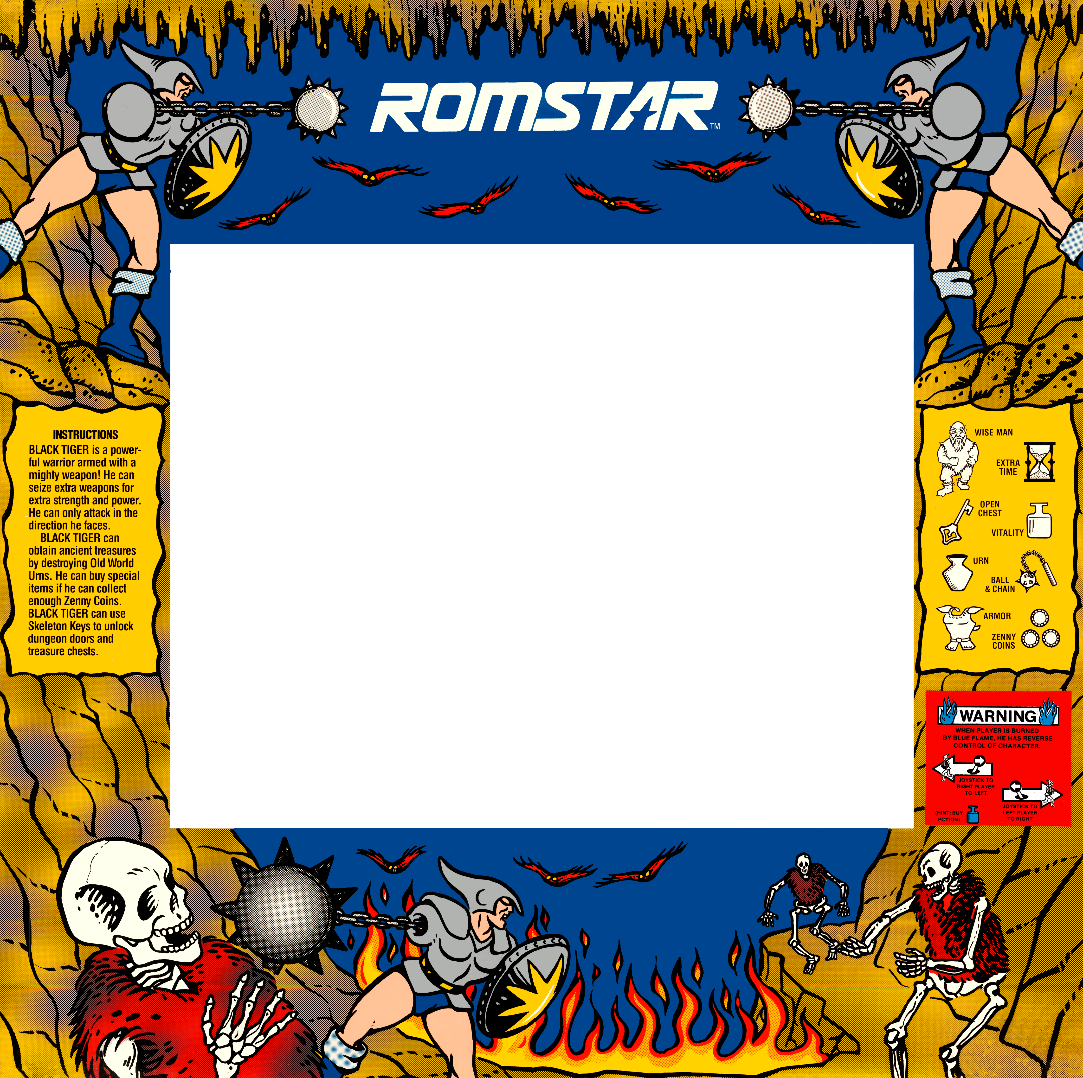
Black Tiger 4K Overlay
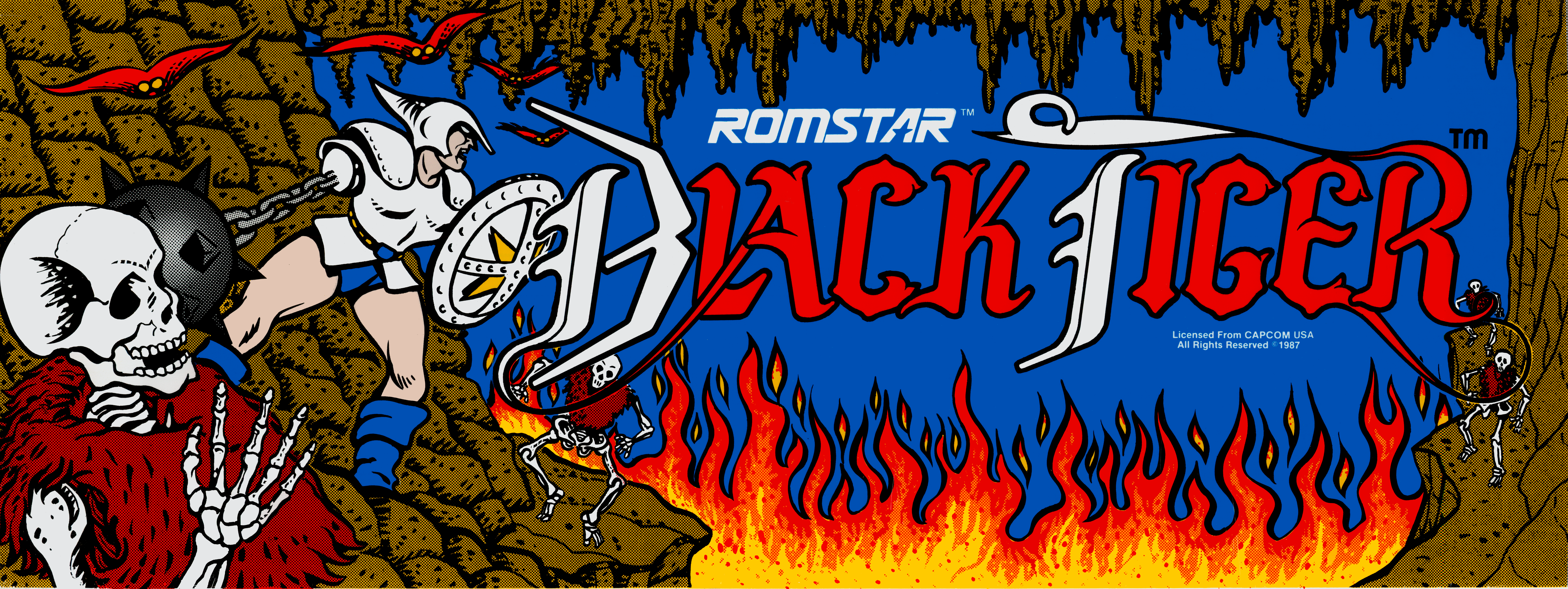
The marquee and bezel I found (unfortunately I don’t remember which site I pulled them from to give credit). But I did some additional cleanup of scratches and smoothed the colors out etc. Both here:
Battle Circuit 4k Bezel Overlay
Went with a new blue look for this game compared to the last bezel design. Created a custom marquee pulling elements of the original arcade poster in. Also translated a Japanese language instruction strip into english.
I spent a lot of time on restoring and translating this instruction strip. I tried to make it as authentic as possible but I’m not that sure I have the right move names as the japanese names were totally different than the american ones. If anyone sends me a correction I’ll update it.
I started with this damaged instruction strip scan:
Removed the wrinkle in the middle:

Wiped out all the japanese text:
And replaced it with english:
And here is the custom marquee:
The bezel is out there too in the bezel directory.
I added a funky yellow and magenta combo, with the original yellow bezel color version. It looks odd to me on a small screen, but looking at it up close on a larger screen while playing, I prefer this one.
This version of the marquee:
This version looks more “real” to me. Weird, jarring color combinations were pretty common, I guess to try and stand out more 
Great job on the instruction card restoration, too. I love that old-school MacOS border at the top-left. EDIT: I just realized the Chicago font was all you. Good choice 
Yeah, I agree, they did have a lot of odd color combinations, sometimes it almost seems random. That’s what I was going for with the yellow version, so I’m glad you agree. Sometimes I do stuff on purpose to make things look “worse” just because there were a lot of weird design decisions back then.
I really like doing those instruction card restores too, where I can translate it like that and create something that looks really authentic but never existed.
It’s a shame this game never got a NA release so we could have some more legit English art, it’s one of my favorite games and IMHO one of the very best beat em ups ever made.
RetroArch also supports that format, so you could use it for taking your screenshots. If you don’t mind posting your conversions, I’m sure people would like using them, too, since they take care of the tedious task of setting custom AR, viewport sizes, etc.


