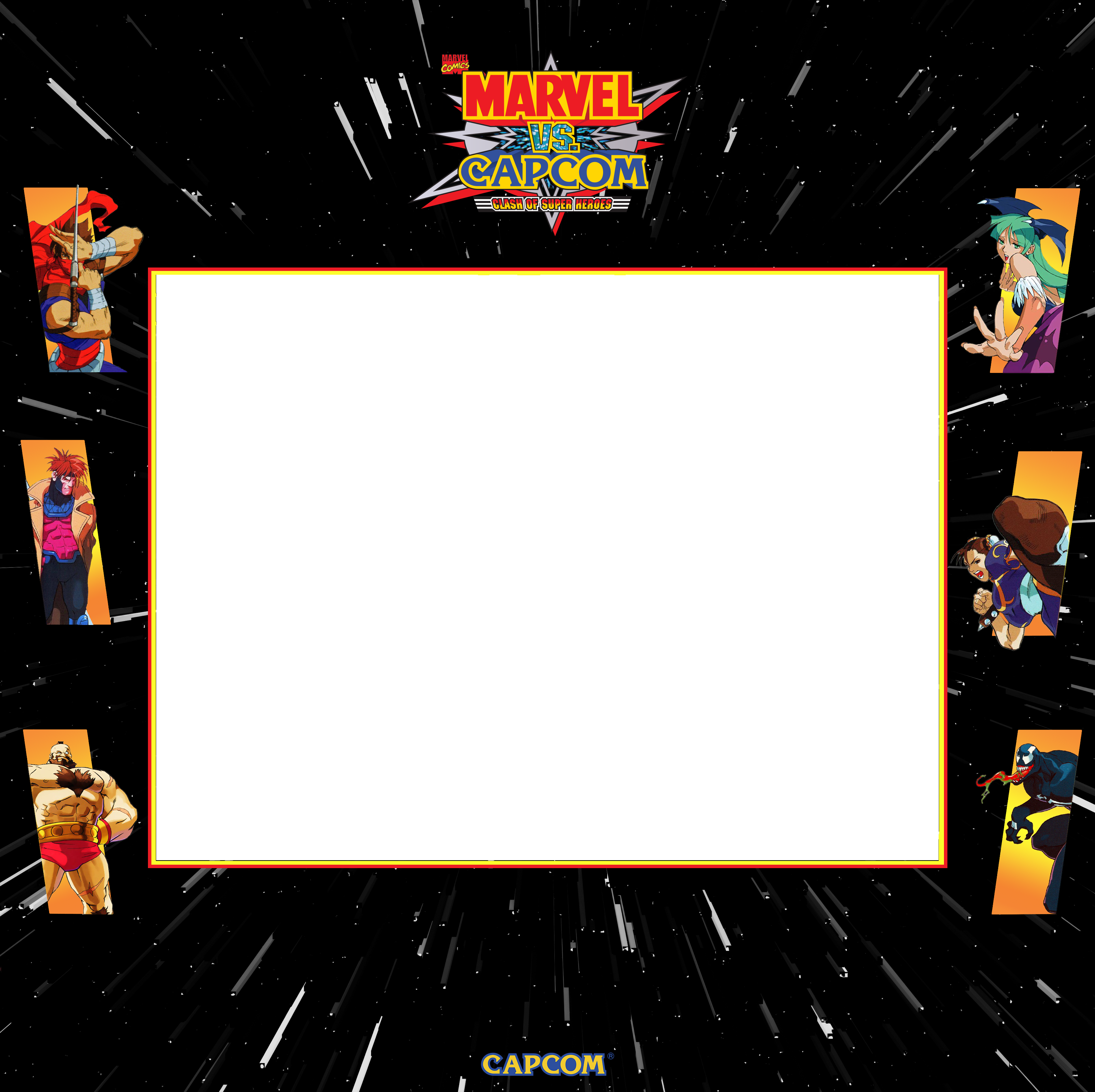
Thanks for the replies guys. I saw the lights out one… awesome stuff… and also orion’s also brill. While i’m Here just gotta say i’m Amazed by all the art you all doing here… top notch 


Is that Marvel vs Capcom bezel official or did you make it yourself? It’s hard to tell with you because you make your bezels look so legit. Great job!
Sorry about that! It’s out there now  As well as the large screen version for folks who don’t like the smaller screen area.
Thanks @Orionsangel! That one is custom, I just tried to follow the marquee design as well as I could.
I put the bezel out in my custom bezels folder if you want to offer it in your format:
Punisher 4K Vertical Overlay
I rearranged the custom bezel I created a while back to fit the vertical layout better. This is based on images captured from the original arcade cabinet control panel.
There shouldn’t be any banding, I don’t see it on my screen. Do you mean the shadow effect?
Here is the original bezel file:
https://www.dropbox.com/s/5xddy5btgmymefq/punisher-ars-invictus.png?dl=0
Yeah I can see it, it’s just the shadow. I see it even when I go to 32-bit depth in photoshop, which is surprising. If anyone has any suggestions for how to address it other than bit depth let me know. For now, I guess i can just not apply that shadow effect for dark bezels.
If it’s showing up at higher bit depth, it makes me think it might be the shadow itself which is causing it. One option which might work for you is to add some dithering to it somehow, I’m not sure what is the best way to do this though, some in some programs gradients add dithering automatically.
In the past I’ve seen low bit depth images successfully use dithering to hide a lot of gradient banding
Good suggestion @HyperspaceMadness , I’ll mess around with it later and see what I can do. I’m surprised Photoshop doesn’t handle this better in their shadow fx algorithm.
That looks really cool! Can you share the PNG?
Sorry I haven’t been posting much lately. I’ve just been really busy in my personal life. I should have time to work on something this weekend.
Yeah, the virus is a pretty big disruptor right now at work and home. Thanks for sharing the graphic! I’ll probably mess around with the effect myself and experiment with some variations.
Updated In The Hunt 4K Vertical Overlay
I am very grateful to ShaunDBurch from the KLOV forums for contributing his In The Hunt bezel, making it available for me to scan in at high resolution and share with the community. Here is the updated vertical overlay with the new scan. I’ve done some work cleaning up the image, removing dust and scratches etc. I’ll post a link to the 300dpi file below as well:
It’s beautiful! big thanks to both of you 
wow amazing ! thx guys
Space Firebird 4K Vertical Overlay
This game is not well known but is a unique piece of arcade history as it was one of the first games designed by Shigero Miyamoto (of Donkey Kong, Mario Bros, Legend of Zelda fame). The marquee I found on ebay was badly damaged and it took quite a bit of restoration work in photoshop, but here you have it:
Here is the cleaned up marquee:
It was a funky cabinet layout, but it looks really cool in person, with the classic wood panels.
Fantastic work as always!
Hi Arsinvictus and Orionangel, I only wanted to say that your work on these bezels are just stunning. Now I have only just begun with a retro arcade in my pincab (using coinops next), but these just finish it off.
I would like to try my hand in these too, not to bad with Photoshop myself, but just limited time. Was wondering if you have those templates, as a starting point. Also need to look into retro arch. That reflection shader does look sweet.
Anyway cheers and thank you for your great work.


