CRT shader debate

I think he does want to come across like that actually. And more out of pedantry than anything else, I would add. Video experts and crt savants not all agree on the sterile (good word to express my point) look, I can guarantee that to you. This is not hard science we are dealing with.

Seriously? Lighten up. I made my intentions clear with my reply to shenglong above. I am not being pedantic in my criticisms, I’m criticizing the objective picture quality of your images and you’re getting all huffy and personally offended by it. Video experts would most certaintly agree when contrast, black level and color accuracy are all off because these are objective things which are measurable. Still no images from fudoh’s 240p test suite, I can see. It’s like it’s impossible to get a single word of reconciliation from you.

On the left, a BVM. On the right, a Nanao 15khz arcade monitor. Completely different, both high quality (not so much according to Nesguy, but believe me, Nanaos are good 2). Needless to say, I much prefer the arcade monitor and its translucent scanlines that merge with the art in a lovely, natural way, rather than devouring half of it.

I don’t like either of those images very much, the BVM is a little harsh even for me. Both of the monitors are good, yes, but in terms of objective quality, the BVM is pretty much the gold standard.

Someone is pushing his personal preference as an ideal standard of godly quality that everyone should switch to right away. If at least said preference resulted in extremely good looking games, or maybe an accurate replica of something like the BVM-Metal Slug image posted above, I would understand the attitude. However, based on the screens posted, it doesn’t seem to be the case.

A blatant mischaracterization which shows that you’re only interested in stirring shit.

from the preceding post: “I think when it comes to how 240p graphics are displayed, the most we can say is that raw pixels on an LCD are wrong. There are many approaches that are acceptable. I think Blaarg’s NTSC composite filter looks very good/accurate, if one is into that sort of thing.”

Shenglong’s kid’s preferring my settings is no surprise at all. It’s as close as it gets to someone who isn’t already invested in an opinion sharing their untainted view of what is superior.

The reason my settings look good, objectively, is because I’ve increased the contrast around highlights and I’ve made the lowlights even darker, both of which contribute to increasing the dynamic range of the image. That’s what the scanlines and mask structure do to the image, and it’s one of the primary reasons why things look good on a CRT, IMO.

Evidence… well arcade games came together with those screens! A pretty strong message from their makers I reckon. They were the standard.

No they didn’t, and no it isn’t. As per the article that Hunter posted, the graphics were made on RGB monitors, the sharpest screens they had available. Sometimes the output was then tested using composite connected to a TV, but it’s unclear just how widespread a practice this was. Even more unclear is how much various characteristics of the CRT informed the pixel artist’s work. The only evidence we have is that they used something called the 0.5 dot technique, which relied on scanlines and the generally lower sharpness of TVs.

The image you brought from hunter’s blog is good, yeah… and much brighter than your preset, man. Does your setup look like that ‘in person’? If so, I think you should start taking photos of your display with a camera instead of internal captures, so we can see how it really is with the strong backlight, instead of having to infer and imagine from abstract values like ‘200cd/m2’ :roll_eyes:

It seems obvious to me that you are trolling at this point. I’ve said probably 10 times now that my screenshots must be viewed with the backlight turned up, and that this is going to vary depending on the display being used. I can absolutely guarantee that the image using the settings I’m using is actually brighter and has more contrast than the shot of the CRT from Hunter’s blog, although again, you cannot accurately judge these things from photos. As a photographer, one would think that you would understand how cameras all do their own thing to the image. So yeah, I could post some screenshots using a camera phone but it’s going to have it’s own inaccuracies which you will then use to make baseless straw man criticisms. For reference, typical CRTs had a peak brightness of around 175 cd/m2 so that’s why I targeted 200 cd/m2. It’s actually almost too bright for extended viewing, so I can’t help but continue to laugh at this baseless criticism.

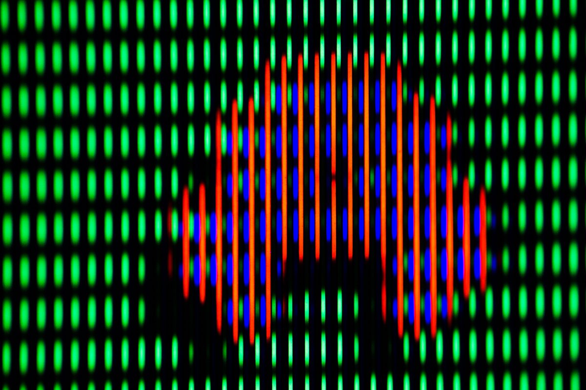
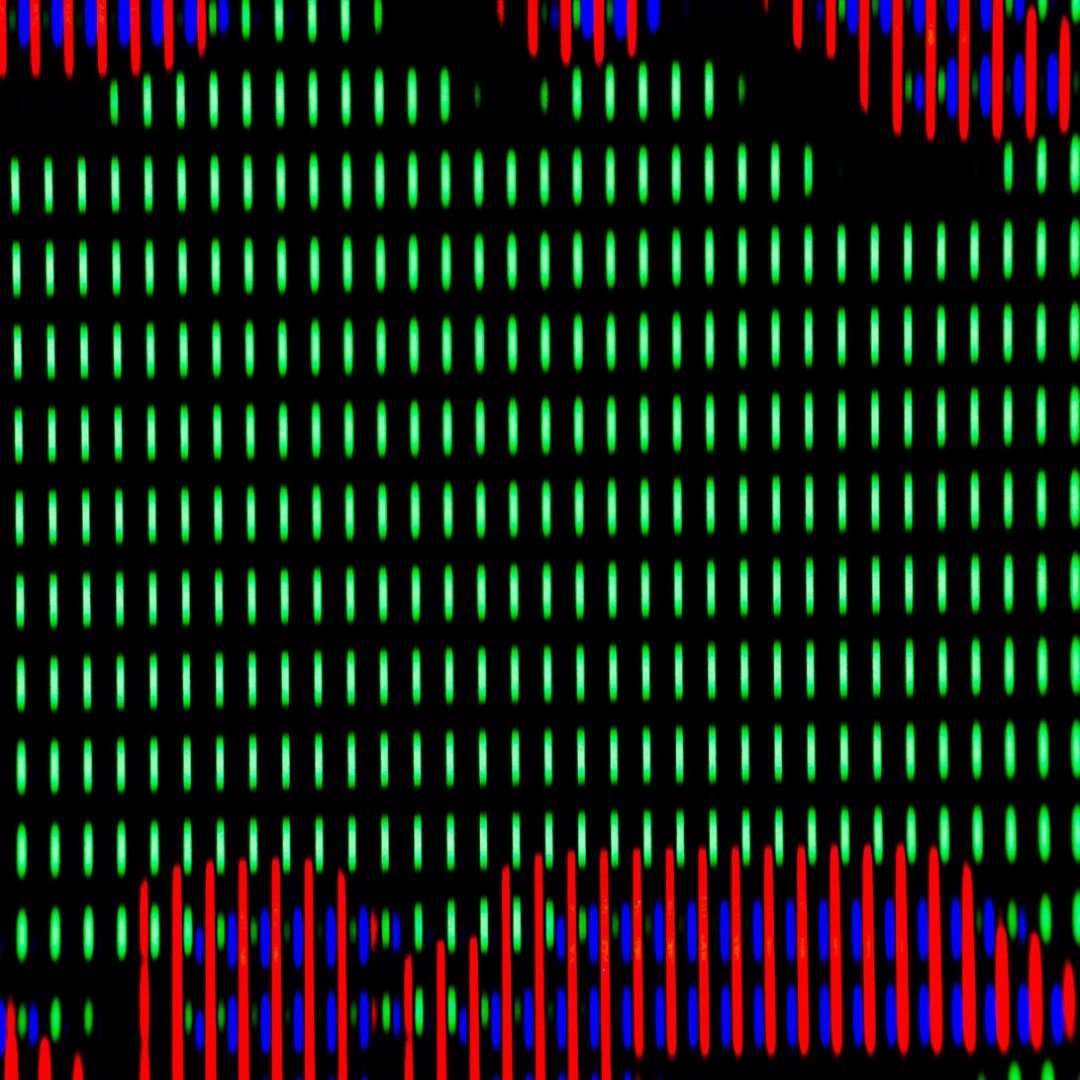
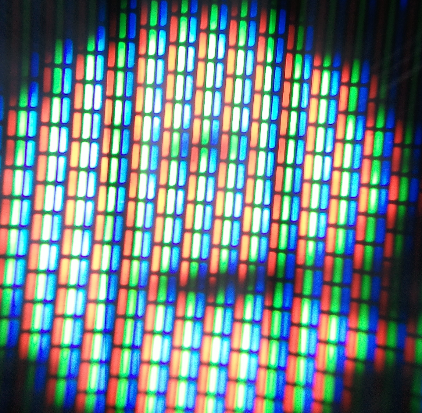
That N comparison is crap for all the reasons which I already discussed. Two different cameras taking pictures under different lighting conditions and I’m not even sure how that CRT is calibrated. The CRT shot is obviously overbloomed, so the fact that your N resembles it more closely in that respect is exactly the problem I’m talking about. The scanlines shouldn’t disappear over white like that, and you can find that information in pro manuals for calibrating CRTs.

Furthermore, an extreme close up like that is highly misleading. I cannot stress enough the importance of proper viewing distance. CRT tech is an additive visual system, meaning it emits light and the light combines after leaving the surface of the screen to form the colors that you see. Get close enough to the screen and you can’t even tell what’s going on. At the proper viewing distance that N looks nowhere near as sharp as when its zoomed in like that, because I’ve gotten the emulated phosphors to glow as brightly as the real thing, which causes the emitted light to blend together and form a smoother image when viewed at the correct distance (this is in addition to the natural “pointilist” effect resulting from the visual cognitive system). Of course this is all completely lost in photos. Needless to say, getting a 1080p LCD to resemble a CRT at every possible viewing distance is an impossible task.

I will grant that the transitions from white to black are somewhat more abrupt than what you observe on a CRT up close, but that’s the kind of detail that you need 4K or higher resolution to capture accurately, and which is greatly exaggerated by adding blurs.

So yes, your example does look closer to the CRT shot in respect to the bloom that it shows, which is precisely the problem, because that shot is overbloomed, whether from the camera or the CRT itself. When it comes to the actual mask/phosphor structure, I think it’s obvious that my settings are doing a much better job of capturing what’s going on. On an actual CRT the mask/phosphor structure should be even stronger than what’s going on in my images, but I’m already pushing the limit of what my display is capable of regarding brightness.

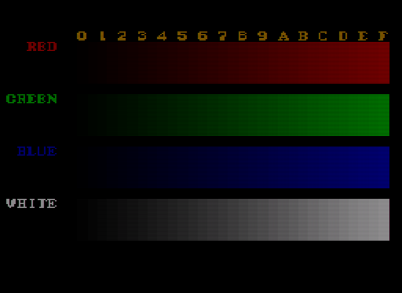
Now lets see those test image patterns from Fudoh’s 240p test suite. Then we can talk about something other than opinions.

1 Like

No I don’t mind that you are criticizing my images. They are beautiful and I don’t need you to confirm that. In fact, considering how different our tastes are, I might want to change whatever you liked about any of them :stuck_out_tongue:

I just don’t like your preset, and I like even less that you are trying to sell it as ‘objectively superior’, ugly and unrealistic as I find it.

What do you want me to do with fudoh’s suite? I can’t recall any prior requests.

Impossible to get words of reconciliation? I can’t see what that has anything to do with fudoh, but anyway… how many times do I have to tell you that I “admire and respect your passion, knowledge and technical approach”? I think this one would the 4th. What I don’t admire nor respect is arrogance.

Only if “objective quality” means prioritizing ugly black bars over beautiful pixel art.

Yes they did and I’m obviously not talking about how games were made, but how they were released and meant to be played by their makers, and that’s on an arcade monitor, not a video/broadcast one. Please note how I don’t use the word ‘professional’ to make a distinction between the two. They are both professional. Different professions though.

As a photographer (and videographer), I understand that a properly configured camera can be quite faithful to the real world. I will not straw-criticize anything based on how you capture your footage. I have seen hundreds of gorgeous shots taken with cameras and phones by CRT users, I actually posted some on the original thread.

Do I also have to tell you again that I would love to see your setup with my own eyes? I’m really curious about it, and a photo or a video would give me an idea. It’s possible indeed that the images that you post here don’t do the real thing justice. So please, let’s see it.

Haha yeah sure whatever. I can only really understand the images you provide, you see? Magical viewing distances, cd/m2 values and all those other abstract things that your preset requires to look alright aren’t something that my imagination can implement accurately.

For the nth (and last) time: NO. It’s not bloom. It’s s-h-a-r-p-n-e-s-s. Your preset exhibits this digital, black-line-on-raw-pixel appearance, which is of course particularly obvious up close but also perfectly noticeable in the full size images you have posted. Now you can say all you want about how a correct, magical viewing distance will make up for that, and I will keep calling that charlatanry, at least until you provide some evidence to back it up.

alright guys, you’ll just have to agree to disagree at this point, as it doesn’t look like we’re getting any new arguments/information, just squabbling.

If we can keep talking about stuff, I’m all for it, but if it’s just personal digs and back-and-forth pecking, nothing good will come of it, so I’ll have to lock the thread.

@hunterk - yeah man good idea to split :+1:t3: And sure, I can be more politically correct. Also I think this new one should actually start with an earlier post, this one

I kept it in the last thread because it was on-topic there and included pictures and settings, but it is helpful for context here, so I copied the contents into the first post.

I just don’t like your preset, and I like even less that you are trying to sell it as ‘objectively superior’, ugly and unrealistic as I find it.

You seem to not understand what I mean by “objectively superior.” I’m talking about qualities that can be measured. I’m not arguing that my opinion is superior because that would be completely fruitless. I think you’re just completely misreading the entire situation based upon this one misunderstanding.

Only if “objective quality” means prioritizing ugly black bars over beautiful pixel art.

Again, there is such a thing as objective quality and signal fidelity, and when video professionals are using these terms they are referring to the same thing, which has a single definition they can point to. We continue to talk past each other because if this.

Yes they did 2 and I’m obviously not talking about how games were made, but how they were released and meant to be played by their makers, and that’s on an arcade monitor, not a video/broadcast one. Please note how I don’t use the word ‘professional’ to make a distinction between the two. They are both professional. Different professions though.

I’m not sure what that link is meant to prove. I think you’re also really underestimating just how sharp anarcade monitor could be in person when well maintained and well calibrated. Furthermore, (repeating myself), I think it’s very likely that developers would design the graphics to look as good as possible using the highest quality signal available on the console, because they were competing with each other over the quality of the graphics and this was a big part of the console wars. Even when it’s clear that composite artifacts influenced the design of the pixel art, it’s not obviously clear that composite is superior to RGB; it’s still a trade-off.

Haha yeah sure whatever. I can only really understand the images you provide, you see? Magical viewing distances, cd/m2 values and all those other things that your preset requires to look alright aren’t something that my imagination can implement accurately.

And what I have been telling you repeatedly throughout this discussion is that you can’t get an accurate idea of what one person’s display looks like by looking at screenshots on your own display, whether they are direct capture or through a camera. Photos can only give us a very rough idea of what things look like in person, and can be misleading. A photo or video does not give you an accurate idea, it just provides more fuel for baseless criticisms. My cell phone camera is simply not up to the task. And a lot of the “great photos of CRTs” are actually very misleading for the reasons which I mentioned earlier. CRTs look vastly different depending on viewing distance because of the way they emit light. In fact, good photos of CRTs are rare, and it is very difficult to get a good photo of a CRT in terms of capturing what is actually going on when seen in person. The ONLY way to get an accurate idea is to see the display in person, or to follow the method I used to arrive at these particular settings. Particular settings are going to vary based on the display being used. I think I mentioned earlier that my display is on the brighter end of LED-lit LCDs, but it’s by no means the brightest out there.

The reason I keep mentioning the cd/m2 value is because it is objective. It provides you what a photo cannot. A peak brightness of 175 cd/m2 is roughly equivalent to a typical CRT, and 200 cd/m2 is almost too bright in a dark room. In other words, my display is matching or exceeding the objective brightness of a CRT.

Since we’re just going in circles with this, I propose that it’s only going to be useful for us to discuss methods rather than specific examples. I’ve asked a couple times for you to provide shots using test image patterns from Fudoh’s 240p display, then I can see what’s going on with your settings, objectively. I’m almost certain that there is too much contrast in your images, again objectively and not as a matter of opinion. Of course, seeing those images on *my * display will only reveal if those settings are accurate on my display. I still won’t know exactly what your display looks like, especially if there are differences with how our displays are calibrated.

As far as opinions go, we’ve exhausted the subject. Everyone is well aware of what our preferences are, and there is no point in discussing them further.

Would you please also copy my reply to it then? That one with the Mario World sidebyside.

ffs, I had hoped it would move it to the proper location based on posting date, but that clearly isn’t the case. :confused:

I’ll try to find a way to fix the order, or at least copy/paste it into place somehow

Haha you can just place it anywhere you like before my first reply here.

I am finding this thread very interesting. Would love for Nesguy to take a picture of a CRT running a game and then a pic of an LCD with his shaders preset running the same. Also, I am not too sure what should Squalo do with fudoh’s, but would love for those tests to be shared here as well.

2 Likes

Here’s what I did to arrive at my settings: I calibrated my display to the sRGB standard. Not much had to be adjusted from the sRGB preset on my monitor. I adjusted the color temp somewhat, and set contrast to 80, which is the highest it goes on my display without resulting in clipping.

Next, I maxed out my backlight setting to 100% to get all the brightness I could get out of the display.

My goal is to get the mask as dark as possible while maintaining around 200 cd/m2 peak brightness.

I applied the scanlines and adjusted the parameter settings until each scanline was as close as possible to a 50% reduction in brightness per visible line (1:1).

I increased “mask light” to 2.00 to eek out even more brightness, then I gradually lowered “mask dark” by one step at a time, taking measurements of the white screen using a light meter. I stopped lowering mask dark when my measurements started fluctuating between 175-200 cd/m2.

Next, I increased “mask fade” until the scanlines over pure white were no longer obviously visible at normal viewing distance, then lowered “mask fade” slightly until they were visible. This adds a bit more brightness, so I then returned to “mask dark” and lowered it a step at a time, taking measurements, until I arrived at 175-200 cd/m2 again.

With this pattern, all the bars from D to F should still be clearly visible, which they are on my display with the settings I’m using.

Just for kicks, but you want the three squares in the bottom right to appear as a solid black rectangle with just one of the vertical rectangles slightly visible.

Should be able to see all the bars, which I do on my display.

This is the white screen pattern. On my display I’m consistently measuring between 175-200 cd/m2.

There are six vertical bars in this image which may not even be visible depending on your display. Three to the right of the greyscale pattern, and three to the left. They should all be visible, with the innermost bars just barely visible, since they are supposed to show blue at a value of 1 IRE, the lowest possible value. On my display, the innermost bars are barely visible - I actually have to zoom in quite a bit to confirm it, but the bars are there. This is normally only detectable with the right equipment.

All of the above test images look good on my display.

2 Likes

C’mon… I didn’t misunderstand anything. Just yesterday, you wrote:

I will leave that there.

It obviously is meant to prove that arcade games very often came paired with arcade monitors. In the example provided, Capcom and the SF3 devs clearly chose (yes… Capcom, not some random guy from the internet) that screen to parade their game. Why is that so hard to accept? So BVMs, no matter how much you like them or how big of a meme they became when people started buying them at cheap prices, aren’t/shouldn’t be a standard for old games.

The rest of your post tells me that you are not willing to show your setup. Fair enough, I will not insist. Nor will I believe that it looks phenomenal and so much better than the images posted.

My monitors, all of them, are Spyder-calibrated, like I already told you. Which means that if yours are correctly profiled as well, we should see a similar image. Which is precisely why industrial standards for screen calibration exist, as you should know. Consistency among people for whom image quality is important, for whatever reason.

And man are you persistent. I said I don’t remember having being asked to post any fudoh screens. I would be happy to oblige, but again: what is it exactly you want me to post? Pluge, color bar, gray ramp?

Please.

2 Likes

You really do need to chill out. I’m also going to assume that you posted before I replied with my test images and give you the benefit of the doubt. You’ve done a terrific job of cherry picking which part of my posts to reply to which leads me to believe that you are arguing in bad faith, but I’m trying to move past that so we can have a fruitful discussion.

I said that I happen to think 1 and 2 are the same thing, but that’s not the same thing as me arguing that this is objectively true, which is what you seem to think. So yeah, the whole thing is predicated on a giant misunderstanding on your part, and you just won’t let it go for some reason.

It obviously is meant to prove that arcade games very often came paired with arcade monitors. In the example provided, Capcom and the SF3 devs clearly chose (yes… Capcom, not some random guy from the internet) that screen to parade their game. Why is that so hard to accept? So BVMs, no matter how much you like them or how big of a meme they became when people started buying them at cheap prices, aren’t/shouldn’t be a standard for old games.

That’s one specific example, which again doesn’t tell us much of anything that we can generalize from. I also am not seeing the part in that link where it explains that the pixel artists themselves chose that particular screen or where they explained that the specific qualities of that particular screen informed their work or why the qualities of that particular screen are essential to properly displaying their designs. I’m just not seeing any of that in the link provided; maybe I’m missing something. There are lots of other factors that go into choosing an arcade monitor; namely, cost. We simply don’t know what they would have chosen as a display if this wasn’t a factor. I could just as easily point to the monitor used in the Toys R Us SNES display unit as “proof” that Nintendo wanted their games displayed in gloriously sharp RGB. We really can’t infer much of anything regarding the artist’s intentions from such examples.

And man are you persistent. I said I don’t remember having being asked to post any fudoh screens. I would be happy to oblige, so again: what is it exactly you want me to post? Pluge, color bar, gray ramp?

from 23 hours ago, do a search with this text: “Can we see some test images from Fudoh’s 240p test suite using your preferred settings? I’d like to see more people using Fudoh’s test suite for adjusting black level, contrast and color; it’s a really great tool.”

If your display is calibrated to the same standard as mine, it still doesn’t mean that we’re seeing the same image on our displays, because our displays have different specs. So you can truly only judge these things in person, by seeing someone’s display or by following the method they used on your own display (which I explained above). The settings you actually arrive at following this method will most likely differ from those I’m using due to the fact that we’re using different displays. Other than buying a plane ticket to Denver, the only way you can form an accurate opinion is by following the method yourself.

They commercialized the game together with that cabinet and monitor, what does that tell you? I’m also pretty sure that whatever stick and buttons were used, Capcom meant their game to be played with them. It’s an example yeah, how many do you need? 10? 27? And then there’s stuff like Sega’s Aero/Astro City:

AstroCity_Cabinet

Sure, that is no doubt a BVM :roll_eyes:

That request of posting Fudoh with my preferred settings wasn’t there when I read the post, I believe. Maybe you edited it afterwards, maybe I missed it. Sorry if I did.

Your Fudoh internal capture screens are completely useless, your whites can never be white under those settings. They will appear grey on any non madly backlit screen. For the rest of us, you should post camera photos of your cranked up screen, and clearly you don’t want to do that. Your methodology is so broken it renders the discussion moot.

So I will post Fudoh’s gray ramp (from the MegaDrive suite, which is the one I have at hand) just to prove that contrast is fine in my setup, and that my whites are actually white. And l will get off there. I don’t feel like going on with this argument, at least for the time being.

The quality of different monitors available in cabinets varied wildly. My NEC XM29+ is essentially a 29" multisync monitor like you would find in a Naomi candy cab. On older 240p games, those scanlines are crisp and the image is fairly sterile (though the slot mask avoids some of that sterility vs the PVM/BVM aperture grills), but it really shines on 480p and 720p content, looking essentially like a giant PC monitor.

The old 15 kHz arcade monitors look much closer to an RGB connection on a regular consumer TV, like you would find in Europe/PAL/SCART-land, as that’s basically what they were.

2 Likes

They commercialized the game together with that cabinet and monitor, what does that tell you? It’s an example yeah, how many do you need? 10? 27? And then you there’s stuff like Sega’s Aero/Astro City:

It doesn’t tell us anything regarding the artist’s intentions for reasons I just discussed and which you haven’t addressed. We can’t infer much of anything regarding the pixel artist’s intentions from these examples, period.

Your Fudoh internal capture screens are completely useless, your whites can never be white under those settings. They will appear grey on any non madly backlit screen. For the rest of us, you should post camera photos of your cranked up screen, and clearly you don’t want to do that. Your methodology is so broken it renders the discussion moot.

You refuse to view the image correctly, using the instructions I provided, and so it’s actually your opinion that is completely uninformed and broken, rendering the discussion moot. Your opinion never even gets off the ground.

These settings REQUIRE an adjustment of the backlight, ffs it’s right there in the explanation of the method I used in the previous post.

I’ve already explained many times now that taking photos with a camera does almost nothing to remedy the situation, particularly if the camera being used isn’t up to the task.

I will certainly work on posting a photo once I can get a better camera than the one I’m limited to. I can absolutely guarantee that there is nothing wrong in the test images I posted as they appear on my display. I definitely don’t appreciate the insinuation that I’m lying about this.

So I will post Fudoh’s gray ramp (from the MegaDrive suite, which is the one I have at hand) just to prove that contrast is fine in my setup, and that my whites are actually white. And l will get off there, I don’t feel like going on with this argument, at least for the time being.

The gray ramp doesn’t tell us much by itself. Contrast is better judged by the color bars test pattern. At the end of the day though you just either have to take my word for it that the test patterns look fine on my display, which you have no reason not to, or wait until I get a better camera that can more accurately show what’s going on. Seriously, I don’t know how petty one would have to be to lie about something like this just to win a debate on the internet with a stranger.

Yeah, probably best to take a break for a while.

@hunterk - yes, and in fact I believe that those hi-res (for the time) monitors like your NEC, xVMs and the like were not designed with 240p in mind, but 480i and up. Thus their high line counts, and the shining on 480i/480p/720p content. And kind of ironically, thus their sterility on 240p.

@Nesguy: sorry if I offended you, man. We will never agree on the xVM look and I might not be in love with your preset’s output, nor with the way in which you are sharing it, but your method is of course theoretically sound, and if you say that in practice it looks lively and bright, then that’s how it is. It didn’t quite work out on my screen, probably due to it being older and not capable of enough blaze.

It has been an interesting duel after all, from which I learnt several things both directly and indirectly, and I hope we will resume the conversation in more friendly terms. Will be looking forward to those photos :slight_smile:

5 Likes

What monitor are you using? I can pretty easily look up its max brightness with a model number.

I looked at my images on my iPhone display through Safari, and they were perfectly vibrant and bright with the iPhone’s brightness maxed out, and clearly brighter and having better color saturation than the photo of the PC CRT image. If I lower the brightness, the image becomes dark and dull, just as expected.

The problem with photos is that we’re just adding another intermediary. You’ve already pointed out the uselessness of the internal screen captures from Fudoh’s test suite, something which I thought was obviously unnecessary to point out, myself. The reason being that we have different displays through which the image is being displayed. That’s why I had to also post “these test images look fine on my display,” because without seeing it in person we can only take each other’s word for it. With a camera we’re making things even worse; now the image is passed through a camera, which does its own thing to the image, and then it’s being passed through a display, which does its own thing to the image. I’m honestly trying to figure out how photos are going to help. Let’s say I post a photo that you think is bright enough. How do you know the camera isn’t altering the brightness levels to make it brighter than it is in person? I don’t know that I would actually be demonstrating anything of value. What would I be demonstrating?

The specific settings I’m using might be too dark for your display, if it’s an older monitor (more than 3 years old). I’ve since viewed my images through multiple displays and was able to get an adequately bright and vibrant image through all of them, after cranking up the backlight. They were all newer displays, though, made within the last 5 years. I readily admit that I am pushing the limits of brightness for these displays; but that’s the whole point. I’m trying to make the mask as strong as possible so that it most closely resembles what actual CRT phosphors are doing. I’m trying to get the emulated phosphors to output as much objective light power as real phosphors on a CRT.

If you follow the method I provided, you’ll arrive at specific settings for your display, with the mask strength as strong as it can get while still maintaining CRT-level peak brightness. Of course, this will require the use of a light meter, but I think you mentioned that you had one.

You can easily add blur (if you must) with the blurscalex parameter. I think smearing the pixels greatly interferes with the natural glow of the emulated phosphors, though. This is because the emulated phosphors are 1 pixel wide on the LCD screen; adding any blur causes them to smear over each other, which has the effect of dulling the image.

The fundamental problem I’m trying to address is the significant loss of brightness and contrast that occurs when scanlines and RGB phosphors are applied. We can address this by: 1) adjusting our display’s settings 2) altering color and brightness values through Retroarch, which can obviously reduce the accuracy of the image 3) significantly reducing the mask and/or scanline strength, compromising the CRT emulation and reducing the positive benefit to 240p content.

1 Like

Here are some decent macro photos I dug up (not mine) illustrating the phosphor structure of an aperture grille CRT. Contrast has been deliberately overdriven to show off the phosphors, according to the source. Notice the second to last image where there is hardly any glow exhibited at all by the phosphors. That’s because glow is something that occurs between the surface of the screen and the eye/lense. A macro lens shows us what’s actually going on.

1 Like

In contrast, here are a couple of macro shots I took of an N64 connected to a consumer CRT via composite (a white letter ‘e’ on black background and a heart icon on blue background, both from OoT):

4 Likes