CRT shader debate

EDIT (8/4/2019): I’ve changed my mind about a lot of things said in the below post, but keeping the original post intact for the sake of the discussion. In particular, I now find that a certain amount of blur, when used with the right mask effect and scanlines, more closely approximates a CRT than the nearest-neighbor scaling used in the below images. Additionally, the mask effect has to take into account the LCD subpixel structure, which the mask pattern used in the below images fails to do. My current settings and example screenshots can be seen here.

[Copied from other thread for context]

I have a very different perspective when it comes to CRT emulation. I think what this thread really demonstrates is just how exaggerated most CRT shaders are. Most of these images have far too much bloom/bleed/blur etc, and I don’t understand why people want that in their games. A CRT image is “soft” for reasons that have very little to do with blur. It’s the scanlines, lower TVL, phosphor structure and glow that gives a CRT image it’s characteristic “softness,” which people mistakenly conflate with blur.

It seems that most shaders are created by either looking at photos of CRTs or by looking at a CRT in person and trying to “eyeball” it. While the latter approach is superior to the former, it’s still inferior to an approach that starts with a sound conceptual understanding of what a CRT screen is actually doing to the image, objectively, along with an understanding of what it is about CRT screens that enhance the objective image quality for 240p content.

Yes, I understand that maybe your crappy low quality TV from the early 90s may have, in some ways, resembled these shaders. The question is, why are you trying to replicate a crappy TV from the 90s instead of a high quality CRT from that era? Back in the 90s, if someone had offered to replace my low quality consumer TV with a high quality RGB CRT, it would have been crazy to refuse. People bought RGB CRTs when they had the money and if they were available, because the image quality is objectively superior. Why people want to add blur, pincushion distortion, signal distortion, bleed, etc is beyond me, but nostalgia isn’t really a factor for me, nor do I care about some poorly defined and dubious notion of “authenticity.”

For those who don’t care for the hyper-exaggerated, over-bloomed, and distorted look you get with most shaders, you might be interested in a more minimalist approach that is focused on getting an LCD screen to actually function in a similar way as a high quality CRT screen that is free of the undesirable distortions that people sought to eliminate on their CRTs, and which are found in many shaders.

The following images should be viewed with your display backlight adjusted to 100%, or else they will probably look like crap.

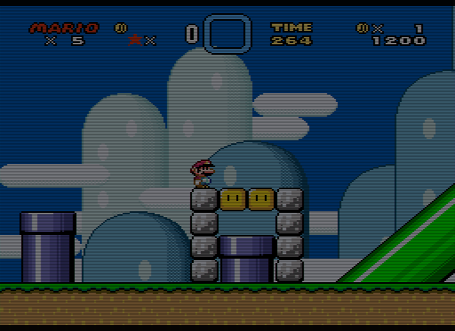
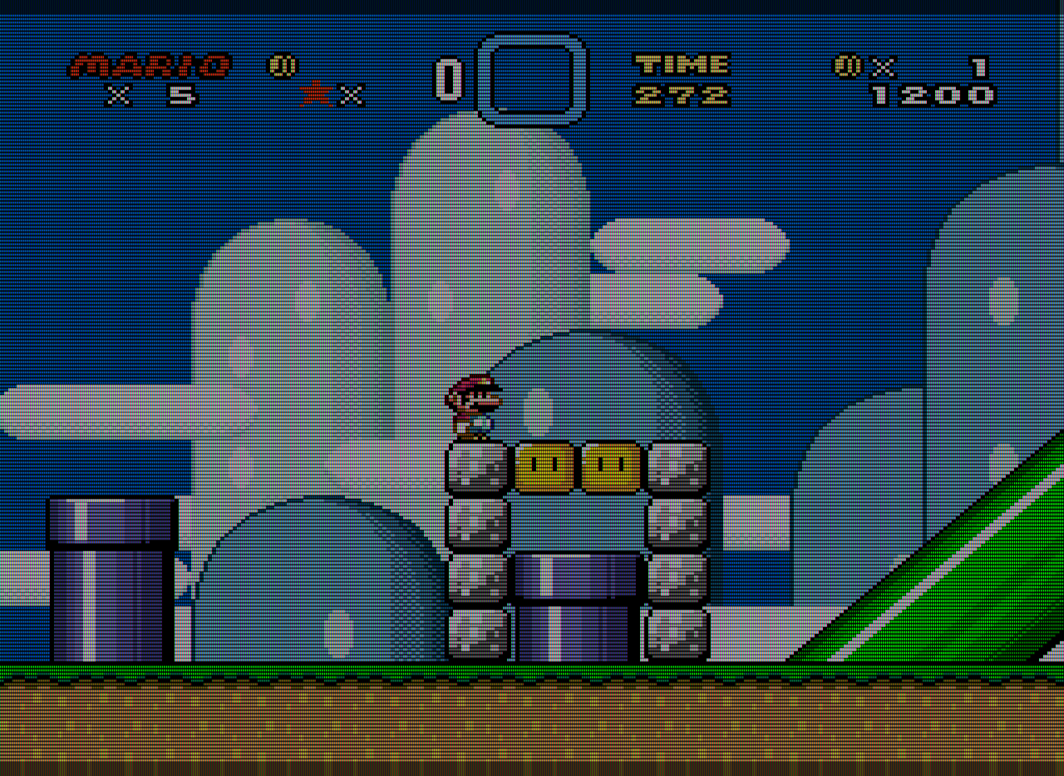
Example shot

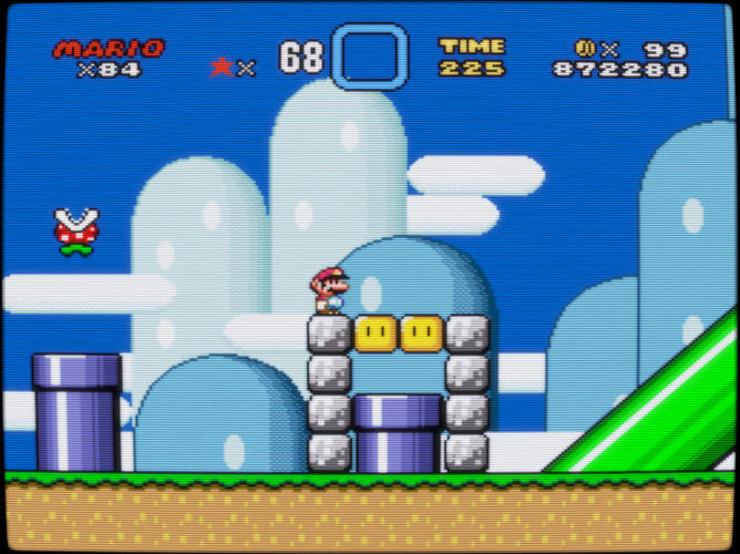
What’s going on in this image? The above is a perfect rendition of a 360 TVL RGB CRT. The only things being added here are scanlines, the RGB phosphors, and some slight vertical blending between the scanlines. The scanlines are a bit less than 1:1 with the vertical blending added.

I’ve adjusted my display backlight to 100% and I’ve made some adjustments to the mask strength to find the ideal compromise between brightness and mask strength. With this configuration, my screen has contrast and peak brightness levels comparable to that of a high quality CRT, and the mask is as accurate/strong as possible while maintaining brightness. At normal viewing distances, the emulated phosphors act very much like those on a real CRT, exhibiting similar glow and halation effects and blending together in a similar way, Viewed in person, this looks better than any shader I’ve tried, and I’ve tried all of them. Get up close and it’s as ugly and incoherent as what an actual CRT looked like up close. Gradually move away from the screen and all the different elements blend together as a result of the way the human eye works, just like with a real CRT!

With my display backlight at 100%, I’m getting a peak brightness of around 200 cd/m2, which is slightly brighter than what was common for CRTs. With HDR capable displays, it should be possible to max out the mask strength while maintaining peak brightness levels that match or even exceed that of a CRT. In other words, with an HDR-capable display, it will be possible to get the emulated “phosphors” to glow as brightly as the real thing on a CRT. At that point it will be really pointless to add glow or halation effects via shaders.

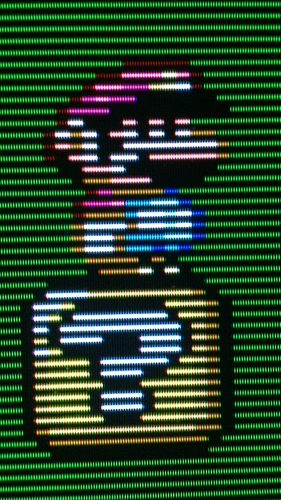
Here’s another emulated image without any vertical blending added- just 1:1 scanlines and the vertical RGB phosphors.

Here’s a close-up image of an actual high-quality CRT (a Sony FW900, I believe), to show the range of what’s possible regarding image quality on a CRT. You’ll notice that this image is far sharper and less “bloomy” than what the vast majority of shaders do to the image. Actually, the CRT image is much sharper and exhibits less bloom than the first emulated image that I posted above, and looks more similar to the second emulated image with “perfect” scanlines. The scanlines in the CRT image are even more pronounced, being as close to 1:1 as possible.

The shader being used in the emulated images is the “zfast + dotmask” shader that HunterK put together, although I’m unsure if it has been added to the shader repository. I’ve stacked this with the “image adjustment” shader for gamma correction. Here are the changes I’ve made to the parameters:

BLURSCALEX = “0.000000”

BRIGHTBOOST = “1.000000”

DOTMASK_STRENGTH = “0.300000”

HILUMSCAN = “8.000000”

ia_monitor_gamma = “2.200000”

ia_target_gamma = “2.400000”

LOWLUMSCAN = “9.000000”

MASK_DARK = “0.000000”

MASK_FADE = “0.600000”

maskDark = “0.200000”

maskLight = “2.000000”

shadowMask = “2.000000”

bilinear filter turned OFF in the video options, shader filter set to “nearest.” Integer scale turned ON in the video options, custom aspect ratio enabled (6x5 integer scale).

NOTE: These settings are partially display-dependent. The goal is to maximize scanline and mask strength while maintaining CRT-like peak brightness, getting the scanlines as close to 1:1 as possible and the mask strength as close to 100% as possible without compromising on brightness. As such, settings will differ depending on the display being used. For reference, I’m using an ASUSVG248QE, which has an advertised peak brightness of 350 cd/m2. If one wants to add some vertical blending, adjusting the “mask fade” parameter will accomplish this. This will also brighten up the screen somewhat and allow the mask strength to be increased, at the expense of making the scanlines less prominent than the “perfect” 1:1 scanlines one sees in the second emulated image and the CRT image.

Also, bear in mind that using this approach limits you to using integer scale, and the horizontal integer scale must be a multiple of 3 in order to avoid ugly artifacts that resemble color bleed. This isn’t that big of a deal when you consider that 6x5 is already very close to a 4:3 ratio, and that the geometry of CRTs varied widely depending on how they were calibrated and was never perfect. Also, bear in mind that using this approach limits you to using integer scale, and the horizontal integer scale must be a multiple of 3 in order to avoid ugly artifacts that resemble color bleed. This isn’t that big of a deal when you consider that 6x5 is already very close to a 4:3 ratio, and that the geometry of CRTs varied widely depending on how they were calibrated and was never perfect.

EDIT: I guess I should also mention that it’s entirely possible to add blur with this shader- just set the shader filter to “linear.” Adjust BLURSCALEX if more blur is desired.

[/end copied post]

I do think that for console games made around the 80s, like the NES, composite or a composite-like look is most suitable, since sprites where designed with the blended picture quality of composite in mind.

I have never seen any actual evidence to support the assertion that this was common practice. What we know is that the graphics were created on RGB monitors after being hand-drawn on graph paper. Furthermore, I think one can make a sound argument that the image quality for NES era games is objectively superior through RGB, even given the loss of some dithering effects. The loss of one or two dithering effects (I’m looking at you, Sonic waterfall) is more than outweighed by the vastly superior color, sharpness and overall clarity of the image through RGB.

3 Likes

The fact that NES can’t actually output RGB would be pretty good evidence to me. Whether they designed the graphics on RGB monitors or not, they output them to regular TVs via regular consoles for testing, so they definitely saw what composite looked like (it would be foolish not to test composite, since that’s how most people would be consuming the content; that or RF).

See sections 2 and 3 here:

3 Likes

There was a complete lack of standards for developers at this time so I don’t think we can really generalize from the few examples that we still have available to us from old magazine articles and interviews (that’s a great link, btw!). The better NES developers probably did test the output using composite. Regardless, I think one can still make a strong case for RGB over composite on the NES. It’s just better in terms of the objective image quality. There’s a whole niche market around RGB modding the NES so obviously the demand is there. Following the NES, pretty much every single console had S-video or RGB, so I think it’s safe to say that composite output was no longer a major consideration from then on.

Yeah, I have one, and it looks great :). The PlayChoice 10 arcade cabinets were also RGB (RGB mods used to have to cannibalize their RGB PPUs).

Even though those were options, S-video was only available on premium televisions, and RGB was unavailable outside of Europe (and some Japanese displays), so composite was still very much a big deal, basically until HDMI became commonplace in the 360/PS3 era.

Now, I don’t say all that to refute your main idea, which is that RGB looks great and NTSC/PAL/composite signal modeling/blurring/bloom/etc necessarily degrades the images. That’s indisputable.

However, that grungy look was how a majority of individuals experienced the games, and the sharp, pristine pixels of RGB often don’t look “right” to them as a result, so there’s no single “correct” way to view them now. (see also: the whole aspect-ratio / square vs non-square pixel jihad/crusade)

2 Likes

Even though those were options, S-video was only available on premium televisions, and RGB was unavailable outside of Europe (and some Japanese displays), so composite was still very much a big deal, basically until HDMI became commonplace in the 360/PS3 era.

Good points, but I wonder how much developers cared about composite beyond the NES era, and how much it influenced the design of the graphics. It seems difficult to provide any kind of definite answer, here. I guess one could argue that since the majority of consumers used composite, that developers would take this into consideration, but it seems equally plausible that they would design the graphics to look as good as possible using the highest quality signal that was available on the platform, especially since different consoles were always competing against each other over the quality of the graphics. There’s not a lot of evidence either way, so it’s speculation. It’s worth pointing out that S-video is nearly indistinguishable from RGB unless using a high quality CRT.

that grungy look was how a majority of individuals experienced the games, and the sharp, pristine pixels of RGB often don’t look “right” to them as a result, so there’s no single “correct” way to view them now. (see also: the whole aspect-ratio / square vs non-square pixel jihad/crusade)

Yup, this is where nostalgia rears its ugly head. I played on a crappy CRT using RF or composite as a kid but I’d never go back to that now that I’ve experienced RGB. I just don’t really get nostalgia, which I think is what is motivating a lot of what people are doing with shaders.

1 Like

I am one of those who like some exaggerated retro shaders, because the games we played at that time (around mid. '80) at the Arcades, they really looked this bad. the Arcades where running non stop the whole year, i still remember playing Galaga the screen where shaking, wobbling, colors washed out and everything blured and glowing :smiley: But it was fun because at home we had only ATARI’s 2600 hocked to TV’s, much more gruesome ;D Everything changed when we got the Amiga Computers at home with the 1080 Monitor, the picture was so clear finaly. We allways searched for better Picture Quality <- see! hehe Today we can run Games from mid '90 or new games from today with the look of the '80, of course this makes no sense, this never happened. But if you lived and played for real at that time (in the '80) it makes sense because it reminds you and brings back the feelings of this cool times. I dont know why the new generation should play it this way, because there is no real connection and everything looks bad, but its up to everyones taste :wink:

3 Likes

I think a big problem is that a lot of what shaders are doing is stuff that occurs between the screen and the eye when viewing a CRT. Get up close to a CRT and you can’t even tell what color you’re looking at. CRT shaders are trying to mimic everything going on between the surface of the screen and your eye by drawing everything on the screen. Glow is a prime example. Get close to a CRT and there is almost no glow at all. That “softness” that people talk about isn’t present on the surface of the screen, and CRTs actually look pretty damn rough when viewed up close. People are being misled by photographs. A good macro photo will illustrate what I’m talking about, but almost everyone takes pictures with their cell phones, which aren’t up to the task of capturing what a CRT is doing. When you stand back, that’s when you can see the glow and halation. With the settings I posted you get real glow and halation from an LCD. Everything else looks fake and exaggerated to me.

4 Likes

This is an amazing article @hunterk, reading this picture’s subtitle is something I’ve been thinking when I read some people, even reviewers from well known sites saying that 3D games from 32 bit era aged poorly, but actually they look mostly right in the TVs or monitors from that era, if I try anything from that time in a modern TV/monitor it will look ugly, even sprite based games.

Edit: This article shed not some light, but a supernova in the way I thought games were developed.

3 Likes

This quote right here:

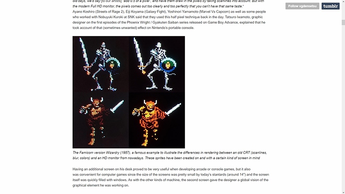
Some graphic designers toyed with these specificities and mastered the 0.5 dot technique. The word “pixel” translates in Japanese to “ドット” (”dot”). It seems that Hiroshi Ono (AKA Mr Dotman) was the first to use that word to describe his work, talking about dot-e (ドット絵, the “e” is the same as in “Ukiyo-e” and means picture) and dot character (ドットキャラクター or ドットキャラ) in the February 1983 issue of Namco NG. “It’s a technique where by slightly changing the color of surrounding pixels, to the human eye it looks like the pixels move by around 0.5 pixels.” explains Kazuhiro Tanaka, graphic designer on Metal Slug (1996). His colleague Yasuyuki Oda adds that “Back in the old days, we’d say [to our artists] "add 0.5 of a pixel”, and have them draw in the pixels by taking scanlines into account. But with the modern Full HD monitor, the pixels comes out too clearly and too perfectly that you can’t have that same taste.“

On the same topic, this article may also be of interest:

’We were working on cathode ray tube TVs where you could do things you couldn’t do with the monitors of today. So yes, emulation does break it. Our job is to try and hide pixels. It’s not that we were ashamed of them, but it was to try and make something look smooth or round where it could look blocky and strange. The skill was to try and push a third dimension which wasn’t there through use of colour, highlights, lowlights…

’It wasn’t about boasting, “Here are the pixels.” I get that, it’s wonderful, but our job was to make things look smooth. If it was metal it should look like metal, if it’s wood then wood. We were making different material types with a limited palette and gigantic pixels. We were trying to do high definition, whether it was the Spectrum or Commodore 64 or whatever. We wanted it to look a better class on that machine.'

(https://readonlymemory.vg/shop/book/the-bitmap-brothers-universe/)

3 Likes

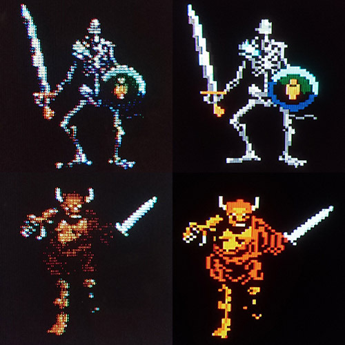
comparison shot using the settings I posted above.

This shot is from the article HunterK posted above. (https://vgdensetsu.tumblr.com/post/179656817318/designing-2d-graphics-in-the-japanese-industry). This is the Famicom version of Wizardry, displayed on a CRT using composite video. Notice how the composite artifacts actually alter the pixel colors and add more detail to the image.

tumblr_inline_phiwexvGTu1w169t0_500

This next image is an emulated image using the settings I posted. Although you lose some of the detail resulting from composite artifacts, the image is much sharper, cleaner, and the colors are much better. It’s a trade-off, but one that is well worth it, IMO. It’s sort of a happy medium between composite video and raw pixels on an LCD. (As always, click once to open image, right click and select view image, then click once to zoom to full size). Display backlight will need to be increased for the second image (I have my backlight set to 100%).

1 Like

This should be in the Shaders FAQ for ppl who can’t remember exactly how CRT looked and what to expect … 100% agree and share the same opinion.

1 Like

As technically as accurate as they might be I personally find a sharp, pixelated image with hard scanlines and dark masks difficult to look at for too long, I don’t think my brain is trained to handle all that “accuracy”! Maybe I’m a bit stupid😂

Over the years I’ve messed with many shaders, at one point I thought xBRZ was king!! :dizzy_face:

Now I’m at a stage where I want my retro games to have a nostalgic feeling on a 50 inch LCD (I still have a CRT TV but I prefer the convenience of a LCD). When I say “nostalgic feeling”, of course I wouldn’t want to go back to having the noise and appalling colour bleed from an RF connection. RetroArch let’s us pick and choose what looks right for us, I find the subtle scanlines, minor softening of pixels and smoothing of colours easier on the eyes when viewed on a large flat screen, my brain handles that effect better for video games than a crisp, sharp pixelated image with dark scanlines.

Whatever floats your boat :sailboat:

4 Likes

I don’t really care to get into a pointless debate over subjective definitions of quality. You’re certainly welcome to your opinions and it’s fine that you want to share your results here.

You’ve mentioned the image being too dark several times now, but I wonder if you ever followed my recommendations regarding adjusting your display’s backlight, as that’s part of how these settings are intended to be used. Doing so results in a peak brightness that actually exceeds that of a CRT (CRT is ~175 cd/m2 while this resulted in a peak brightness of ~200 cd/m2 on my display).

I’m really only interested in the definition of quality that actually gets used by video professionals. Your image resembles a poorly calibrated CRT with overblown contrast and brightness and too much bloom (scanlines should still be clearly visible over white according to how professionals calibrated CRTs).

Regarding the scanlines, as CRT tech improved the scanlines get closer and closer to 1:1; see the image I posted of the Sony FW900 above, which is both sharper and has more prominent scanlines than either of the emulated images I posted.

I don’t get the blur at all. Even the slightest amount of blur doesn’t do anything for image quality IMO. You’re just trading one form of eye strain for another (blocky pixels for blur). Enabling quilez scaling with the zfast shader and setting blurscalex to 0 is still too blurry for me, and I grew up playing these games with a crappy RF or composite connection. When the edges of objects are blurry like that, my eyes keep straining to find the edges. It’s as exhausting as watching a 3d movie (which I dislike). It’s not doing anything to benefit the pixel art. I think one can make a case that composite artifacts benefit NES era and earlier games, but even that is questionable, since a good many people seem to prefer RGB for that as well. Even so, composite artifacting isn’t just blur; it’s more complicated than that and it isn’t accurately captured by just blurring the image.

Also, as I mentioned earlier, cranking up the backlight and viewing the image at a proper viewing distance mitigates the sharpness somewhat, because then the emulated phosphors are acting more like real phosphors, which results in the emitted light blending together at the right distance. Get close enough to a CRT and it’s rough as hell; much rougher than either of the emulated images I posted.

Another thing worth considering is that your eyes will adjust to the amount of light being emitted because your eyes dilate. If you’re used to viewing images with too much contrast and brightness, a properly calibrated image is going to appear too dark and dull. After a few days of viewing a properly calibrated image, it will no longer look dark but it will look more accurate and produce less eye strain.

Also, if you insist on blur, then you can easily adjust the blur with the shader I’m using by adjusting the “blurscalex” parameter and setting shader filter to “linear.” This shader is extremely lightweight so it should have no problem running full speed on older / low power systems.

One thing noticeably absent in all of your images is anything resembling accurate RGB mask/phosphor emulation. That may not be important to you, but it’s definitely an integral part of how all CRTs worked, and IMO it’s one of the most important aspects of CRT emulation. EDIT: I see you’re using 720p, so that effectively rules out any kind of accurate RGB phosphor emulation. You just can’t make the phosphors small enough at that resolution.

I simply wouldn’t want to experience any modern game, or a movie with such obvious, opaque black bars eating up so much of the signal

Of course I don’t play modern games or watch movies with these settings; that would be silly. This is exclusively for retro gaming.

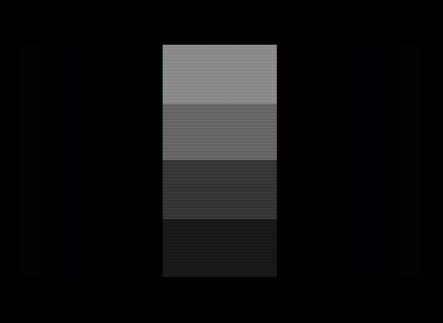
FWIW, I’m really pushing the mask strength with these settings while trying to maintain acceptable brightness. Here’s a shot from Fudoh’s 240p test suite. I need to zoom in to really see it, but with my backlight at 100% the inner bars are just barely visible; this is what they should look like since they’re supposed to be displaying blue at 1 IRE, the lowest possible value.

[edited to add previous post for context]

@Nesguy - we already talked about it in the other thread, but here goes my opinion about your settings for whoever didn’t read it there: as much as I appreciate and admire your technical/scientific approach (and I do!), your images look as artificial to me as mine look to you. The scanlines are too prominent, the resulting image too dark, and also too sharp. I don’t like playing with such obvious artifacts between my sight and the art in the game, they do get in the way. It’s not about nostalgia and crappy TVs during childhood as you think. I simply wouldn’t want to experience any modern game, or a movie with such obvious, opaque black bars eating up so much of the signal. Same applies to retrogaming. Let’s put them side by side.

I’m not saying my image is a more accurate simulation, or better. It’s not a competition. What I’m saying is that it looks easier on my eye. More… playable. But like @shenglong always says, the beauty of retroarch is that it provides so much choice. It’s also great that we can share knowledge and experience in these forums. I’m not saying my image is a more accurate simulation, or better. It’s not a competition. What I’m saying is that it looks easier on my eye. More… playable. But like @shenglong always says, the beauty of retroarch is that it provides so much choice. It’s also great that we can share all this knowledge and experience in these forums. Also the devs are around as well, and I hope it’s good for them to get this kind of feedback too :slight_smile:

[end previous post]

@Nesguy - I will respond here to both posts if that’s ok. I was not talking about bloom, but sharpness. In the images that you posted on the other thread, I can see square pixels and sharp angles in the shader image. The CRT is much smoother obviously. If you will not it see it now, I can only recommend a pair of glasses.

raw%20pixels soft%20crt

Regarding brightness, I don’t think my screen would be able to reach the necessary levels to compensate for all that blackness anyway… and honestly I don’t need nor want to crank its brightness to the max (which would also destroy color everywhere else, and I don’t use my computer just for running emulators) to achieve a bright image in old games.

As the crops I just posted (from your own images) clearly demonstrate, those settings are in fact a far cry from an actual crt monitor, and certainly not up to the air of superiority with which you flaunt them. It’s also kind of ironic that you keep talking about proper calibration, while having to raise the brightness of your LCD to extreme levels in order to achieve decent gamma/brightness.

I will be repeating myself here, but calibrated screens are essential to my job, and on my (or any) calibrated monitor that is not operating at blinding intensities, those settings will result in an overly dark image. Plus the too prominent black lines eating up the pixel art. Plus the excessive, almost raw-pixel sharpness.

That said, if that’s how you enjoy your games, good for you. It’s all a matter of taste. I have also told you already that I admire your passion, knowledge and technical approach to these matters, and it’s great having people like you around here, but I find it inelegant to speak like you are right and everyone else is wrong, specially when you certainly aren’t.

Lastly, if we really must set a reference to how old games should look like, that would be a good arcade monitor, not a video/broadcast one. Arcade games, the ultimate videogame frontier at the time, were developed with the former in mind. That’s how the artists wanted us to see their creations.

6 Likes

In my humble opinion (opinions are like arse holes, everyone has one!), arcade cabinet monitors from the late 80’s and throughout the 90’s, were the pinnacle for displaying video games of that era. I could not have or afford an arcade cabinet in my home back then, but now if I want to re-create that same feeling I would go with the visuals of an arcade monitor for coin-ops obviously and home consoles rather than a high end BVM style CRT. Maybe I’m being unfair as I’ve never been exposed to a BVM style display so don’t know how the output of one looks like. I now have a DIY custom built VEWLIX style arcade cabinet, it has a FHD 32 inch LED display, I can re-create, re-live and enjoy the arcade style look through shaders and MAME HLSL.

I really appreciate @Nesguy’s depth of knowledge on displays, judging by the posts, he calibrates real screens so must know his stuff, I’m just a casual retro gamer, stuck in the 90’s who likes tinkering with shaders, trying new ideas out etc… so I have no authority to question his ability.

However, reading through this thread I have noticed, bar his outstanding, in depth knowledge in displays, much of the feedback @Nesguy has provided appears negative towards everyone else’s screenshots, although I don’t think he wants it to come across like that - it’s probably more out of frustration as people are posting visuals that are frowned upon by video display experts so they are deemed wrong. Yes a casual retro gamer might like the pin cushion effect, the extra bloom, blending of colours, heck throw is some blurring too for good measure but are they wrong or is it a problem if they like that look? RetroArch’s shader system let’s you do that, pick and choose what you like, leave out what you don’t (yes I sound like a broken record stuck on repeat!).

I do hope it doesn’t put off others from posting their screen shots so we can see what fun things people are doing with their shaders.

Funnily enough, me and my 3 kids were doing some arcade gaming last night, I thought I’d get their feedback. I fired up classic Street Fighter 2 and loaded my preferred shader effect (light scanlines/masks, subtle blooming and softening etc…) then I loaded the shader zfast+dotmask with @Nesguy preset and all 3 of them liked the zfast+dotmask visuals.

Blah, hey what do kids know anyway!

4 Likes

I will respond here to both posts if that’s ok. I was not talking about bloom, but sharpness. In the images that you posted on the other thread, I can see square pixels and sharp angles in the shader image. The CRT is much smoother obviously. If you will not it see it now, I can only recommend a pair of glasses.

Sharpness is affected by bloom, whether it’s coming from the CRT itself or the camera.

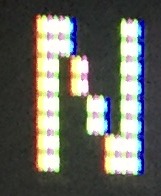
The subpixel details you’re showing in the zoomed in image are literally impossible to recreate at 1080p, so you’re just showing the limitations of all shaders. Blur does not at all accurately capture the details in the zoomed in “N” from the CRT, as a side by side image using your settings would no doubt reveal.

Regarding brightness, I don’t think my screen would be able to reach the necessary levels to compensate for all that blackness anyway… and honestly I don’t need nor want to crank its brightness to the max (which would also destroy color everywhere else, and I don’t use my computer just for running emulators) to achieve a bright image in old games.

Actually, increasing the backlight doesn’t affect the color values, not when you follow the methods I’ve used to arrive at these settings, which involved the use of a light meter. I also use my monitor for daily computer stuff, it’s pretty easy to just press a button to switch between picture presets…

As the crops I just posted (from your own images) clearly demonstrate, those settings are in fact a far cry from an actual crt monitor, and certainly not up to the air of superiority with which you flaunt them. It’s also kind of ironic that you keep talking about proper calibration, while having to raise the brightness of your LCD to extreme levels in order to achieve decent gamma/brightness.

Let’s look at a side by side using your settings, then we can have an actually meaningful discussion. What these crops show aren’t the limitations of the settings, but of current display tech. As I just mentioned, 1080p isn’t up to the task of replicating all the subpixel details in that image, but it’s definitely doing a better job than the settings you posted, which have no trace of mask simulation at all, and which resemble a CRT with overdriven contrast and brightness. Furthermore, a close up with the crappy phone camera I used isn’t accurately capturing the glow that occurs at proper viewing distance - in fact, such comparisons are very limited in what they can actually demonstrate, and only there to give a rough idea. It has to be seen in person, period.

It is objectively not “overly dark” when these settings are used as intended. I’ve measured between 175 - 200 cd/m2 peak brightness when my backlight is at 100% and the settings are applied. When I’m not playing a game in Retroarch I press a button on the side of my monitor to switch to a different picture mode preset.

The sharpness of the pixels is somewhat mitigated by getting the emulated phosphors to glow as brightly as the real thing on a CRT, and viewing the image at a normal viewing distance for 240p content, which is typically 1-2 feet back from how far people ususally sit from their monitors. Without that, you lose a lot of the glow that occurs between the surface of the screen and the human eye and the blending that results. Without adjusting your display, you’re not using the settings as intended and won’t get a good picture or an accurate idea of what it looks like when the settings are used as intended.

Lastly, if we really must set a reference to how old games should look like, that would be a good arcade monitor, not a video/broadcast one. Arcade games, the ultimate videogame frontier at the time, were developed with the former in mind. That’s how the artists wanted us to see their creations.

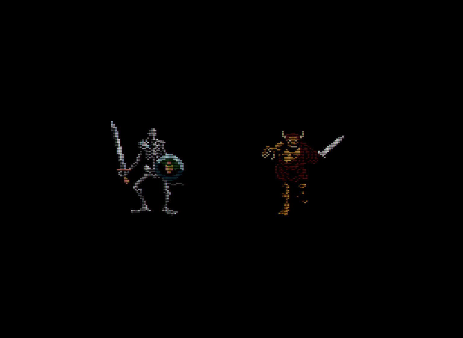
I think you’re inferring way too much regarding the artist’s intentions without any real solid evidence to back it up. The article Hunter posted is a pretty good reference. I think one can make a case for composite video benefiting NES era games, but the benefit gets increasingly questionable when you’re talking about anything more recent than that. Even then, it’s questionable. See the post I made above with the images from Wizardry. Sure, you lose some detail, but honestly, I can’t even tell that’s a robe in the composite version; it looks like some kind of weird fur only on the lower half of the orc’s body, maybe. It’s clearly supposed to read as a robe, which it does in the emulated image, and the colors and image clarity are obviously superior with RGB.

Can we see some test images from Fudoh’s 240p test suite using your preferred settings? I’d like to see more people using Fudoh’s test suite for adjusting black level, contrast and color; it’s a really great tool.

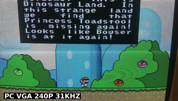
Lastly, here’s a shot from Hunter’s blog, for the sake of comparison. Notice how the scanlines are even more prominent compared to the images I posted. This is pretty close to what I consider “ideal” for 240p content. I’m pretty sure this is just a standard 90s PC monitor, nothing too fancy or expensive for that era.

A lot of people find the image of 31 khz CRTs to be too sterile, which I can certainly sympathize with. Hell, a lot of people find 15 khz PVMs to be too sterile, as well. I have a bunch of CRTs because I’ve found that each one is different, and each has its own quirks and charm (the joy/frustration of analog equipment lol). Personally, I love them all!

I got rid of this little 13" consumer CRT because it was a little too grungy, even for me.

My 15 khz 25" Neotec arcade monitor is much less defined than my PVMs, to the point that the gaps between very bright scanlines is scarcely there at all. It also gets a lot of halation/diffusion as a result of the super-thick glass.

I enjoy a lot of different looks and shaders (including xBR/ScaleFx) and switch among many, depending on what I’m playing, but I still get a kick out of this:

7 Likes

pretty much this, yeah.

I often think we’re just talking past each other in this thread - which is easy to do since there are two different things being discussed, here: 1) objective picture quality 2) subjective picture quality.

I happen to think 1 and 2 are the same thing, and that much of what people are doing with shaders is akin to motion interpolation on modern TVs or the other “enhancements” that manufacturers add to TVs to make them stand out more in the store. Sure, it might make the image “pop” more, but it isn’t accurate and results in lost detail and increased eye strain under normal viewing conditions. Many of the images in this thread, IMO, are akin to TVs set to “store mode,” with overblown contrast and brightness and too much bloom. When I criticize an image, I mean that it falls short in some respect regarding the objective picture quality. Of course it’s ultimately up to the individual whether they prefer an accurate image that reduces eye strain or an exaggerated one that causes eye strain. The “it’s too dark!” complaint is one that is all too common to display calibration professionals.

I don’t like any of the images in that comparison using Link :stuck_out_tongue:

I think the real thing missing from many of these attempts at CRT emulation is the mask/phosphor structure and phosphor glow. This is really essential to breaking up the pixels into smaller units and creating the illusion of a higher definition, IMO.

I’ve been playing around with some composite filters for NES games, and I’m kind of on the fence about it. It definitely brings out more detail, but at the cost of a less coherent image overall. It’s not clearly better or worse IMO. I think when it comes to how 240p graphics are displayed, the most we can say is that raw pixels on an LCD are wrong. There are many approaches that are acceptable. I think Blaarg’s NTSC composite filter looks very good/accurate, if one is into that sort of thing.

I think the 31 khz PC CRT image is pretty close to ideal in terms of objective picture quality, but I can see why it might look too sterile to some people; those scanlines are even more prominent than those in the emulated images I posted. I’ve come to appreciate a bit of vertical blending between the lines.

1 Like

@embe - that’s fantastic, I must give that 199X-BLOOM a go.

@Arviel - very nice, and great choice of games there too!

I think he does want to come across like that actually. And more out of pedantry than anything else, I would add. Video experts and crt savants not all agree on the sterile (good word to express my point) look, I can guarantee that to you. This is not hard science we are dealing with.

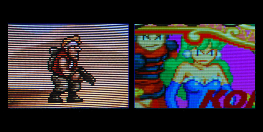
On the left, a BVM. On the right, a Nanao 15khz arcade monitor. Completely different, both high quality (not so much according to Nesguy, but believe me, Nanaos are good). Needless to say, I much prefer the arcade monitor and its translucent scanlines that merge with the art in a lovely, natural way, rather than devouring half of it.

Someone is pushing his personal preference as an ideal standard of godly quality that everyone should switch to right away. If at least said preference resulted in extremely good looking games, or maybe an accurate replica of something like the BVM-Metal Slug image posted above, I would understand the attitude. However, based on the screens posted, it doesn’t seem to be the case.

Also @shenglong your kids probably read what you write here and they are trolling you my friend :stuck_out_tongue:

@Nesguy

Evidence… well arcade games came together with those screens! A pretty strong message from their makers I reckon. They were the standard.

The image you brought from hunter’s blog is good, yeah… and much brighter than your preset, man. Does your setup look like that ‘in person’? If so, I think you should start taking photos of your display with a camera instead of internal captures, so we can see how it really is with the strong backlight, instead of having to infer and imagine from abstract values like ‘200cd/m2’ :roll_eyes:

Now Ns galore haha

raw%20pixels soft%20crt N

Left is Nesguy’s preset, center is Nesguy’s crt, right is my settings. Nesguy’s are cellphone photos, mine is direct feed. Also, I don’t think that FFVII’s start screen is the best choice for this sort of exercise. Still, some conclusions can be drawn. I haven’t boasted about my preferences being hyper-realistic or anything like that, they are simply what I like. But lo and behold, they actually look closer to the real thing.

(Full size)

Absolutely. As important as the scanlines themselves.

2 Likes