Sorry to say this but I’ve noticed a regression between
0.9.107 2022-04-17 Rev 1
and
1.0.002 2022-07-14 Rev 1
My presets look less sharp in the new version and there seems to be a slight reduction in contrast as well.
I’ve been able to reproduce the difference in two different presets.
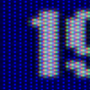
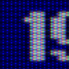
To me it’s obvious but if you can’t see it, you can zoom in and pay attention to the edges of the white text on the blue background.
In the older version every other blue dot from top to bottom is slightly darker than the one above and below it, while in the new version all of the dots are the same brightness.
Another thing to look for is that in the old version, white text is more spikey than in the new version and the subpixel detail in grey lines also appears more blended and less detailed than before.
Output file sizes are also slightly larger in the new version. All else being equal, darker screenshots tend to compress better than brighter ones. This corresponds with my findings about the differences in the dot pattern.
To summarize the woven slot mask dot pattern that Mask 6, height 1 width 3, size 2 produced before has been replaced by a more uniform, straight grid pattern.
0.9.107.2022-04-17 Rev 1
CyberLab__Slot_Mask_II_for_CyberLab_or_Core_Blargg_Composite_or_S-Video_Filter.slangp + Blargg_NTSC_Turbo_Duo_SNES_PSX_S-Video_CyberLab_Special_Edition.filt


1.0.002 2022-07-14 Rev 1
CyberLab__Slot_Mask_II_for_CyberLab_or_Core_Blargg_Composite_or_S-Video_Filter.slangp + Blargg_NTSC_Turbo_Duo_SNES_PSX_S-Video_CyberLab_Special_Edition.filt


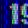
I’m also seeing something similar in
Version 1.0.001 2022-06-24 Rev 1.
CyberLab__Slot_Mask_II_for_CyberLab_or_Core_Blargg_Composite_or_S-Video_Filter.slangp + Blargg_NTSC_Turbo_Duo_SNES_PSX_S-Video_CyberLab_Special_Edition.filt

