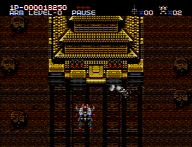
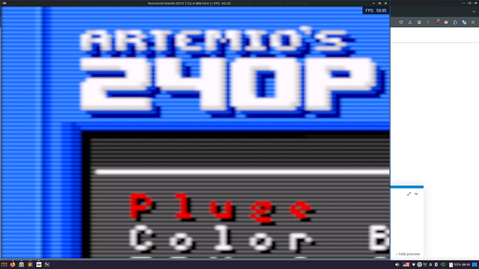
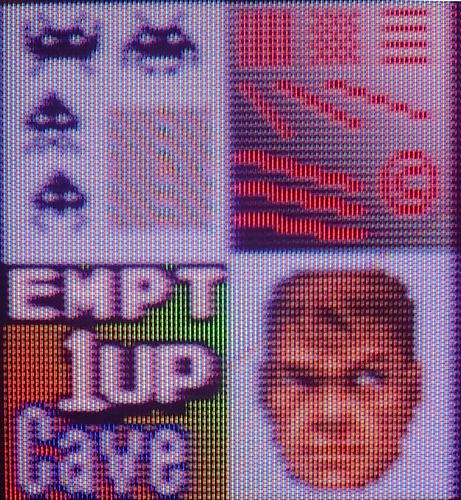
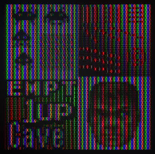
Just gave it a try and it works quite well with lower resolutions and looks really nice. Nice work
Thanks for trying it! Is that on a Steam Deck? I generated a few test images at 800 pixels tall and thought they looked pretty good as long as I didn’t zoom in too far. I don’t have a Steam Deck to test with personally, though.
Very thin scanlines suffer from not having enough pixels to work with, so it can make sense to be conservative with the minimum scanline width. Supersampling antialiasing would help, but I’m not sure the performance costs justify the quality gains.
Yes it’s on a Deck. At a normal viewing distance it looks really nice with the standard and composite settings. Lowering the max/min spot size will break the image though but that’s expected with that low resolution
I’ve cleaned up the code a bit and made a few additional changes. There’s a zip file here.
- Configurable input gamma I looked through the source of a few emulators and it seemed like most output in the original system gamma (i.e. they did not correct for the different gamma of modern displays compared to CRT TVs). I added a configuration option for different input gammas and defaulted it to the original system gamma.
-
Fix undefined behavior I was previously relying on undefined behavior when using
texelFetchwith out-of-bounds coordinates. - Performance improvements Some code was restructured to reduce register usage. I also switched to using a cubic function as the spot model. The raised cosine was more expensive to compute. I could just barely get the shader running in 4K at 60 FPS on my Ryzen 7700X’s integrated graphics, but the margin is too close for comfort and I had to reduce the maximum spot size (smaller spot sizes are slightly faster). Lower resolutions should be fine on integrated graphics and 4K should work on decent APUs or discrete GPUs.
Additionally, I wanted to highlight one advantage of this way of doing scanlines. I said in a previous post:
Consistent sharpness regardless of horizontal input resolution Some shaders get much sharper when the horizontal resolution of the input increases. This shader retains a consistent sharpness. For example, imagine stretching a 256 pixel wide input image to 512 pixels by duplicating every pixel horizontally. The output should look exactly the same.
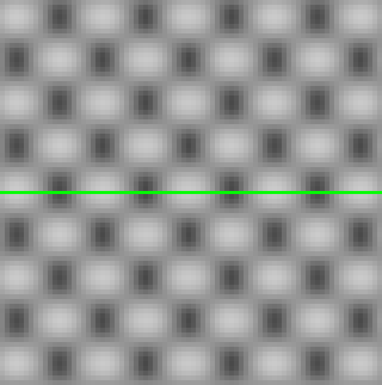
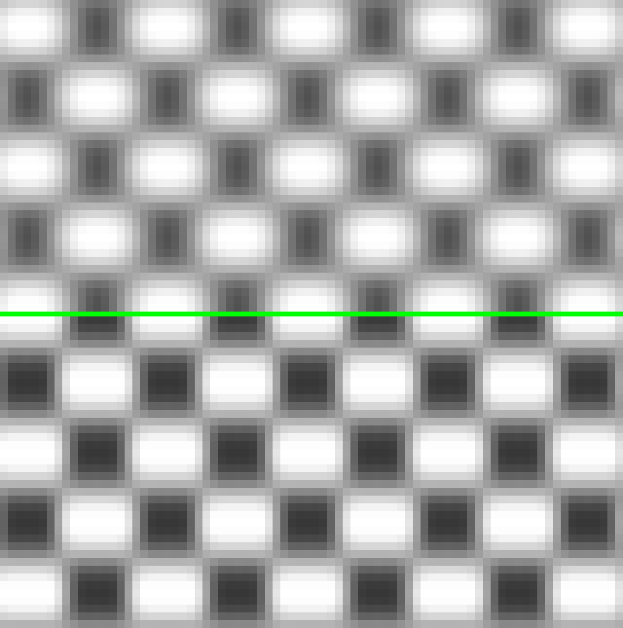
While I was testing, I made a visual demonstration of this. I generated two checkerboard patterns: a 320x240 single pixel checkerboard, and a 640x240 checkerboard with pixels doubled horizontally. Like the following two images (cropped and scaled up 20x so you can see the details):

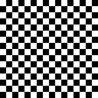
I ran both checkerboards through this shader and another popular shader with the aspect ratio fixed to 4:3. Crops from each shader are below, scaled up 16x. The top is the single pixel checkerboard, and the bottom is the double pixel checkerboard.
With this shader they both look the same, but with the other shader the pixel boundaries are sharper on the double pixel checkerboard. I think the resolution-invariant behavior is “correct” from the standpoint of what a CRT would look like. The CRT sees only the level changes in the input signal, not actual pixels.
I think resolution-invariant behavior is useful for a few reasons:
- Consistency of configuration You can configure the shader once and use it on systems having different horizontal resolutions, and it will look like the same CRT.
- Games that change resolution Some games change resolution for menu screens, cut scenes, etc. This was especially common in the fifth generation consoles. If pixel transitions suddenly get sharper, it would look like the console was quickly plugged into a different CRT in the middle of the game.
- Some systems change resolution during a frame To deal with this, emulators usually scale each portion of the frame to the least common multiple. This is possible on the SNES, I believe, though maybe only used in A.S.P. Air Stike Patrol. It was more commonly done on the Amiga, where you might have text at a higher resolution in the same frame as graphics at a lower resolution. At these higher resolutions many shaders look too sharp.
oh yeah, keeping a consistent look regardless of resolution is a great advantage. A common game where it matters is Secret of Mana on SNES, which doubles the horizontal res when text boxes are on-screen.
Looks good, i would suggest to check the code and sharpen vertically to better match an actual CRT. It’s almost there horizontally. But still looks really good anyway.
crt, notice there are no edges on pixels, they are curved, shader is pretty close. Shot from Retroarch to CRT 20" with crt-emudriver on a Radeon card on a PC i have, 2560x240
Thank you for your input, DariusG! Could you explain what you mean about vertical sharpening? As far as I know, CRTs didn’t do any vertical sharpening at least until the later digital era.
For reference, here’s a quick attempt at the upscale-test image with a little bit of glow and a mask applied over the top. This is essentially the same scanline-drawing method as the shader, just in Python/Taichi so that I can prototype more easily and generate images at arbitrary resolutions.
The lines aren’t as thick (the lines on your CRT are quite thick!) and there is obviously no deconvergence. Since it isn’t a photograph, there is also no default tone curve applied, so it’s a bit darker and the highlights aren’t rolled off. The white balance is also different. I probably should have reduced the RGB bandwidth a bit as well.
That looks close enough, yeah that CRT has a bit of deconvergence too.
I’ve made some updates to this shader. Here is a new zip package.
First, I’ve made some performance improvements to the scanline simulation. I’ve split the width calculation into a separate pass so that it is not recalculated repeatedly in the main pass. This allows the shader to run comfortably on my Ryzen 7000 iGPU.
Second, I’ve added overscan. There are two new parameters for horizontal and vertical overscan. I think there is a case to be made for making the vertical overscan asymmetric, since apparently most TVs showed more of the bottom than the top, but for now it is symmetric.
Finally, I’ve added glow (or diffusion or bloom, whatever you want to call it) to simulate the glow around the bright areas of the screen caused by the light scattering in the glass. There are new parameters to adjust the width and strength of the glow.
This is just a gaussian blur mixed in with the original image, which seems to be the way it tends to be done. To be honest, I’m not sure if the gaussian is the “correct” kernel for accuracy to actual CRTs, but it looks pretty good.
I’ve taken care to make this effect fast so that the shader still runs on my iGPU. It downscales the image 3 times by a factor of 0.5, blurs the smaller texture, then upscales and composites back onto the original texture. There are some performance tricks in the downscale and blur passes. The blur radius is varied depending on the output resolution so that, for a given glow width, the final image looks roughly consistent regardless of output resolution. Ideally the number of downscale passes would be varied depending on the output resolution, but the slangp format doesn’t really allow for that. I think 3 passes should be reasonable to cover resolutions from the Steam Deck to 4k.
Here is a screenshot of the glow with the default parameters, which I would call a wide glow at a moderate strength:
I just realized the link in my original post is now broken. I can’t edit it any more, but is there any chance it could be changed to the GitHub release page or the repository root? I expect it to break again eventually because I will probably rename the repository at some point.
done.
Would you want it added to the slang shader repo? We’d probably want to rename it to something that disambiguates it from the other CRT shaders, though (crt-beans or crt-aduffey or whatever).
I like ttthis shader, its simple and looks good.
The shader is always in interlaced mode? because tom me the option in the shader seems to do nothing but at the same time the screen flicker is noticeable on thin horozontal lines like the life bars on fighting games.
Thanks! Sorry for the late reply here.
What was the core and content that you saw flickering on?
Interlacing is on whenever the content is more than 300 pixels tall. Most of the cores handle interlaced content by weaving the fields together, so the shader unweaves the fields and displays only the even or odd lines of each frame. The parameter chooses whether to display even/odd lines on even/odd FrameCounts (for example, the first frame displays odd lines, the second displays even, etc) or even/odd lines on odd/even FrameCounts (the first frame displays even lines).
The reason there isn’t an option to turn off interlacing altogether is that the horizontal size of the output of the second pass (scale_x1 in the slangp file) needs to scale up as the vertical resolution of the input increases. As the scanlines get narrower, more samples are needed to properly estimate the values. I haven’t figured out a way to do this within the constraints of the slangp format, so this shader really only supports displaying around 240-280 lines per frame (for example, 240p or 480i content).
Hopefully that makes sense!
I think I would like to add this to the repo. I’ve been thinking that I may split it into two, a “simple” version and a “deluxe” version. I’ve been experimenting with masks and thinking about fishku’s raycasting curvature, and if I end up integrating those I would put them in the deluxe version.
I’m not sure whether I should keep the glow in the simple version or save it for the deluxe version. Glow adds 8 shader passes, 2 parameters, and around 40% overhead compared to no glow (e.g. going from around 2.25ms to 3.2ms in 4k). I’d love to hear anyone else’s thoughts.
I also wonder if anybody could test this on Intel or Nvidia GPUs before I try to get it merged. I have only tested it on AMD (and briefly on a Mac, but Macs seem to do some weird scaling that makes it look off).
crt-beans is fine for a name. Naming things is hard. 
My opinion/suggestion: take a look with every other crt shader on the official repository and see which category is under-represented. That way, you can tune your shaders to matter the most. It’s hard being relevant these days; either you create something never done before or you cater for some niche.
Anyway, here’s something I haven’t seen done much: get a good, but old, shader and make an updated version for it. User Hyllian did it recently for crt-royale. You don’t need to stay close to said shader, just reproduce its effect with a more modern and better code, with your own personal touches.
I think it’s a good idea with ‘simple’ and ‘deluxe’. I would save the glow for the deluxe version to keep the ‘simple’ preset simple  will your mask work with non integer scaling too? I’m interested to see it
I had the same thoughts about GTU but not the skill or knowledge to improve it like this, so this instantly became my favorite scanline implementation.
I was never able to get crt-royale or crt-guest-advanced to give me convincing performance with PC-98 games no matter what I did, but yours (after some code changes and additions on my end) I was able to get basically perfect.
I hadn’t kept up with this thread since May, but I had been adding the features I wanted to see on my own since then and kept forgetting to share.
Anyway, the version I’m happy with has:
- A simple subpixel mask implementation inspired from the Filty Pants blog post (ran out of links I can post, sorry)
- VGA line-doubling mode for DOS games.
- Constant brightness regardless of scanline width (just a scale factor of 1/(scanline width)^2; I don’t know how physically-justifiable it is).
- A semi-fixed scanline width mode that uses a reference resolution instead of matching the input resolution, so games that switch resolution don’t also switch monitors. (It scales with the square root of vertical lines, and seems to work fine even if scanlines overlap.)
- Wider resolution range (I’m sure there’s a good reason for scaling to 907 horizontal pixels, but by using half the display resolution instead I can use this shader for Darius or even SVGA.)
- Integration with the NTSC color fringing simulation from crt-guest-advanced-ntsc.
- A new shader I’ve written to combine a Famicom palette generator with crt-guest-advanced-ntsc for proper artifact colors in NES games (I should probably figure out how to contribute it over there…).
- Presets for various systems, including one that looks really good for PC-98 games
Currently at https://github.com/NonWonderDog/crt-beans/tree/nwd but I branched it in May and it’s not up-to-date with the latest yet.
Caveat is that I’m not as performance-focused, so it’s probably much slower. It works full speed with SEGA Naomi games in Flycast at 1080p on my Nvidia Shield, though, which was my performance target.
Also I had broken my dev setup on my desktop a while ago and was lax about git commits. Sorry.
Dunno what’s wrong with my Imgur account, but here’s an album on vgy:
And when I said that I couldn’t get any other shader to work on the PC-98, this is what I meant:

The text is just flat-out illegible on anything newer than an early-90’s 0.41 mm dot-pitch 31 kHz PC monitor. But with this shader (with a mask pass added), I can emulate one.
What is the resolution that you are playing at?

