that a very good update! thanks!
the font are indeed will be better with the new option

also I like the new Raster Bloom update
but I will not post a preset update yet, since it has crt-black_crush-koko which is not added to the slang repo yet

that a very good update! thanks!
the font are indeed will be better with the new option
also I like the new Raster Bloom update
but I will not post a preset update yet, since it has crt-black_crush-koko which is not added to the slang repo yet
I second this, It works!
Would this resolve the issue @Jobima was having with interlaced content that wasn’t happening with the Phosphor Persistence shader?
@guest.r WOW, nailed it with this update. I was just thinking about this font problem the other day, I could never really get font edges to look completely right no matter how much I fiddled with the sharpness settings. This solves the problem!
I use Phosphor Persistence shader since it can be used after interlaced to do some Phosphor Persistence magic that help in reduce interlaced flickering, unless you mean this
I was just inquiring as to whether you could now use CRT-Guest-Advanced to do what you previously needed to use Phosphor Persistence for since these changes were implemented by @guest.r.
I tried the ntsc shader and I noticed an issue where the grass on a soccer stage on TT Acme Allstar on Genesis would be garbled during motion, as if Rainbow filter was enabled. HD shader version displays it fine in motion
Because shader has so many options, which is the one to disable that effect?
There are basically two options, one is to merge fields, other is to reduce fringing or maybe artifacting.
hi @guest.r
I wonder if it possible to have mixed interlace mode that will do mode 3 in moving areas and mode 4 in static parts of the frame, to kinda do adaptive deinterlacing
Thanks for the suggestion. You can also shed some light on the effect purpose, like when and where this should work better compared with regular interlacing.
It can also go an other way, like static interlacing with edges and dynamic for surfaces. This, for example, would reduce flickering etc…
in fact that what I want, mode 4 but if there are moving it will use mode 3 so it will not has comb, perhaps with few fading pixels that average both modes between the two areas to have homogeneous mix
edit: maybe its better to make the mix adaptive, which mean if the different in pixel between the previous frame and current frame was big it will overlay from mode 3, if it small it will merge (average) mode 4 with mode 3
New Release Version (2025-11-16-r1):
Notable changes:
Download link:
https://mega.nz/file/lsYVgYKA#qhBViGxer3SPzIfYlU6MvNw5orJgOykA95uFG_w-yWU
I ended up using ntsc_rainbow1 = “3.000000” which dont flickered like 1 and 2
A good choice for some resolutions indeed. I deliberately added more options, since 1&2 are heuristics based.
I would also like to explain a bit, how the new Font Preserving functionality is to be tweaked. Some logic is contrast based and most games work nicely with parameter setting like 0.30. It’s “safe” to play Sonic Waterfalls like with below 0.36, since both waterfall and fonts are both “non-checkerboards”.
Checkerboard patterns are quite safe not to be re-dithered…
Overall, I’m quite happy with the results, still I didn’t make it a default setting, since it’s a bit resource consuming with higher resolutions. Also NTSC Adaptive Sharpness is needed to be active.
Normal:
Font Preservation:
mode 4
mode 5
mode 3
I think it also worth adding mode 5 with mode 3 motion, since mode 5 is kinda do nice anti-aliasing in PS1 games
Greetings @Guest.r Thanks for your hard work and dedication as always but there seems to be some sort of regression in the latest version. I think I was able to finally get the “m” resolved, while having Merge fields off and with NTSC Artifacts down to about 0.80 there is no more flickering/dot crawl in dithered areas (or fonts on fonts which might resemble vertical line dithering patterns. I could be wrong but I think I was able to crank Artifacts all the way up to 1.30 to 1.40 with very little noticeable temporal artifacts for a relatively sharper and clearer rendition of that infamous “m”.
Now, with the latest version, that seems to have fallen apart. At settings which give me a proper " m" with full blending of dithering, (Artifacts 0.80), There is some strange dot flickering occurring mosty near the edges of the very narrow parts of the scanlines that is very noticeable on white fonts. I could remember it clearly on the right and left hand edges of the “e” in the same Turbo Duo startup screen for example.
What is it about that screen that makes it so difficult to render clearly, while at the same time having all checkerboard dithering blended perfectly without having artifacts in the blended areas?
I appreciate that the diagonal artifacts are now gone though but there still seems to be some challenges with useability of the NTSC Artifacting and Fringing features.
To be more specific, after trying many combinations of settings including your recommendations, I ended up with situations where there is a horizontal “bridge/branch” being formed near the base of the legs of the “m”. Turning Artifacts and Preserve Fonts up either very high makes it disappear with the font appearing clear but with massive flickering/noise/dot crawl in blended dithered areas, while turning those settings down result in the “m” becoming less vertically defined and clear but flickering and dithering being blended with less flickering.
Maybe I haven’t tried every setting combination possible but I’ve almost given up. I know the potential for more font clarity and sharpness might be there in the newer implementation but it seems to be at great cost, at least to the PC-Engine.
In the previous version, I think I managed to find a tiny sweetspot where the “m” was legible enough and not flickering, all of the dithering was blended with no noticeable flickering and I could dial the Artifacts up slightly more for some nice chroma NTSC Artifacts.
The new implementation seems a bit more ambitious in its use of heuristics and other detection algorithms but there’s some cost in the temporal realm and introduction of strange never before seen artifacts flickering dot artifacts that seem a bit out of place.
The more conservative approach in the Beta seemed to work better for my corner case but of course you would know what’s the best course of action going forward.
I can easily revert my presets to use the previous version if necessary.
Sorry for the lack of new screenshots but I’ve been extremely busy lately so I couldn’t compile a proper post but I did want to get this off of my chest but not before giving it the type of testing and experimenting it deserved.
Great idea and concept though. You devs come up with some amazing solutions to problems which benefit us so much.
Thanks again and keep up the great work as usual.
It’s a bit hard to test these situations without a preset and most importantly - a low resolution screenshot (gpu screenshots disabled) of a relevant scene.
Posting a low res original image and ntsc parameter values would help a lot!
Yeah, my apologies. I know a picture paints a thousand words, I just really haven’t had the time to properly document the setup and the issue, hence the thousand words. I’m also aware that I use a non-standard CRT- Guest-CRT-Advanced-NTSC shader stack so it’s quite possible that I’m experiencing things which may not be applicable to the main, official iteration.
Aperture grille masks can look a bit strange sometimes when you reduce the mask strength:
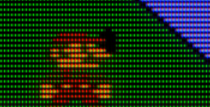
It’s a bit weird how there’s a horizontal glow between phosphors while the scanline gaps are solid.
However, we can somewhat mitigate this by manipulating Magic Glow to add a vertical phosphor glow that extends through the scanline gaps:
This is an improvement. Notice how the green phosphors glow in a cross-shaped way, vertically and horizontally. It’s more natural than the previous shot, but it’s still a bit artificial.
I wonder if there is a way to have a circular/radial glow around individual phosphors? This would be more natural/organic.


