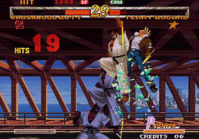
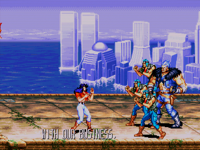
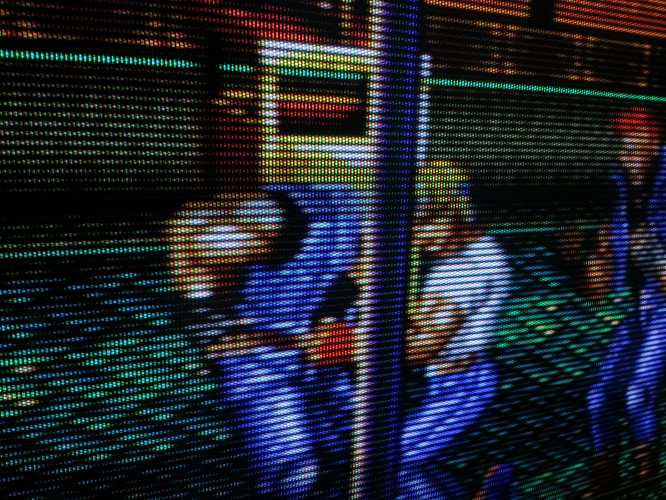
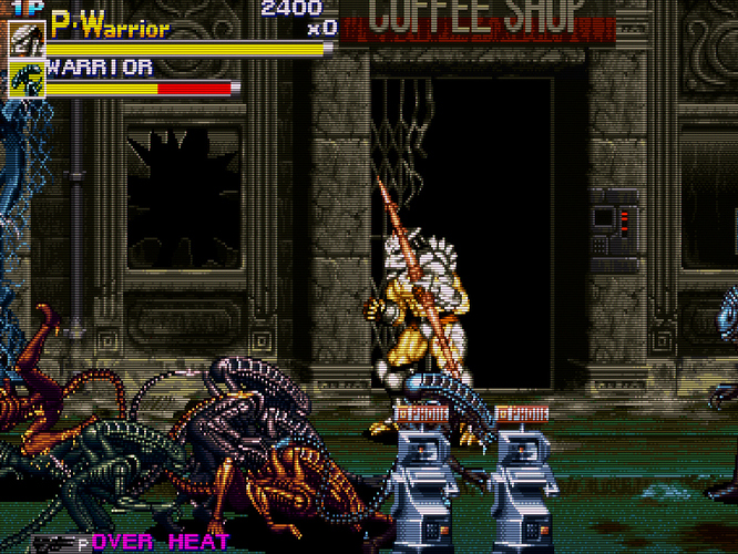
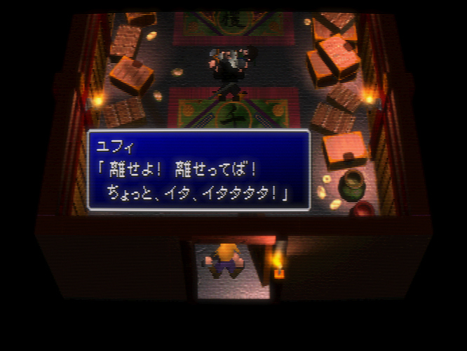
Can you please post your shader preset files here?
What game/s, Great_Dragon?
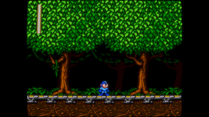
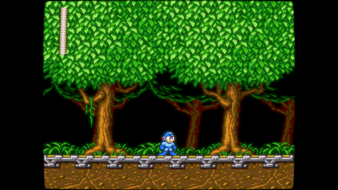
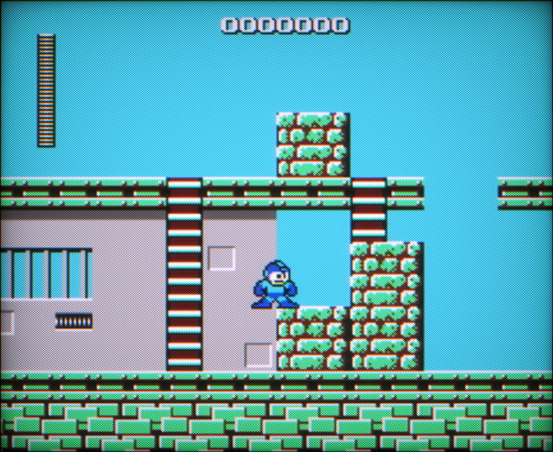
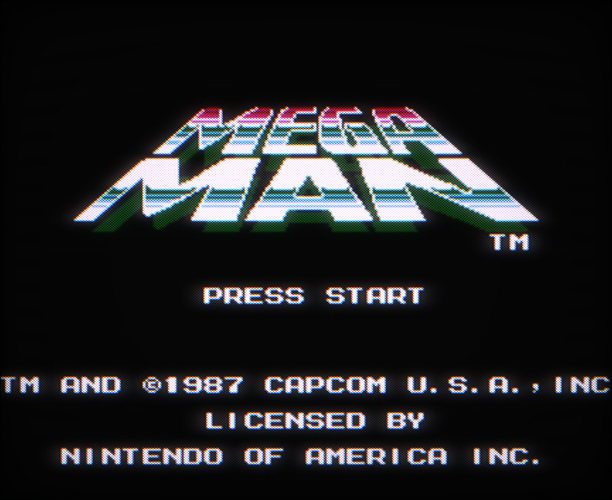
A good example of how important it is to color correct certain games: Megaman Willy Wars.
Original (yes, someone in Capcom decided that this gamma was fine) CorrectedAnd come on people, post some screens. I would really like to see what other people can achieve!
And a close-up (which is in fact how people usually post this sort of screens)
CRT emulation has really come a long way indeed. It’s amazing that old games can be made to look this good on modern monitors 
At last, a few screens thank god : )
It seems like many people are buying into that ‘BVM look’… dry, ultrasharp with thick black scanlines and perfect geometry. And I wonder why. I played a lot of games in the 80s and 90s, and I don’t remember a single tv or arcade monitor that looked like that. It reminds me of the early 2000s when shaders didn’t exist and we simply slapped 75% scanline overlays on top of everything. LD-CRTs were blurry, bloomy and curvy, and I much prefer a smooth, organic, less digital look, but to each their own I guess!
Well depends on each person(photographic memory)/tv/output and ofc the difference between what we see and what the camera capture. Also the shaders a a bit limited. And is also another debate of how games looked like because of the tech at the time vs. what they were supposed to look like. I’m pretty sure that flicker and distortion were a tech flaw. RGB was in EU and delivered best image clarity. Here is a sshot on a B&O mx6000 on retroarch_Wii 240p rgb scart … as u can see there is a huge difference between shader ap. grille and actual rgb output ap. grille (both closeup and what you see when playing at a comfy distance)
Personally, I cannot stand distortions + image not fitting properly the screen especially when playing on a flat screen led. 4:3 on a 16:9 screen is alsmot too much for me :)). But nevertheless that is me.
The bloom in some of these screenshots is really awful :\ I use several CRT’s and not one of them look like that.
@ryuuji89 - that looks great. A bit dark but still good. It also shows how blurry real crts are. The pixels melt. Do you use shaders? If so, have you managed to replicate that look with them?
Of course those characteristics (just like scanlines by the way, or glow, or in fact even chiptune music!) were flaws and limitations, but the industry learnt how to take advantage of them, to the point that they became an essential part of how we experienced videogames back then. 24p in films could be called a flaw as well, and there it is to this day, because it simply is part of the nature of movies.
@butanebob - yeah I like my bloom. So let us see some captures of those crts of yours, or your shader setup… or something. That is the point of this thread. Screen-less criticism cannot be taken seriously.
@hostile1975 - FotNS, the increased IR is the reason why you can’t see any scanlines. If you want them, try reshade. That’s what I use in those cases and it works great!
I thought you use system bases shader presets and not configure them for each game individually. That is very time consuming for me and it doesn’t make any sense for me. As I try to emulate CRT device of that era that produces image.
I don’t configure each and every single game individually of course, only certain ones that need it (although once you know what you are doing, that takes seconds). Different systems yes. I already tried to do what you are trying to do, find a configuration that goes well with everything. And it does not exist. Well it does, kind of: play on a real CRT.
Still if you want a quick answer, I already gave one up there:
That combination gives great results for everything that is 240p. The AAoffset default setting is 0.25, which is actually too high. Try 0.10 and if you need a hand with any other setting, here we are 
@Squalo the closeup pic of Streets of Rage is from a Bang&Olufsen MX6000 using RetroArch_Wii 240p @15Hz via RGB Scart no shaders. Posted it to show the difference between shaders and actual tv.
@ryuuji89 - I know, did you read my answer?  “It also shows how blurry real crts are. The pixels melt. Do you use shaders? If so, have you managed to replicate that look with them?”. Maybe I should have asked, ‘do you also use shaders?’. What I’m trying to say is that considering that you have that nice crt around, maybe you had tried to replicate the way it looks with shaders on a lcd screen. I know I would!
yes I use shaders but I find it really hard to get the same result as the crt. Currently using a customized NEC XM37 shader (part of the Analog Shader Pack version 3).
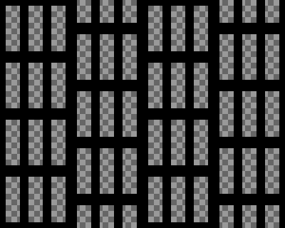
^That does not looks as I want when using shaders. Also the hardest thing most likely is the RGB dots. On crt u can see then when you are very close to the screen (very close) but on lcd/led is almost impossible to do it because is not how lcd/led works. Setting the opacity too high > u get to see them from far away (which is wrong)… setting it lower u won’t get the same pixel effect.
Nevertheless I prefer High end tv look (rgb) and not PVM/BVM because it looks too perfect, too close to lcd/led look.
Current progress with my customization
That looks awesome ryuuji89!
Will try to share some screens once I get home.
aa-shader-4.0-level2-pass2 - is really cool. Thou 0.25 is the lowest value allowed. But it looks fine to me. What I can’t get to work is “crt-easymode-halation”. It just ruins brightness and gamma. What settings do you use to fix it?
As for my current preferences I use this great shader combo for all 240p games except arcade. https://pastebin.com/W2GmbuhZ You have to have this shader pack 3 to be able to use that shader preset above.
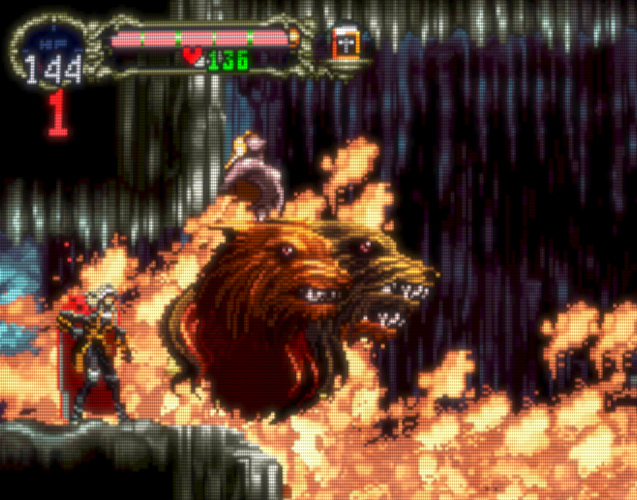
@ryuuji89 - nice, but a bit too sharp I think, compare it to your own SoR screen. Is it even linear filtered? And yeah the mask is hard to replicate, but look at the castlevania close up I posted. It’s alright I believe. @embe’s shot has some blur, it looks more natural imo.
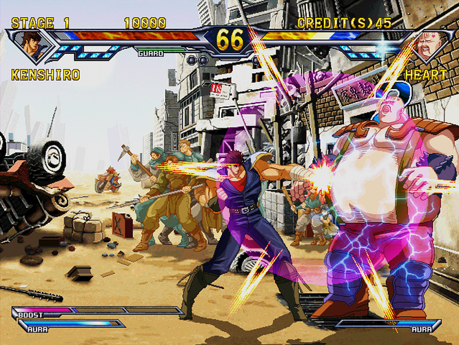
@Great_Dragon - Yeah you have to edit the AAoffset manually using a text editor. I will post some easymode parameters. The other one you posted would look fine… with some scanlines, I can’t see them, only the mask grid.
This is my favorite. It’s the S-video Slotmask Sharp preset from @solid12345 Analog Shader Pack 3. Looks so close to the original look, ESPECIALLY if you play on an OLED TV.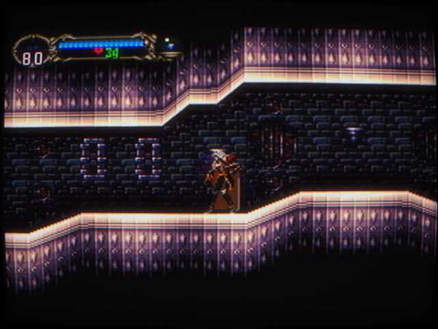
I prefer shadow mask over scanlines as my TV didn’t have one back then.

