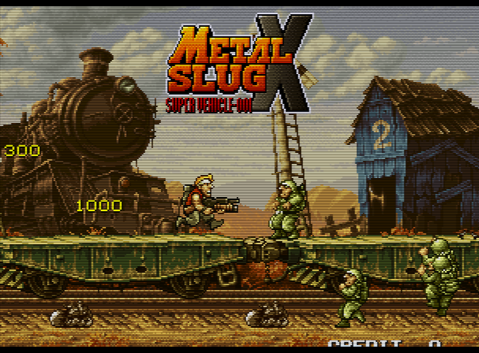
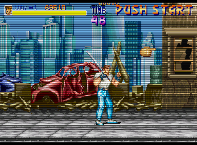
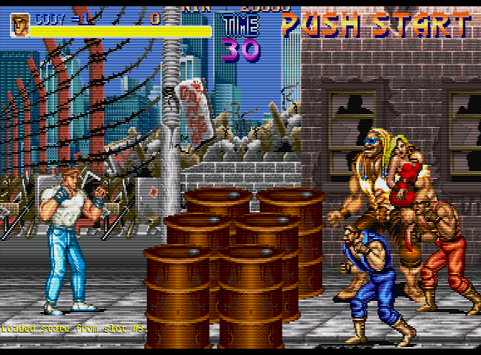
Here are a couple more shots of CRT-aperture. I didn’t like the bloom you get with the default settings, so I reduced it to what I felt was a reasonable level and increased the brightness setting to compensate until I was matching the max brightness on my CRT monitor. This messes with the gamma curve somewhat, but it looks very nice when actually playing a game instead of displaying a test pattern (IMO). This is with BFI enabled and my display backlight at 100%, so brightness and colors look very different in person. The glow in this shader really helps to brighten up the highlights without being too obvious or distracting.
Aperture is nice, on my personal scale for easy-to use - looks reasonably good out of the box on every display I’ve used, I’d probably rate Hyllian higher because it’s a bit faster among other things.
edit:
After playing around with Hyllian and Aperture some more, I think I’m now leaning toward Hyllian being my preferred shader. Once you remove the bloom and glow from Aperture, it becomes difficult to get it decently bright without throwing the gamma out of whack. Looks like Hyllian is still the reigning champ for overall ease of use and picture quality.
edit edit:
bah, now I’m back to using Aperture. After some additional tweaking I was able to remove the glow and maintain good brightness and gamma. The two shaders are very similar now, but Aperture’s sharpness/scaling looks a bit better IMO.
Aperture:
Hyllian:
What settings are you using for crt-apeture?
I raised gamma a bit because it was looking a bit under-saturated in some areas.
I also have black frame insertion enabled (which reduces brightness by 50%) and my backlight at 100%. Brightness and gamma are display-specific and will have to be adjusted per display.
alias0 = ""
BRIGHTNESS = "1.900000"
filter_linear0 = "false"
float_framebuffer0 = "false"
GAMMA_INPUT = "2.600000"
GAMMA_OUTPUT = "2.400000"
GLOW_DIFFUSION = "0.000000"
GLOW_HALATION = "0.000000"
GLOW_HEIGHT = "0.500000"
GLOW_WIDTH = "0.500000"
MASK_COLORS = "2.000000"
MASK_SIZE = "1.000000"
MASK_STRENGTH = "0.000000"
mipmap_input0 = "false"
parameters = "SHARPNESS_IMAGE;SHARPNESS_EDGES;GLOW_WIDTH;GLOW_HEIGHT;GLOW_HALATION;GLOW_DIFFUSION;MASK_COLORS;MASK_STRENGTH;MASK_SIZE;SCANLINE_SIZE_MIN;SCANLINE_SIZE_MAX;SCANLINE_SHAPE;SCANLINE_OFFSET;GAMMA_INPUT;GAMMA_OUTPUT;BRIGHTNESS"
SCANLINE_OFFSET = "1.000000"
SCANLINE_SHAPE = "1.000000"
SCANLINE_SIZE_MAX = "1.500000"
SCANLINE_SIZE_MIN = "0.500000"
shader0 = "C:\Program Files\RetroArch\shaders\shaders_glsl\crt\shaders\crt-aperture.glsl"
shaders = "1"
SHARPNESS_EDGES = "1.000000"
SHARPNESS_IMAGE = "2.000000"
srgb_framebuffer0 = "false"
wrap_mode0 = "clamp_to_border"Those settings look amazing, I’m gonna use them !
I have a couple of shader setups that I use depending on the game or just whatever I feel like playing on, the first is what I’d call a more ‘normal’ looking CRT, using ‘Neuromancer Sharp’ from Zombs shaders (with some brightness settings tweaked here or there I believe) it looks much like the real CRT tv I own, while the second is that very heavy scanline/sharp image Sony BVM look, just using CRT-Royale Kurozumi (also with a bit of brightness adjustment and a little diffusion added)
‘Normal’ CRT style:
BVM style:
@Siors Could you point me to Zombs shaders, I’ve been looking and the best I’ve found is his Reddit post, and Neuromancer Sharp isn’t included?
Ah yeah the reddit post doesn’t have the updated pack I see.
Here you go, zombeaver’s post a little ways down this page (if it doesn’t link directly to the post): https://forums.launchbox-app.com/topic/30010-the-big-ol-retroarch-shader-thread/?do=findComment&comment=316299
I’ve also realised I made a mistake, it’s Neuromancer Clear, not Neuromancer Sharp (which is a shader, but not the one I use!)
Thanks!
Jesus, that pack is gigantic compared to the reddit pack.
Looks pretty good, but I think you should add at least some slight scanlines in the “regular CRT” version. Not sure where people get the idea that scanlines aren’t visible on a regular CRT television. I had a Walmart brand 20" CRT a couple years ago (Sanyo) that I found used on Craigslist, and the scanlines were still visible from like 5 feet away. Plus, the pixel art was designed with scanlines in mind, using a half pixel scale, and artists relied on scanline bloom to do things with highlights and lowlights that aren’t possible on a modern display (sans shaders). Without that, the image loses all sense of depth.
The BVM-style shots look nice 
It’s too bad that BFI saps so much brightness; you can’t get the highlights bright enough without adding some amount of bloom when using BFI on an LED-lit LCD. Otherwise, I’d probably just slap Royale-Kurozumi on there and call it a day.
It would be cool to see some shader setups that take BFI into consideration; it’s a real challenge to get decent-looking scanlines, brightness and gamma when using BFI.
Thanks  These shots are definitely overblown without reducing the brightness or activating BFI, and only intended to be a proof of concept. Gamma and brightness will need to be adjusted for the individual display being used. Fudoh’s test suite and a light meter phone app are all that is needed for this.
It’s as close as I could get to matching the scanlines, brightness and gamma on my CRT computer monitor using the interlacing shader and with some added signal blur from TVout-tweaks.
One thing I’ve found playing with shaders is that the resulting max brightness and gamma are absolutely essential to the perceived quality of the resulting image. BFI makes it very difficult, but it’s still possible to get decent image quality on a 5 year old display using shaders. (Forget about using lightboost on the ASUS VG248QE, though).
The thing is, one of my CRT TVs has very hard to see scanlines unless you put your face very close to the screen, and that shader is the closest I’ve got to resembling that look.
Here’s a picture of that TV:
While it clearly looks different to the shader, it’s also not very…scanline-ey either, and this is very close to the screen, when sitting at playing distance you can see even less. I’m not sure how to go about making the shader look closer really. Perhaps a very slight scanline as you said.
(Not that this TV is exactly what I’m shooting for)
Interesting; that almost looks like vertical scanlines but I think it’s just the phosphor strips. I’ve never seen a CRT TV that didn’t have scanlines with 240p content.
What TV is that and what type of connection are you using? What game/system?
Setting contrast and/or brightness too high can also make the scanlines less noticeable. Also, the camera can add its own blur/bloom.
I think that regardless of what some CRTs may have looked like, it still holds true that pixel art was designed with scanlines and variable beam width in mind, and doesn’t look as good without this.
Unfortunately it takes a resolution of 8k to reproduce correctly the different types of masks, even in 4k is not sufficient with some parameters but remains correct.
1.https://pasteboard.co/IicMVt1.png
2.https://pasteboard.co/IicNl8f.png
3.https://pasteboard.co/IicMuGA.png
4.(Bonus aperture grille) https://pasteboard.co/IicLrhgX.png
Oh that second to last one does look particularly nice I must say.
You can get away with 4K if you’re just going for an aperture grille; there’s no black space between the phosphors.
Even 1080p is sufficient for an aperture grille if you’re willing to accept some compromises (either uneven spacing of the phosphor strips at the sub-pixel scale or a max TVL of 270 if you’re using a pattern that’s red/green/blue/black).
Not sure what the TV is as I’m not at home currently, but it was a PS2 running Sonic Pinball via RGB Scart.
My phone camera definitely makes it look more bloomy than it really is but it’s not too far off.
Also @ProfessorBraun how did you get that look for those shots? They look darn good.
Ah, that would explain it, then. PS2 is 480i to 480p. If you’re using YPbPr component, most PS1 games will display in 240p on the PS2.
I’d be curious to see what your TV looks like when displaying 240p.


