Please show off what crt shaders can do!

It’s DOS Wing Commander with that shader i wrote before about (never uploaded) tweaked a bit more. SNES Wing Commander has much inferior graphics imo.

Trying to look like how i remember the 1084S-P (mine is dead in storage room lol, flyback gave up the ghost).

3 Likes

Triying Mask strength as I use to do it before, I’m trying without the old mask clipping, I think it was something like this. :sweat_smile:

2 Likes

It’s all about practice and trial and error. If you come out of your comfort zone there’ll always be a learning curve before you perfect a different way of doing things.

In the Mortal Kombat II image with the higher Mask Strength, I think the colours look a bit less saturated as well as there’s a posterized look. Lastly, the Gamma is not as dark compared to the previous Mortal Kombat image with the many mitigations. It does seem a bit more accurate though from a CRT emulation perspective. You just need to tweak things some more like the colour, gamma and saturation to the point of Nirvana.

Another thing I’ve noticed and I’m sure you’ve noticed too is how chunky the phosphor triads are now that you can see them more clearly. I know you’re trying to model your real CRTs but you can also try using Mask 10, Size 1 in order to get finer phosphors and you might see that is doesn’t look as jarring and might actually be closer to what you’re accustomed to but just more accurate.

1 Like

I think Wing Commander would have been double-scanned on VGA monitors (like other mode 13 games). Something like this:

wc

That’s a bit more difficult to pull off at 1080p, though:

wc-1080

2 Likes

I love wing commander how it looks :heart_eyes:
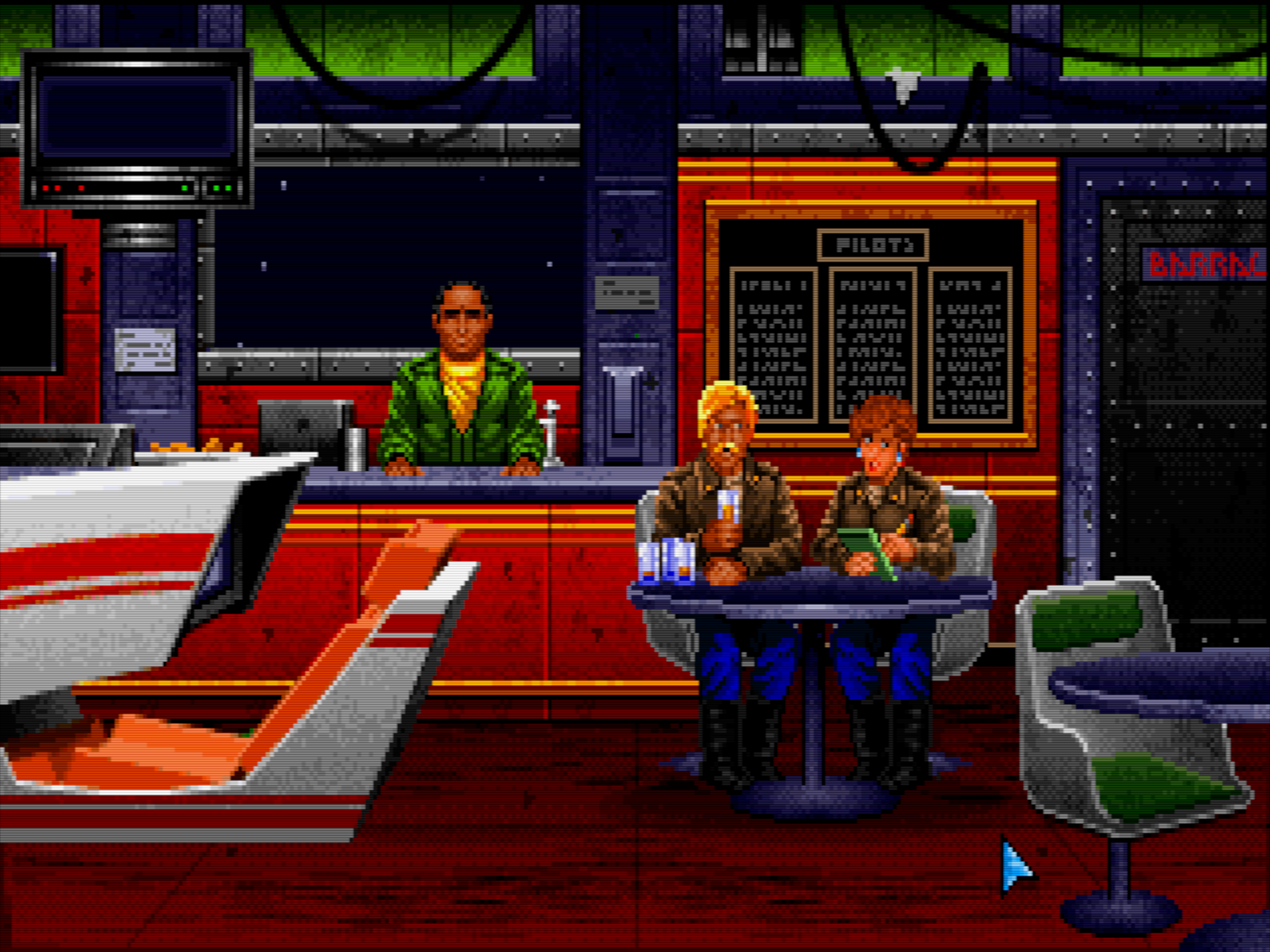
, thanks to you it was easier to configure my settings, I tried this game on my Philips CRT, so I could copy the image, and this is the result. :point_down::point_down::point_down:

:tada::tada::tada: Thank You! :tada::tada::tada:

And this is a real photo of my Philips CRT. :grin::grin::grin:

3 Likes

Hey man, you definitely learn fast!! Your preset definitely looks more like your real CRT now compared to the diluted version. Based on the photo, I might lower the Base (black) Mask probably by one or two notches to closer match the CRT even if it means it can hardly be seen except in a zoomed in photo or screenshot.

To my eyes, I think you’ve nailed it!

I would love to see what you can do with some HDR added into the mix! Doesn’t your display get even brighter when you enable HDR?

1 Like

Thank you. :grin: I changed a bit what you mentioned about lowering the base mask black.

Before:

After:

I will try it on my computer later on if I can, I made this with my mobile phone and it hasn’t got HDR.

1 Like

To be honest, both look beautiful. If it’s not bothering you, you should probably stick with the “Before” setting.

The main reason I’m saying that is because the transitions between the lit phosphor, Magic Glow and Base (black) Mask look more seamless and gradual than the “After”, which has a sharper drop-off now due to the larger difference in brightness between the Magic Glow’s “tail” and the Base (black) Mask.

To make the second one look better, you’d probably have to go back and recalibrate Magic Glow and it may not really be worth it or end up looking better after all the effort.

The “After” does seem closer to the photo though but I know how photos sometimes don’t tell the whole story.

So, the first one looks more “Analog” to me and it brings me back to some memories from a few years ago when I longed for such a feature because I always felt and noticed that the glow from the phosphors tapered out gradually and I strongly disliked the white/grey cloudy halo type of glow we had before Magic Glow brought RGB phosphor glow, because that’s the language CRT’s speak in - “RGB Phosphor Glow”.

On another note. One thing that separates CRT Royale from other shaders is the dirt on the phosphor tiles. How about trying to simulate that by using a very subtle layer of static high resolution noise?

Don’t worry it’s good to know for learning :sweat_smile:. I went back and also lowered mask bloom, leaving it with default magic glow and a notch of halation, here’s another screenshot.

And this one with a bit raised Mask bloom.

1 Like

I definitely prefer the one without the raised Mask bloom because the raised Mask bloom introduces some whitish, cloudiness for example on the character in the middle’s hair that doesn’t seem to belong in the picture at all.

1 Like

I’m trying something different. And I think it looks better IMO.

3 Likes

Seems good. How do you think it compares to your CRT? And it’s also refreshing to see some Sonic 1 screenshots without focusing on that damn waterfall.

1 Like

Once you like it that’s the most important thing, but that’s not accurate to the CRT, even with a Slot Mask display if I recall correctly.

In my opinion, I prefer the previous attempts which looked closer to matching your CRT.

I didn’t even have to zoom in to see the pattern and all it does to me is raise you’d black level and decrease your contrast ratio in the process.

Again, this is merely my opinion. You are the one who must decide when it comes to your presets.

I’m talking specifically about the raised Base (black) Mask though. The new Mask Edge mitigation looks awesome. I don’t like how the scanlines can be seen over the Base (black) Mask and it’s prominence.

1 Like

Well I got 2 presets, the one before and this other"different" to test things, It’s not deffenitive yet, I still have to improve scanline strength, also I’m a bit confused about “gama correct” and “ntsc gamma correct” do both go in the same direction, or oppossite one to another? What happens sometimes is in a dark game looks good like wing commander, but when I change to a brighter game, then. It looks a bit off, also happens when I try with a brighter game and then change it to a darker game.There’s something I’m still missing, I think I will keep the 2 presets and work on both to get to a conclusion, there’s still work to do. I also like the first preset I showed you with wing commander, but then I change to a game like Super Mario World and it doesnt look right, there’s something in the “middle” between the 2 that I haven’t found yet, maybe scanline size or gamma Correction, Im confused If it has to go possitive or negarive. For now I will rest a bit. Thanks for the opinion as always it helps me to improve.

2 Likes

As I said to @Cyber , it looks good in a game, if I start working on a darker game I get closer to the settings and looks good, but when I change to a brighter game, it doesn’t, that’s why I’m a bit confused and I keep changing from brighter to darker, I know I shouldn’t do that because then I keep changing things all the time and that’s not good because then I will get no where. I’ve been working on my mobile phone, but I will switch to my computer so I can See better the errors, from now on I think I will do that, on a small screen I can’t see all the details. :sweat_smile:

2 Likes

I would assume that different content needs different presents anyway, since I don’t any shader could just extrapolate that correctly once you have settings that reasonably resemble one type of content with a given signal. E.g. 50 vs 60 Hz looks obviously different on the CRT because of the different resolutions. Something like Wing Commander wouldn’t even take up all that screen space etc.

2 Likes

Ok guys, I switched to my computer, and I made quite a few small changes that I couldn’t see on my mobile device, I used the “Wing Commander preset” and I raised “complementary gamma” from 1.25 to 1.65, also I changed “ntsc filter width taps” from 0.16 to 0.17, I lowered “raise blacks” from 0.04 to 0.01, also changed on the emulator Pico Drive the aspect ratio settings from “CRT to PAR”. I though that having it on that setting would look better, at least on my CRT it’s with that setting and it looks good, but not on the shaders. I will check other emulators just in case if I changed something and try them later.

Also, just to let you know, the emulators have to be set in accuracy mode, or interpreter, or cycle exact like on amiga when available, those options also makes a difference in strong masks. I’m not saying this is perfect, I suppose I need a bit of more tweaking in some other areas but I think it’s a bit better.

Here are some screenshots made from my PC.

2 Likes

Funnily enough, aspect should be the other way around :crazy_face: Pico Drive “CRT” is supposed to mimic the correct aspect and thus needs to scale (make the image taller by scaling on the horizontal axis). That shouldn’t be necessary on the real CRT, I set any core to 1:1 pixel aspect/PAR or similar settings for this reason, since stretching is accomplished by other means.

2 Likes

Making some progress…

6 Likes

3 Likes