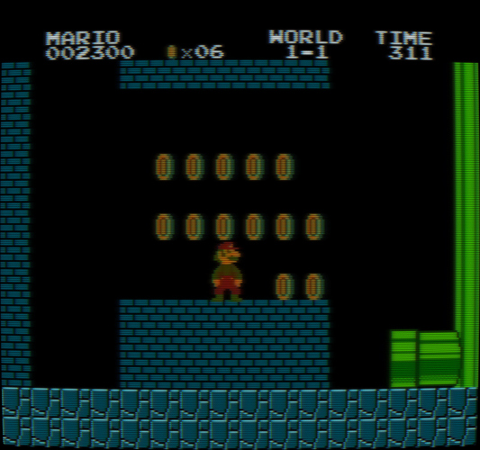
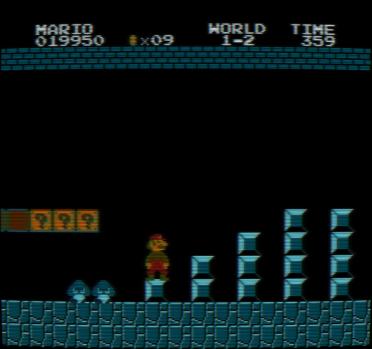
It uses the exact same color conversion process I wrote about here:
https://forums.libretro.com/t/correct-color-some-evidence-related-to-the-nes/48914/155?u=anikom15
The red channel gets boosted significantly and slightly shifted to orange by the conversion matrix. Then the final color correction stage to map to sRGB compresses red which also makes it look more orange. The NTSC-J phosphor is not only more orange, but the transform from D93 to D65 also makes it more orange as well.
Sharpness is tricky because I believe actual TVs are far blurrier than even those screenshots. Even PVMs, while they have high resolution, are still quite soft. The trouble is twofold. Compared to raw screenshots, a very blurry image is jarring. People aren’t used to it. The second is that our perception of blur on the CRT vs. the modern display is different. I believe this is because of how the brightness and masking interacts. The CRT is more blurry, but we still perceive it as acceptably sharp. However if you look closely at a CRT you can see how difficult it can be to distinguish individual pixels depending on the content.
The shader has a mask diffusion parameter. The default value is 2.0 and is designed for a standard brightness level, like 100 to 200 nits or so. The brightness is adequate for this level. You can reduce the diffusion to get a sharper mask and ramp up the brightness. This should result in a more realistic image. I would eventually like to have an HDR set of presets that will handle this automatically for HDR displays.


