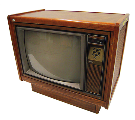
Presenting the old school analog TV pack...version 2!

[QUOTE=John.Merrit;28309] I will open a new thread if there’s interest, so not to hijack solid12345’s thread. [/QUOTE]

No problem, anything anyone wants to do to edit these files and improve on them that would be awesome which is all i’ve been doing with previous work, also would love to see some screenshots from other people.

As for github repo, I am not sure how rights management works, I am not a developer by trade but I believe all these shaders are allowed to be reuploaded to github since I left all attributions in? It seems we’ve all been editing each other’s files and sharing them already for months.

[QUOTE=John.Merrit;28309] Spaceman, many thanks for the comments. The low resolution is due to me using a mobile phone camera and poor lighting. I intend to borrow a friend’s DSLR camera and do it again properly in many resolutions with a better reflection. I made these images in a couple of hours. The screen space is one main problem, giving priority to either overlay or screen is a tough one. I am open to any suggestions. I will open a new thread if there’s interest, so not to hijack solid12345’s thread.

As soon as I have the DSLR, I intend to hook up to the TV used in these overlays, real machines emulated by Retroarch such as NES/SNES/Megadrive and take high resolution photos of the real machines running. Upload them to the overlay forum, then we have some real shots to try and match with the emulated Retroarch shots. Be interested in how close one can get to the real thing.[/QUOTE]

Grab a camera and do more. You’ve a talent for such a thing. The reflective screen gives off an all new level of authenticity.

We try to keep redundant shaders out of the repo, and these would add a lot of redundancy. I didn’t check how much of these is accomplished through tweaking parameters vs more invasive changes but if they’re all parameters, we can add them just as cgps, which would be great.

I have finished my JVC TV overlays. I created my own thread over in the overlay forum, if anyone is interested.

Awesome, I started using your pack and love the reflective glass, though I turn the opacity down 50%.

I updated the shader pack, made a slight tweak to the scanlines filter, the gamma was a bit too dark and this should fix some of the issues of the scanlines not showing up on lighter areas.

I had a chance to try the shaders with some Nintendo 64 games and it looks awesome, my next thing to do will see if I can optimize things further, I noticed some shaders like composite chew the resources a bit more on more intensive emulators.

Great update, solid12345, will be downloading in a short while.

>>> though I turn the opacity down 50%.

As much as 50% ? Blimey, you wouldn’t really see any glass effects at 50%, surely ? During making these, I already lowered the alpha channel’s opacity by 40%. And even then, it sadly looked like the glass and vertical scanlines were already lost. I’m wondering if it’s possible, through lots of tweaking, to almost force the emulated video + shader effects through the overlay, whilst still keeping the TV effect. Going to play around a bit, along with the real hardware running side-by-side.

Would you like me to upload a higher-percentage-opacity version, so you don’t have to go through the opacity settings in the menu ?

I have a real N64 + lots of carts. I will try some Mario Kart 64 side-by-side with Retroarch + your shaders, to see the difference. One difficult thing with doing a side-by-side test is that the TV is still a TV, so lots of colour/brightness/contrast settings were set for TV viewing. There is no “Factory Default” setting on these old CRT sets, so no sort of standardised setting other than setting the levels to 0/middle/far left etc…

[QUOTE=John.Merrit;28472]Great update, solid12345, will be downloading in a short while.

Would you like me to upload a higher-percentage-opacity version, so you don’t have to go through the opacity settings in the menu ?

I have a real N64 + lots of carts. I will try some Mario Kart 64 side-by-side with Retroarch + your shaders, to see the difference. One difficult thing with doing a side-by-side test is that the TV is still a TV, so lots of colour/brightness/contrast settings were set for TV viewing. There is no “Factory Default” setting on these old CRT sets, so no sort of standardised setting other than setting the levels to 0/middle/far left etc…[/QUOTE]

Nah it’s fine, I may customize it to my personal liking in photoshop. I tend to prefer my image bigger and “zoom in” on your overlay so I mostly just see the edge of the TV border and none of the faux room/bookcase, just personal preference. I like a little glare but not a whole lot.

As for comparing to a real CRT, yea everyone’s TV is going to be different, color temperatures will vary and some peoples sets will be a bit blurrier, sharper, etc., there is no “right” setting. That is why I tried to go with a variety of “looks” for this pack to give people options. I think composite and s-video looks much better for 8-bit era games for example by smearing the blocky pixels but prefer a sharper picture through RGB for 32/64-bit era games for instance. Consequently this is probably how most people’s experiences were growing up, the progress from an early 80s Famicom-era television to a nice late 90s trinitron is vastly different so alot of people would have been playing Playstation on a better TV by the time it came out.

[QUOTE=solid12345;28479]Nah it’s fine, I may customize it to my personal liking in photoshop. I tend to prefer my image bigger and “zoom in” on your overlay so I mostly just see the edge of the TV border and none of the faux room/bookcase, just personal preference. I like a little glare but not a whole lot.

As for comparing to a real CRT, yea everyone’s TV is going to be different, color temperatures will vary and some peoples sets will be a bit blurrier, sharper, etc., there is no “right” setting. That is why I tried to go with a variety of “looks” for this pack to give people options. I think composite and s-video looks much better for 8-bit era games for example by smearing the blocky pixels but prefer a sharper picture through RGB for 32/64-bit era games for instance. Consequently this is probably how most people’s experiences were growing up, the progress from an early 80s Famicom-era television to a nice late 90s trinitron is vastly different so alot of people would have been playing Playstation on a better TV by the time it came out.[/QUOTE]

This is how I’ve set it up. Plain Black Overlay zoomed in to around 1.15 to 1.22 on my 16:10 Shaders at 4:3 or 5:4 emulator depending. I’m setting the cores up cable dependant. By that I mean Snes and Megadrive era Scart. N64, PSX and Saturn is S-Video Atari era is old TV settings That sort of thing.

It’s stella work both of you. In conjunction, my old games look almost how I remember them when I first played them. Now we need to find you a scan of a Sony PVM.

Funny you should mention that:

[QUOTE=hunterk;28494]Funny you should mention that: http://imgur.com/a/GlJnl[/QUOTE]

lol if there is one thing you can’t accuse the PVM of is being stylish.

One idea I had for an overlay the other day was one where the game screen is shifted a bit to the left to make room for a faux TV control panel on the right like these common TVs in the 70s/80s

There’s not an easy way to move the image to the other side of the screen is there?

Moving the image is pretty easy. You just need to modify the texcoords, either in the vertex or when the texture gets sampled in the fragment. It’s an option in the image-adjustment shader, so if you’re already using it, you should be all set.

And yes, PVMs are ugly :stuck_out_tongue:

Ha! solid12345, loving it.

How about this ?

http://www.filefactory.com/file/3nl43mes5wub/borders.zip

Not had time to do anything major with it. The original photo was too warped and noisy. So the un-warp, noise removal left it a bit wonky and soft/lo-res looking. I still have the original, which is bigger than 1080p. So I was thinking of doing a fullscreen version without any background, just the TV. And, removing the reflection and adding something a lot more subtle.

Spaceman, thanks for the comments.

[QUOTE=John.Merrit;28505]Ha! solid12345, loving it.

How about this ?

http://www.filefactory.com/file/3nl43mes5wub/borders.zip

Not had time to do anything major with it. The original photo was too warped and noisy. So the un-warp, noise removal left it a bit wonky and soft/lo-res looking. I still have the original, which is bigger than 1080p. So I was thinking of doing a fullscreen version without any background, just the TV. And, removing the reflection and adding something a lot more subtle.

Spaceman, thanks for the comments.[/QUOTE]

I dunno. The reflection in conjunction with the shader is what nails the look. Of course I don’t know what the “subtle” is. How about one with and one without.

Spaceman, will be doing a fullscreen one both with and without the reflection. Subtle, is putting the TV in a environment that would have been more realistic when playing videogames on the real thing, as opposed to the workshop + tube lighting reflection in the original. I used to play old 80’s videogames in a more ambient lighting, due to those old warm 2500k 40w filament bulbs which would only be strong enough to light-up a tiny room. You could stand outside my house at night and see the glow of my old 26" CRT more than the room’s own lighting.

I would love some shader that could sort of create a light glow effect generated by the virtual screen. Perhaps a bloom glow effect shader that projects the glow outwards from the screen ? Sorry for going on, I just love this kind of stuff.

[QUOTE=John.Merrit;28535] I would love some shader that could sort of create a light glow effect generated by the virtual screen. Perhaps a bloom glow effect shader that projects the glow outwards from the screen ? Sorry for going on, I just love this kind of stuff.[/QUOTE] I talked about exactly this with Hunter K. , but it seems to be impossible to be done, without screwing up the scanlines and shadowmasks :frowning: . I was very disappointed to hear this and gave up on this project

something like this: .

I tried to experiment with using some of the bloom filters in my pack, but I just didn’t like the look it was giving me, they’d clash with the dark scanlines and end up looking ugly. I figured a good compromise was bumping up the luminance a bit so real bright whites and colors still looked bright and contrasted well surrounded by a dark background, I prefer a nice grilled shadowmask though to bloomy colors if I had to pick between one or the other.

You may be able to take the bigblur border shader and integrate the crt effect into the border pass (i.e., borders/resources/bigblur.inc; to avoid messing up the scanlines with scaling later on in the pipe) and then put an overlay over the top that uses alpha transparency to let the blurred background image bleed through as a faux reflection.

solid12345, not full-scene, (or is it full screen space ?) bloom, only bloom that would effect the edges of the emulated screen and blooming outwards, not inwards - so shouldn’t effect scanlines. Not that well versed in HLSL, so I’m not sure if this can be done.

u-man, yeah that sort of thing. What about putting the scanlines in the overlay ? Or would the ‘look’ be too static and fake ?

yes, they wouldnt look real and would not be even with the “real” thing. they wouldnt match up with the “right” pixels… but we could make a shadowmask this way :wink: .

This would be my steps for doing this:

My first step would be the monitor border texture: 1.)

Second step would be a blur, that would be a little larger scaled than the game screen. Maybe in a process like Hunter K. mentioned in the post… “bigblur border shader” 2.)

Third step is the game-screen with your CRT-geom shader 3.)

And last step would be the flat bezel on top of it: 4.)

I would not do the bezel with a alpha, because you would need to adjust the curvature of crt-geom to align properly with the bezel. With my method you dont need to take care of that, it would fit every time, no matter how the curvature would look.

This here is just a example, we dont need to have the borders of the bezel that big. I am just to lazy to do proper picture examples. I guess everyone has enough imagination to understand what i mean :wink: .

[QUOTE=u-man;28545] I would not do the bezel with a alpha, because you would need to adjust the curvature of crt-geom to align properly with the bezel. With my method you dont need to take care of that, it would fit every time, no matter how the curvature would look.

This here is just a example, we dont need to have the borders of the bezel that big. I am just to lazy to do proper picture examples. I guess everyone has enough imagination to understand what i mean :wink: .[/QUOTE]

Yes, I like what your saying. I was worried about losing the curvature because of a misalignment with the bezel, but your method would work fine. I could be wrong here, but the overlay would need to be pixel accurate ?