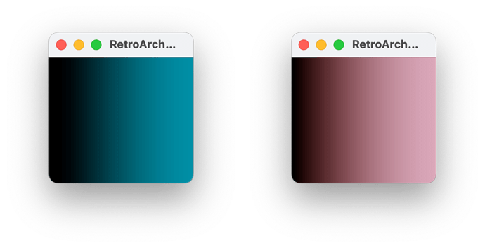
Real GBA and DS-Phat colors

From the greyscale patches, I was curious on how accurate the patches would be because of the limited color depth the hardware has, GBA being 5 bit, and DS being 6 bit from your research. Tho I thought it has 8 bit when I used moonshell long time ago, but must be dithered. I get more promising results in GBA’s 240p test suite than when tried from moonshell. That’s unless if there is a similar homebrew made for NDS hardware that uses more color for better color sampling.

Yeah I get that only 9 patches is a solid choice to save time and such. I do worry on the accuracy on the gamma for GBA and NDS because of limited color depth where you can’t exactly match the color RGB value from the screen HCFR expects for each patches. It was why I did 32 patches for those screens to collect full data as none of the homebrew could dither through currently. As well as the issue also applies to black and white four patches since the GBA for example have a limited color depth that makes each BW patches have bigger luminance difference between each other, even for just one notch difference, compared to other displays that allows full 8bit color display where there’s more subtle difference between patches on luminance.

I can successfully do the PSP for 9 patches and 4 for black and white since it does allow 8bit mode for RGB and uses it for its interface when I load pictures from it. The GBA and NDS with more limited depth options is a different story. 10% grey for example expects 26 RGB to be show from the display that HCFR gives out, but GBA would only have 24 or 31 RGB greys due to limited depth, which may affect gamma results. As for the near black or near white, it would be 0 RGB, then 8 RGB, or 255 RGB, then 247 RGB, respectively. It was why I only put 32 black to white patches to the data as I wanted to preserve the gamma results without any mismatch to my concerns.

As for CHC data for DSi family, I sadly don’t have them as I only have the Phat and Lite models when I mentioned that I would share them. As for the instructional measurement, I do have Colormunki Display and Colormunki Photo, a Colorimeter and Spectrometer, respectively. I used Photo for Display’s correction for just my monitor when calibrating for better whitepoints. I wasn’t sure if the Photo is less accurate when reading your report files, but I did get very similar points from how my Display samples the colors. The Photo was able to read black colors with hardly any struggles because of its TN panels having less contrast where the black color isn’t too dark on full brightness and just around 600:1 from DS Lite.

Yeah I did my best to explain all this just to help out, I do apologize if there were few things that didn’t make sense, but I try to understand all of them as best as I can. I was happy to see your glsl shaders on the repository for each screen. My fun fact, I measure my PC monitor with higher than 10 patches on HCFR, like 20, just to check the gamma curve for the dark areas to say it follows closely to pure power gamma, as well as measuring near black and white levels to see more deeper analysis.

Small update on the retroarch shaders I’m working on.

These past weeks, I’ve been working on the retroarch shaders by using colorspace conversion formulas to reach the best color accuracy possible using the data from the HCFR files which @Pokefan531 and @pica200 shared on this thread but I’m encountering some strange issues.

Some handhelds seem to look fine after the conversion but others are definitely off compared to the already existing retroarch shaders. After a lot of trial and error without understanding why the colors were so different between my and the existing retroarch shaders, I finally decided to create an external python script to perform the same colorspace conversion of a given input image just to make sure there’s nothing strange going on with retroarch, the shader, the framebuffer or something else and the results speak for themselves.

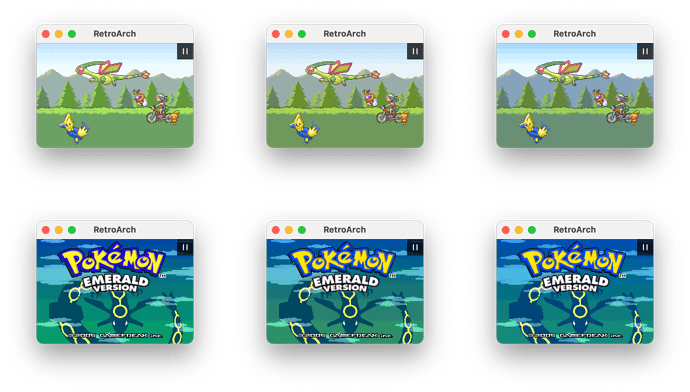
The example I’m showing, refers to the GameBoy Micro display:

  • The 1st image at the top is the original / unfiltered image coming from retroarch.
  • The 2nd image is the retroarch output after my shader has been applied.
  • The 3rd image is the output of the python script which is actually comparable with the existing retroarch shader.
  • The 4th image is the current official retroarch GB Micro shader

In the end the colorspace conversion math should be correct but i need to figure out why if applied to a shader ends up being so different


@Pokefan531 what you said about 32 patches vs 9 patches makes sense. My assumptions were pretty much based on how you should measure a modern display which should follow a standard gamma with bigger deviations on dark and bright colors. Considering that these old console’s screens don’t follow any kind of standard (for white point, for chromaticity coordinates, very unstable gamma/luminance), and considering that their colors in the ranges 0%-10% and 90%-100% have a deltaE < 1.0 even with big gamma errors of 0.15 (this result is based on some DS Lite colorspace analysis), I agree that 32 greyscale patches is a good approach to get a good accuracy. If you are measuring newer consoles like DS Phat, DS Lite etc. you might even want to measure 64 patches. I’ll try to update the documentation.

So I can give you an idea why the third image is different from the 4th. It uses all given data from the colorimetry shader (from misc folder) and I lowered the brightness to se non-clipped white color that the colorimetry shader does as it lacks luminance compensation. I then put all the colors on gimp or photoshop, and then turn its white color to 255, much like how you can compare Absolute Colorimetric with Relative Colorimetric on how it handles white balance.

And then I also lowered the brightness, so the white is not 255, but rather around 242 on both RGB values, still balanced. Why did I do this? The red color is clipped on the yellow color since the blue subtracts red color as the blue color is our of gamut, so it gives green and red color primary to use more red, so it adds up to the yellow color, and with the white being full 255, the yellow color has its hue changed and can’t see full red color on yellow due to clipping. Scaling the luminance down brings the yellow color to show its full hue and luminance along with the rest of the main color swatches.

So yeah, the difference between the third and fourth pic, while correctly handles the GB Micro data, the 4th pic is done with my manual tweaking by both Relative Colorimetric and Luminance Scaling. When I used a modified colorimetry shader I did for weeks, I get the same results as the third pic.

As for the second pic, I’m not an expert on shader coding, so I wasn’t able to explain why it’s so purple, either the shader coding itself or how it’s handled under libretro shader engine. I am not sure what exactly, but hopefully you are able to solve the issue by a proper port.

As for swatches on the greyscale, yeah I consider testing with 64 patches once a native NDS homebrew lets you play with color for both top and bottom screen.

Speaking of colorimetry shader, I played around with it this week again to see what would fit for my next batch of shaders. I did managed to add display’s gamut mode (sRGB, DCI-P3, Adobe, and Rec2020) and multiple profiles (GBA, GBA-SP, etc) as well as adding gamma correction that the original shader lacked. It worked quite well, just missing two things I need, Absolute vs Relative modes for white balancing, and luminance scaling for clipped primary and secondary colors. But otherwise, works quite well as expected.

Although, I still would use the color-mangler based shader as those are quite easy to understand, which are the ones I’ve been using for at least a decade. They’re useful for a more simple port to other projects that doesn’t need multiple profiles for host displays, or needing the code to be sufficient.

Oh and one last thing, I got honored by a mention from an open source FPGA project, being Game Bub. Their website has mention my shaders as part of their color correction article that plans on adding GB and GBA profiles for their firmware to play gameboy and GBA games.

1 Like

Hi again,

I finally found the culprit for the reddish tint in the shader: floating-point rounding errors! When I first discovered this, I couldn’t believe it was even possible. But after some simple steps, like precalculating the transformation matrix (linear RGB > XYZ + chromatic adaptation + XYZ > linear RGB) with double precision and plugging it into the shader, I already noticed major improvements, even though it was still far from the full double-precision Python algorithm.

In the end, I decided to use LUT textures, though not without some regret. Here’s why:

  • Supporting multiple color spaces requires multiple textures
  • Textures take up space (not huge, but still wasted)
  • No cool shader effects like showing out-of-gamut colors (possible with a separate LUT, but more wasted space)
  • On handhelds, 8-bits bit depth LUTs can take up to 3MB, which unfortunately crashes RetroArch

At least LUTs bring some advantages:

  • You can use complex algorithms for out-of-gamut mapping (e.g., absolute/relative colorimetric or perceptual rendering intents), which should probably be avoided in shaders
  • They greatly simplify shader code
  • They’re easily portable ???

In the end I updated the shaders of these consoles (I’d really appreciate a feedback):

  • DS Phat (top and bottom screen)
  • DS Lite (top and bottom screen)
  • GB Micro
  • GBA SP AGS-101

Unfortunately I couldn’t update the 3DS, New 3DS XL and Sony PSP 1000 because of the 8-bits bit depth.

DS Phat and GB Micro are very close to the existing RetroArch shaders, so I won’t go into detail. DS Lite and GBA SP AGS-101 are more interesting, so I’ve included comparison images below.

For every LUT texture, I also ran tests to gather insights on the conversion. Here’s an example for the DS Phat: _https://github.com/Brankale/Handheld-Color-Space-Project/blob/main/handhelds/Nintendo%20DS%20Phat/%5B2023-07-24%5D%5BTop%5D%5BPokefan531%5D/shaders/lut_report.png

Finally, if you are interested to the documentation, shader files, measurements, reports etc here’s the updated link to my github repo: _https://github.com/Brankale/Handheld-Color-Space-Project


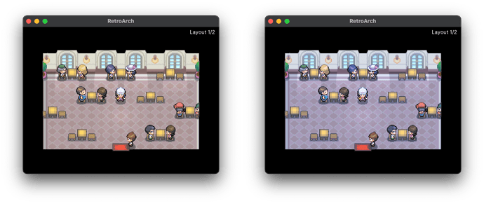
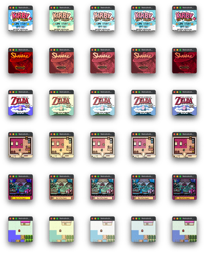
DS Lite shader comparison:

  • 1st column: unfiltered image
  • 2nd column: current RetroArch shader (based on Pokefan531’s research)
  • 3rd column: my shader (based on Pokefan531’s colorimeter measurements)

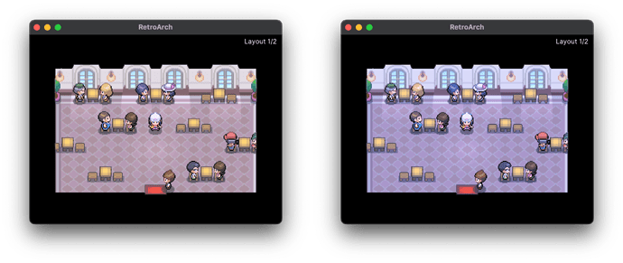
GBA SP AGS-101 shader comparison:

  • 1st column: unfiltered image
  • 2nd column: current RetroArch shader (based on Pokefan531’s research)
  • 3rd column: my shader (based on Pokefan531’s colorimeter measurements)


@Pokefan531 I think I understand how you produced the 4th image. Maybe I’m wrong, but after thinking it through, I believe those extra steps are unnecessary and actually reduce color accuracy. Here’s why:

  • From my tests, out-of-gamut colors are not common in normal gameplay. Reducing accuracy on the colors seen most often isn’t worth it.
  • Even when colors are out-of-gamut, simple RGB clipping usually keeps DeltaE < 2, with only a few exceeding 2. Results improve further if clipping is done in CIELAB space, or if you search for the color that minimizes DeltaE within the target color space convex hull.
  • Considering the bit depth and the lack of gradients in GB/DS games, you won’t lose detail (e.g., two gradient colors meant to be different will look the same).

Since handheld color spaces almost fit entirely in sRGB, the most accurate option is absolute colorimetric rendering intent (clipping).

I’d like to hear your opinion, maybe I’m missing something important.

Also, if you have time, I’d be very interested in how my updated shaders (i.e. DS Phat, DS Lite, GB Micro, GBA SP AGS-101) compare against real hardware. Unfortunately, my only test device is a DS Lite with a nearly broken screen, but even so I can see major improvements compared to the current RetroArch shader.

1 Like

There’s a reason I had done a few of those for my shaders.

As much as your method is really accurate when it comes to presenting how the displays I have look, there’s a reason I chose to do relative colormetric rather than absolute. When I was doing the PSP shader as a basic and new one back in 2015, I had some feedback here that states the whites are too bluish, preferring perfect whites. That was before I got my hands on the PSP. Since many players usually use emulators with perfect white balance, some would have an issue with the whites losing a bit of a balance. And also, when I did the VBA shader around the same year when the white is slightly cold, many seem to prefer the perfect whites as they see olive green colors pop in a little more as well as the overall tint being well balance as some here commented. And last, the overall white balance do vary between screens of the same console and model. The NDS and DS-Lite for example have a bit of different white points, which also affects the overall colorspace, but when balancing those screens to perfect white balance, the top and bottom screen seems to be pretty much identical aside from few small number difference on the RGB matrix XY values. I had users in here who mention having multiple GBAs and SPs with different overall white balance between units.

But yeah, I would love to consider having both relative and absolute where the white balance is there for everyone who prefers perfect whites, or exact replica of your hardware’s screen with its white balance. Also a random fact that you may agree or not, but when I play my NDS Phat or GBA SP, when playing for quite a while, my eyes may adjust its color temps to match the display’s color temps, which had me see how the screen looks without paying attention the display’s actual white balance. Tho random and YMMV, but you can tell me otherwise about that.

As for the clipping, I used both DisplayCal’s apps such as Synthetic ICC and 3DLUT Maker to look inside GIMP, or use the Colorimetry shader with my gamma corrected 2.2 implemented to it, and use the xy values on the shader to produce those results. I often used the latter but both produce quite similarly. Only difference was the latter option has clipped whites when the white color is not D65 as either one of RGB are clipped to preserve the luminance, so I have to lower it down. As for out of gamut colors such as the blue color, yeah I tried that for about a decade where many displays that I own could not display the exact blue color as the hardware’s display. It’s also a bit far from DCI-P3 colorspace, and even the PSP colorspace needs Rec.2020 colorspace to show its blue color. Yep the blue color being highly saturated turquoise is a challenge, so I let the tools I have currently do its job.

Btw, I’m not sure if any tools I have uses CIELAB, but you can be the judge of that.

As for the gradients, I seem to be fine with what I got for GBC, GBA, and NDS. The PSP, someday I would retest it on HCFR with more data for near black and white steps included.

So yeah I checked my DS-Lite and SP-101 on your shader implementation. They seem to hit more closely to the screen with both the white balance and the greyscale color temps. Yeah, I would prefer the shaders than LUTs as you mentioned, some handhelds may not handle LUTs depending on the size, as well as easier to load the shader without using a preset to load the texture. Although, I do think 32x32x32 for GBC and GBA would fit quite well since that’s how many colors the GBA can output. As for NDS having more depth, 32 would interpolate by the shader, but 18 bits as you mention, 64 can fit well for it. But given the LUT shaders could max at 64 or 65, it’s best to use 32 or 64 to your needs.

Also, fyi, I had decided to share my modified colorimetry to showcase how I wanted my future shader packs should be, making the process much easier while switching your display’s colorspace and switching the GBA’s colorspaces in existence. As a sneak peek, I included the GBA SP-001’s colorspace that I have right now. Sure it doesn’t have data for grey color temps, but this is pretty much white and color matrix data stored in the shader.

https://mega.nz/file/LFhgnRAR#8CV8BJIpkZqkfi7LuB4_bw90WHQ0ia-L2okteoESCWM

I just call this a beta or preview of my new generation of shaders for the displays, containing the presets of GBA hardwares as well as your display’s colorspace to see the colors well accordingly. There’s a few things missing such as those mentioned above, but yeah. Like I mentioned last time, I still would use the color-mangler for those who wants to see the code for easier read when implementing it to their projects that are easy enough.

This could be your inspiration to see how the shaders work on your end if you can fix up your shader files with the red tint as you shown. You can also take a look at other color corrected shaders like Grade, which covers colorspaces on different TVs and color temps. Yeah, I had been playing with CRT shaders using grade’s shaders that displays SMPTE-C from older CRT displays as well as playing with Japanese colorspaces with D93 whitepoints when playing Famicom discs.

1 Like

I finally solved the mystery of the red-tinted shader.

When you first mentioned the “colorimetry” shader in the misc folder, I didn’t pay much attention to the fact that the author avoided using the mat3 type. I assumed it was just due to inexperience with the shader language’s typing system.

But after seeing your GB Micro working correctly, I started to get suspicious and that led me to uncover the real issue: the multiply operator.

When you perform a mat3 * vec3 operation (and probably other combinations involving mat3 ), the shader appears to fall back to medium-precision floats. However, if you manually perform the same calculation, it uses higher-precision floats, which gives the correct output.

I’m leaving this screenshot here as a reminder for everyone so we don’t run into this issue again.

That’s good news that your shader is solved. I didn’t even know about how mat3 and floating point works, but interesting how it can achieve higher precisions.

Btw, does that code automatically adjust gamma correction to any shader? When I used the colorimetry shader for the first time, it lacked any linearization or gamma corrected adjustments, so I somehow included to be gamma corrected in the process.


As a side note, I had worked with Spotread app on Linux where it can read Colormunki Photo’s spectophotometer to see color that is non backlit. I had mixed results for GBC and GBA, as I have less saturation than what I see from those displays. That’s because both handhelds have extra layer of glass in front, so the colormunki photo has to be closer to the display to get more accurate readings. I did use the SP-001 and since the glass layer is thinner, I get a bit brighter results, and colorspace data be more closer to how I see the display’s colors. Tho, still a bit far from how the colorspace is presented when I worked on the shaders. To get much better readings, I would have to open the handheld case to remove the top layer to have the colormunki photo be literally on top of the LCD for much closer readings. Yeah, the farther the Photo is from the LCD by the screen protectors or layers, the luminance results is darker and the saturation level is lowered. So one day, I would have to open the handhelds to scan the colors that way to see if it produces better results. One thing I can say is by default, some of those unlit screens have warm color temps on the white point according to the early readings. Something like D50-D55 color temps, and GBA one that I have was about D60. Tho, each unit can vary. The only thing I succeeded was the greyscale luminance for GBC that the gamma is abnormal and gets brighter on brighter colors, so an odd curve.

Allocated most of my time for personal stuff and didn’t notice this thread suddenly exploded.

Not of much help with that unfortunately. I didn’t really check how you can turn the HCFR values into a proper shader.

I first need a test homebrew that can show the full bit depth. I was not sure how to handle the reduced bit depth of 6 per channel for DS/DSi either so i didn’t bother yet. And my 2 DS lites have very noticeably different LCDs. One has a red/pink’ish tint. The other looks neutral white. The DSi is also fine but the DSi XL has slight discoloration around the edges of the screen. I need to see if i can fix that. The going theory is this is caused by moisture trapped inside the LCD layers and it affects many consoles of the DS line.

Side note:
The implementation to generate the lookup table in open_agb_firm at runtime is already not very fast. If i were to implement full colorspace conversion with all the steps above it would slow down more. The floatingpoint hardware just isn’t super fast.

@Pokefan531 When I was doing the PSP shader as a basic and new one back in 2015, I had some feedback here that states the whites are too bluish, preferring perfect whites.

I can partly agree with this statement; however, in my opinion, this approach undermines the main purpose for which the shaders were created. Ultimately, you could consider keeping both options available so that everyone can choose the one they prefer.

@Pokefan531 the overall white balance do vary between screens of the same console and model.

This is a good point; however, before calculating a simple average of the measurements, we should probably check the screen vendor. It’s possible that color differences occur between different manufacturers, but may be minimal when comparing screens from the same one. For instance, the DS Lite has two known screen suppliers - Hitachi and Sharp. This could also explain why @pica200 is noticing varying tints across his units.

@pica200 And my 2 DS lites have very noticeably different LCDs. One has a red/pink’ish tint. The other looks neutral white

The challenge here would be determining how to obtain the screen manufacturer info and how difficult it is.


@Pokefan531 Also a random fact that you may agree or not, but when I play my NDS Phat or GBA SP, when playing for quite a while, my eyes may adjust its color temps to match the display’s color temps, which had me see how the screen looks without paying attention the display’s actual white balance.

Yes, I’ve also experienced this phenomenon while experimenting with the shaders that produced a red tint. I believe I’ve seen this phenomenon documented in some Color Appearance Models (CAM) as well.


@Pokefan531 Btw, I’m not sure if any tools I have uses CIELAB, but you can be the judge of that.

I’m honestly not sure. If we’re referring to a professional or specialized tool, it’s likely that they do, but I can’t say with complete certainty.


@Pokefan531 Btw, does that code automatically adjust gamma correction to any shader? When I used the colorimetry shader for the first time, it lacked any linearization or gamma corrected adjustments, so I somehow included to be gamma corrected in the process.

Talking about the “colorimetry” shader in retroarch, I think there’s a lot to say.

I’m not entirely sure what was its original intent, but considering our use case, yes, it does come with a number of issues.

First, as you also pointed out, it lacks essential steps such as the linearization and delinearization of RGB values. Additionally, it doesn’t account for chromatic adaptation, which is necessary when the source and target color spaces have different white points like in our case.

The shader also applies some questionable color compression techniques. While the functions are labeled as “hue preserving,” what they actually do is simply scale down the RGB values. Since RGB is not a perceptually uniform color space like CIELAB, this approach is suboptimal and it likely doesn’t preserve hue as claimed. For this reason, if accuracy is a priority and you are not working with very large gamuts exceeding sRGB, I think it’s probably a good idea to look for other solutions.

Lastly, I would personally recommend precomputing the RGB to XYZ transformation matrix to remove unnecessary overhead from the shader and use double-precision floating point values to achieve better accuracy. You can also use this website https://www.russellcottrell.com/photo/matrixCalculator.htm (i don’t know if they uses double precision but at least it’s quite simple and you can also compute the chromatic adaptation matrix)

If you are interested, I updated the 3DS top screen shader which handles both linearization / de-linearization and chromatic adaptation so you can take inspiration: 3DS Top screen shader


@Pokefan531 I had worked with Spotread app on Linux where it can read Colormunki Photo’s spectophotometer to see color that is non backlit. I had mixed results for GBC and GBA, as I have less saturation than what I see from those displays. That’s because both handhelds have extra layer of glass in front, so the colormunki photo has to be closer to the display to get more accurate readings. I did use the SP-001 and since the glass layer is thinner, I get a bit brighter results, and colorspace data be more closer to how I see the display’s colors.

At this point, we are entering a territory where my knowledge is limited. One thing I can say with some confidence is that, for reflective screens, color depends on the ambient light source. Unlike emissive displays, the colors can vary significantly depending on the light frequencies illuminating the screen.

I’m also unsure whether measuring very close to the screen is advisable, since the meter could block incoming light. However, I don’t own any of these consoles, nor do I have a meter, so I can’t make a definitive judgment.

Despite these limitations, I’m very interested in the results. If they are reasonably accurate, they are certainly better than having no data at all. I’m not sure if you can generate an HCFR CHC file using the spectrophotometer, but even raw data in a text file would be very helpful.


@Lorenzooone I’d like to know, from @pica200 ‘s files, how could I get the values needed for a shader to recreate the colors of the 3DS’ screens? Thanks a ton for any answer!

If you’re interested, I’ve created a 3DS shader based on @pica200’s CHC files. You can find the shader here: 3DS Top Screen Shader

If you want to extract the data yourself, you’ll first need to install the HCFR software. You should obtain:

  • XYZ coordinates of Red, Green, Blue, and White: You can get these directly from HCFR, but note that they are approximated values. For more accurate data, export the measurement report (available in my GitHub repository here). Once you have the coordinates, you can convert them into xyY and create an RGB → XYZ matrix. Bruce Lindbloom’s website (link) is a helpful reference for all the math involved.
  • Gamma values for Red, Green, and Blue channels: Open the “Gamma” tab and enable individual channels; by default, only the average gamma is displayed. These values are also included in the shader linked above.

For your first two replies, yeah it’s also why I wanted two options for either Relative or Absolute Colorimetric intention on the shader. Fun fact, before 2023 or 2024 releases, I used to have white balance on my shader to use the white point from my handheld displays, which could be considered absolute at its closest, without the greyscale color temp adjustments. I removed it because I thought no one would be interested in using it as well as the variance of each unit’s displays. But with your help and all, I am willing to include the absolute method, this time being better handled going by your current shaders.

And yeah I am aware of different vendors of displays. The Sharp and Panasonic displays have a bit of differences, but as new handhelds go, it becomes less different aside from quality. As more recent example, the switch has lots of vendors of displays, and with a lot of data I found for the switch, the standard model, it all aims for sRGB colorspace with Pure Power Gamma 2.2, with more consistent color temps on greyscales. But yeah, more data for older displays like the DS line is good to collect. I only have the DS Lite that was brought in August 2010, and screens are somehow still in a good condition, no yellowing whatsoever.

As for the CAM you mention, yeah I also encounter that on either real display or shader. As I do prefer using Relative personally, I wouldn’t mind including the absolute if anyone wants the absolute representation to see the accuracy and effect of eye color temp adjustment. One interesting thing in my experience is the adjustment only seems to happen to me on NDS, SP101, and Micro, but not on D93 white point when I used Grade’s shader for NES or PC-Engine games, since the white point is far enough to notice it constantly, but an interesting thing to see.

As for colorimetry shader, yeah that’s more of a basic colorimetric shader as you noticed. Interesting take you got there for chromatic adaptation as I didn’t know much about it. That’s something I should learn when adjusting colorspaces for primary colors to your display, on either relative or absolute. As much as I only have basic shader coding, since you got more experience with the transformation, I’ll let you do the honors. But yeah, my modified colorimetry was just moreso a concept of what I wished the shader should output with your display’s colorspace to the handheld’s colorspace. Tho, I don’t really use options such as darken or desaturate as it affects the image quality on some shades. It’s why I lowered the white luminance to prevent clipping on other colors. Being around 245 out of 255 ain’t bad, just to show correct yellow color without RGB clipping. The blue color clipping out of gamut is a different story.

As for GBC and reflective displays, and colormunki photo, I finally found Spotread app from argyllcms that actually uses the photo’s lens to sample colors from surfaces without a light. It has its own light inside the spectrophotometer, which was how I got the pre-results for GBC and SP-001 displays. As for removing the cases and the layers, it seems challenging when I see clips of disassemble each handheld. GBC seems to be the easiest, but for GBA, I get concerned on the sticky surface that holds the screen from the bottom of the screen glass. The SP has the screen glass layered on top of the LCD rather than the case holding the glass, and you would need to peel it off to have more reading performance. On top of that, for SP-001, it has another glass layer where the frontlight is active on, so that’s something I would have to consider and think before I decide to disassemble, along with the tools I do have around me. I’d do GBC first later on. But yeah, the more closer the Colormunki Photo leans to the LCD, the better results I get.

As for @pica200 , your 3ds shader implementation is also what had me wanting to keep doing the color-mangler based shader that I always use just for easy coding for portability. Yeah, I imagine the shader coding needs to be more simple to at least render. That’s what Extrems said to me long time ago for implementing the shader to Gameboy Interface on GC. As for your DS-Lite, I only found a partial solution, I did see a couple of videos leave the screen on for a few hours to reduce the discoloration and the yellowing that those DS screens suffer from when it’s not in use for a long time. And yeah, I’m also looking for a DS homebrew coloring app to use full depth as well for even better HCFR data.

Almost forgot. I have a good phone camera now which is capable of capturing the SP’s frontlit screen somewhat accurately.

The color temperature difference is a little bit exaggerated possibly because of the left frontlight bleeding more but the right (new) SP really does have that much more clarity. It’s much better.

Make sure to view the picture with software that properly handles ICC profiles both of your monitor and the picture itself. It has an embedded Display-P3 profile. Additionally it’s a 10 bit HDR picture. Unfortunately not many viewers support UltraHDR JPEGs yet.

Interesting. Yeah, the frontlight glass can vary in quality, mine is ok, but it does have a reflection bleed from the screen to go by around 4 pixels up. When I used my RGB portable light to hit it from the top angle, it doesn’t show the glass bleed.

But yeah, I did the whole procedure on grabbing the color data again on the screen’s colorspace. The red is slightly less saturated than the GBA one I had that has the sharp display. The red’s color temp is nearly as cold as the GBA screen’s. Although, the white balance on the screen that my colormunki photo read showed the white point being warmer, like past D55, and seeing the screen like that myself, as well as the frontlight layer also showing the white point when viewing it, it does add the reason the red color is just warm than how it’s usually looked when having the white balance match your calibrated display’s D65 white point. It’s something on how those displays are warm by default it may be the reason there’s some users saying how cold and less saturated the red colors look, as I had both GBC and SP-001 being a warm temp overall that shows the primary colors being in a warm state when viewed with a warm white point. I can guess on those reflective displays the primary colors, especially the red color, may be made cold to accommodate the common warm temps the white points are on a lot of those displays. I know each unit do vary the white balance, as my GBA one isn’t as warm as GBC or the SP.

I can give Brankale an input on this on how those displays work, and how it would work if the sampled colorspace with cold reds are handled with chromatic adaptation and stuff, both on absolute and relative renditions.

Hi again, it’s been a while since my last post.

I did some research on how to handle white balance to correct variations between different console screens and found something I didn’t fully understand previously.

The chromatic adaptation step used in my shaders actually alters the console’s screen colors but in a clever way. It models the eye’s chromatic adaptation, which is how the brain perceives the same color under different white points (aka illuminants) and under the assumption of full adaptation to the display’s white point (i.e. after you look at the screen for a bit).

Full adaptation may not always hold in real viewing conditions, especially in mixed lighting conditions but, since we are talking about very similar illuminants (at least on the already measured consoles), it should not be a problem.

So we can say that chromatic adaptation doesn’t achieve absolute color accuracy, but rather perceptual color accuracy and also offers some benefits:

  • Produces a more neutral grayscale, helping to fix screen tinting and temperature issues (see the image below).
  • In my tests, it often reduces out-of-gamut colors and lowers Delta E errors, likely because it brings colors closer to the display’s white point, reducing RGB clipping.

However, since this intermediate step changes the colors, I added an option in all shaders to disable chromatic adaptation to get absolute color accuracy for side-by-side comparisons with the real console’s screen. This can also solve issues where chromatic adaptation (or white balance for simplicity) is not desired like this one:

@Pokefan531 Although, the white balance on the screen that my colormunki photo read showed the white point being warmer, like past D55, … It’s something on how those displays are warm by default it may be the reason there’s some users saying how cold and less saturated the red colors look, as I had both GBC and SP-001 being a warm temp overall … I can give Brankale an input on this on how those displays work, and how it would work if the sampled colorspace with cold reds are handled with chromatic adaptation and stuff, both on absolute and relative renditions.

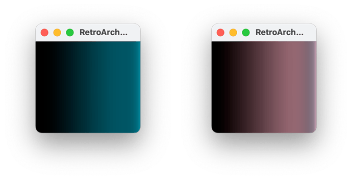
Example on the Gameboy Micro shader:

  • Bottom Left: chromatic adaptation OFF
  • Top Right: chromatic adaptation ON

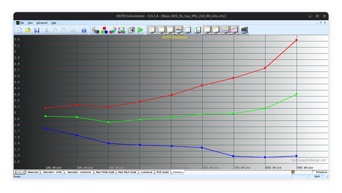
It’s important to note that white balance can also be achieved by using the same gamma for all channels. For example, if red = 2.5, green = 2.2, and blue = 1.9, the result is a bluish gray. Using an average gamma of 2.2 (an oversimplification, not the correct way to calculate it) would yield a neutral gray.

However, averaging gamma values is not recommended, as it ignores how displays handle color. Since many older consoles have distorted gamma curves (as shown below), this method can produce significantly different results, as illustrated in the next example.

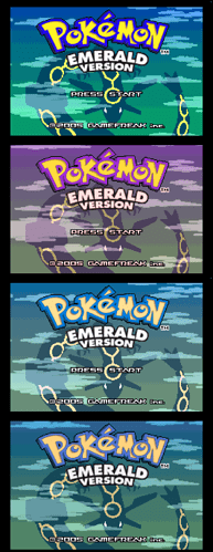
DS Lite shader (with chromatic adaptation):

DS Lite shader (without chromatic adaptation):

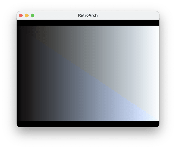
New 3DS XL screen gamma:


@Pokefan531 As for GBC and reflective displays, and colormunki photo, I finally found Spotread app from argyllcms that actually uses the photo’s lens to sample colors from surfaces without a light.

This is great to hear! With a controlled light source, we can actually obtain accurate measurements.

Do you know what kind of light source the spectrophotometer has? is it D65?

Also, do you know if it’s possible to change the spectrophotometer’s internal light? It would be awesome if we could measure how the console’s screen reacts to different types of light, such as illuminants A, D50, D55, D65, D75, ID50, and ID65, which replicate incandescent, daylight, and indoor lighting conditions. I don’t know if this operation can also be done through chromatic adaptation since the screen is not emissive.


@Pokefan531 I’m also looking for a DS homebrew coloring app to use full depth as well for even better HCFR data.

Do the screens of the DS Phat, DS Lite, and DSi really have 8-bit color depth? Using MoonShell, I can only see 6 bits but it might be a software limitation. Most sources online also claim they are only 6-bit.

That’s a great research. I tried your shader last week, and so far it hits pretty well for me. Although I was gonna question your gamma works, but since you added more options involving chroma adaptation as well as the gamma as shown, I’m interested to test it again. The DS Lite matches more closely to the fourth pic when I test it again, it seems more closer than last week’s commit. It is really amazing so far.

As for your question on the spectrophometer, it only has one light. Although it seems to still do wonders for me.

I did get the tools delivered to change the case for the GBC. I did scan the screen more directly without all the additional lens and stuff. It still shows smaller gamut, but 50% more higher luminance (Y) on the scans. When the Colormunki Photo scans the screen, not only it scans the active subpixels, it also scans the inactive ones at the same time, resulting a mixture that becomes a smaller gamut than what the screen actually displays. Lesser on Yellow, Cyna, and Magenta colors as it fills more subpixels, but still a smaller gamma and gives the gamut shape have a little bit of hexagon shape on the graph.

However, I did my attempts to solve the issue, as well as the fact scanning the LCD more closely helped more on the data I can have. I put white, black color (as it shows non-zero as it shows lighter black color), RGB, and YCM on GIMP when setting HCFR to rec709 with pure power gamma 2.2 to show the result colors as is. In GIMP, I used Levels to clip both the black color and white color to pure black and pure white, with linear mode, which gived me promising results on the fullest chroma data. I then made ICC profile out of the HCFR data to give off the output for the main colors by creating an LUT texture. I blend the given LUT on the main colors with the layer I used Levels on to blend with LCh Color that gived me the exact colors that somehow better matches my GBC than just eyeballing it. I matched it with my current shader (color-mangler method) to test on the GBC, and it seems to hit more closer than any eyeballing methods I tried. It ends up being a bit less saturated than the latest public release, but good news! The red color is not as cold as it was on many previous releases. Thank goodness for all this research and new method to fix the mess of intolerable red color that looks cold and a bit pinkish, that can be completely put to rest forever.

As for the greyscale, HCFR doesn’t even scale the 0% black to be black with the rest of the greyscale to show internal gamma. It looks very bright on the whole gamma even though it shows gamma at 0.8 and contrast as 4:1. Although I see more contrast on GBC when shooting actual lights to the screen, but yeah, the gamma on all 32 values looks way compressed as I want to see it scaled. So far I can only do the Y value to do some math for its luminance to put on GIMP as 16-bit integer for better scaling. However, it does show good results, I wanted to see the actual full scale just incase. But overall, I had to solve the colors with just what I can do for both the chroma and the greyscale.

So yeah, here it is, the GBC HCFR data, despite not showing its full potential due to its limitations, but doing some math like I did may solve it. My method of solving it can vary as I’m still researching on how to get full potential of the display from above methods.

https://mega.nz/file/LY4VwbZa#aPRbCJf-pMkw8IwcBE7H0NHL8PZPlrBrB7fT_1QoQOE

And yes, the GBC display is overall warm, like D55 or D50 warm, as that’s how the screen is. It is overall warmer than the GBA I have laying around. The gamma and its color temps is more challenging than the primary colors overall so far.

Edit: To answer about your NDS bits question, I don’t know actually as I never tested a reliable homebrew that shows actual colors. In moonshell, I noticed it uses dithering for both images and video, so back then I thought it was same as GBA being 15 bit, but then you mention 18 bit being the actual one. So I pretty much wanted to check if anyone made a homebrew that’s much like 240p test quite from other consoles.

Edit2: Instead of doing all that for my method, I found a better one. Not using ICC or gimp to scale. I’ll be using the graphs in HCFR to scale black and white to 0 by 1, under its RGB values, as it’s stored linearly inside HCFR. I did my concept of scaling black and white to show off true colors, and it turns out with favorable results, if not better than my previous method. I simply did this (Value-Black) / (White-Black) for each RGB values. After I am done for each RGB scaling, I put those scaled numbers in HCFR and got its fullest colorspace from it. So far, it improves quite well each time. So yeah when scanned from the unlit displays, it would need to be scaled from black to white along with color primaries and even secondaries. With this, I no longer get a hexagonal shape in the graph, pretty much triangle. As for the greyscales, I can see if it helps out, but I can scale the Y value in much the same level as I did for RGB.

1 Like

Updated CHC to include GBA and GBA-SP 001 displays. Removed the previous GBC chc data for this.

https://mega.nz/file/SUxgwazR#OyUNaw3_dsUzEekQ-5o1IqAXS19zd_nBwH-WxhM3ogc

I fixed GBC’s white color data on its color page to be the same as from greyscale. The blacks for all of them were rescanned when entered Solid Color Screen from 240p test suite, as the colormunki photo somehow has got slightly brighter on black colors when I finished the greyscale swatches, but still at the moment with bright colors such as white, red, green, blue, yellow, cyan, and magenta. It’s why the black color in color page in hcfr is slightly brighter than in greyscale as the instrument itself stayed at the black color for quite a while before starting to scan. Also the greyscale is handled well generally, but the GBA’s greyscale measurements are a mess on the first 1/3 of swatches due to a noisy nature of the spectrophotometer when sampling a dark area that’s below 0.3-0.4 Y luminance. But the data for color primaries and white color are not affected by it, as they’re bright enough. The GBA SP is somehow brighter on the data due to the screen being thinner for the colormunki to take a more closer look.

Maybe I may reshoot the GBA on another day for better darker swatches, but pretty much the colorspace seems to work completely well. For all those unlit displays, it’s all compressed because of how the colormunki photo and other instruments samples colors with both active and inactive subpixels that really gives off weaker and compressed colorspace that it’s not supposed to. So what I did as stated was use the black data and white data to scale each other for each RGB value in HCFR by 0-1. It decompresses the colorspace and fully shows all those colors to their fullest just by having the black and white scaled for each of their RGB values along with the color primaries and secondaries. Done that for GBC, GBA, and SP-001, and totally got the full picture of how their colorspace and luminance looks like. I just take the xy values on scaled data to HCFR and use on modified colorimetry to see how it looks. Also, I did try scaling XYZ for both black and white, while the white scaled by (0.9504,1,1.0889) for D65, I get uneven results and mismatch on how the real displays looks on the colorspace and their color luminance, so I find scaling given RGB a better approach. And also, RGB in HCFR is stored linearly, which means putting the same values to GIMP requires gamma correction to 2.2 to see it correctly.

Fun fact, remember in 2023 when I was caught using non-gamma 2.2 for NDS shader and few other ones? Yep that’s because I find the 2.2 one a bit less saturated than how the real displays looked. Turns out you need to work fully on the data to use full black and white inputs to scale the whole thing to your monitor to truly show off the input data’s saturation levels to present the NDS screen quite faithfully. Yep, even for a 100:1 contrast ratio screen , since it’s not a huge contrast and dated in today’s standards, even a colormunki display or photo can still blend active and inactive subpixels together, and since inactive subpixels on a backlit screen still emits light, it’s still included to the instrument. So for any input data, it has to scale completely to the host display to fully show the whole colorspace. HCFR doesn’t automatically scale them for you even if you have non-zero blacks on the data. Although for modern displays that uses at least 1000:1 contrast ratio would have barely a difference, they may still be scaled on some programs.

So yeah I scaled the NDS RGB in same manner as the GBA, and it did what I thought it would. The saturation level for color primaries now matches to the NDS Phat and both looked pretty much identical, aside from the white temperature since I scaled them all to D65 as that’s the temp I set in HCFR.

I’ll keep an update to the greyscale situation for any of the three profiles.

2 Likes

Here’s a recap of the last week research on @Pokefan531 GBC screen’s measurements.

The shaders I’ve developed until now assume a property that holds for emissive displays: mixing two colors corresponds to summing their XYZ coordinates (e.g., Red + Green = Yellow ⇒ XYZ_red + XYZ_green = XYZ_yellow). However, this assumption is not guaranteed for reflective displays like GBC screen.

This discrepancy can explain why HCFR’s CIE Yxy diagram shows a hexagon rather than the classic triangle for the GBC. As a result, the current shader logic for emissive displays does not apply to reflective displays like the GBC (summing XYZ coordinates does not yield the expected color). In addition HCFR reports very low gamma, which produces a completely washed‑out image.

However, as @Pokefan531 also noted, I was concerned about the very low measured brightness (only 1 cd/m2 for white) so the first step I did was to subtract the black XYZ coordinates from all measured color patches. Fortunately, this restored the XYZ additivity property, allowing us to proceed with the current emissive-screen shader logic and forget about the odd hexagonal shape in the graph.

Since all XYZ coordinates changed, the next step was to recompute the gamma values (the HCFR-based ones are no longer valid). Here’s where it gets interesting.

By using the additivity property we have that XYZ_grey(x) = a·XYZ_red + b·XYZ_green + c·XYZ_blue. Once a, b, and c are determined, gamma_red = log_x(a), where x is the grey intensity (0 = black, 1 = white). The same formula is used for the green gamma and the blue gamma.

This approach lead to these results:

This initial implementation performs poorly: the blue scale is overly dark, and magenta exhibits distorted blue hues in highlights, as shown in these images.

The second implementation differed slightly: I first scaled the primaries’ XYZ coordinates to the white point, then recomputed the gamma values (the formula is XYZ_grey(x) = a·XYZ_red_scaled + b·XYZ_green_scaled + c·XYZ_blue_scaled). This method yields results that closely match HCFR’s gamma calculations.

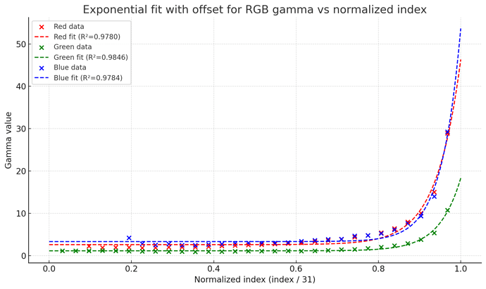
The results are the following:

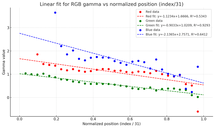
Now the gamma values are quite unstable (even for very similar colors) and some cannot be computed because the logarithm is undefined for values ≤ 0, resulting in poor-looking gradients.

Therefore, I chose a linear fit for gamma (the dashed line in the graph), which resolves the issue, as shown below.

But now let’s forget about math and and let’s see the results:

  • 1st column: raw image
  • 2nd column: my shader (chromatic adaptation OFF => equal to the console’s screen)
  • 3rd column: my shader (chromatic adaptation ON => adapted to neutral D65 white illuminant)
  • 4th column: i guess it’s @Pokefan531 LUT table derived shader (/shader/handheld/color-mod/gbc-color retroarch shader file)
  • 5th column: gambatte shader

If you are interested you can find the experimental shader on my GitHub.

Conclusion

I’m not quite satisfied with the results:

  • There are too many approximations.
  • The shader appears low in contrast, but I can’t confirm without a Game Boy Color. Increasing gamma might help, but it’s yet another approximation.
  • On reflective displays, reflected color depends on the ambient illuminant. My shader relies on @Pokefan531’s spectrophotometer’s internal light, whose illuminant is currently unknown.
  • The XYZ primaries’ scaling factors were unexpectedly odd (some negative or near zero). They should be ~1.0. This likely explains why the derived gamma values are harder to handle than on emissive displays. As @Pokefan531 mentioned, this is likely due to the spectrophotometer’s difficulty measuring very low luminance values.

Next steps

  • Measure individual R, G, and B channels gradient instead of just the greyscale to more accurately derive gamma. @Pokefan531, is this possible with the 240p suite? Separate CHC files per channel are fine if you can’t pack them into a single file.
  • Analyze the new GBC, GBA SP AGS-001 and GBA measurements of @Pokefan531 to check if they have similar issues.
  • Explore alternative methods to improve accuracy further:
    • @Pokefan531 mentioned the spectrophotometer measuring both active and inactive subpixels.
    • Improve RGB gamma math ???
    • Improve greyscale XYZ to RGB gamma calculations ???

A lot of weird things happen when I scan the screen that way, moreso directly to the LCD without any case glass on top of it. It was the best I can do. So I had to do tricks in order to grab the data much closely. I had someone who tried to find RGB gamut by clipping black and white’s values to 0-1, except the white being scaled to D65 ones (0.9504,1,1.0889) to reveal. It looks odd to the primary colors as I stated previously, as the blue color on the SP when scaling XYZ has the blue color go way past even rec 2020 which looks unrealistic to what I saw on the SP 001 screen. So my better solution that rally solved all three LCDs constantly is to instead use the RGB values from the HCFR (under Rec 709 Gamma 2.2 and exported from csv) to have the black and white be scaled 0-1. HCFR’s RGB data are stored linearly than actual post-gamma correction. I used the black data from the primary page as I scan the whole primaries just after the greyscale, as when I finish the white color, the colormunki photo somehow is slightly bright on the lens when it just scanned a bright color on a very dim space, but it still samples the white, black, red, green, blue, yellow, cyan, and magenta consistently with very low deviations.

Regardless, it does sample the luminance of the greyscale consistently, as I have that banding issue on the real display too. All I did was to only scale the Y value to 0-1 for the primaries to find its xy values which worked out well. Yeah I scaled it to D65 that way, but the warm white color is pretty much how the GBC looks. Not sure about the dark blacks tho, as that’s another issue I have yet to find out to see its full contrast ratio. But yeah, any instrument can scan color primaries including with inactive subpixels, which even the emission LCD displays has that treatment to both my Colormunki Photo and Display. It was why when I mentioned that about the NDS that it also shows same level of saturation when it’s done that way when comparing the shader with the real display. Of course you can still preserve the white color temperature just by scaling the RGB value down to 1 together instead of each individually, and have your own white values preserve its color temperature while the black one is clipped. It’s the way how to read the chc data’s full input color from its black to white to see how it looks.

The color primaries are solved that way to fully see the colorspace of the LCD. The greyscale can easily be read by its Y value scaled. I even take data from RGB to put onto GIMP before I apply gamma correction and remove saturation after clipping black and white swatches, and get the same luminance results. The problem the screen shows when scanned that way is it somehow scans the gamma at its brightest, so a really bright gamma when it comes out that way. It could be due to how pixels in those reflective displays work on how it perceives the light in order to be lit on different degrees than typical LCDs. It also has different gamma depending on what angle the light shoots to the screen from top, middle, or bottom. Left and Right angle doesn’t matter, but upper angle makes the screen with higher gamma and reverse applies too on lower angle. I ended up using the GBC test suite to use pure black and white horizontal stripes on the motion blur page to check each swatch to find out its gamma by squinting my eyes to blend the horizontal square to see if it blends, and that’s how I find the gamma for it, which I just simply tone the gamma on the scanned gamma inside GIMP and that’s how I figured how its gamma pretty much matched on the whole thing. Even the GBA’s data did the same thing except with a darker gamma by default when scaling the Y value to see how it looks. It has a reverse effect on the gamma works on the GBA by light angle, mostly because of how GBA layout is BGR than GBC using RGB, so the whole screen is rotated 180* angle since the subpixels literally is also rotated. It’s also a gamma I have to solve, except I somehow poorly scanned the greyscale as I haven’t opened the case yet, but I did with the SP as it was easier. It somehow reads the luminance better like almost 5 nits, so figuring the gamma is less of a hassle. Except the very dark colors have a blue tint, which I don’t know why. Tho it concerns me if I left the frontlit on, but it seem impossible since I took out the frontlit glass layer out when I scanned the screen directly, so it wouldn’t shoot lights on the whole screen. Although because of higher read nits than GBC or GBA, the gamma seems to look more closer to the screen overall, and despite the tint on the blacks, clipping it with the whites to find its colorspace still completely matched with the screen.

As of finding out the color temps, I can still solve it by simply scaling the white to D65 on either RGB or XYZ to find the color temps of each swatches. I put them in GIMP and was able to use LCh Color to blend them together, except the SP due to blue tint on darker colors. For GBC and GBA, it was pretty easy, as I just blend them to the gamma ramp to see how it looks. It seem to match the middle and brighter greys quite well, but the darker and the black swatches looks too saturated for how it looks compared to the rest of the greyscale. What I did was play with the averages for GBA gamma by adjusting its RGB gamma each. I was able to have the middle colors match that way while the darker colors blend to the black color pretty good, if not better and matches much more closely to the GBA screen.

So at the end, I really find the greyscale and gamma pretty difficult to solve, but possible based on those experience I did, and still in wip for a scaled look. I spent a week solving the whole situation on the greyscale, with both ups and downs of course.

As for the next steps, the test suite can measure RGB gradients, but I do have issues when opening up the GBC case as I put a new one that makes the battery metal pad tighter so it’s harder to remove. But overall, I can easily solve the color primaries by RGB scaling, and greyscale color temps by RGB or XYZ scaling, and luminance by Y scaling alone. Although I can rescan the GBA without the case someday while trying to average the swatches by multiple data on black swatches to get better reading.

1 Like

Well the results look good at least, even if the accuracy is questionable. How well do you think the screens align with each other in tolerance? If you only have measurements from one screen, may not be too helpful if another screen has a strongly different result.

The screen gamma is also sensitive to viewing angle, and different colors present a different viewing angle. The spectrophotometer’s light source and sensor cannot be at the same angle, so is there any possibility for that to have an effect?

I have an R script that can calculate RGB to XYZ matrices:

https://github.com/anikom15/scanline-classic/blob/master/tools/colormatrixcalc.R

Sorry if I missed it. Have you done work on the monochrome Game Boys?

1 Like

Hi @anikom15

With “the results look good at least,” do you mean the shader don’t look too bad in general, or that it’s pretty close to the GBC display?

For the tolerances, unfortunately screens vary by manufacturer, production tolerances, warm‑up behavior (likely irrelevant for reflective displays), and aging/exposure, which can shift colors. I can’t confirm how different Game Boy Color screens compare to each other because I don’t own one, but notable unit‑to‑unit differences are likely (I can’t say exactly how much); the same goes for other consoles. I have some examples which has been reported on this forum thread on my github but they are just for the GBA SP. Always on this forum some users reported differences between different 3DS and NDSi display units.This is why collecting multiple measurements for the same console is valuable: it helps design an appropriate shader and determine whether differences are primarily due to the display manufacturer or other factors. We can also create multiple shaders based on the most relevant factors, such as the panel manufacturer.

About the spectrophotometer’s sensor, I can’t comment definitely because I don’t have the console or the instrument. We could ask @Pokefan531 whether rotating the spectrophotometer changes the readings, since he mentioned that higher incidence angles yield higher gamma. If the readings don’t change, we can assume the light is effectively perpendicular or that its angle effects are negligible.

For RGB to XYZ conversion, I have a script in the math folder on github that uses the Python colour‑science library. I haven’t promoted it much because I’m still iterating, but I plan to add clearer documentation so the matrix, gamma, and related steps are reproducible and accurate even without this library.

Regarding monochrome Game Boys, I don’t currently have data for them. Most measurements so far are from @Pokefan531, with a few from @Pica200. They both have the consoles and the measurements tools which I don’t have. You can ask them if they have those consoles, but I don’t think so from what I remember.

1 Like

I always have the Colormunki Photo literally placed center at a flat angle, meaning it lays on the metal side of the LCD screen while the screen is getting scanned from it. The gamma and all are pretty much compressed depending how much nits it can measure.

I did rescan the GBA one without the case for direct measure and got better results. I did scan each swatches three times to average them, which took a while to do. I did end up having more better results than my last attempt when it was scanned with the case. The only tricky part was to reverse the black compensation for first couple of grey swatches when putting them up on gimp or calculating them when trying to uncompress the gamma from the scan. Same with the SP scan, except I somehow solved that issue because it has slightly more nits when it was scanned. Despite that, I used the black data from the primary page and it totally improved by a lot. The gamma ramp on the GBA and the SP looks very similar to each other when I looked at both, as well as the test suite blending the black and white stripe square with grey 24 at motion blur section when I squint to see it blend, as well as grey 10 blend with black and grey 15 stripe, and at grey 26 with grey 15 and white stripes. This was shot at the middle light angle, and even the SP’s frontlight shoots the light that way internally from the glass layer, produce the same results. At the end, they can look slightly washout on the gamma ramp part, but that’s how both the GBA units I used for this looks.

Like I said for the GBA-SP, somehow my measurement on the color temps or xy values from black to grey looks colder than warm white above, which doesn’t match the greyscale color temps that I see at the real SP screen, from the frontlight or the portable light I use. I may revisit scanning them one day, but it was challenging to open the SP’s screen case and remove two glass layers since the last time I tried it, I ended up having dust inside it when assembled, as I lacked few materials for it.

As for my shader progress, I had finished the shaders and updated them, including the gamma shaders, which as previously stated, no longer use LUT shaders to do them. To summarize, I had updated all values for the colorspace part for GBA, GBC, SP001, SP101, Micro, NDS, DS-Lite, and PSP on sRGB, DCI-P3, AdobeRGB, and Rec2020. NSO-GBC needs its gamma ramp shader to look correctly.

The reason why I separated the gamma and shader for the next update is because of stuffs like LCD shaders where a gamma change can affect the LCD grids if placed on top of it, and it wouldn’t look right. It would be the best to place the gamma before any LCD shaders that use RGB subpixels is loaded, then use the color shader on top of it to fully emulate how the LCDs truly look. Also, only GBC and GBA has gamma toggles to when to use the gamma ramp or not. I still have to update the slang presets to direct the shaders to a right location before I publicly post them with a link.

Edit: Here is the update shaders that’s finally out.

Currently, I don’t have the reshade textures up yet, but will soon be up.