Show your current theme!

Many people are working on their own icon sets, or wallpaper sets. RetroArch allows to change the system font, and the background shader. It also supports per system backgrounds and static backgrounds.

I’m often surprised when I see screenshots of RetroArch from the members of the community, so I had the idea to create this topic to see more setups.

5 Likes

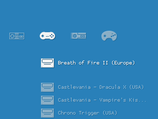
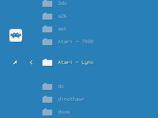
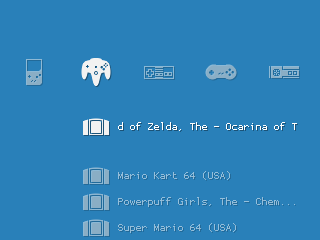
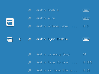
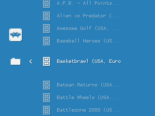
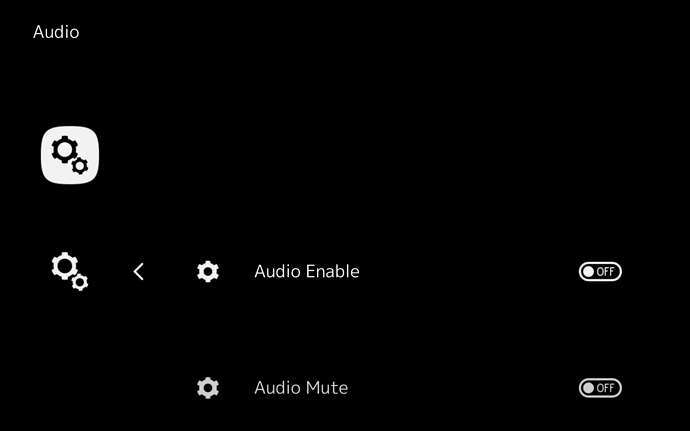
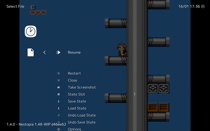
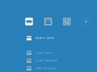
The theme I’m creating for Gamegirl.

Icon theme: Pixel, a 32x32 monochrome pixel perfect theme Wallpaper: a united background color Font: the default pixel font of RGUI Shadows: yes, to increase readability Boxarts: no, not enough room Special constraints: it’s for a handheld console, the screen is super small 320x240

5 Likes

Looks great!

How do you load themes like this? Do you have to manually set aside the default assets and drop your own in their place? A unified themes selector would be kind of handy for general users, and would encourage more creativity like this.

1 Like

Well, each XMB theme is primarily an icon theme. But they also come with a default font and static background.

Then RetroArch lets you override the font and the background, and lets you enable or disable shadows.

There are 4 kind of backgrounds:

  • the default one provided in the theme
  • a background of your choice, located on your disk
  • a dynamic background theme, the background will change when you browse horizontaly, per system
  • an animated background like the ribbon or the snow (but animated backgrounds let you choose one of 10 predefined gradients)

Now to develop your own theme, just choose “Custom” in Menu Settings -> Icon Theme, and create a folder called “custom” in your assets, and place icons, fonts, and backgrounds there, replicating the hierarchy of other icon themes.

I love this Bokeh animated background. It would be even better if we could make it react to the horizontal scrolling, like a subtle parallax effect.

2 Likes

Thanks for the guide!

12 Likes

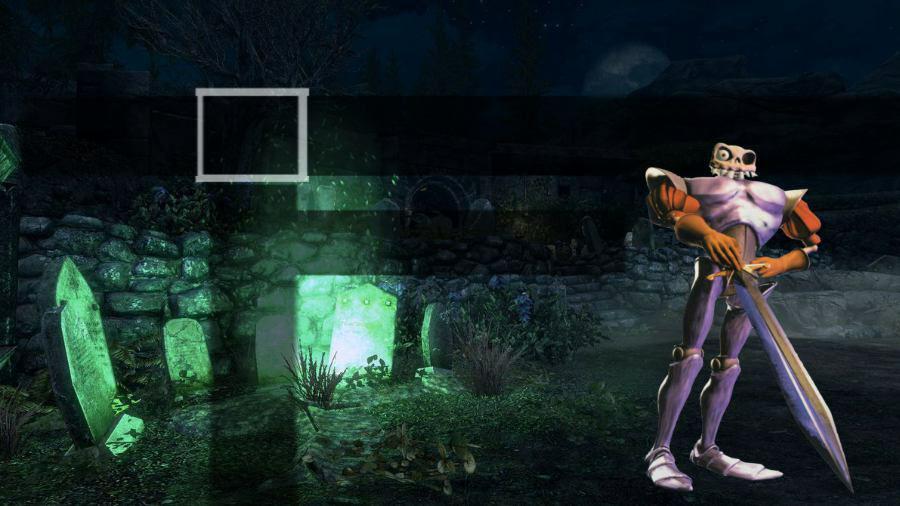
thanks, now I know how to create themes, try to make one of “Medievil” is one of my favorite games and I found out long after he left for never had a PSX. The truth is that I did not have game consoles, I enjoy the games today thanks to retroarch.

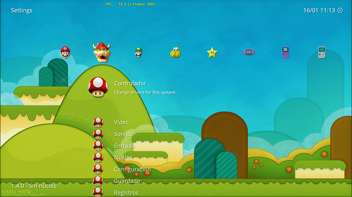
Very nice mario theme @Renetrox

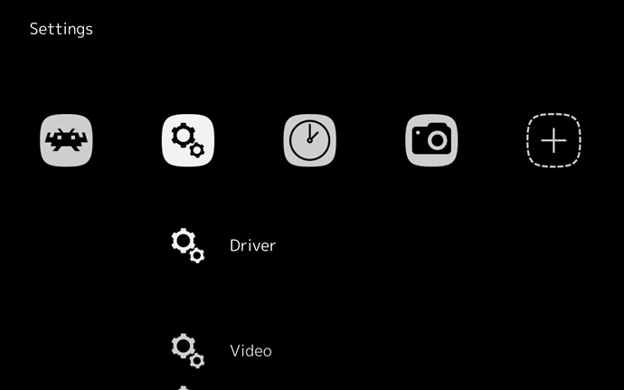
This is a high contrast theme I’m working on for visually impaired people:

2 Likes

That’s just the usual theme with a black background, right? My RA looks like that using 1x1black.png as the background, mainly so I could see through the menu nicely while a game is in progress.

I force the psp layout, which is a special layout in xmb where:

  • only 5 icons are displayed horizontally
  • the active icon is the second from the left, instead of the third from the left
  • no sublabels are displayed

I also set a scale of 125 here.

Sadly it was not enough for the guy to be able to read the screen. He’s able to play some games however (I wonder which ones). So he sent me some links about accessibility and it looks like a difficult thing to implement well.

A black-and-white, no-checkerboard-background version of RGUI might be more accessible, though obviously less attractive.

If rgui used a “pixellate”-like algorithm instead of regular bilinear when upscaling, it would look nicer.

This is what I use on PS Vita:

After taking the pics I disabled the core name (gets cut by playlists) and the time (seems to not regard my gmt config), and it looks even cleaner.

The dynamic backgrounds you’re using are not bad

Disabling the core name seems like a good idea in general.

I really like Systematic (REALLY), but was curious about how custom themes worked, so I decided to try to do something quick. This is the result:

There are many things that can be improved (removing small text, first of all, and there are some inconsistencies), but I was pretty satisfied. Using only the logos, without a frame would make me go crazy.

Of course after this I went back to Systematic. :slight_smile:

Edit: sorted most of the problems I had with it and uploaded them here:

(lots of copyright infringement, so use at your own risk)

2 Likes

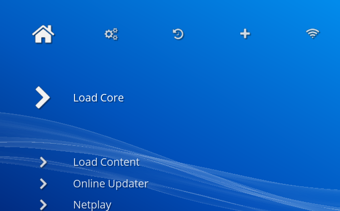
RetroArch Font-Awesome Theme… Was curious what the Font-Awesome icon font would look like in RetroArch. Turns out it works pretty well on top of Monochrome.

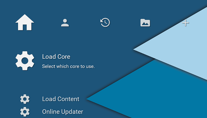
RetroArch Material Design

This is nice but “Material Design” is not just a “material” wallpaper and icons. It’s also about the way things move, animations and stuff.