
As for the CRT it appears this cabinet is a rebadged Taito Egret 3 which you can read about here:
3 Likes

Love me some deconvergence!
2 Likes
It’s a former Taito Cabinet turned into Atomiswave, running a CPS 2 game?
2 Likes
Is there a way to avoid blurring the individual triads while adding deconvergence? Maybe @guest.r knows?
In the CRT shot you can still see distinct RGB phosphors but they get blurred together in the LCD shot.
From what I can see in the crt shot, deconvergence is something that only happens at the edges of objects(?)
For some reason the vertical lines are emphasized more in the LCD shot, as well.
3 Likes
Yeah that really shows off the beauty of the CRT, the phosphors that are partially lit and fading out really smoothly and in some cases into super fine spikes. Probably gonna need 16K to get close to that.
Well no, it’s just that the colors aren’t all perfectly aligned over a given part of the image, but you only notice it at the edges where it runs off by a certain amount. You don’t see it in the middle cause they’re already overlapping there anyway. I’m sure there’s a far more technical way to describe it though.
Yeah it seems like the signal is way too sharp, as if it’s not using the right type of NTSC pass or something. Also noticeable on the red parts on Cyclops, and the black lines between the yellow and blue on his thighs turning into hard stairs. I know arcade monitors would be getting a cleaner signal than consumer TVs (they’re RGB or VGA or something, right?) but I think it’s still much different than just passing the raw pixels through. Although I could be completely wrong and it’s from something else entirely.
I gotta say though, getting as close to that arcade look as possible is the dream and I’m really excited to try it out eventually. I hope we start to see some nice RGB grid gaming OLEDs this year, and not just those curved ultrawide ones they’ve announced so far…
3 Likes
I suppose it depends what kind of deconvergence you’re talking about but the answer is yes as my first attempt will simply be an offset which by looking at the images is all I need and is all I’ve done for my vertical deconvergence. Let’s see though.
That’s probably just poor focus from my camera - I haven’t added any blur at least kernel based blur.
On my CRT it’s an offset - a misalignment of the electron beams resulting in lighting up the wrong phosphors. This gives a blur effect to your eyes.
1 Like
Yup that’s precisely why I need to add horizontal deconvergence.
I’m not so sure chucking more pixels at this is the solution - let me add the horizontal deconvergence and see where we get to. I’m not convinced there’s an awful lot of luminance difference across a phosphor as the beam goes across it. Sure there maybe very subtle differences but I’m not sure you’d be able to really tell - certainly at a distance at least.
I think this is mostly down to the horizontal deconvergence again - it gives a much softer image. As for Cyclops there’s a whole load of stuff going on there not least the camera - in the full image you’ll see the highlight on Juggernaut’s boot has been completely removed/clipped out so it’s probably just a poor photo. I also need to do some more work on the Sammy Atomiswave simulation as I noticed I’ve got Cyclops belt wrong. I don’t think much of this has very much to do with the input signal as I’ve mostly proven in my PVM shader, it’s largely a screen problem. But I do see some overly aliased pixels so I could be wrong. I’m going to try and implement the deconvergence tonight as it should be relatively simple to add - famous last words.
I’d say not quite as you describe it as in, in the factory they stuck a Sammy Atomiswave logo on the cabinet instead of a Taito Egret logo. Quite what decides its a rebadged Taito cabinet rather than a rebadged Sammy cabinet I’m not sure. But yes you are right its running a CPS2 game - its probably run a lot of different games in its time. It is an absolutely amazing screen to see in person though.
1 Like
Just a small thing to add from this photo I think this might be a PAL system. It is in UK after all - I set my camera to 1/60 shutter speed and you can see black lines - I think if instead I’d set it to 1/50 those lines would go because of better synchronisation.
However I dont know if you get PAL arcades but then again aren’t NTSC and PAL based off of different A/C electric systems? I may well have just made that up in my head - certainly the UK has a different voltage to both mainland Europe and the USA.
Sorry I just meant that to match the close-up look of the spiked and faded phosphors as well as their rounded corners it would need way more.
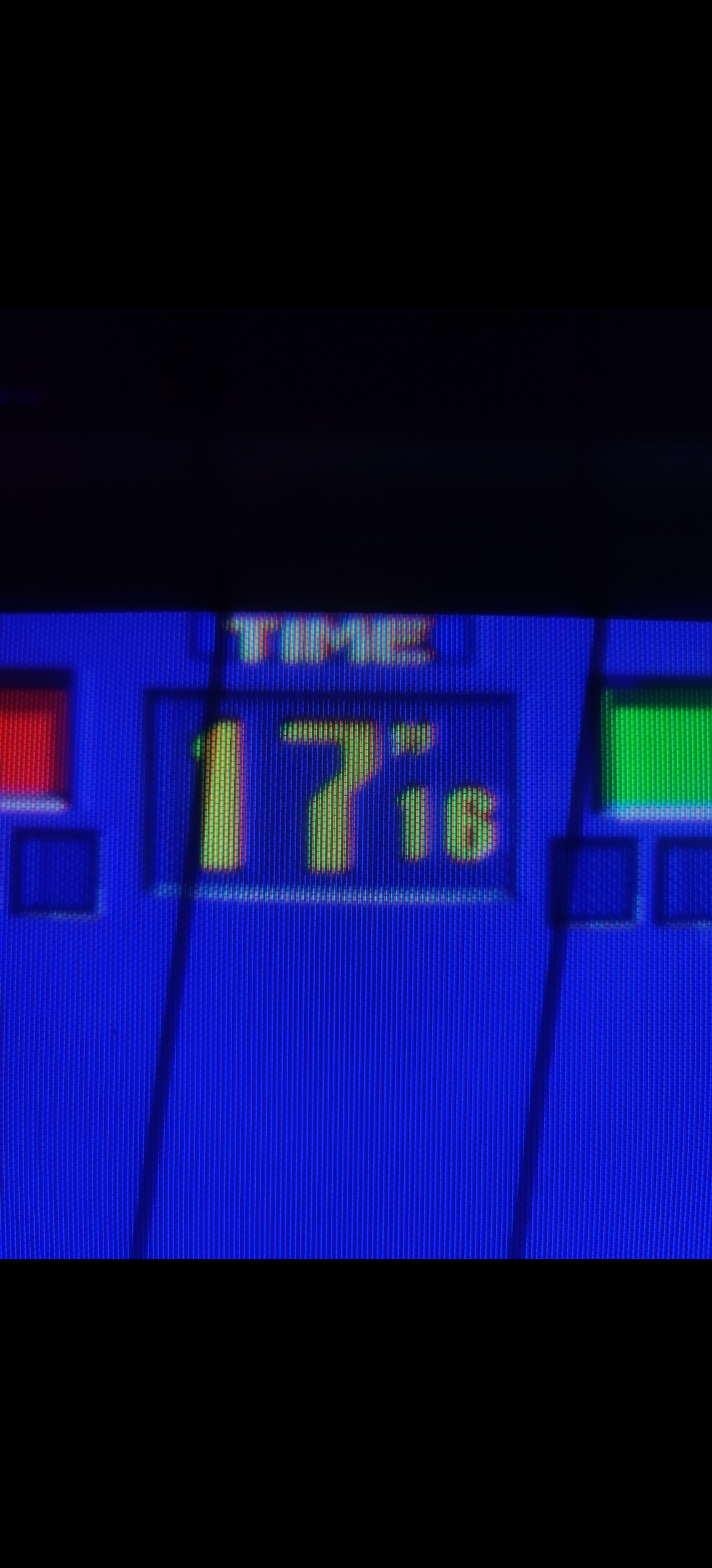
Of course you lose most of it at normal viewing distance, but still I bet a lot of the subtle smoothness and blending comes from the way they’re fading and only partially lit, even just barely in some cases. I mean just looking at that picture of the timer there are a dozen different phosphor shapes based on how they’re being lit.
In this case it might be the deconvergence, but based on your full shot of the cabinet the alignment/calibration seems off so it’s probably not good to try to match that exactly, at least for the base setting. Though it’s also hard to tell how much of that is from geometry bloom… I think I would much rather the blending and softness come from the signal’s consistent properties than “flaws” of the individual display’s setup.
But does this mean you are or aren’t doing the NTSC signal emulation? Because just in my limited experience playing with CRT Royale, tweaking the NTSC settings makes the biggest difference in “believability” of the resulting image. Where the base version without the NTSC passes just looks like a mask pasted on top of an emulator.
I don’t mean to be presumptuous and I only have a very limited and surface-level understanding of how this stuff works, so apologies if I’m way off. Relying on just deconvergence for blending reminds me of how a lot of modern games will use heavy chromatic aberration to hide poor anti-aliasing or just generally insufficient resolution, rather than as a subtle post effect. And it’s interesting because that’s supposed to just be an undesirable trait of a particularly bad lens, maybe similar to using a cheaper monitor and then also not keeping it properly calibrated. Like that post you linked mentions they downgraded from the nicer Toshiba to a cheaper and inferior model, for example.
It seems better to address the source where possible and then season the display-specific stuff to taste, but that could be difficult without overwhelming users with settings. A lot of that will also come down to whether someone wants to reproduce the best case scenario possible at the time, or what the majority of people would have actually experienced. Of course I think it would be nice to be able to try both.
1 Like
If I may chime in, slight deconvergence makes highlights pop more imho. (It does more things to the overall color structure of the image as well, in a good way imo.)
We had a big thing about in the CRT shader show off thread, someone could find my ramblings and screenshots. (I’m about to head out for the day or I’d find them myself.)
2 Likes
So dont get me wrong here CRT Royale is great but a lot of what CRT Royale does seems to be largely trying to over come a shortness in brightness and low resolution displays (<= 1080p). There are a lot of kernel based blurs, blooming and noise generation that goes on that IMO doesn’t really happen in an actual CRT, or at least is that visible, or at least doesn’t happen with my PVM with a component SCART socket (it is using NTSC internally) - thats a lot of caveats.
The vast majority of the CRT image look in my experience comes from the electron beam lighting up the phosphors and trying to adapt itself at a very high frequency that its not able to do that well and so the soft image. Deconvergence absolutely gives a blurry image - I bought a PVM just before christmas and during travel up here the H STAT had got completely out with a really blurry image - just a small tweak to it gave a much much sharper image.
Modelling the displays like this has worked reasonably well so far but your point about the source signal isn’t lost on me I do get that it will be a contributing factor. Just how much for the display systems I’m simulating is the question. On a poor consumer CRT I can guess it may well play a much larger role, on a high end professional display/1990’s arcade cabinet I guess much less so. But lets see where we get to with the low hanging fruit and then tack back to noise in input signals etc.
1 Like
luckily, the NTSC part is largely solved and can be run before this shader, just as is done with crt-royale.
2 Likes
Well it’s not that I’m not evetually going to get around to looking at the source signal, of course I will, it’s just in my opinion it’s not the largest factor and therefore highest priority in recreating a lot of my displays. Admittedly a lot of what I see are PAL and so the colours match those much more accurately (NTSC isn’t a world away though).
What an NTSC system does to the source signal in terms of noise I’m not sure but I’d imagine it varied quite a lot from display to display?
yeah, the display’s comb filter plays a large role in how grungy it looks. The older and cheaper the display, the more chroma/luma crosstalk and dot-crawl make it to the screen.
1 Like
Yes for sure - this virtua fighter display is the poorest I’ve seen so far but I think its issues are in convergence rather than a poor signal BUT I may well be proved wrong on that or rather it maybe the poorer signal plays a much more significant part in this display than I thought. As you say though its dead simple just to shove a PAL/NTSC shader in front and see what effect it has.