Hello, I’m very new to this, so I apologize in advance for butchering a finely-tuned shader.
I’ve been playing Metroid Fusion on mGBA, and though I appreciate that the vba-color and gba-color shaders are much more accurate to the original hardware, I recently tried Fusion on Switch Online and I really like their color implementation. It’s toned way down compared to the raw output, but it’s a lot more saturated than the vba-color/gba-color shaders. I wanted to try to match that with a customized shader, so I copied vba-color.slang into a new file and have been messing around with the parameters for a few hours, and I am way down a rabbit hole now. I’m a JS dev, but I have no education in coding shaders. I know some basics like what saturation, lumosity, and gamma mean, so I’ve just been changing parameter values via trial and error and have gotten about as far as I can without advice from someone more knowledgeable. I appreciate any and all advice/criticism, and thank you for reading!
First, here’s a screenshot with vba-color and darken screen set to 0.4:
Next, here’s a screenshot from Switch Online’s GBA app:
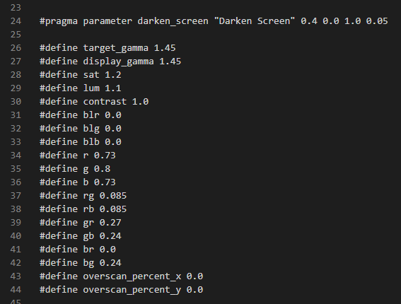
And here is my attempt at adjusting vba-color, and the params I have set:

I mean, it’s kind of in the ball park but not really, and there are a lot of things I don’t know how to control. I bumped up the saturation and lumosity a bit, and played around with adjusting the r, g, and b, and left everything else alone. Some things I notice:
-NSO’s reds are way less saturated, but the pinks pop like crazy. I don’t know how to affect the pink saturation level without also affecting everything else. -NSO’s blues and purples are also darker and more saturated, see the minimap grid in the upper right, Samus’ legs, and the computer control panel. When I try to fix that by bumping up the blue levels and/or overall saturation, the rest of the image goes way out of whack. When I darken the image or adjust the gamma, I lose too much detail in the room background. -NSO’s yellow floor tiles look way greener/colder than in mine, but the light gray ceiling tiles are warmer/more yellow. what the heck.
I’m obviously taking a very crude stab at this, but I am really enjoying this, and I’d love to learn more about how to do it properly. I have the comparison screenshots up on my monitor, changing the .slang file in vscode, restarting retroarch every time I adjust a value, and it’s a lot of fun.


