
No. Recommended is 120 cd/m2 http://www.tftcentral.co.uk/reviews/dell_u2410.htm
1 Like
In the end I am not desperate to get a perfect calibrated 240p output on these modern displays. I can’t speak for others however, for me personally, emulation is very, as you call it “subjective”.
I know I look like I’m being pedantic, but there are some objective reasons why one would prefer a calibrated image, among them: reduced eye strain, increased visible detail, colors that more closely match the output of the console, and a more vibrant image. In particular, the altered colors, overdriven contrast and exaggerated bloom in a lot of these shots bothers me, and would be considered flaws to be corrected by professionals that work on CRTs.
If you’re happy with what you have, though, that’s great. This all reminds me of when I calibrated my dad’s TV and he immediately complained that the resulting image was too dark 
I personally prefer the great @EasyMode’s screen shots just above his posts

My own settings are somewhat between what Easymode has posted and what larch1991 posted; there is 0 blending between the scanlines in larch1991’s shots, which is as close to “perfect” as CRT tech could get, and closely resembles the close-up of the Sony FW900 I posted a few days ago.
The comparison shot he posted demonstrates that he matched the color values and brightness of the shot without any mask or scanlines applied. I’m doing the exact same thing.
Easymode’s opinion regarding this method; it’s interesting to see the perspective of someone who’s written shaders.
“Turning up the Scanline and Mask strength and cranking up your display’s brightness is a neat trick. I’ve played around with that in the past, and the results can look quite nice if your display has brightness to spare.”
1 Like
No. Recommended is 120 cd/m2 http://www.tftcentral.co.uk/reviews/dell_u2410.htm 1
That’s a recommendation for doing image work in a dark room, AFAIK, and even that isn’t universal. Recommendations on this vary widely. There is no single correct setting for brightness, it has to be matched to the viewing conditions.There’s no reason why we shouldn’t calibrate to a higher brightness level.
Again, this highlights the problem with sharing individual settings, as not only are people doing wildly different things with their displays, there is also no single “correct” recommendation for what level of brightness a display should be calibrated to.
“Public areas (department stores, hospitals, transit stations)
• High-level brightness LCDs (300 cd/m2 and above) are recommended to suit higher
ambient light and viewing distances of around 100 cm.
Offices
• Mid-level brightness LCDs (250cd/m2 to 300 cd/m2) are recommended for normal ambient
light and viewing distances of around 60 cm.
Study rooms
• Low-level brightness LCDs (200cd/m2 to 250cd/m2) are recommended for lower ambient
light (e.g. desk lamp) and distances of around 50 cm.”
“Since we consider 200 cd/m2 to be an ideal average for peak output, we calibrate all of our test monitors to that value. In a room with some ambient light (like an office), this brightness level provides a sharp, punchy image with maximum detail and minimum eye fatigue. It’s also the sweet spot for gamma and grayscale tracking, which we’ll look at on the next page.”
. There is an ISO standard that specifies a brightness of 160 candela/m2 for critical inspections of color prints.
Yes, I edited images and videos previously and I get used to that brightness value. Something higher than that isn’t comfortable to me.
If you’re targeting 100 cd/m2 then you should be able to increase the mask strength even further compared to what I’ve done, so that’s actually a benefit if you’re trying to max out the mask/phosphor strength like I’m doing.
Good to see all these new replies!
@Nesguy - yes, with your method you might very well achieve those TMNT results. And I imagine that will make you as happy as a sandboy. But what will you do then? Play games? Haha it’s much more fun to tinker with shaders. Still, I don’t like that look, it’s too… oh wait
Regarding my screen, (a 2009 TN/24"/1080p Iiyama ProLite) it’s just pointless to try. Good for my work because it’s kind of flat, neutral and matte, not so hot for games and films. Like I told you, increasing the brightness to the required levels isn’t possible, and even if it could get more or less there, my color calibration would be completely ruined. I might give it a go on my Samsung 1080 40 incher, which is not exactly state of the art either but it’s built around a seriously nice (at least for its time) SuperPVA panel.
And by the way, I like antialiased Macro Mario much better than the raw images! (and you knew I would, I’m sure)
@hunterk - that’s pretty much exactly like the first TV I had for myself, a 14" lo-res Sharp, whose output I actually have fond memories of. I wouldn’t go for that look nowadays, after having fallen in love with (subtle) scanlines. I think @Great_Dragon digs it though.
Yeah, you and I grew up in the same kind of place haha. And we are all weirdos here. Nobody, literally not a single person in my ‘real life’ gives the slightest of fucks about the stuff we are so passionately talking about here.
I would, sir  “Attack me if you dare, I will crush you!!”
Correct. Specially because the actual results so far don’t seem… well, spectacular (also imo of course)
Cameras in manual mode don’t do their own thing. If the brightness and contrast in both scenes are indeed equal, just keep the same settings (aperture, shutter and iso) and you are good to go.
In general I agree of course, but I will take your idea a step further: what I’m trying to do is take that nostalgia and elevate it to a higher level of quality (same applies to sound and controls, btw). For instance increasing the internal resolution of 3D games makes them look SO much better and detailed, while at the same time the crt shaders keep them connected with the way I experienced them 20 years ago.
And I have already talked about it, but bear this in mind: a perfectly calibrated 240p output is not necessarily sterile and xVM-ish. Regarding 240p content, those monitors have too many lines for their own good. A perfectly calibrated mid-res arcade monitor or a consumer 90s Trinitron-like tv (my personal references) look nothing like a perfectly calibrated xVM! Not better or worse, just different. The rest is a matter of taste.
Yup, that’s why I insist that he post camera photos. The raw captures will always look like that on a normally-configured display. Which is a shame, because after all this talk I really believe that his actual results must be very interesting.
Well like I just said to shenlong, and my point all this time: it really depends on what kind of crt you are trying to (more or less) perfectly replicate.
His halation shader, for me, is simply the best. Those blur passes (horiz-vert) are bliss. Before I started using it, I was trying to achieve something like that via high radius gaussian blur + bloom on reshade, with prosperous enough results. But the way in which he implemented that idea, what his method does to tonal values… genius.
Furthermore, masks are good and diverse (the shader even automagically compensates for the lost brightness as you increase their intensity), scanlines almost always look perfect even at non-integer, it has good curvature… I could go on and on. And considering all the goodies that it brings to the table (blur and bloom for instance tend to be very expensive, and it does both) it’s pretty fast.
I will try to find a post in which he explains how he got there. I think @Nesguy has already spoken with him about his shaders, and I’m sure @hunterk has, too. Perhaps you two can help me with that.
Phew. Came here to say hello, ended up posting a brick…
1 Like
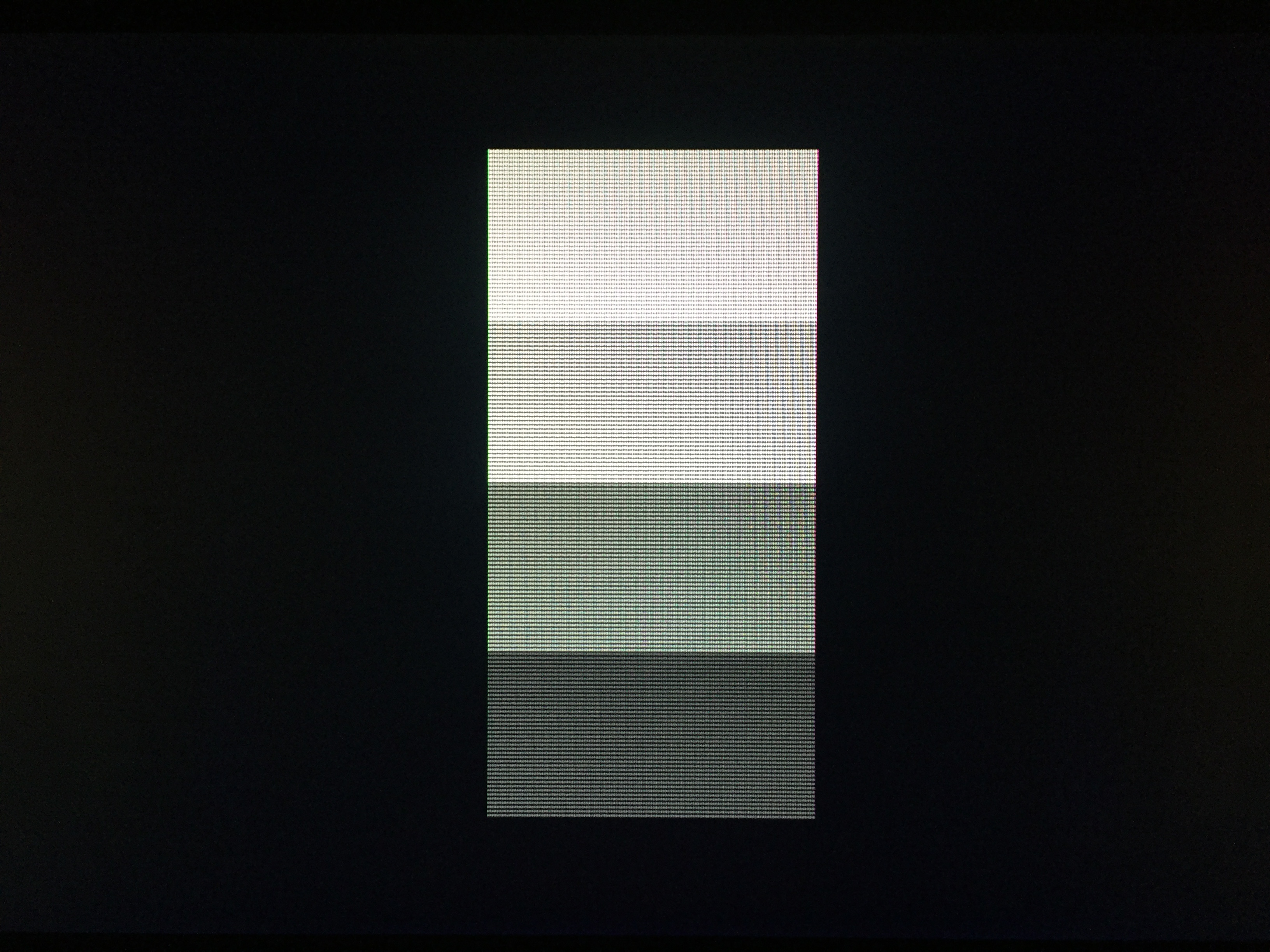
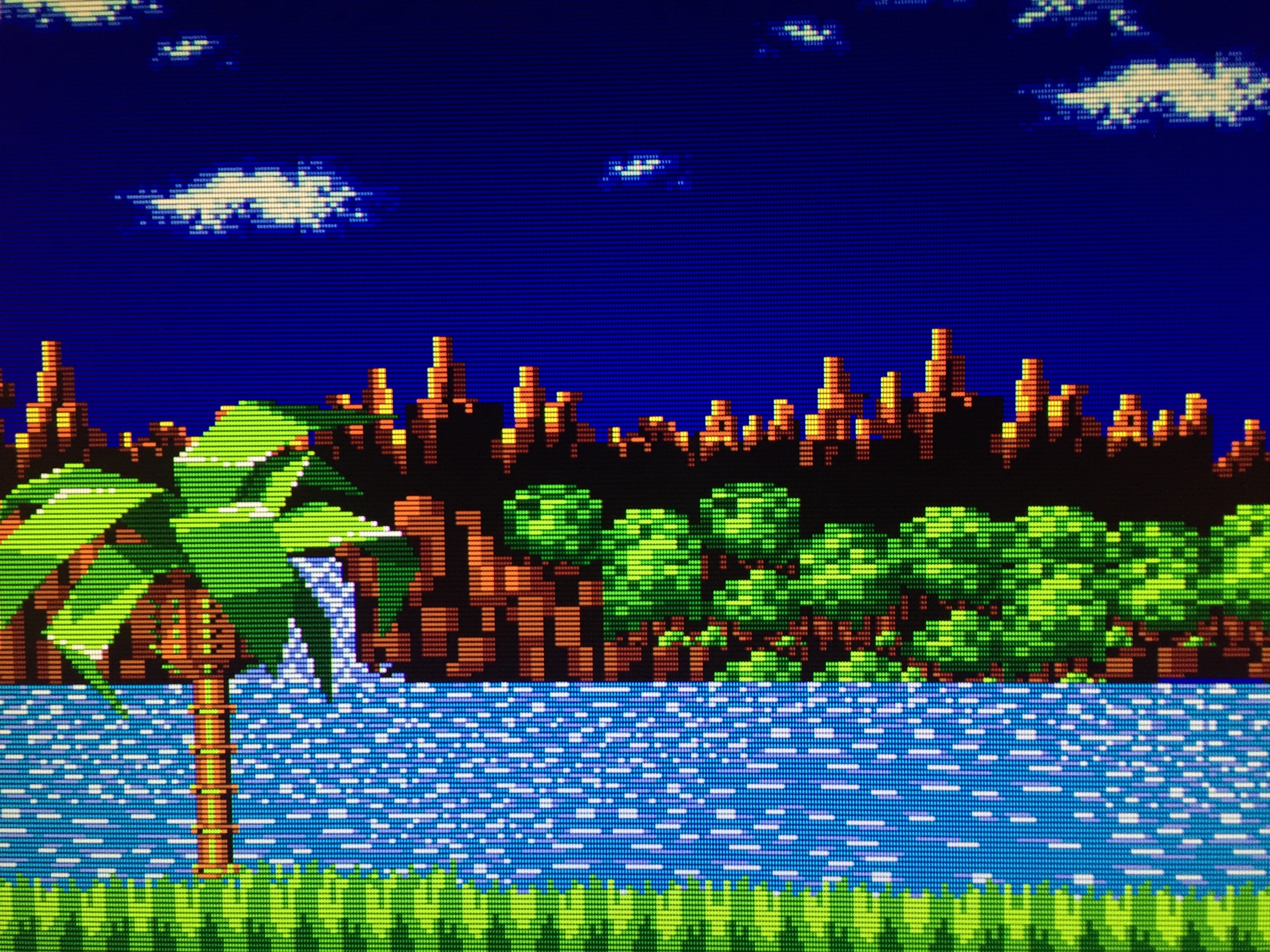
Well, I’m not really satisfied with these photos, but here are some first attempts with my iPhone 6. I can’t get the camera to not mess with the color saturation or brightness. No matter how much I fiddle with zooming in/out or the exposure, it’s a trade off between brightness and color saturation. You can see all kinds of weird stuff being done by the camera, including some awful moire, just like you see in photos of actual CRTs. I hope this at least demonstrates that my display is not as absurdly dark as might be suggested by some of the direct screen captures I posted- see the shot of the Sonic background in particular. In person, the image is even brighter and has better color saturation than what’s shown here. I’m not sure how much use these are in terms of proving anything, but here you go. I’ll try to get some comparison shots up tomorrow.
4 Likes
Yeah, that looks properly bright 
I can see in the scroll test shot that the camera/eye adds some faux beam dynamics (i.e., brighter pixels appear larger), which is an important part of the CRT look to me that wasn’t evident in your earlier screencaps.
Good stuff!
2 Likes
Definitely looks better when you see the actual TV output screen like that, I would be happy with that 
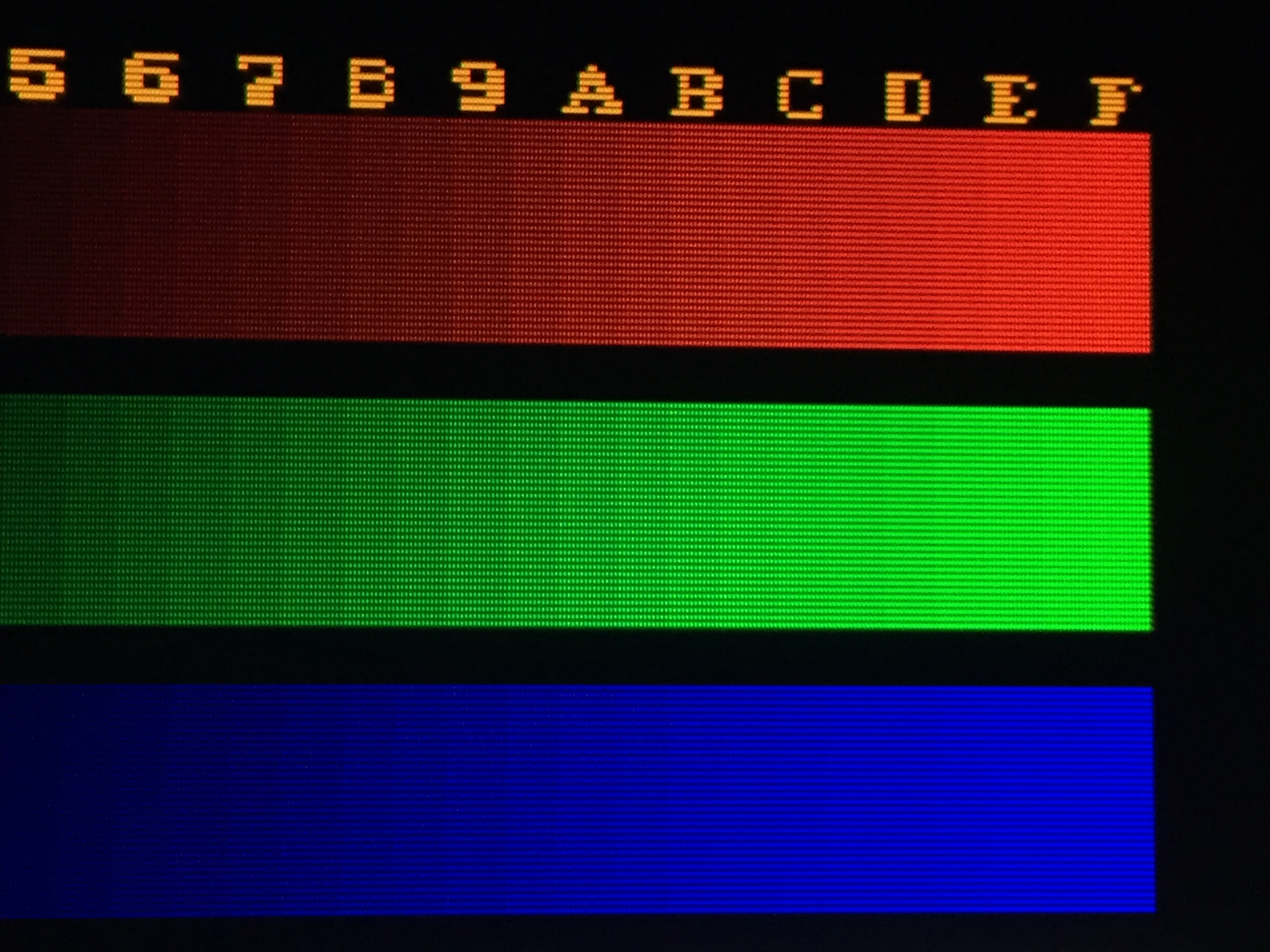
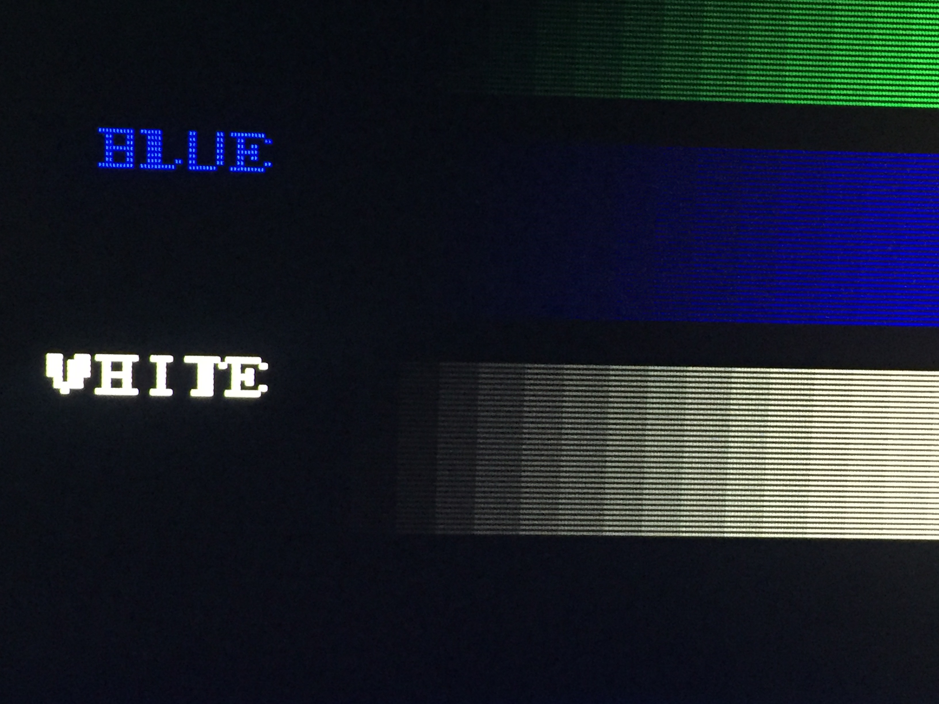
Quick question if you don’t mind (I’m always keen to learn), you can see the scan lines fading out on the pure whites, I’ve seen that happen on real hardware when the whites bloom - is that a negative i.e. is that because those screens are not calibrated or is that a normal thing with CRT displays?
2 Likes
It’s a normal thing for CRT displays, and is influenced by the quality of the display and calibration. If you check out the shot of the Sony FW900 I posted a few days back you can see that there is hardly any bloom at all. Pro manuals for calibrating CRTs recommend adjusting contrast to reduce this effect, so that you don’t lose detail in brightly colored areas. A little bit of bloom helps the highlights “pop” more, though. So this is one of those things that comes down to preference. In general, though, you should be able to clearly make out scanlines over white on a well-calibrated, good quality CRT.
Here’s that shot of the Sony FW900 again:
2 Likes
Do keep in mind that “240p”/double-strike content is going to look different on a properly calibrated CRT than 480i, as the individual lines are going to be hit twice as often, resulting in increased brightness (on an individual line/phosphor basis; total image brightness is unchanged) and increased bloom as compared with normal interlaced content, due to twice as much juice going into each lit phosphor per unit of time.
4 Likes
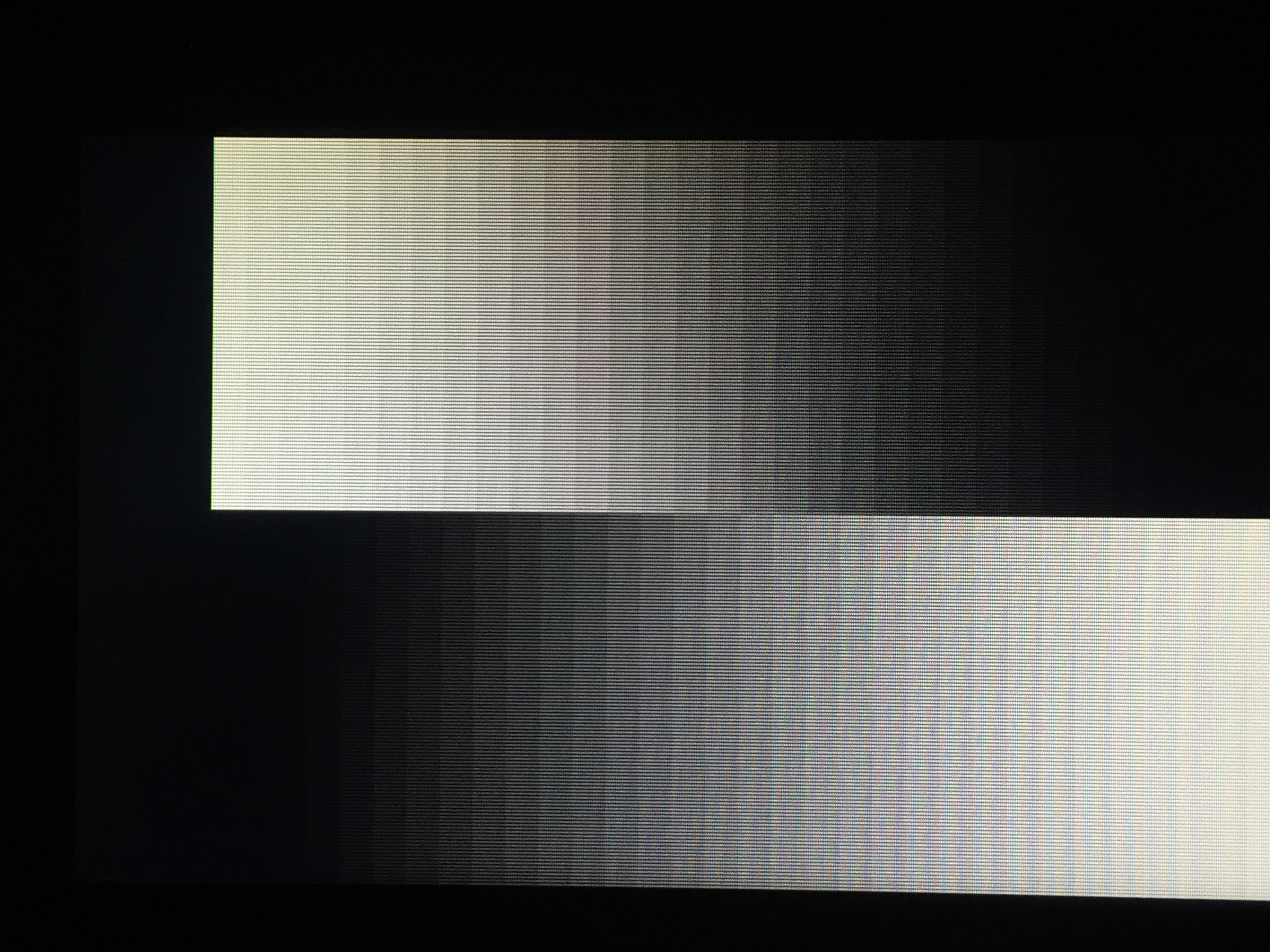
I deliberately defocused the camera by zooming in to max while up close and then moving back a few feet, the same method used to take screenshots without scanlines for magazines back in the day. One of these shots has my shader preset applied and the backlight adjusted to 100%. The other shot is with no filtering except for gamma correction, and the backlight at the normal setting of 35%. Color saturation is crap compared to real life, and the iPhone camera keeps altering the colors in different ways, so bear that in mind.
EDIT 2: updated the photos with gamma correction. A slight adjustment to color saturation was made in the photo with shader settings applied: I changed “saturation” in the shader parameter settings from 1.00 to 1.20 (max 5.00). I checked the color bars test pattern in Fudoh’s 240p suite to ensure I wasn’t getting any clipping in any of the colors. Could probably be tweaked a bit further but I think this is good enough for the sake of this comparison.
EDIT: haha, I realized after taking this that I didn’t apply any gamma correction to the shot without filtering, so that’s another thing to keep in mind. I’ll redo this later when I have the time.
3 Likes
Ha, I didn’t know about that. Pretty clever!
1 Like
Yep 
I still want to get a comparison shot where one can actually see the shader, but it’s tough! The camera keeps doing different things depending on if the shader is applied or not, and I also lack a proper stand. I’ll get it eventually.
EDIT 2: updated the photos.
EDIT: oops, just realized I didn’t apply any gamma correction to the no filtering shot.  That alone might account for any small differences in brightness/color. I’ll try to redo this soon.
Yeah so much better! I would like to see more games and less Fudohs, but I get real cathodic-ray vibes from these images.
Slightly off topic: I don’t have an iphone, but I’m sure there are free or at least inexpensive apps that will give you manual controls. Or you can try this out. The relevant part:
You know how you can tap to focus on anything in the frame? Well, try long-tapping on that same thing. After a short moment, the little focus square will pulse twice. This indicates a focus lock. Whatever you told the camera to focus on will stay in focus whatever you do. You can reframe the picture, putting that sharp subject at the very edge of the frame if you like, and it will stay in focus (unless you or that subject moves).
This is pretty powerful, because just by pressing a moment longer than usual when focusing, you can tell the iPhone exactly what you want it to look at. To exit the focus lock, just tap anywhere also on the screen. iPhone manual exposure
When you lock focus in this way, the iPhone also locks the exposure. And that might not be the right exposure for the shot you’re taking. Say you focused on someone in a shadow, or with dark skin, or in black clothes. They will likely be exposed perfectly, while the scene behind them looks washed out, with weak colors and far too bright in general.
But fret not, because when you engage the iPhone focus lock, you also can enter manual exposure mode.
To manually change the exposure, just swipe up and down on the screen. Going up lightens the image; going down darkens it. This isn’t true manual control, which would let you actually choose the values for the camera lens aperture and the shutter speed. It is more correctly called “exposure compensation.”
2 Likes
I tried playing around with exposure but gave up pretty quickly; seems like it’s always either under saturated and bright or the saturation is okay but it’s too dark. I’ll see if I can do better with one of the third party apps.
I understand you are a perfectionist, but really, the images you posted before are well exposed and look great. Disable shaders, focus and lock exposure as that guy says, enable shader, take another photo with same settings… that will work! And yes, your setup looks really nice, now we can finally see it. The raw captures don’t do it justice, as I ended up suspecting.
Aside from the proper brightness, the imperfections added by the phone (which you probably hate haha) give it a much more organic and realistic look. If someone told me those come from a high-end crt, I would believe them. Good stuff indeed!
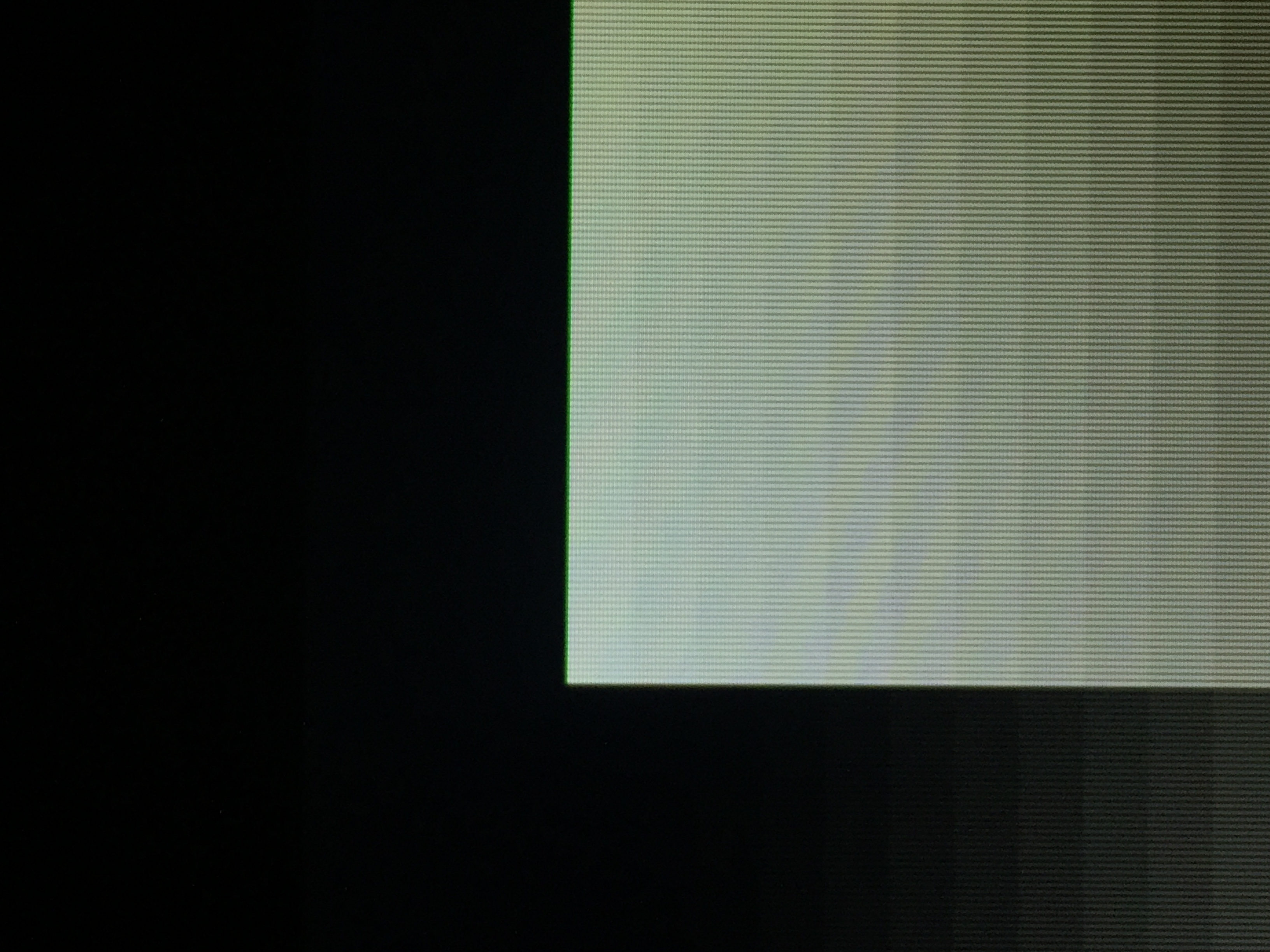
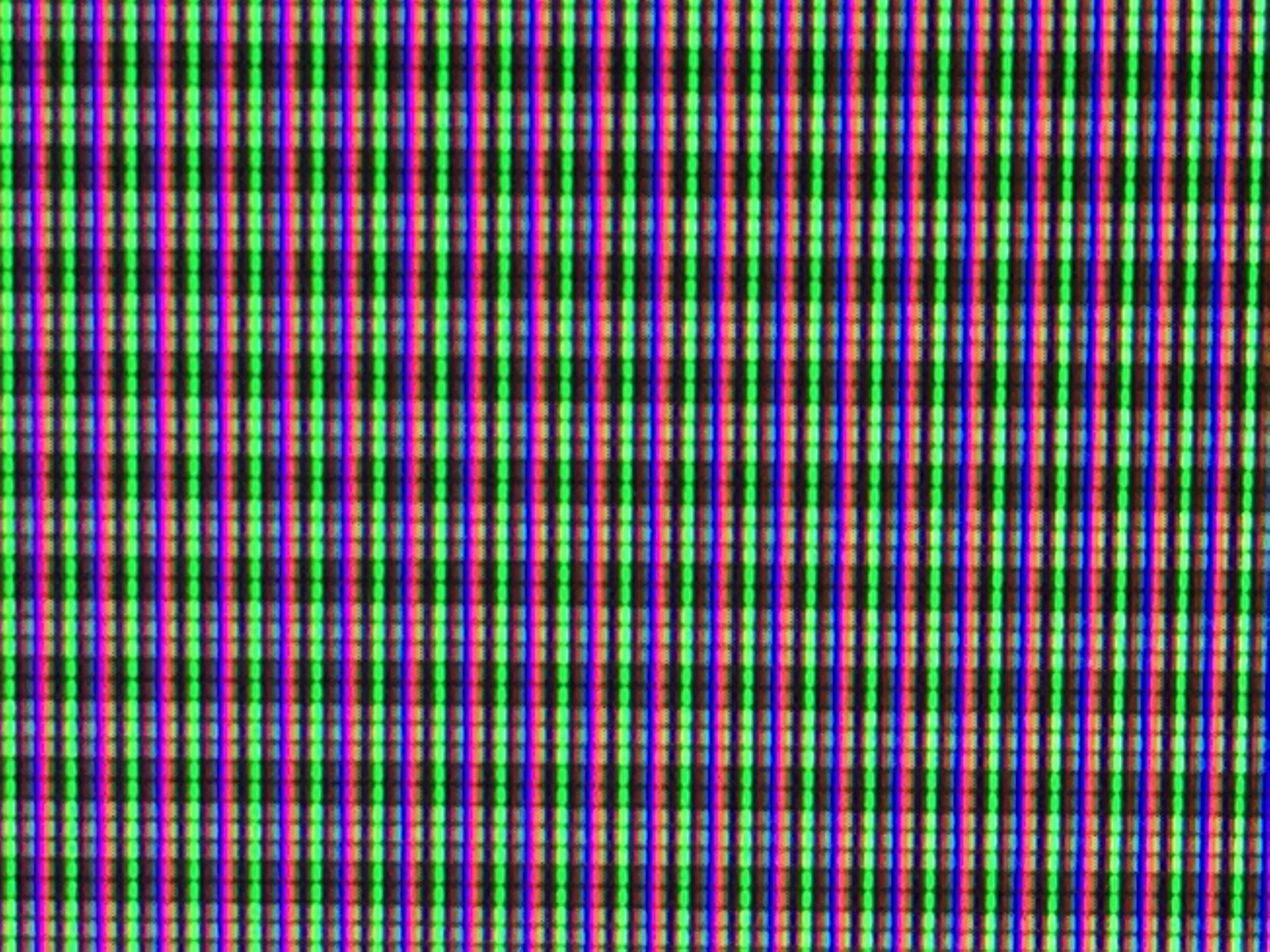
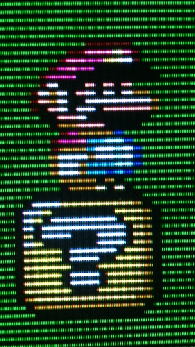
Edit: I took a closeup with my phone as well. Interesting to see the ‘phosphors’ this way!

1 Like
Actually, I sort of like how the shot of the scoll test screen (the Sonic background) turned out. The camera approximates the glow and the faux beam width variation that is seen in person, although the camera maybe exaggerates this a bit. This makes the image on my display somewhat less sharp and more natural looking than the direct screencaps indicate. Of course there are still some problems with that shot, the faint brown lines above the treeline have almost turned to black, and are more easily seen in person. It bugs me how the camera alters the colors based on the exposure level. You can also see this in the pluge, where the vertical bars disappear completely, but are detectable when viewed directly on my display.
Disable shaders, focus and lock exposure as that guy says, enable shader, take another photo with same settings… that will work
The current hold up is that I’m having difficulty finding any combination of settings that will eliminate the moire seen when the shader is applied. The same problem exists when taking pictures of CRTs, but somehow people are able to eliminate it. I just don’t know how or if my phone is even up to the task. The moire alone can make things appear a bit darker than they actually are in person. The lack of a proper stand isn’t helping things, either. Adjusting the backlight on my display is actually an inconvenience for once
I’m actually not totally into the xVM look, either! I like a little bit of glow and bloom, but I also like my scanlines. I also happen to like the texture provided by the phosphor structure and I like being able to see the mask at normal viewing distances. I think a little less than 1:1 is ideal. My display as configured is actually more accurately described as being somewhere between a consumer Trinitron displaying an RGB signal and a PVM. Of course, this would be a perfect Trinitron free of all manufacturing flaws and perfectly calibrated. This is based on the width of the phosphors, which are somewhat chunkier than you would see on a PVM. For reference, the emulated aperture grille at 1080p is 360 TVL, while a 20" TV from the early 90s would have been around 300 TVL. Pro monitors start at 400 TVL and the BVMs were 900-1000 TVL. I would agree that the image when displaying 240p content starts looking a little sterile at that point, and the scanlines become a little harsh for periods of extended viewing. Those displays were designed more for editing content than for actually viewing it.
However, I’ve never actually seen a BVM in person, and if anything has been demonstrated in this thread, it’s how radically different a display can look in person compared to photos. I might change my mind if I saw one of these displays in person.
This is a really interesting thread. It does seem like a useful conversation to have because it’s important to put forward and clarify preferences for the heroes that actually work on CRT shaders.
With your preferences, Nesguy, which are pretty similar to mine, I’m surprised you simply haven’t defaulted to putting together an actual high-quality CRT setup rather than deal with compromises on a flat panel with shaders. Maybe you just don’t have the space for it. I know I certainly will never be satisfied by anything else after enjoying a super high TVL BVM–Yes, these things look incredible. Not “authentic”, not like when I was a kid, sure, but who cares? Once you see what those old games were capable of looking like, there’s no going back IMO.
But even though I do most of my retro gaming on a BVM, I’m still interested in the development of CRT shaders because I know I won’t be able to hang on to this thing forever. So far I’m most grateful for kurozumi’s preset. It really does come close to a BVM (with resolution above 4K especially).
We still need to wait for a technology that sufficiently solves the motion persistence of sample-and-hold displays though. Your picture may look even better than any CRT ever made at some point, but once your character starts moving fast or stuff scrolls around you’ll see a blur that never existed even on a shitty CRT. That’s a problem that no shader will ever fix.
2 Likes
Must have been a terrible arcade with broken monitors. Or more likely - your memory is playing tricks on you.
1 Like