CRT shader debate

It’s a normal thing for CRT displays, and is influenced by the quality of the display and calibration. If you check out the shot of the Sony FW900 I posted a few days back you can see that there is hardly any bloom at all. Pro manuals for calibrating CRTs recommend adjusting contrast to reduce this effect, so that you don’t lose detail in brightly colored areas. A little bit of bloom helps the highlights “pop” more, though. So this is one of those things that comes down to preference. In general, though, you should be able to clearly make out scanlines over white on a well-calibrated, good quality CRT.

Here’s that shot of the Sony FW900 again:

image

2 Likes

Do keep in mind that “240p”/double-strike content is going to look different on a properly calibrated CRT than 480i, as the individual lines are going to be hit twice as often, resulting in increased brightness (on an individual line/phosphor basis; total image brightness is unchanged) and increased bloom as compared with normal interlaced content, due to twice as much juice going into each lit phosphor per unit of time.

4 Likes

I deliberately defocused the camera by zooming in to max while up close and then moving back a few feet, the same method used to take screenshots without scanlines for magazines back in the day. One of these shots has my shader preset applied and the backlight adjusted to 100%. The other shot is with no filtering except for gamma correction, and the backlight at the normal setting of 35%. Color saturation is crap compared to real life, and the iPhone camera keeps altering the colors in different ways, so bear that in mind.

EDIT 2: updated the photos with gamma correction. A slight adjustment to color saturation was made in the photo with shader settings applied: I changed “saturation” in the shader parameter settings from 1.00 to 1.20 (max 5.00). I checked the color bars test pattern in Fudoh’s 240p suite to ensure I wasn’t getting any clipping in any of the colors. Could probably be tweaked a bit further but I think this is good enough for the sake of this comparison.

EDIT: haha, I realized after taking this that I didn’t apply any gamma correction to the shot without filtering, so that’s another thing to keep in mind. I’ll redo this later when I have the time.

3 Likes

Ha, I didn’t know about that. Pretty clever!

1 Like

Yep :slightly_smiling_face:

I still want to get a comparison shot where one can actually see the shader, but it’s tough! The camera keeps doing different things depending on if the shader is applied or not, and I also lack a proper stand. I’ll get it eventually.

EDIT 2: updated the photos.

EDIT: oops, just realized I didn’t apply any gamma correction to the no filtering shot. :sweat_smile: 
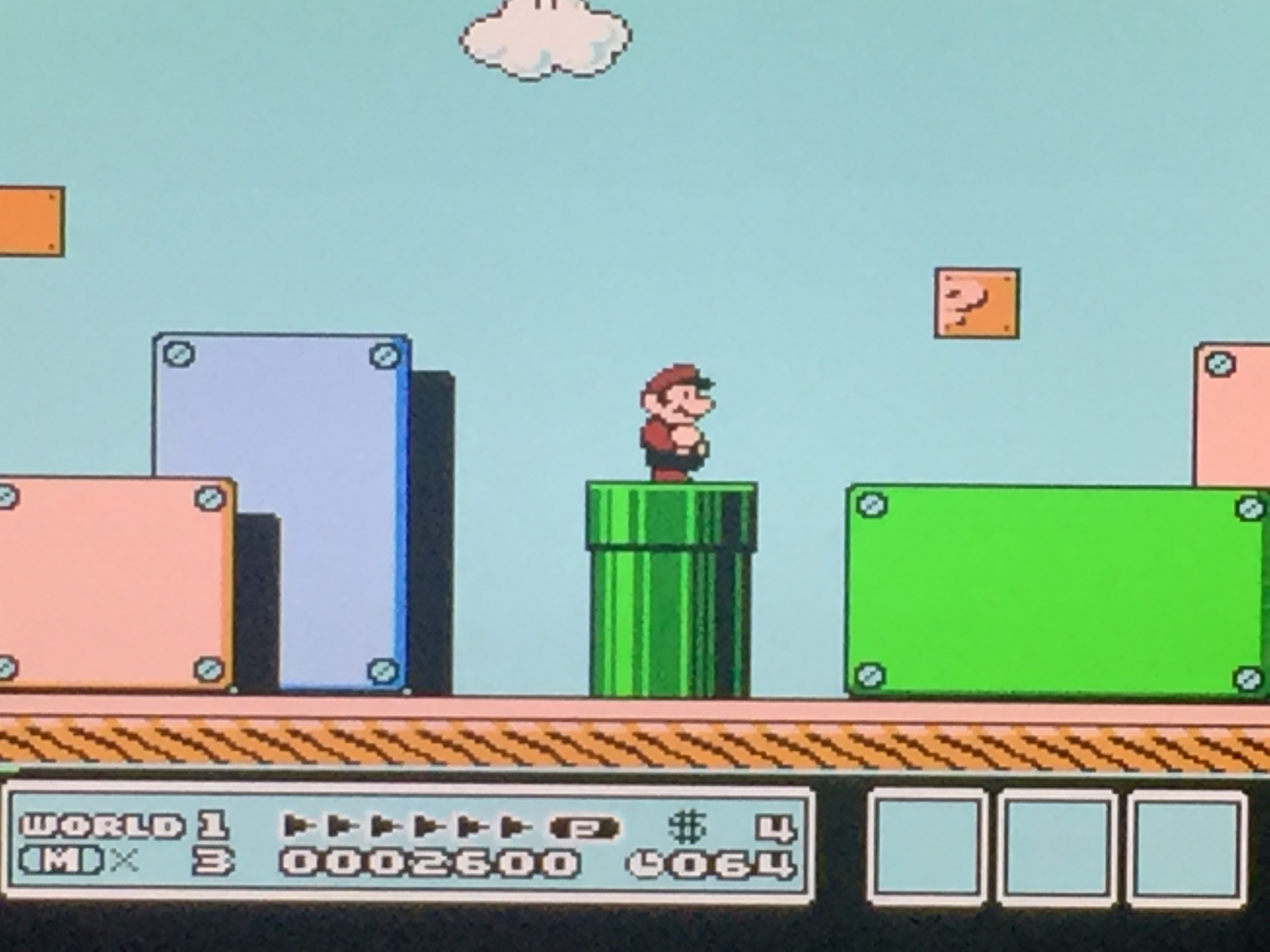
That alone might account for any small differences in brightness/color. I’ll try to redo this soon.
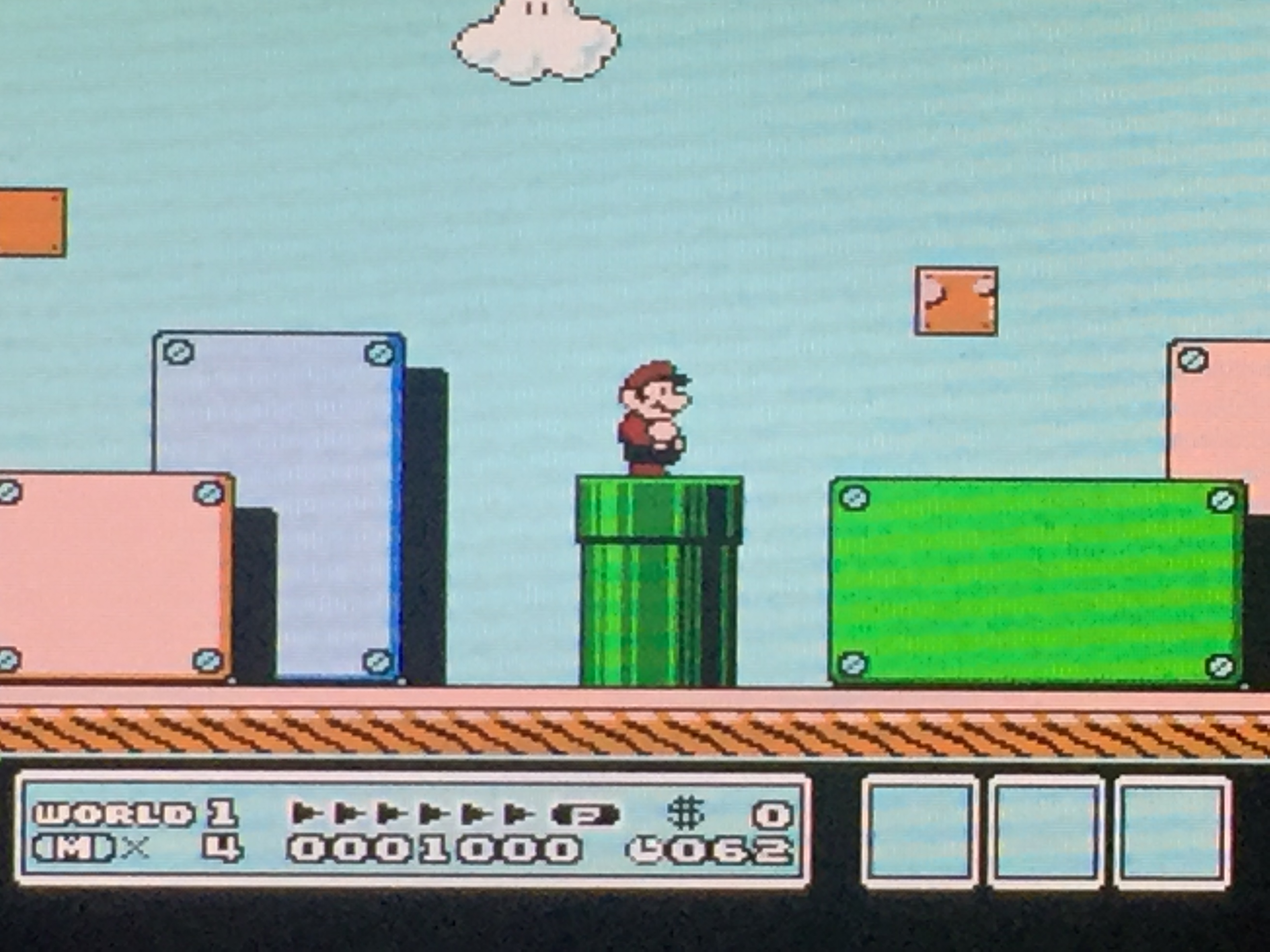
Yeah so much better! I would like to see more games and less Fudohs, but I get real cathodic-ray vibes from these images.

Slightly off topic: I don’t have an iphone, but I’m sure there are free or at least inexpensive apps that will give you manual controls. Or you can try this out. The relevant part:

You know how you can tap to focus on anything in the frame? Well, try long-tapping on that same thing. After a short moment, the little focus square will pulse twice. This indicates a focus lock. Whatever you told the camera to focus on will stay in focus whatever you do. You can reframe the picture, putting that sharp subject at the very edge of the frame if you like, and it will stay in focus (unless you or that subject moves).

This is pretty powerful, because just by pressing a moment longer than usual when focusing, you can tell the iPhone exactly what you want it to look at. To exit the focus lock, just tap anywhere also on the screen. iPhone manual exposure

When you lock focus in this way, the iPhone also locks the exposure. And that might not be the right exposure for the shot you’re taking. Say you focused on someone in a shadow, or with dark skin, or in black clothes. They will likely be exposed perfectly, while the scene behind them looks washed out, with weak colors and far too bright in general.

But fret not, because when you engage the iPhone focus lock, you also can enter manual exposure mode.

To manually change the exposure, just swipe up and down on the screen. Going up lightens the image; going down darkens it. This isn’t true manual control, which would let you actually choose the values for the camera lens aperture and the shutter speed. It is more correctly called “exposure compensation.”

2 Likes

I tried playing around with exposure but gave up pretty quickly; seems like it’s always either under saturated and bright or the saturation is okay but it’s too dark. I’ll see if I can do better with one of the third party apps.

I understand you are a perfectionist, but really, the images you posted before are well exposed and look great. Disable shaders, focus and lock exposure as that guy says, enable shader, take another photo with same settings… that will work! And yes, your setup looks really nice, now we can finally see it. The raw captures don’t do it justice, as I ended up suspecting.

Aside from the proper brightness, the imperfections added by the phone (which you probably hate haha) give it a much more organic and realistic look. If someone told me those come from a high-end crt, I would believe them. Good stuff indeed!

Edit: I took a closeup with my phone as well. Interesting to see the ‘phosphors’ this way!

1 Like

Actually, I sort of like how the shot of the scoll test screen (the Sonic background) turned out. The camera approximates the glow and the faux beam width variation that is seen in person, although the camera maybe exaggerates this a bit. This makes the image on my display somewhat less sharp and more natural looking than the direct screencaps indicate. Of course there are still some problems with that shot, the faint brown lines above the treeline have almost turned to black, and are more easily seen in person. It bugs me how the camera alters the colors based on the exposure level. You can also see this in the pluge, where the vertical bars disappear completely, but are detectable when viewed directly on my display.

Disable shaders, focus and lock exposure as that guy says, enable shader, take another photo with same settings… that will work

The current hold up is that I’m having difficulty finding any combination of settings that will eliminate the moire seen when the shader is applied. The same problem exists when taking pictures of CRTs, but somehow people are able to eliminate it. I just don’t know how or if my phone is even up to the task. The moire alone can make things appear a bit darker than they actually are in person. The lack of a proper stand isn’t helping things, either. Adjusting the backlight on my display is actually an inconvenience for once :stuck_out_tongue:

I’m actually not totally into the xVM look, either! I like a little bit of glow and bloom, but I also like my scanlines. I also happen to like the texture provided by the phosphor structure and I like being able to see the mask at normal viewing distances. I think a little less than 1:1 is ideal. My display as configured is actually more accurately described as being somewhere between a consumer Trinitron displaying an RGB signal and a PVM. Of course, this would be a perfect Trinitron free of all manufacturing flaws and perfectly calibrated. This is based on the width of the phosphors, which are somewhat chunkier than you would see on a PVM. For reference, the emulated aperture grille at 1080p is 360 TVL, while a 20" TV from the early 90s would have been around 300 TVL. Pro monitors start at 400 TVL and the BVMs were 900-1000 TVL. I would agree that the image when displaying 240p content starts looking a little sterile at that point, and the scanlines become a little harsh for periods of extended viewing. Those displays were designed more for editing content than for actually viewing it.

However, I’ve never actually seen a BVM in person, and if anything has been demonstrated in this thread, it’s how radically different a display can look in person compared to photos. I might change my mind if I saw one of these displays in person.

This is a really interesting thread. It does seem like a useful conversation to have because it’s important to put forward and clarify preferences for the heroes that actually work on CRT shaders.

With your preferences, Nesguy, which are pretty similar to mine, I’m surprised you simply haven’t defaulted to putting together an actual high-quality CRT setup rather than deal with compromises on a flat panel with shaders. Maybe you just don’t have the space for it. I know I certainly will never be satisfied by anything else after enjoying a super high TVL BVM–Yes, these things look incredible. Not “authentic”, not like when I was a kid, sure, but who cares? Once you see what those old games were capable of looking like, there’s no going back IMO.

But even though I do most of my retro gaming on a BVM, I’m still interested in the development of CRT shaders because I know I won’t be able to hang on to this thing forever. So far I’m most grateful for kurozumi’s preset. It really does come close to a BVM (with resolution above 4K especially).

We still need to wait for a technology that sufficiently solves the motion persistence of sample-and-hold displays though. Your picture may look even better than any CRT ever made at some point, but once your character starts moving fast or stuff scrolls around you’ll see a blur that never existed even on a shitty CRT. That’s a problem that no shader will ever fix.

2 Likes

Must have been a terrible arcade with broken monitors. Or more likely - your memory is playing tricks on you.

1 Like

Indeed. What I’ve also noticed that probably because of this, if you look closely any mask (aperture grille) structure in a shader is also eliminated in faster scrolling background, Just look closely with a still screen the shadow mask / aperture grill is there, as soon as the game starts scrolling the shadow mask / aperture grill is gone. This is even the case on very fast refresh rate / g-sync screens that refresh within 3ms.

The positive thing is that every year the screens are getting better. This is the trend that probably will continue:

  • Resolution: Up(Better)
  • Contrast: Up (Better)
  • Brightness: Up (Better)
  • Response time: Lower (Better)

Based on this trend we only have to wait before true to life CRT simulation will be possible through shaders.

Give all the discussion we’re seeing here and all of our own experiences that shows that we need to jump through hoops before even getting something close to a true to life CRT simulation with shaders, I would say we’re quite a bit off from where we would like to be, but within a timeframe of five years the above technology jumps may have been large enough to get to something that could actually compete in a live side-by-side comparison of a real CRT screen and a simulated one.

Here’s to hoping we’ll all still be here to enjoy that moment then! :thinking:

2 Likes

Yes, and it’s also the case even with an OLED with instant response time! That’s because the blur in motion, especially noticeable in retro games, is not due to “motion blur” or “ghosting” caused by the pixels not changing fast enough. The problem, “motion persistence”, is actually in our eyes!

LCDs and OLEDs are sample-and-hold technologies. Unlike CRT or plasma, which are pulse-based techs, LCDs and OLEDs don’t paint the picture line by line like a CRT at a certain rate (think of slow motion footage of a CRT working). Those blank moments as the raster is re-painted gives your eyes a chance to more smoothly “erase” the previous moment’s image from your visual perception, letting you feel as if movement is smooth. Plasmas were not as good as CRTs at this, but they were much better than later displays. On their part, LCDs and OLEDs hold each frame for 16ms, and then change immediately to the next, so the previous frame lingers in your eyes as the new one comes up, resulting in the impression of blurry movement.

Some tricks have been developed to partially remedy this. One is to introduce fake frames in between the real frames to smoothen out your sense of motion (motion interpolation), which obviously can introduce visual artifacts, especially noticeable when using static effects like shaders. Or a black frame can be introduced in between, which helps, but to work well it has to match the rate of both the display’s refresh rate and the content being shown, plus it makes the image looks darker, obviously, which requires compensation in brightness. Rolling scan techniques have been introduced in current (very expensive) OLED PVMs and BVMs, but like black-frame insertion those also need the right conditions to match, so they are still not suitable for retro games and their common 60fps and 30fps rates.

Blur busters has a lot more info on the issue and current solutions. Can start here: https://www.testufo.com/persistence

For now the best thing to do is pester monitor manufactures to introduce (or bring back in DELL’s case) adjustable flicker rates.

3 Likes

See this is one thing I’ve been thinking about ever since I got my G-sync monitor. Say I’m playing a SNES game at 60.0988118623 frames per second, in G-sync - why can’t RA double that rate, run the content at that doubled rate with a black frame inbetween each frame? I assume audio sample rates would have to be halved as well.

Probably would be performance-heavy. Keep in mind I have no idea what I’m talking about.

With your preferences, Nesguy, which are pretty similar to mine, I’m surprised you simply haven’t defaulted to putting together an actual high-quality CRT setup rather than deal with compromises on a flat panel with shaders. Maybe you just don’t have the space for it. I know I certainly will never be satisfied by anything else after enjoying a super high TVL BVM–Yes, these things look incredible. Not “authentic”, not like when I was a kid, sure, but who cares? Once you see what those old games were capable of looking like, there’s no going back IMO.

Space is definitely a factor since I’m currently living in a one bedroom apartment. Another factor is that it’s just becoming increasingly hard to find a good CRT where I live. The last few times I went hunting, I either came back empty handed or with junk that I wound up taking to the recycling center (where it was no doubt relocated to a giant warehouse where CRTs are just left to rot). It seems that if one wants a good CRT these days, you have to be prepared to shell out some serious cash and have something shipped from across the country. It’s definitely something I’ve been considering.

I think, objectively, the qualities of a CRT that benefit 240p pixel art are the scanlines, the lower TVL, phosphor structure, glow, and lack of motion blur. The scanlines were deliberately taken into account by pixel artists (see the quote regarding the “0.5 dot technique”). I think it’s also obvious that the phosphor structure, glow and perhaps lower TVL were essential to getting the highlights and lowlights to look as intended, and to capture some of the fine details which create the illusion of a higher definition.

A lot of people also seem to think that signal-specific qualities, which are separate from the qualities of a CRT, somehow benefit pixel art. I think blur and artifacts resulting from composite video may have been taken into consideration by some pixel artists when they designed the graphics for some particular games, but whether or not this actually benefits the pixel art compared to using RGB is somewhat questionable, IMO. The famous example is the Sonic waterfall. I think people are forgetting just how awful the composite output of the Genesis was. People are also forgetting that there is such a thing as a “cognitive filter” - at a certain distance, the Sonic waterfall looks transparent even through RGB or S-video, but without the horrible crosstalk and artifacts. People are sitting way too close to their displays and then complaining that everything looks too sharp. Rather than move back a couple feet and view it with the max viewing angle the content was designed for, they start blurring the shit out of everything with shaders, which brings me to your point:

We still need to wait for a technology that sufficiently solves the motion persistence of sample-and-hold displays though. Your picture may look even better than any CRT ever made at some point, but once your character starts moving fast or stuff scrolls around you’ll see a blur that never existed even on a shitty CRT. That’s a problem that no shader will ever fix.

That’s another excellent reason to not add any blur to the image via shaders or filters. Even an LCD with a 1 ms response time looks horribly blurry in motion compared to a CRT. When you add additional blur via shaders or filters it just completely wrecks the picture quality when things are in motion. It makes me wonder if people are actually playing games with these settings or just trying to get a good screenshot, or if they’ve just become so accustomed to horrible motion blur from LCDs that they don’t notice it.

1 Like

This is how Nesguy’s shader looks on my display. Not easy trying to capture this through a phone, looks a lot better in person.

3 Likes

@Umwelt - it’s true that real xBMs look incredible, specially in motion. But their scanlines are too obvious, and the fact that they block so many pixels rubs me in a wrong way. Would it be possible for you to post images of your BVM here by the way? It would be quite interesting if you and @Nesguy (or anyone else using similar presets) could share the same scene from a particular game (that will probably be either Super Mario World or Sonic the Hedgehog haha, as those two seem to be the standard when it comes to testing out this sort of thing).

Regarding blur, I don’t mind it when it comes to the actual output from the game, but yeah, the problem that @rafan pointed out is quite a pita indeed. And it also kills the scanlines when there’s vertical motion, at least on my screen. I have been thinking about that for a while, and the only solution I came up with is an actual piece of glass containing a scanline+mask overlay that you could attach to your screen. I would call it the Takayanagi :sweat_smile:

@Arviel - wow that actually is a bit too bright!

There’s probably a misconception going on here. BVMs, and any non HD CRT for that matter, does not block any pixels with the blank lines that we call “scanlines”. CRTs display all of the horizontal lines that consoles output at what we call “240p” resolution. It’s basically a hack of standard 480i/576i resolution (Nintendo internally called it “double strike”, you can Google it for more info).

When it comes to shaders that add “scanlines”, there are no real pixels being blocked either. When a 240p signal gets converted to a standard progressive resolution (480p and higher) it is simply being multiplied line by line. So technically the shaders do block pixels, but only those multiplied pixels, but the original pixels remain the same.

So there is nothing wrong with “scanlines”, they were part of how these games were originally displayed, and sprites were designed with them in mind. On older CRTs from our childhoods they were present, it’s just that we did not notice them, did not sit close enough to the screen, or they were less prominent than on the professional monitors we often see today.

3 Likes

@Umwelt - Yeah, I know how it works, but thank you for the explanation anyway. Well the thing is that lower res CRTs produce more subtle scanlines that merge with the content, creating an illusion of a “full image”, if you know what I mean. Like the lines are being multiplied, even when they are not. Hi-TVL monitors on the other hand break that illusion with their black, thick bars, which I personally find quite distracting. I don’t know whether you read the whole thread, but a long story short, I much prefer the look of an not-so-hi-res arcade monitor or TV, both the real things and most definitely in emulators/shaders. And not just because that’s how I played as a kid, but also as an adult I just find it more pleasing.

2 Likes

@Squalo That idea of a “full image” makes sense, though it would still be inaccurate to say that any pixels are blocked even on a monitor where the blank lines are really pronounced. In any case, if you enjoy the arcade-like feeling of being close to the screen while keeping that sense of a full image then low TVL monitors are the way to go.

I personally find that the high TVL monitors still look “full” from a reasonable viewing distance, and the gain in sharpness and contrast more than makes up for any drawback. But things get trickier when it comes to shaders that replicate that look, because we often sit closer to PC displays, and our flat panels do not have the same properties as high TVL CRTs, and so even from a distance the blank lines do not seem less prominent as in the case of a CRT. So this should be taken into account when designing and tweaking shaders (I do think this is already possible to some degree on CRT Royale presets like kurozumi).

3 Likes