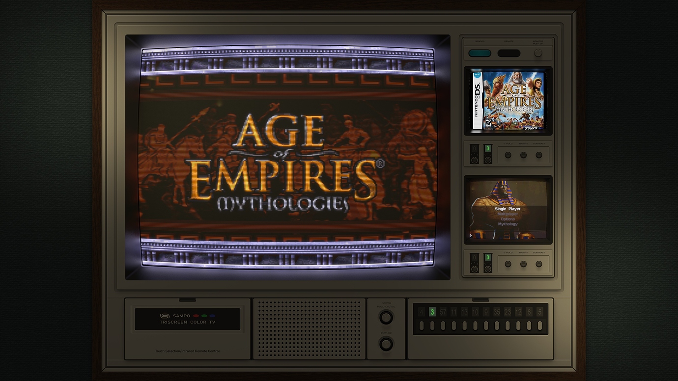
Duimon - HSM Mega Bezel Graphics and Presets - Feedback and Updates

Hey guys, so an update on my experiments…really happy with @HyperspaceMadness and @Duimon suggestions earlier! Later I will go into detail for my fellow noobs, but I’m still experimenting and have a question…

When using “SMOOTH-ADV”, it notice it seems to add dots everywhere. It’s not really a problem on its own.

But I notice when tweaking scanline settings…those dots seems to interfere or mix in with the scanlines producing a weird look.

Is that just the “nature of the beast”? Or is there any way to reduce the effect of those dots?

We’d really need a picture to show what these dots are. Without an image we really can’t guess what is going on.

For reference, this was the weird effect I was getting:

(you can see the dots better if you maximize the image)

But I think I figured it out. “Scanline direction” is on by default and produces that dotted-effect. When I turn it off, then turn on “Fake Scanlines”, I get more normal looking scanlines.

1 Like

If this is a Playstation game I think 3D games are rendered at a higher res than 2D games, and fake scanlines render at 240 by default, so part of the issue could be just scanline resolution.

The default mask is 1 (Lottes) for the SMOOTH though, which looks “dotty”, so changing it to something above 4 will make a big difference.

2 Likes

Hey Dear Duimon !

I don’t know if its possible regarding MelonDS core but do you plan to make a Bezel for NDS to match this format please ?

1 Like

It is on the list for a future sometime. Setup is fairly easy but I will need to modify the source a bit.

When I release the Sampo 9519 in my TV repo it will have this kind of screen ratio.

Along with a guide to creating art for the top screen using Photoshop. (Photoshop will be a requirement.)

It is also possible that @HyperspaceMadness will make adding art to a second or third screen much easier in the coming months.

The future preset will use a modified NDS graphic. (Similar in layout to my horizontal 3DS preset.)

6 Likes

Found a National ad that has the TH20-B8 and TH20-B205. I thought to share it to show the cost of them and the others with them.

2 Likes

what i personally think. This is a furniture style design rather than vintage. A design like a Japanese Buddhist altar or chest of drawers.

There was a time when rugged designs such as silver and black were disliked, so there was a boom to put the TV in the chest of drawers. A Japanese hobby of enjoying the warmth of wood.

This hobby has not been lost even today, and furniture-like liquid crystal TVs are being developed, albeit slightly.

In the case of SONY, there was a furniture-like one, but it pushed out a slightly futuristic design. Overall, SONY was not good at furniture-like designs, but they were selling with a technology called Trinitron.

This is the case with SONY. The model I have the right source for is not listed in this catalog…but the design is similar.

2 Likes

My first TV was “PHILETTA ROYAL 8027”,I played a lot of nes games on this TV. although it sometimes color cast(screen whole turns yellow\green or red,i must hit it bring back to its former condition),but I had a lot of good time on it.

1 Like

off topic.

When I saw my current TV (which is also used as a monitor for my PC), I realized that the culture of furniture design is still being passed down.

By the way, the current furniture-like LCD TV looks like this, but I didn’t get much attention.

wafu-tv-shuunou02
(The channel dial on the main unit is a dummy)

6 Likes

These are trends influenced by artistic currents, until the mid 80s everything was Pop Art, then modernism made a transition to the minimalism of today. At first wood was used to generate acceptance in homes, but then they adapted to what was fashionable, because it sold.

There were many outdated designs of their time, including some very rare hybrids that combined several styles.
image

It could even influence success or failure.

4 Likes

You have to love that secret remote control compartment.

1 Like

Duimon_MB_Logo

* * * The Duimon-Mega-Bezel repo and release are updated to v1.1.3.0. * * *

The Potato repo is also updated.

Changes:

  • Added the Infocom Z-Machine (Sampo 9519)

  • Moved some images to the “_Common” folder.

* * * The Duimon-Vintage-TV repo and release are updated to v0.0.3.0. * * *

Changes:

  • Updated and renamed the Panacolor TH18-C17 to TH20-B8.

  • Added the Sampo 9519 (Normal, NDS, and 3DS Presets.)

The link to the current releases are in the first post. Installation/Update instructions are near the end of the second.


I have added a “Vintage_TV” folder to my “Front-End-Assets” repo. Inside, the Sampo_9519 folder contains assets and a guide for creating art for the small screens.


** Note **

The potato presets, for systems that use glcore, are currently broken. I created my new presets using an alpha version of the shader. Please be patient while @HyperspaceMadness completes the work on his next update.

8 Likes

Great job! i’m enjoy it now.thank you!

1 Like

Under Construction SpongeBob

5 Likes

Having some extra hands would be great!

I keep asking my selves… since there are more than one of us, why can’t at least one be napping at all times?

Maybe I should be asking why one can’t be working on this project. :wink:

4 Likes

Under Construction Old Timey Octopus.gif Small

4 Likes

How can i fix this?

Fixed it. Deleted the mega bezel folder and downloaded slang_shader in RA.

1 Like

I don’t know what you are trying to fix.

You do need to set your RA video aspect to “Full”.

Unless you have a 4x3 monitor, your viewport should be 3840 x 2160.

1 Like

Instead of the game, only the mega bezel parameters were displayed. This was because I still had a manual installation of the hsm mega bezel and updated it via retroarch slang_shader. After I deleted the mega bezel folder and loaded the slang_shader again via retroarch everything works as desired. That the background was cut off was due to the wrong setting yes. I had not set it to 16:9.

1 Like