Duimon - HSM Mega Bezel Graphics and Presets - Feedback and Updates

Thank you so much for doing this, much appreciated! :metal:

After digging some parameters, I’ve noticed that it doesn’t support non-integer scaling so I did use _3__SIMPLE__GUEST-DrVENOM as a HSM shader and applied some bezel size adjustments with non-integer scale and 2d curvature parameters to please my ultimate liking :relieved:

Afterwards, I took “Playstation” and “Playstation_Decal” graphics from Logo folder then merged them down and tweaked decal position to match with shader bezel. Also made a hole in the middle screen area to make a room for shader bezel. In the end, I used it as overlay on top of _3__SIMPLE__GUEST-DrVENOM shader and here is the initial result;

And here I tweaked some more and used Crop Overscan parameter to fit the game screen to bezel;

4 Likes

Very nice!. You are becoming quite fluent in using the shaders. :star_struck:

Hopefully your results will let others know that they don’t have to be dependent on my presets, they can create there own, tweaked to their liking.

BTW. I have updated the CPC Monitor graphics, the power buttons and text were off center. I also added a bit of feathering to ease the transition into the generated frame.

3 Likes

Thanks to you guys who made this possible from the beginning and also great support from you guys helped a lot :relaxed:

3 Likes

Hi again, I did a custom preset with game specific stickers :star_struck:

Any idea what parameter makes the first image graphic darker versus my previous image post? Tried to find the culprit but with no luck :thinking:

https://forums.libretro.com/uploads/default/original/3X/7/8/783b3684f8a8fd7771aa521d1f22ffe3c031c377.jpeg

FYI;

  • I’m using “_3__SIMPLE__GUEST-DrVENOM” as a shader preset from previous release of HSM shaders,
  • Thanks to 'Simple Preset' option, I saved shader as a 'Game Preset',
  • Added custom graphic which has stickers, decal and led images path to simple preset as you can see below,

BackgroundImage = “:/overlays/bezel/Duimon/Logo/Playstation_Chrono-Cross.png”

TopLayerImage = “:/overlays/bezel/Duimon/Logo/Playstation_Decal.png”

LEDImage = “:/overlays/bezel/Duimon/Logo/Playstation_LED.png”

  • I guess “_3__SIMPLE__GUEST-DrVENOM” doesn’t support decals so it didn’t show up on top of bezel, so, as a workaround I made it overlay instead :grin: And for night mode, lowered opacity from 100 to 40 so it blends with night mode quite well.

Btw, @HyperspaceMadness do you think it is possible for RetroArch devs to expand the number of overlay use more than one? So we can place sticker images on screen. It would be great feature to have.

2 Likes

Probably viewport vignette.

2 Likes

Yes, thank you it was [BG Image] Vignette Opacity. I kinda like it actually.

I just wanted to point out that the parameter names are different between the old (from last August) and the new one. Is there a reason you want to use the old shader vs the new one?

If I haven’t already, I’m going to turn off the viewport vignette by default, it is definitely what you want when you have a regularly textured background, but when you have a custom graphic background like the ps1 it is rarely what you want.

I haven’t used overlays in a detailed way. One thing to mention is that the overlay feature was primarily created to create control overlays for touch screens, think buttons you can see and touch on the screen. Take a look at the overlays which come with Retroarch, this ability to add and place individual graphics may already be there.

2 Likes

There are a few reason;

  • Decal logo images has individual layer system in new releases and it doesn’t follow bezel when I use non-integer scale which I do a lot :grin:

  • I guess the old shader bezel reflections looks a bit more pleasant to my personal taste by default.

  • My poor system also couldn’t benefit from new advanced fancy features. It locks to 50fps even on Pokemon Mini system and audio crackling follows :upside_down_face: Even with Standard shader I’m unable to use 2x internal resolution on PSX same with the old high tier shaders. So I’ve decided to stick with current setup instead of starting all over again which I just recently finished all system setup with old shader presets. Therefore even old shaders are still new to me :hugs:

Ah, you’re right maybe I need to load a PNG that contains at least two sticker as an overlay image and play around Horizontal/Vertical Separation and X/Y Offset values to place images around the screen. Thanks for the heads up, I’ll give it a try.

Thanks for explaining why you are using the older shader

So I’m bringing this back to the STANDARD preset

This is something I’m going to fix, I calibrated them to look like the old one, but then working on the new one they changed at some point, I just need to tweak them so they are like they were originally

2 Likes

Man, I do feel bad now just because this brought you more work to do :slightly_frowning_face:

Thanks anyway for all your amazing work and effort up until today, same goes with @Duimon

2 Likes

Here’s an Advanced preset WIP.

The NDS! :grin:

I reworked the source to make it one of the more popular colors. (Or close anyway, it was surprisingly difficult.)

I am using the Bezel Image Layer for the main body and buttons so it can be colored using the HSV parameters.

Lowering the Saturation and Value gives you something like the Standard preset.

Or you can go really light and get almost metallic looking.

(Although the logo gets a bit washed out. :frowning_face: I may put a thin outline around the white text.)

The logo, LEDS, and other details like text, are using the Cab Glass Layer.

I have the Standard buttons as the Decal layer and they can be partially transparent to darken the buttons, or fully opaque to look like the Standard. (If you switch to multiply blending mode you can make them black.)

7 Likes

Are some missing graphics for systems coming after once Advanced presets will be finished? If so would you give priority to these two classic system :relieved:

  • ColecoVision
  • Commodore 64
1 Like

I’ll have to check past posts, I think I have fulfilled all the requests, so my request list is clear. I am still putting off any Commodore stuff until the end, in deference to @TheNamec and his set. I will put ColecoVision at the top. I have been looking forward to it since it has very much in common with the Intellivision. (So much that I’m wondering if it is a derivative in some way.)

Edit: I think I have actually committed to doing the WonderSwan Duo next. It will take some time because they have vertical games also and will require two graphics. (Although the B&W and the color have as much in common as the NGP & NGPC.) (And in all honesty I will just have to rotate and scale them. :upside_down_face:)

1 Like

WonderSwans would be great too :grin:

Any estimation for MSX/2, Odyssey2, Super Famicom Disc System, Virtual Boy :upside_down_face:

Thanks for mentioning about TheNamec, btw! I wasn’t aware of his works now I see why you haven’t included Amiga/Commodore 64 stuff which I’ve found it weird at first tbh. You’re indeed have a good reason.

1 Like

LOL! No estimation, I have multiple projects, and each graphic can take many, many hours.

I also have a lovely wife who needs my attention, :innocent: not to mention I do 99% of the cooking, (Although she doesn’t need my help, it’s a privilege.) and I have a full time job.

I also recently committed to learning how to skillfully use the most recent addition to my office.

Have no worries my friend. :grin: Doing these graphics gives me great satisfaction and counts heavily towards my quality of life, I am not going anywhere.

Right now my chief goal, in this little corner of the world, is to help @HyperspaceMadness whittle away at some of the remaining bugs and get this shader to V1, so it can be made available to those outside our little space here. The best way for me to do that is to try and leverage as many features as I am able in the Advance presets.

6 Likes

Here’s an update on the NDS Advanced preset WIP.

I added the outline on the logo as I threatened, changed the white text & symbol elements to a 75% gray, tweaked the bezel highlight, and fine tuned the opacity and blur on the surface textures.

Since a lot of these Advanced presets will require alteration to the original source, I have been porting any improvements to the originals, so we get an update to the graphics along with a new preset. Of course this takes time. :wink:

I think this one is done and should be up in the repo soon.

5 Likes

I deeply apologize for such selfish question I was originally curious and meant to ask which ones are up next according to your list but it ended up in such an unfortunate way, sorry :innocent:

1 Like

No worries my friend, I was not offended and it gave me an opportunity to let the community inside my head for a bit. :crazy_face:

1 Like

I was out in the garage looking at my vintage computers and look what I found!

The incredibly rare IBM DS/2. :exploding_head:

4 Likes

While I was originally having just a bit of fun with the last shot, I have decided to spend a little more time on it and include it in the repo.

While I have a couple more fun things to add I have a couple shots to show what motivated me.

The first shot was just a static background layer. This last one uses the Decal layer in “bezel” scaling mode for the vintage monitors, and the Top Layer is used for the monitor LEDs, also in “bezel” scaling mode.

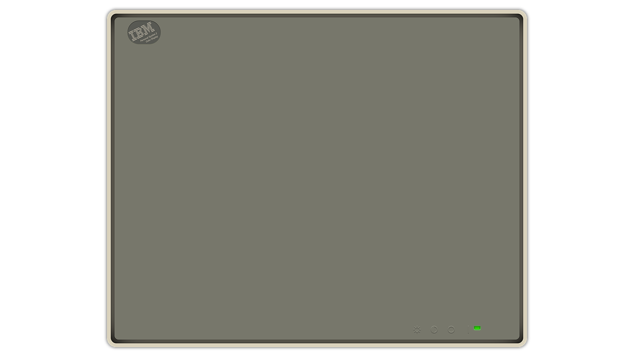
This is the Decal image.

As you can see it is only one monitor. The shader duplicates it and both screens can be moved in any direction or scaled in any way and the monitors will move and scale with them.

(The stray LED in the top left corner could be solved with a simple change to layer order.)

And here’s a night shot showing a single LED image being used on both monitors.

6 Likes