
Hi @kokoko3k, I wanted to ask you a question that stems from my own curiosity: I’m using your “slotmask_taller_brighter” preset with the game “Cyberbots” and I’m really enjoying it. Was creating a slot mask with taller cells your idea, or were you inspired by some kind of real-life screen or television?
Hi there, there’s a story behind that.
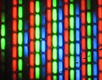
On low resolutions like 1080p, proper sized slotmask and scanlines did not play nice, leading to weird artifacts that i like to call “hives patterns”.
Look at this at 100% 1:

One possible mitigation was to lower the scanlines gap and/or the slotmask visibility, but the other was to just make the slotmask height = 1px.
Taller means that the height is 3px, so each phosphor between two slots is a tall rectangle instead of a square; this is indeed more similar to the shape found in real CRTs:
Since I finally found a way to clear the “hives” see here, I made more presets with a proper slotmask look, that’s it.
2 Likes
All clear. I also had this effect when I tried to use the slotmask in megabezels a while back, before you created the NG presets. Now I understand even more that 1080p isn’t ideal for slotmasks; the grill aperture is better, unless you find custom workarounds to mimic the slotmask at these resolutions. So, as I imagined, the taller system ends up being the closest thing to a real slotmask, even if it doesn’t strictly simulate one (again, due to the limitations of 1080p). You’ve satisfied my curiosity, thank you, and above all, thank you for your brilliant work! Your solutions are fantastic.
1 Like
Last question: is it just my eyes, or does it seem like the taller system, in addition to being brighter, also has less aliasing on the image? I’ll have to try it soon with high-resolution content. Thanks again for your time.
Uhm, nope, there is no special setting to mitigate aliasing, at least nothing different from the other non “antialiased” presets.

2 Likes
So maybe my eyes are deceiving me, but that’s fine. I’d abandoned the idea of upscaling, but I’m always happy when I “perceive” less aliasing in the image. The content and its native resolution probably have a big impact. Thanks again, you’re always so kind.
These shaders are amazing!
I was wondering if any more NTSC presets will be added to new generation. I only see two there now but I like the NTSC presets from 4.1 more.
1 Like
Hey Thanks!
Since the presets list is already pretty “crowded”, I’m starting to delete some presets when I add new ones.
Any particular request? I can assist you in making a new one.
Also, keep in mind that “ng” and “4.1” are just naming conventions, the base shader is the same.

Hello everyone. Here’s a screenshot of your work @kokoko3k along with that of @duimon - I activated the phosphorus decay, leaving the basic settings unchanged, and increased the bloom quality to value 6 (but 5 is also fine, it depends on the screen and the brightness you want to achieve), all using the shadowmask variant, but even with slotmask it’s superb. I just need to make some better adjustments for the aperture grill. What can I say, the screenshot speaks for itself, in motion it’s even better - truly wonderful - thanks @kokoko3k
1 Like
Oh, I thought the ones in ng used an updated shader. Nevermind about adding ntsc presets there then.
Most people seem to like rgb shaders, but I really love the composite or ntsc look. The one of yours I’ve been using for the non-handhelds is ntsc 1 selective. I’ve made a few adjustments, lowering the brightness (input signal gain to 1.75; looks like it’s starting to clip at 2), color artifacting strength to .2, and glow to blur bias to .7. Unfortunately, lowering the blur doesn’t blend the sonic waterfall anymore. Other cores seems seem fine but I kept it at 1 for Genesis. Composite on a real crt is still pretty sharp. It would be nice to have all dithering blended while being sharper. I know that might not be feasible with your shaders which run really well on the steam deck.
The standard I’ve been comparing all ntsc shaders to is guest-advanced-ntsc with mega bezel, which is too demanding for the steam deck. With that shader all dithering is blended really welI, though it is also a little blurry but less so than yours. Your shader also has a moire pattern on the steam deck. I guess because the resolution is too low?
1 Like
^^ This is the one to blame. ^^
Lowering “glow to blur bias” alters the blur behaviour, see the docs:
    Glow to blur bias:
        Higher negative values -> more glow : brighter colors expands over darker ones.
        Higher positive values -> means blur: all the colors are blurred.
        0.0 means no blur, no glow.
Since the blur algorithm is applied to the detected “Sonic waterfall like” patterns, it will not be able to blend them anymore.
The proper way to achieve a sharper look everywhere and a smoother one on those patterns is to leave “glow to blur bias” all the way to the right (1.0) and higher the sharpness instead:

In the example above, 3.0 will be used as the target sharpness for the whole image, while waterfalls will use the sharpness value specified in the “Megadrive fake transparency” section:
In the followin screenshot I’ve set as you did
- input signal gain to 1.75
- color artifacting strength to .2
…but left “glow to blur bias” to 1.0 and in the same section, set sharp-x and sharp-y to 3.0:

As per the moirè patterns, yeah, it is due the Deck’s low vertical resolution (this was the reason I went for a Retroid Pocket 5 btw).
I managed to reproduce it by setting a window to 1280x800px size, and indeed is there, but fortunately it is not that evident, just a bit on very bright areas, right?
There are countermeasures to the issue; one is already used by the shader and it is:
This lower the moirè, but as said is already set. The other is to use fake integer scanlines, but it trades scanlines accuracy for moirè prevention.

Moirè free at 800p:

But it is up to you to use it or not, this is with slotmask fake offset set back to 0.0, but fake integer scanlines set to 1.0:

For completeness, the last contermeasure would be to activate the integer scanling, but unfortunately it would produce a very small picture for the little deck’s screen, and with overscaling enabled it would cut a very large portion of the image, so I’d avoid it.
1 Like
Yeah, it looks nice; however I suggest you to not set the blur quality so high, 6.0 or even 5.0 are really overkill and really needed for very, VERY large blurs, which doesn’t seem the case, judging from the screenshot; a quality of 1.0/2.0 would be enough.
It is true that altering the blur quality alters its strength, but the right thing to do is not alter the quality, but operating on its “bloom mix / strength” parameter and/or the “Power/Vibrance” one.
You can inspect what the blur looks like by “soloing” it via the following parameter:

1 Like
Thank you! It’s basically perfect now!
1 Like
Thank you so much for your help. I really like the effect, but it was clear something wasn’t right. However, given my limited ability to use the individual settings correctly, I stopped there. I’m now experimenting with the two values you suggested, but I haven’t been able to find the right balance. I’ll try again in the next few days. In the meantime, thank you so much for your immense work.
1 Like
There is one issue I noticed. In Kirby’s dreamland 3, the dithered pattern in the second level in the foreground isn’t perfectly blended. It looks pretty good on the steam deck but on my 4k tv it’s more obvious.
I couldn’t find any setting to improve it. The guest-ntsc shader does blend it better. I wonder if there’s a setting I missed or if anything could be done.
Edit: I’m using mesen-s and there’s a setting called “blend hi-res modes” that fixes it. I still wonder if it could be done with your shader though.
Can you post a screen of the game where the dithered pattern is well blended and not well blended? @passballtotucker
EDIT: Looks good here; fake transparency off:

Fake transparency on:

Maybe the mask patter is deceiving you? This is without scanline’s fake slotmask effect and without horizontal triad emulation (and input signal gain lowered).
OFF:

ON:

…also, for SNES games, it seems Overridden X-sharpness set to 0.60 does a better job.
EDIT:
Not directly related to kirby, but I just committed a change to the development version where “glow to blur bias” is always set to 1.0 when using fake transparencies.
1 Like
Here it is with the default ntsc 1 selective preset:

Here it is with overridden x-sharpness set to .6:

And here is ntsc 1 selective with mesen-s blend hi-res option:

x-sharpness at .6 does get pretty close to mesen’s blend option. I don’t think the screenshot captured the difference between those two well, but I think it’s clear with the default preset, it doesn’t blend it perfectly. Ideally the shader could blend any console’s dithering like a real crt without adjustment. Though I guess each console handled composite outputs differently. It would be cool if you could have a preset adjust automatically based on which core you’re using.
I just think your shader is fantastic want it to be as good as it can be.
1 Like
Thank you!
A shader can adapt itself to an input resolution, at best. It has no clue what core is running, but that is covered by Retroarch itself, you know, through presets per core.
Also, every decision the shader has to make brings additional gpu load, so using presets overrides is definitely the way to go.
When you talk about how well a crt blends those patterns, you are probably referring to the NTSC input signal (crts can be very sharp), but I think you are overlooking the fact that here we are trying to artificially keep part of the image extra sharp, and the other one blurred, while back in the day the whole image was way more soft, everywhere.
As a side note, ntsc-1 is intended for megadrive, as it produces wide straight rainbows, while ntsc-2 produces diagonal stripes, as seen on NES. I ignore how artifacts looked on SNES on ntsc; I live in Europe where output with PAL was far more relaxed 
1 Like
A cool idea for retroarch could be to automatically assign shaders to cores based on given preferences. Just a nice convenience feature. For example, I could select consumer crt with composite connection and all cores would just load with the best shader for that.
I had a CRT recently and I thought it was sharper than guest advanced ntsc but that could’ve had more to do with the screen size difference with the 27” crt and 65” 4k TV. Though on the Steam deck that shouldn’t be a factor.
Differences between ntsc and pal composite sounds very complicated.
Hi I’m trying to convert the Uborder MrRetrolust pack I did to use koko. But I’m struggling. Would you be able to diagnose if I upload?