mode 4

mode 5

mode 3

I think it also worth adding mode 5 with mode 3 motion, since mode 5 is kinda do nice anti-aliasing in PS1 games

mode 4
mode 5
mode 3
I think it also worth adding mode 5 with mode 3 motion, since mode 5 is kinda do nice anti-aliasing in PS1 games
Greetings @Guest.r Thanks for your hard work and dedication as always but there seems to be some sort of regression in the latest version. I think I was able to finally get the “m” resolved, while having Merge fields off and with NTSC Artifacts down to about 0.80 there is no more flickering/dot crawl in dithered areas (or fonts on fonts which might resemble vertical line dithering patterns. I could be wrong but I think I was able to crank Artifacts all the way up to 1.30 to 1.40 with very little noticeable temporal artifacts for a relatively sharper and clearer rendition of that infamous “m”.
Now, with the latest version, that seems to have fallen apart. At settings which give me a proper " m" with full blending of dithering, (Artifacts 0.80), There is some strange dot flickering occurring mosty near the edges of the very narrow parts of the scanlines that is very noticeable on white fonts. I could remember it clearly on the right and left hand edges of the “e” in the same Turbo Duo startup screen for example.
What is it about that screen that makes it so difficult to render clearly, while at the same time having all checkerboard dithering blended perfectly without having artifacts in the blended areas?
I appreciate that the diagonal artifacts are now gone though but there still seems to be some challenges with useability of the NTSC Artifacting and Fringing features.
To be more specific, after trying many combinations of settings including your recommendations, I ended up with situations where there is a horizontal “bridge/branch” being formed near the base of the legs of the “m”. Turning Artifacts and Preserve Fonts up either very high makes it disappear with the font appearing clear but with massive flickering/noise/dot crawl in blended dithered areas, while turning those settings down result in the “m” becoming less vertically defined and clear but flickering and dithering being blended with less flickering.
Maybe I haven’t tried every setting combination possible but I’ve almost given up. I know the potential for more font clarity and sharpness might be there in the newer implementation but it seems to be at great cost, at least to the PC-Engine.
In the previous version, I think I managed to find a tiny sweetspot where the “m” was legible enough and not flickering, all of the dithering was blended with no noticeable flickering and I could dial the Artifacts up slightly more for some nice chroma NTSC Artifacts.
The new implementation seems a bit more ambitious in its use of heuristics and other detection algorithms but there’s some cost in the temporal realm and introduction of strange never before seen artifacts flickering dot artifacts that seem a bit out of place.
The more conservative approach in the Beta seemed to work better for my corner case but of course you would know what’s the best course of action going forward.
I can easily revert my presets to use the previous version if necessary.
Sorry for the lack of new screenshots but I’ve been extremely busy lately so I couldn’t compile a proper post but I did want to get this off of my chest but not before giving it the type of testing and experimenting it deserved.
Great idea and concept though. You devs come up with some amazing solutions to problems which benefit us so much.
Thanks again and keep up the great work as usual.
It’s a bit hard to test these situations without a preset and most importantly - a low resolution screenshot (gpu screenshots disabled) of a relevant scene.
Posting a low res original image and ntsc parameter values would help a lot!
Yeah, my apologies. I know a picture paints a thousand words, I just really haven’t had the time to properly document the setup and the issue, hence the thousand words. I’m also aware that I use a non-standard CRT- Guest-CRT-Advanced-NTSC shader stack so it’s quite possible that I’m experiencing things which may not be applicable to the main, official iteration.
Aperture grille masks can look a bit strange sometimes when you reduce the mask strength:
It’s a bit weird how there’s a horizontal glow between phosphors while the scanline gaps are solid.
However, we can somewhat mitigate this by manipulating Magic Glow to add a vertical phosphor glow that extends through the scanline gaps:
This is an improvement. Notice how the green phosphors glow in a cross-shaped way, vertically and horizontally. It’s more natural than the previous shot, but it’s still a bit artificial.
I wonder if there is a way to have a circular/radial glow around individual phosphors? This would be more natural/organic.
You can try negative halation also, for something, that would look radial with normal TVL setups the difference between mask first->glow and glow first->mask is in very small margins.
I believe @kokoko3k has made such a glow, you guys sure tried it out a bit.
Small radius, negative halation has been the way to go for me from day one. I profoundly love what it does with the brightest parts of the scene. Bloomy light cutting through deep scanlines… it’s gorgeous.
I exaggerated it here for dramatic effect, but you get the idea. Even the downscaled mame menu font looks cool!
I’m not sure how to achieve the “radial” look with it, mind posting settings?
This might look “as intended” with very low TVL (<200), even with 4k. Just add some halation, use “fine bloom sampling” and keep the mask strength. Visual differences between implementation are very small.
That’s a low TVL even for me!  300-400 is about as low as I’ll go.
@Nesguy why of course!
gamma_out = "2.200000"
h_sharp = "4.500000"
s_sharp = "1.000000"
SIZEHB = "2.000000"
SIGMA_HB = "1.000000"
SIZEVB = "2.000000"
SIGMA_VB = "1.000000"
warpX = "0.040000"
warpY = "0.050000"
c_shape = "0.200000"
csize = "0.020000"
bsize1 = "0.050000"
glow = "-0.200000"
bloom = "-0.200000"
mask_bloom = "-0.200000"
halation = "-0.300000"
hmask1 = "-0.000000"
brightboost = "3.000000"
brightboost1 = "2.500000"
gsl = "2.000000"
scanline1 = "20.000000"
beam_min = "1.500000"
beam_max = "1.100000"
scans = "0.600000"
shadowMask = "9.000000"
maskstr = "0.600000"
maskboost = "3.000000"
mask_layout = "1.000000"
smoothmask = "0.100000"
mclip = "0.150000"
maskmid = "1.000000"
The effect here will be again pretty heavy and a bit too obvious, for demonstration purposes. I suggest starting with the sampling parameter and the effect amount slider (try positive and negative, to see how they affect the image). When you get the idea of what those do, go for radius/sigma/mask amount etc.
Halation and glow are definitely one of the most difficult things to get right, since they interact with absolutely everything else. You get your gamma/brightness/sharpness/etc (and it’s a long etc) right, proceed to change glow/halation and byebye your earlier settings. It’s not a problem with the shader itself, of course. Just physics. I’m also quite sure that it was pretty hard for @guest.r to implement such a thorough, multipass halation/bloom/glow system. But it paid off, there’s nothing quite like it afaik. Amazing stuff.
Well, it didn’t quite help me achieve what I was going for, but looks nice regardless. Thanks for sharing  I think I may need to revisit the kokoko3k method. Maybe some additional vertical/horizontal deconvergence could also help?
This is why I tend to avoid it, and prefer relying on an extra bright display 
Oh and speaking of halation @guest.r, this is something that I’ve been wanting to ask you about for a whlle.
Starting with nearest neighbour Y axis and interpolated/smoother X axis, I want the effect to be quite visible without affecting sharpness too much, so I configure halation with a very small X radius (for mask glow) and a larger Y radius (for glowy light bleeding into adjacent scanlines). The logic here is basically that the halation/glow radius ought to be in line with the fact that the mask is much smaller than the scanlines, and that X axis sharpness is already being attacked by interpolation.
What do think about this approach? I really like the results, but is it sound/realistic?
Yes I understand, but when you use halation the way I do (negative, small radius), overall brightness is not affected by it as much. The effect is supercool, and quite different from mere increases in brightness!
Don’t forget to add a very subtle amount of base black mask.
Even though it leaves something to be desired in extreme close-ups (wish there was a way to make it more “radial”), I’m liking this “Cross Glow” configuration at appropriate viewing distances. This will probably become a standard feature in my HDR1000 Local Dimming presets. Screenshot looks way darker than in-game, as usual.
Follow up to my previous post demonstrating regression in 2025-11-16-r1 vs 2025-11-11-r1.
2025-11-16-r1
2025-11-11-r1
Bonus: 2025-11-11-r1 with -10 Adaptive Sharpness
With 2025-11-16-r1 -Adaptive Sharpness produces a result that looks almost identical to +Adaptive Sharpness when using the new Preserve Fonts Parameter which is supposed to require +Adaptive Sharpness which I find a bit odd.
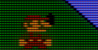
2005? when CRTs still alive
Latest version uses a totally different implementation compared with “beta” version. Now you can use any type of adaptive sharpen. What has improved is better font detection and significantly reduced numbers of “false positives”. Ofc. it’s still a hack, relaying on contrast properties and general circumstances, since a font-pattern detection would be slow, not neccessarily bullet-proof and could also produce false positives.
The parameter also works differently. Now it’s value means contrast threshold for font detection. Values around 0.35-0.37 should be enough to clear most font situations, stronger values are producing more false-positives with bar dithering.
I will take a look if i can improve a thing or two, but it’s definitelly working differently.
In this particular case 0.35 - 0.37 isn’t really having much of an effect. Although my demonstration is static I tested extensively and tried many different combinations of values before deciding to report an issue.
My ultimate goal for Turbo Duo/Grafx16/PC-Engine is to have the “m” and other fine point fonts legible without being blended while at the same time having all checkerboard dithering blended without seeing any temporal artifacts and flickering.
In the older iterations, circa 2024, I was able to achieve this with various levels of compromise of blending/bluriness of the “m”.
In 2025-11-11-r1, I seemed to have gotten results that looked better than my previous efforts with the added benefit of NTSC Artifacts and Fringing being on the table.
It was always hard to strike a balance between increased font legibility via increasing the Artifacts value and visible flickering/noise in the blended areas.
I found that to make the flickering less noticeable, I needed to lower artifacts to at least 0.80.
Anything higher and I know that I would have to accept some visible noise/movement in the blended formerly dithered areas.
Thanks for your hard work on this. I have confidence in your abilities but if it isn’t able to be resolved or improved at least the implementation in 2025-11-11-r1 is there for me to fall back to.
I guess i fixed it already (the M issue). You can test it here:
https://mega.nz/file/w9QUgSoJ#8AKsA1v5rm4TCEUG8GfOxAcAUlT5VpYeth9UOMNfZfQ
For other situations, i need original image to see what happens…
That’s standard 2-phase behaviour with non-merged fields. Dunno what to do here besides already available fixes.


