Thank you so much for sharing your work!
Hey there,
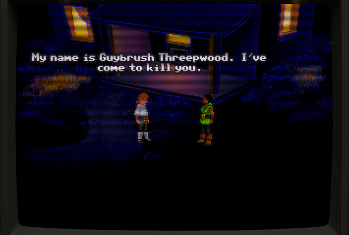
This week got me playing through the CD-ROM version of Call of Cthulhu: Shadow of the Comet (1993) on DOSBox-Pure. A french point and click inspired by the works of HP Lovecraft. It’s not a really good adventure game in term of puzzles, but hey, there’s Jack Nicholson and Vincent Price in there, so it cant be all that bad… XD
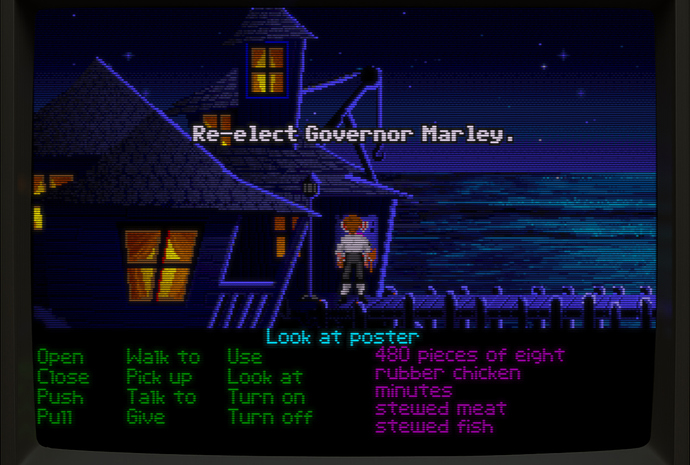
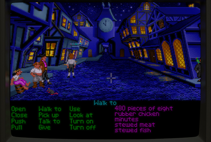
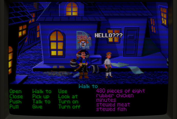
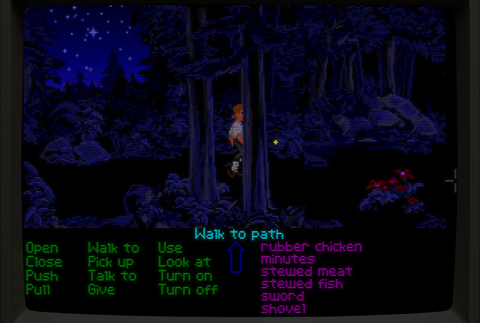
I capped the CPU cycles at something around 2500 cycles so that the animation weren’t sped up too much, then I used CRT-Guest-Advanced with JINC2 and ScaleFX prepended, and set the gamma to in 2.80 / out 2.40 and raise black level to -20, as I found the grey level and undertones were far too bright in the raw images. This way I think it looks fthaghn.
Vincent LePrice
Jacques DuNicolesson
Coming along nicely! Looks like it could benefit from a bit of sharpening but why does the banner look so orange instead of red?
It uses the exact same color conversion process I wrote about here: https://forums.libretro.com/t/correct-color-some-evidence-related-to-the-nes/48914/155?u=anikom15
The red channel gets boosted significantly and slightly shifted to orange by the conversion matrix. Then the final color correction stage to map to sRGB compresses red which also makes it look more orange. The NTSC-J phosphor is not only more orange, but the transform from D93 to D65 also makes it more orange as well.
Sharpness is tricky because I believe actual TVs are far blurrier than even those screenshots. Even PVMs, while they have high resolution, are still quite soft. The trouble is twofold. Compared to raw screenshots, a very blurry image is jarring. People aren’t used to it. The second is that our perception of blur on the CRT vs. the modern display is different. I believe this is because of how the brightness and masking interacts. The CRT is more blurry, but we still perceive it as acceptably sharp. However if you look closely at a CRT you can see how difficult it can be to distinguish individual pixels depending on the content.
The shader has a mask diffusion parameter. The default value is 2.0 and is designed for a standard brightness level, like 100 to 200 nits or so. The brightness is adequate for this level. You can reduce the diffusion to get a sharper mask and ramp up the brightness. This should result in a more realistic image. I would eventually like to have an HDR set of presets that will handle this automatically for HDR displays.
This doesn’t make much sense to me. Whatever we see and perceive is what we experience and what we should be trying to emulate, including the colours. There’s a point where theory should give way to the practical because sometimes we can make mistakes in our calculations or theories and sometimes we need to make up for what is unaccounted for or can’t be fully understood or explain so we hack, cheat or fake it until we get it to look and feel right.
Take a look at the CRT shots in these links. This is what we should strive to see in our screenshots and output of our LCDs/OLEDs:
both of your statement is correct, CRT tends to get blurrier in flat and bright areas, but it will be sharper (less blurry) than that in Edges (especially in text which has a big contrast change)
You are sharing pictures of late model high-end CRTs with RGB inputs (except for the Street Fighter one) and these shader presets are simulating late 80s consumer TVs on composite. Fundamentally there is a TVL difference of anywhere from 30% to 80%. That is why you’re seeing such a big difference.
This is actual 20" consumer CRT shot on RGB (wait for it to load), i would say it’s a bit sharper too than those screenshots. Camera will blend and smooth colors a bit.
Composite
300 TVL was common in the 80s and early 90s, then with S-Video it started going up, and went up further with DVD and then EDTV. 450 was around the high end for a consumer set toward the end of the CRT era, 500 and up is seen exclusively on professional monitors, as far as I know.
I like shots 1 and 3, the mask in 2 looks a bit strange IMO.
Soft but sharp, glowy CRT feel. Using a custom overlay with guest-advanced to add strength to the vertical lines of the slotmask while reducing the mask strength and boosting brightness. I think it works perfectly, except I have to fiddle with the custom aspect ratio width to get it to line up right, which isn’t ideal. The overlay brings a very noticeable improvement.
I believe <300 TVL was common for 14" low end consumer sets (the reason some people say “i don’t remember scanlines”, they were playing on a low end 14"), 20" were around 400-450 TVL. Middle sets like the 1084 were 400+ on 14". They were really sharp, although some blurriness was common on 14" low end.
But to be blurry as in e.g. crt-lottes you would need a composite signal and a 14" low end and that was a pretty common combination back in the day nevertheless.
Just for some additional context @anikom15 and @DariusG, this is the “TV” that I grew up with. From the 80’s straight through the 90’s and it was very sharp and clean through Composite. I wish I had known about the S-Video “mod” back in the day.
https://www.reddit.com/r/crtgaming/s/E4WFYk4hhw
Late 90’s it developed some issues, then spent the last couple years under a table before finally being dumped at the side of the road long before we knew the real value of those things.
Yeah the commodore 1702, not a bad monitor at all. I still got my old 1084S-P1 on storage with a blown flyback.
The TVL figures given (for TVs usually from the marketed total linecount) are typically for the best signal type available.
There’s obviously going to be differences between CRTs of different time eras. Many years ago , I connected the Wii to the TV from a deceased family member. TV was probably from the middle of the 80s. I thought it looked ghastly, but I didn’t know half the things I know today, so I couldn’t make any significant adjustments.
The 1994-95 17" model I got a few years ago didn’t have that much worse composite compared to my newer 2000+ CRTs, but ofc these are not really Apple-Apple comparisons. The TV couldn’t do NTSC and was in worse condition compared to the ones I had.
Figures like TVL or the phosphor pitch are obviously also not the end of the story here. Interestingly, the 0.64mm pitch of the Commodore 1702 is still the same given for TVs of similar size 20 years later according to the CRT Database. I’m guessing this isn’t the part where significant jumps were made. As I stated in another post, the IBM monitor released for EGA equipped PCs in the early 80s also already had a pitch of 0.31mm. That isn’t much different from the 0.28 mm SVGA monitors 10 years later.
That being said, here’s a bunch of collected pics from older CRTs.
The Genesis has an extra soft composite signal. That is the major cause of blur in my screenshots.
If you do the math
1702 with 0.64mm: 440x330 resolution at 14"
1084S with 0.42mm: 660x500 resolution at 14"
That 1084S had insane TVL for the size. should be 500 TVL more or less. The Daewoo models (1084-SD) still got the same TVL. There is another Commodore monitor, the mutisync 1950 that got even more, 600
The TVL differences for the same tube get rarely documented, but there is some info available for 20" Ikegami/Panasonic models:
All for a tube which is supposed to be capable of 865 TVL.


