
Superclose indeed! But notice the cooler tones on the CRT. You need D93 or something of the sort for the definitive look 
1 Like
Looks like a Trinitron, so yeah. But, you won’t be able to match the CRT’s 9300k with an LCD…. Well, maybe with a fancy professional display. My HDR1000 MiniLED (like 85% Rec2020 coverage) monitor can’t do it.
2 Likes
Mathematically, maybe not. But perceptually, hell yeah!
(oh and you got a miniled, cool stuff)
1 Like
Well, everyone has different sensitivities, tolerances, priorities, etc.
I notice a pretty stark difference when using 9300k on my Dell CRT Monitor compared to 9300k on the MiniLED. There’s no wash-out or loss of contrast on the CRT. I wouldn’t have a problem using 9300k on a CRT.
2 Likes
CRT skin is a bit too magenta, I feel. Most likely due to camera white balance settings. Shader, a little bit too green. I would say the ideal one lies between the two.
Somewhere around here

2 Likes
Well, my goal is a general purposes shader, and aside from my fading memory I did try to mach it with " CRT Pixels" images so it should be independent from my display limitations (that why I asked before to have professionally CRT Images database since not all shaders/presets people still has CRT/working-CRT and most people that still do have CRTs dont do shaders/presets stuff)
3 Likes
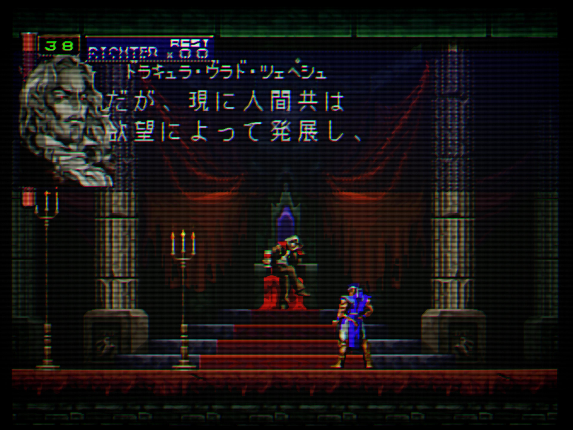
The whole opening to this game is such a challenging scene in general, lots of dark content and high contrast content that just suffers horribly on an LCD, this type of scene is hard mode for shader tweakers.
Yes, it’s excellent for gamma tests. Not ideal for colour though, with those superdark backgrounds. Extremely cool graphics anyway. Konami hit a homerun with this one.
2 Likes
this kinda has more greenish color
anyway, that not the last update
this is the last one
4 Likes
The image I posted was not meant to be a definitive color correction or anything of the sort, just a quick edit to show that the CRT capture is too cool and the shader one too warm. In any case, excellent job with the preset 
Out of curiosity, I just ran the game to see what my standard settings for the PS1 look like.

2 Likes
Not related to shaders, really… I dont plan on playing the game again but I always struggled with finding a proper aspect ratio that wouldnt make Dracula look like a fat version of Chris Cornell.
The intro is also showing a moon and a clocktower that look also a bit stretched IIRC.
2 Likes
lol yeah sotn uses funky resolutions. I think they did it to fit sprites and assets from Rondo of Blood (and maybe other older games from the franchise) in the ps1’s 240 line framebuffer. What I do is stretch it vertically a bit. Not perfect but it looks good enough like this I think


2 Likes
Yep it’s some kind of frankenstein of a game in term of resolution. I’ve played trough it like this: https://www.youtube.com/watch?v=L0u9TfByif0
Still not convinced with that aspect ratio, I think I overcorrected. It’s also the Saturn version modded with the excellent Medusa teams’s extended patch. And I think Konami corrected the stretched portraits in that version.
That version was looked down, notably because the Saturn port downgraded transparency and used dithering instead, but the extended patch solves that.
The unmodded game also benefits from JINC2 in that regard and restore transparency very well IMO. https://forums.libretro.com/uploads/default/original/3X/2/8/287df81b9e0d51fb9e87ef2977d1453d8fe80853.jpeg
1 Like
Yes, you certainly over-corrected
If you play the game again, I think you can safely use the screens I posted for reference. If I remember correctly, the Saturn version was 320x224, while the PSX 256x240. Konami stretched the latter to fit the former and the result was funky as all hell. Then you have the fact that it was not a traditional 2D game. A PS1-optimized 3D engine runs the whole thing, and textured poligons are used for rotations and all those gorgeous special effects. Porting it to the Saturn must have been a nightmare. That said, I too love that version, and didn’t know about that patch. It looks amazing!
If I ever play the game again I’ll use the preset with NewPixie I linked in the last link. The screen you posted look stretched to me except maybe the last one. And then again, the moon and castle shot look stretched. It’s a good game, but resolution wise I think it’s a mess, and it certainly seems paradoxical to me that presumed artists having thought about red color bleeding from the eyes wouldnt think the art was stretched compared to portraits in the menu and the promo material…
They are stretched, of course. Vertically like I told you. You need 64 lines to get from 256 to 320 and a normal 4:3, that was the basis for my stretching and I went from there. And also like I told you those proportions I set may not be geometrically perfect, but not off by much, and certainly look way more natural than that strange native aspect ratio, with all its fat count Cornells 
Maybe that’s just me… I mean they still look streched horizontally, despite correcting. The moon on the 512x240 shot seems to be some digitized picture. Yet it doesnt look like the real moon at all, it’s squashed. There’s no aspect ratio consistency in the game between the resolutions used in the game itself, the menu and the cinematics.
Fat count Cornell. He lived like a murder, how he’d fly so sweetly.
There is a Qol version for ps1 that removes the black bars; and setting an 8/7 aspect ratio the portraits look better, the moon might be not “round” by design 


to get a circle had to go with 16/15  but then portraits don’t look very good…

2 Likes
When listening to the soundtrack of the game, there’s a fan favourite in the song of “The Tragic Prince” where the electric guitar is out of tune. I believe Tak Fuji, who recorded the track, admitted he was not happy with his take. But the game being cult, people could argue nowadays that the guitar solo sounded flat by design. XD
Anyway, Jobima linked one of my post to this thread, maybe to get some feedback on the shaders. They look gorgious. My issues are with the game itself, I wont derail this thread further.
3 Likes
Yes, they are slightly stretched horizontally still and I repeat, not geometrically perfect, and that’s because if you stretch the game further vertically, menus and prerendered cutscenes go out of bounds. That’s the reason why I posted a “select your destiny” shot too. It’s a carefully thought out compromise (I love SOTN and I play it often).
Fair enough!