Sony Megatron Colour Video Monitor

I am showing the base image (from what Windows is producing, before being process by the TV) between the two shaders in HDR mode, and so that would show a difference in terms of the underlying starting point.

The point was that there is a drastic difference in colors (even though as I had noted I think that the perceived brightness is the same).

1 Like

To assist, see the following:

Imgur: The magic of the Internet

which shows phone picture shots (not windows screenshots) of

  1. tv pixel layout
  2. running the 4K HDR arcade setting
  3. running easymode shader (all settings same, I just switched shader).

As articulated, the brightness itself seems fine, just something is up with the colors.

1 Like

Did you try all the things I mentioned in this post above: Sony PVM HDR 4K Shader

Yes, I have changed the settings to what you recommended.
I will note that in the shader, changing from RGB to BGR appears to make no difference (whereas the brightness ones are readily apparent).

1 Like

Just one more thing you’re on Retroarch v1.10

Through nvidia control panel I forced my display into 10 bit which helped. Sharpness and contrast have a huge impact on picture so I adjusted that as well. It looks better and I’m getting better colors.

Now I’ve seen too much and cannot un-see it. I’m noticing how odd the Local Dimming feature is on all games. Elden Ring, for example, Bright scenes or setting suns look amazing. I almost have to squint my eyes it gets so bright. Yet in a cave by a small campfire the light is dull. I’d expect the fire to be burning bright. Games on consoles with HDR have similar issues. (Maybe that’s how it’s supposed to be but it doesn’t look right to me.)

I’ll keep playing around and see what more I can do.

2 Likes

@MajorPainTheCactus I hope my responding is OK with you. I don’t want to step on your toes.

I’m not sure “fine” is the word I would use. The Super Mario World shot doesn’t look like HDR is on at all.

You mentioned HDR mode. Have you turned on HDR in Retroarch?

1 Like

Hi everybody so I finally got some time to go back to my Virtua Fighter shader and the cabinets mad convergence issues.

So first of all where we left off last time:

Old:

So I fixed up deconvergence in the horizontal direction to be smooth rather than stepping and fixed a few bugs in the vertical convergence (see v4.0 on GitHub). All in all this gives me greater control over the deconvergence and I think this is the best yet.

An observation I can make is that the image still feels softer on the arcade screen and so maybe this is the time to look into the signal and maybe sampling the original image with a linear sampler rather than a nearest neighbour. I had tried this before but it didn’t seem to work maybe I need another shader pass beforehand?

New:

CRT Photo: OnePlus 8 Pro Camera: Pro Mode, ISO 200, WB 5000K, Aperture Speed 1/60, Auto Focus, 48MPixel JPEG.

LCD Photo2: OnePlus 8 Pro Camera: Pro Mode, ISO 200, WB 5000K, Aperture Speed 1/60, Auto Focus, 48MPixel JPEG.

2 Likes

To answer a few question:

Yes, I am using 1.10.

Yes, HDR is on in Retroarch - and I know this as well because the TV switches to HDR when I open Retroarch. Also, if I alt-tab out the Windows desktop has that “look” with very dim colors etc when HDR is switched on. In summary - HDR is on in Retroarch, TV is in HDR mode.

As for the SMW picture - what I mean by the brightness is fine is what I mean above - it does not have the look like the Windows desktop does in terms of an overly dark and muted image. The overall brightness of SMW running the 4K HDR shader isn’t that far off from the Easymode shader (both with HDR on). Just all the color are washed out.

1 Like

Some interesting further feedback for consideration. To confirm again, I am running Retroarch 1.10, HDR is on, TV switches to HDR when I open retroarch.
Now, some interesting observation I just made

Running SMW in Bsnes - if I have the shader to, say, easymode, I have now noticed something. The image itself looks good in the game. The menus in retroarch itself (XMB) maintain a neutral color and brightness when going to the quickmenu, etc.

Now, when I change the shader to one of the 4K HDR shaders, something interesting happens. I notice immediately that the menu text and icon colors now have that “glow” that I have seen in other applications (like Kodi) when HDR is enabled but the menus and OSD are in the wrong colorspace. The game itself though has the same, washed out look.

Why this is interesting is that there is no change in the display - it doesn’t blank out, I don’t see anything else alter. The TV’s system info still says it’s getting a 4K HDR10 input. So - it may be a system specific issue but it’s almost as if the colorspace for the game itself isn’t changing and thus, as others have said, looks like HDR isn’t on. Except it is on on the TV, and Retroarchs quickmenu text and logos would suggest the TV has switched over to an HDR signal.

2 Likes

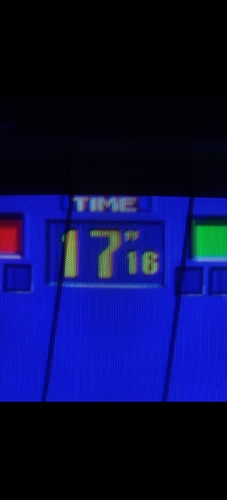
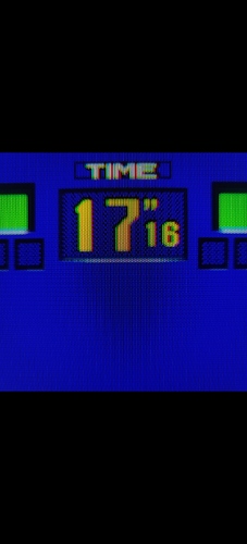
and now softer! This looks a bit more like it! No idea why TIME now has a green background anyone?

CRT Photo: OnePlus 8 Pro Camera: Pro Mode, ISO 200, WB 5000K, Aperture Speed 1/60, Auto Focus, 48MPixel JPEG.

LCD Photo2: OnePlus 8 Pro Camera: Pro Mode, ISO 200, WB 5000K, Aperture Speed 1/60, Auto Focus, 48MPixel JPEG.

2 Likes

Hmm have you tried different Retroarch drivers: D3D11 and D3D12 pass HDR metadata to the display and so they maybe better/more compatible than the Vulkan driver.

hah, wut? does it blink blue/green, maybe?

1 Like

Looks great! The deconvergence is still a bit strong though, I think. Zooming in on the small “1”, you have two lines of green phosphors that are near fully lit in the LCD shot, while the outermost green line isn’t lit up as much on the CRT. Same thing with the reds on the right.

1 Like

No it’s constantly green - I’d like to say it’s my shader but it isn’t :joy: I am on the attract more so possibly sometimes attract mode does this?

1 Like

Yes you’re right, hmm so I think I’m at the limit of deconvergence and I simply need more colour bleed in the horizontal axis. I think I need to sample another phosphor across and have that contribute so I can bring in the convergence.

1 Like

Not only that but the leftmost square is now green. Weird

1 Like

I think that’s normal as it’s a picture of the actual arcade and in attract mode part of it is to replay the last fight. In the case I took the picture I think someone was beaten at 17:16 - hence red energy bar. Whereas on my shader shot no one has played and the attract mode defaults to a default game where the energy bar is green at 17:16.

However that default game now has a green TIME box whereas before it didn’t. Weird!

1 Like

So back to the mystery of the Sammy Atomiswave cabinets screen. I may need some help on this one as I’m a little stumped…

Here’s the better shot of Cyclops without the blurry pixels as you can see we’re still seeing a loss of detail. It looks to me as though its all super saturated that the darks are getting crunched into the lights.

I’m not sure there is too much of an issue with convergence on this screen (there’s a slight amount as pretty much always).

So what exactly is happening to the colours on this screen? It has lots of darks so its not a complete brightness/contrast issue (I’ve tried already). I also dont think its a blur issue as the outlines of everything are relatively sharp.

The screen in person gives off this look that its super bright but its not really.

My current best guess is that its doing some kind of heavy chroma quantisation. Maybe I should try that? Maybe its luminance quantisation actually?

Anyway let me know your thoughts.

EDIT: Maybe the CRT is really bright as the photo was at ISO 100 - the LCD photo nearest to it is ISO 400!

CRT Photo: OnePlus 8 Pro Camera: Pro Mode, ISO 100, WB 5000K, Aperture Speed 1/60, Auto Focus, 48MPixel JPEG.

LCD Photo2: OnePlus 8 Pro Camera: Pro Mode, ISO 200, WB 5000K, Aperture Speed 1/60, Auto Focus, 48MPixel JPEG.

LCD Photo2: OnePlus 8 Pro Camera: Pro Mode, ISO 400, WB 5000K, Aperture Speed 1/60, Auto Focus, 48MPixel JPEG.

2 Likes

Two close up shots of CRT (one loses the slot mask because it was shot at 1/30):

CRT Photo: OnePlus 8 Pro Camera: Pro Mode, ISO 100, WB 5000K, Aperture Speed 1/30, Auto Focus, 48MPixel JPEG.

CRT Photo: OnePlus 8 Pro Camera: Pro Mode, ISO 100, WB 5000K, Aperture Speed 1/60, Auto Focus, 48MPixel JPEG.
2 Likes