Retro 4K Shader *highly recommended*

Hi,

I want to share my Shader settings with you. Its a Shader-Compilation how I remember it back in the days (90s on a CRT) with an additional filter-upscale for 4K-Monitors. I play all my retro cores (genesis, snes, nes, gameboys, n64, psx, saturn, neo geo, turbo grafx, arcade) with 2D-Graphics on it. Please give it a try and set out some feedback if you like :slight_smile:

How to:

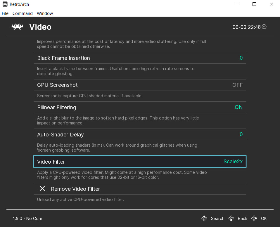
First you should go to the Settings and click on Video and change the following entries (very important):

| I highly recommend the d3d11 or vulkan video driver to use with this Shader-Compilation, otherwise it won’t load (perhaps) = Settings -> Driver -> Video Driver -> d3d11 for nvidia users / vulkan for amd users |

Bilinear Filtering = On!

Video Filter = Scale2x.filt (very important) -> if your core crashes, then use Normal2x.filt (saturn core)

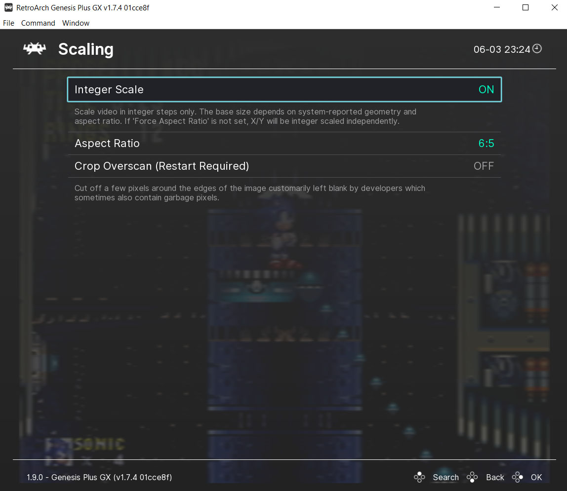
Scaling -> Aspect Ratio = core provided (or something near to that ratio for your core)

Scaling -> Integer Scale = ON

Scaling -> Crop Overscan -> OFF

Output -> Screen Resolution = 4096x2160 (60hz) -> go as high as u can with 60hz (I recommend a 4k Display!)
Settings 1 Settings Ratio

Download this package: silverbreakers_retro_slang_shaders.rar (5.71 MB)

/Mediafire-Backup: silverbreakers_retro_slang_shaders.rar (5.71 MB)

Zusammenfassung

(if the download will be down in the future you can write me a personal message on this board and I will reupload them here) - I need to be still alive of course^^

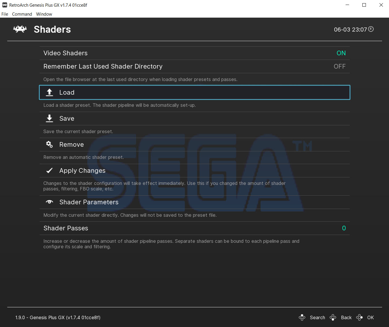
Extract the whole silverbreaker_shaders.rar in your retroarch/shaders folder. After this go to your favorite Core + Game, load a Game and then go to the Shader-Menu and activate shaders (Main Menu -> Quick Menu -> Shaders). Click on ‘Load’ to load the silverbreaker_shaders.slangp in your shaders folder of retroarch.
Settings shaders

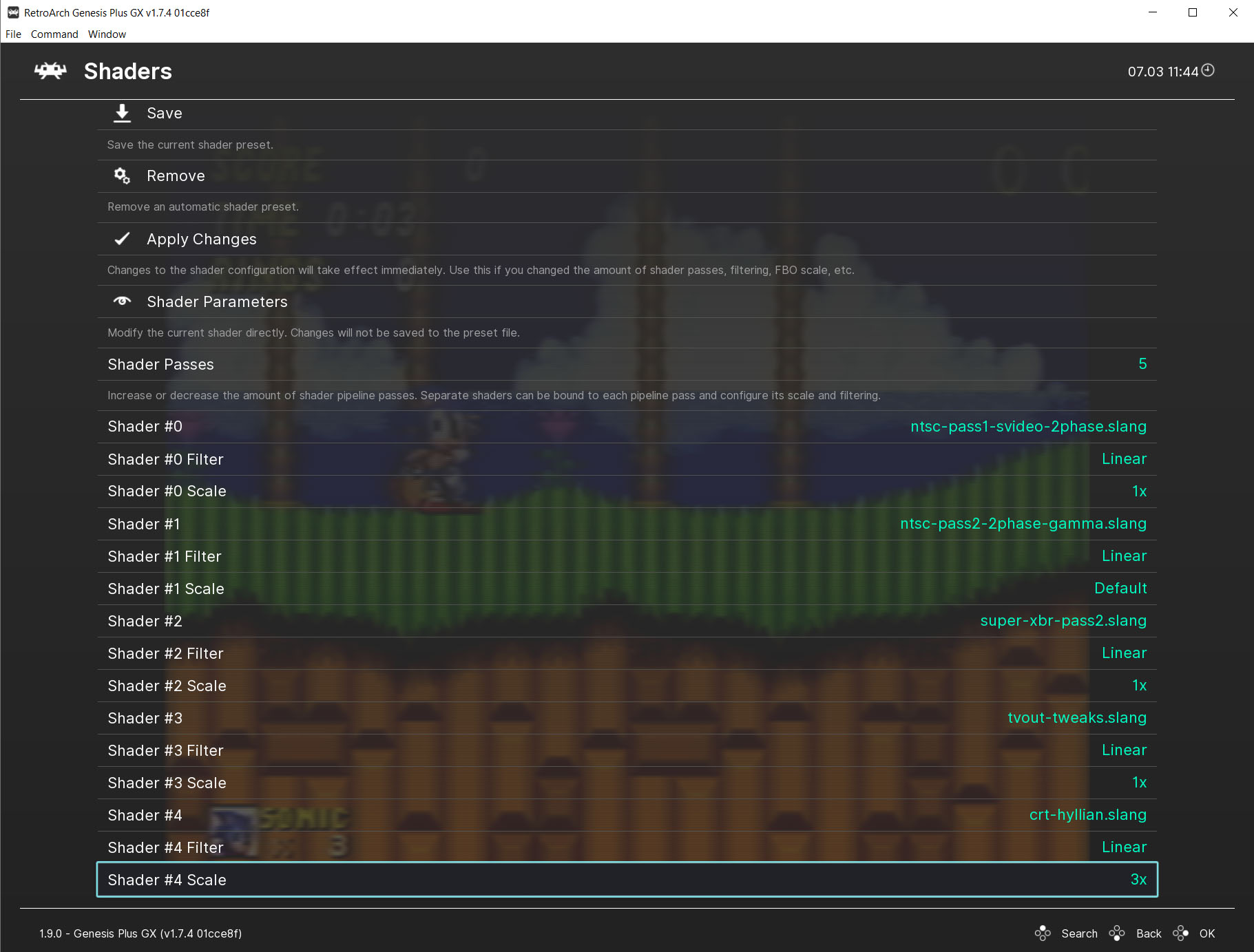
Shader Settings

Please check now the Parameters at the shader menu and change them to the values in the picture below:

(with Apply Changes you can then activate them)
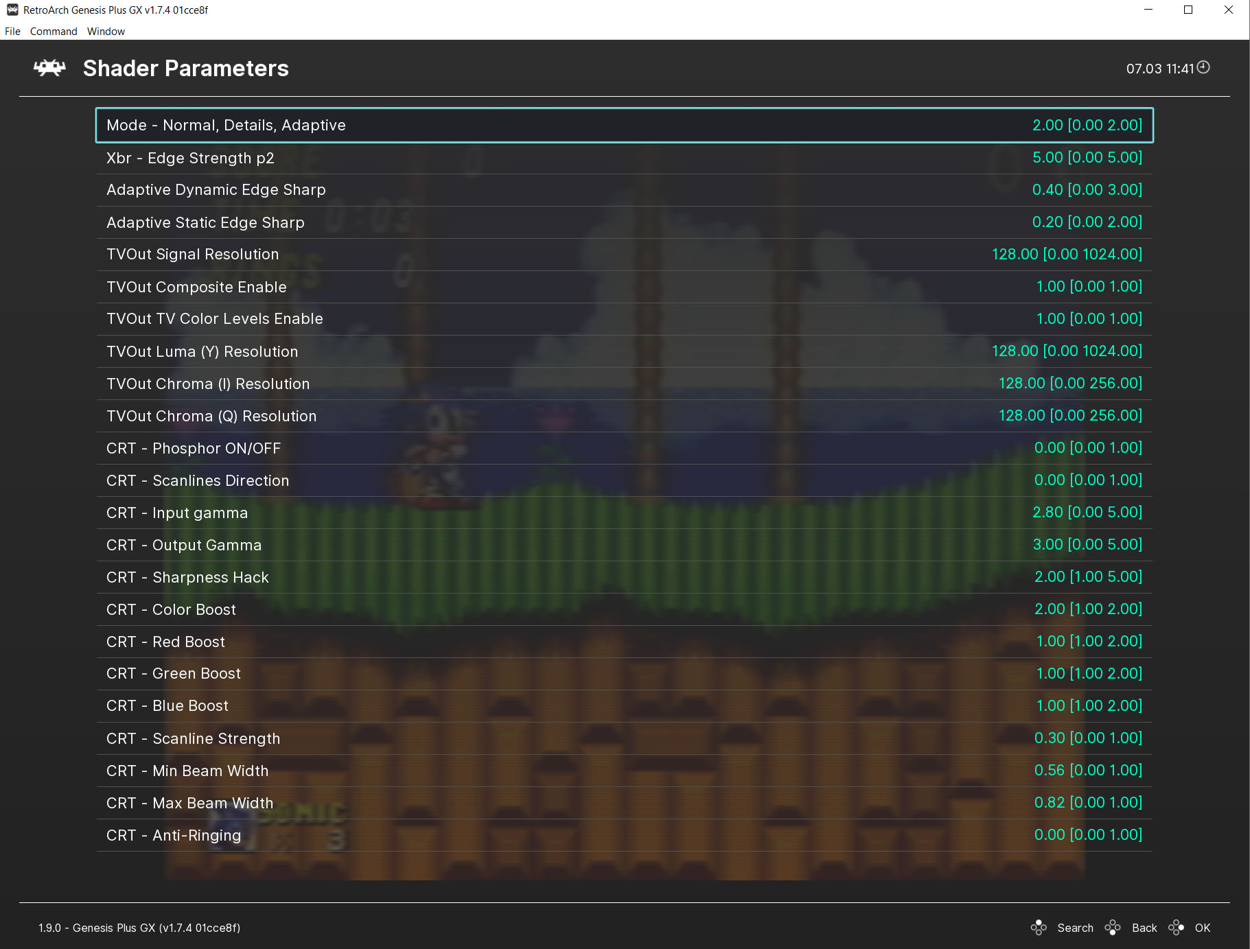
Parameters

You can now play in the parameters menu with the ‘TVOut Luma (Y) Resolution’ setting to lower the overall-resolution. Lower than 128 is good for old systems like gameboy, gamegear - higher than 128 is better for Playstation 1 games - if it will become to dark, you can change that with higher values at ‘CRT - Imput gamma’ or ‘CRT- output gamma’. Try to set Input gamma and Output gamma further apart to enhance brightness, for example 2.50 (gamma output) to 3.30 (gama input) or just the other way - you can play with this two options if you like to
 You can also change the colors to suit you more with the ‘TVOut Chroma (I) Resolution’ and ‘TVOut Chroma (Q) Resolution’ setting.

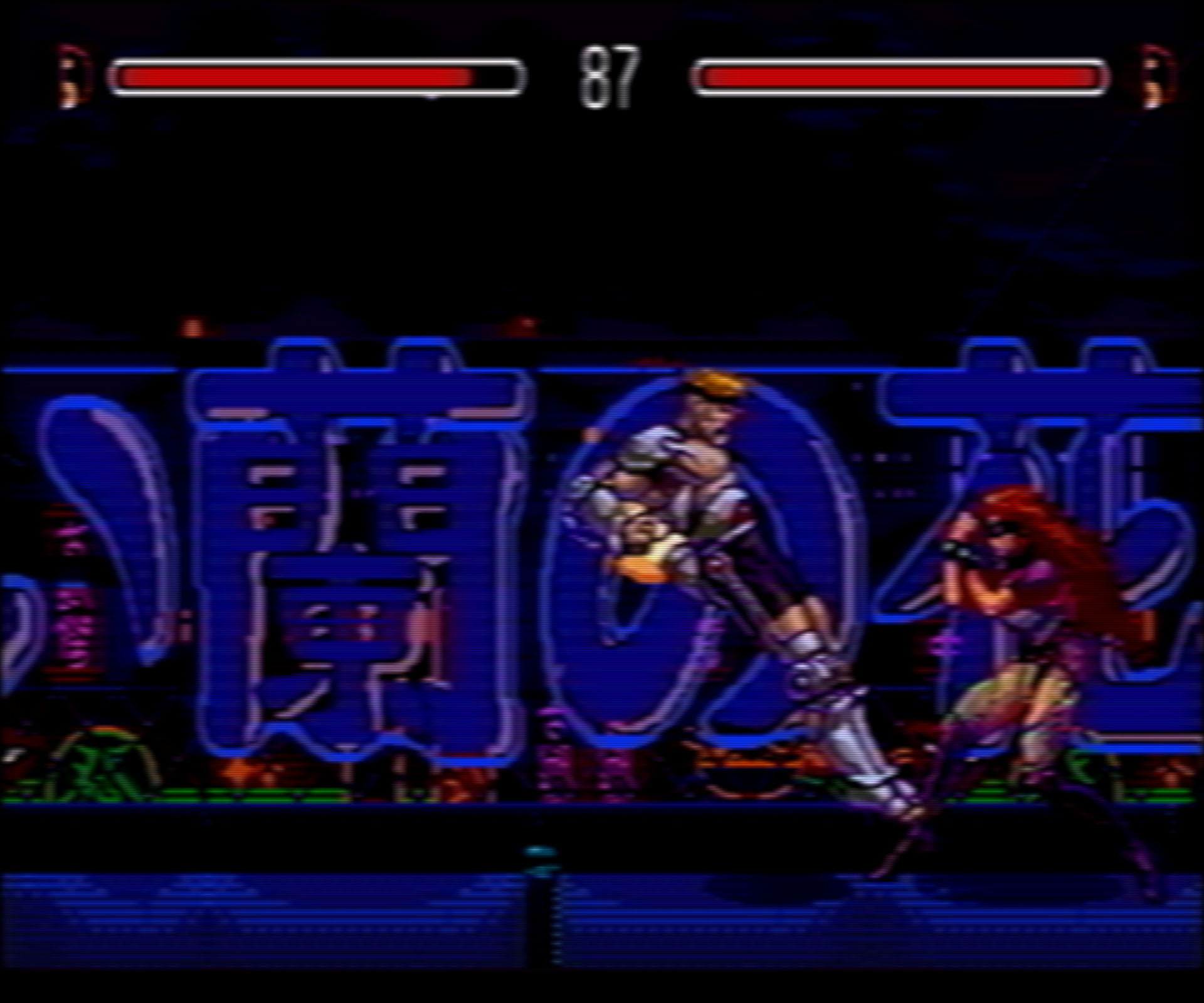
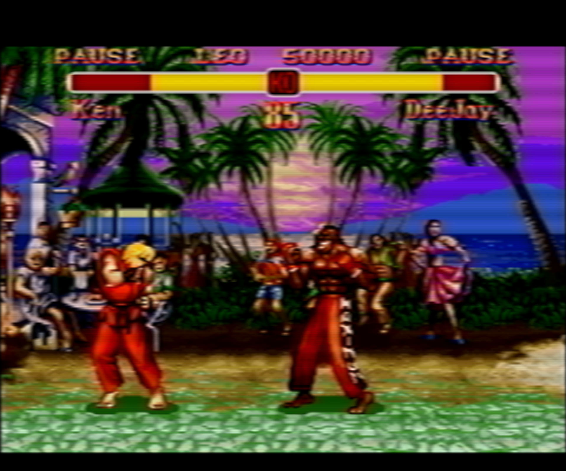
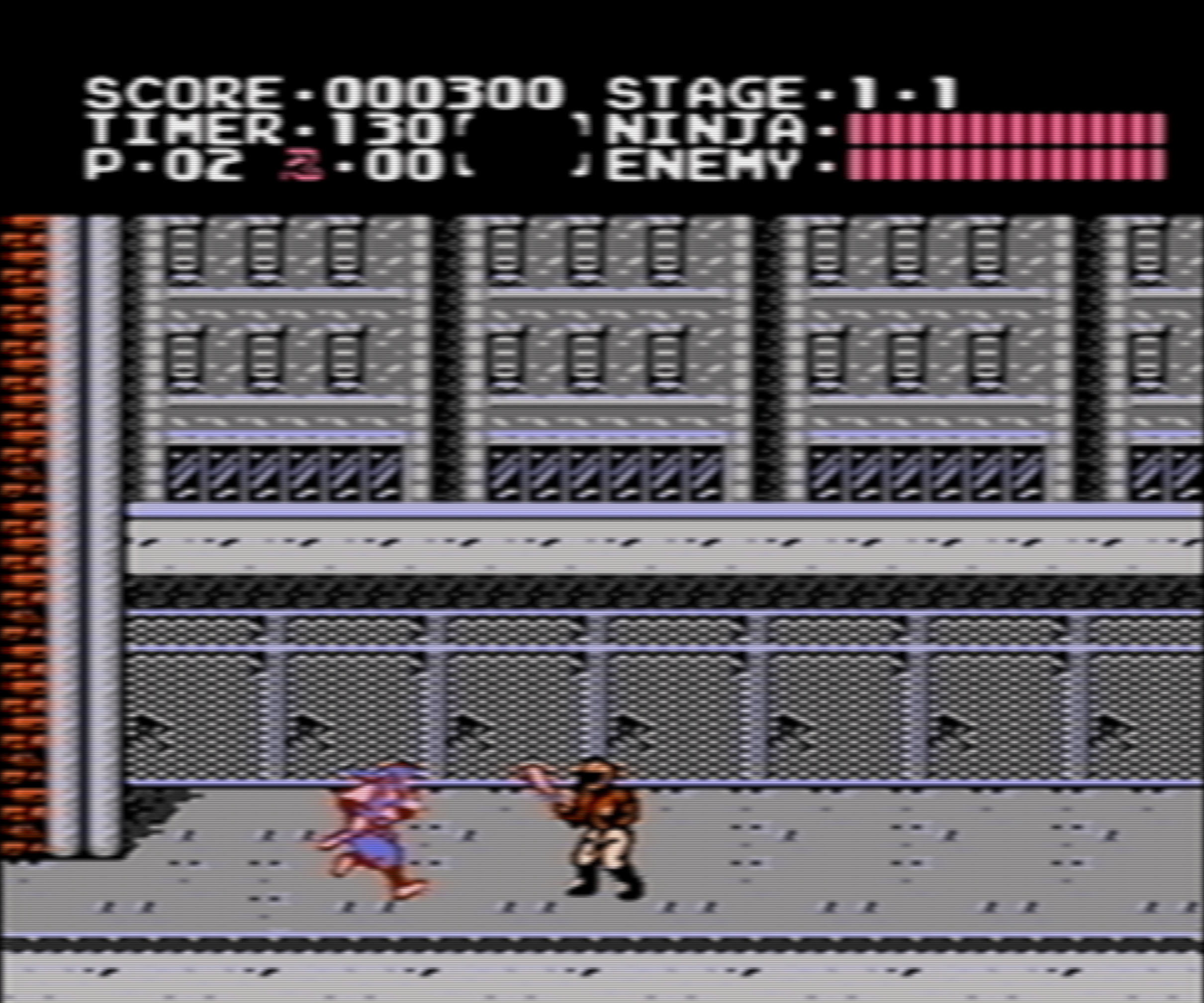
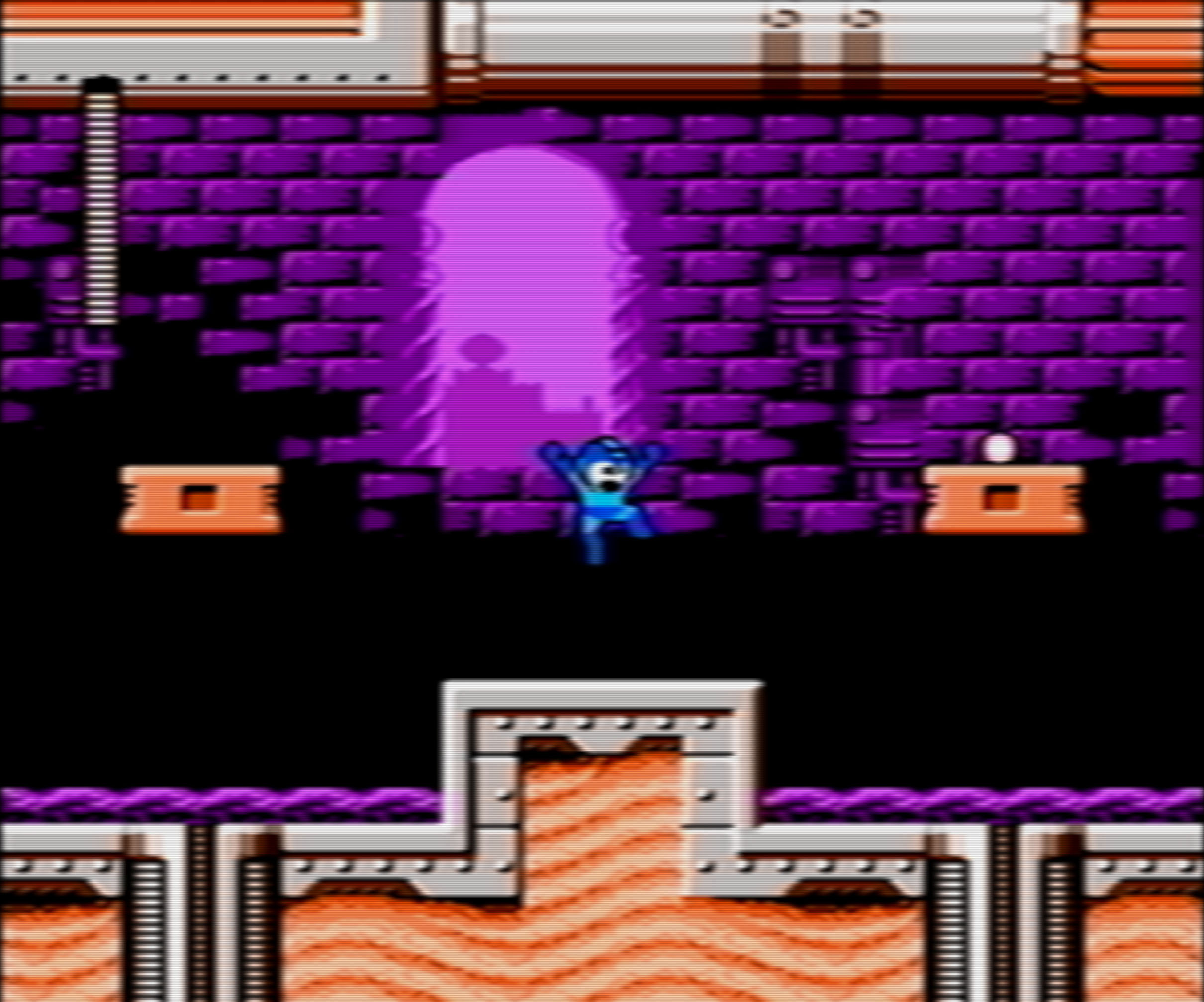
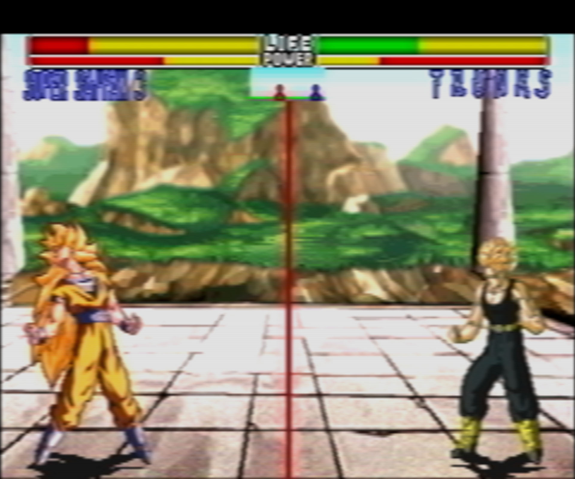
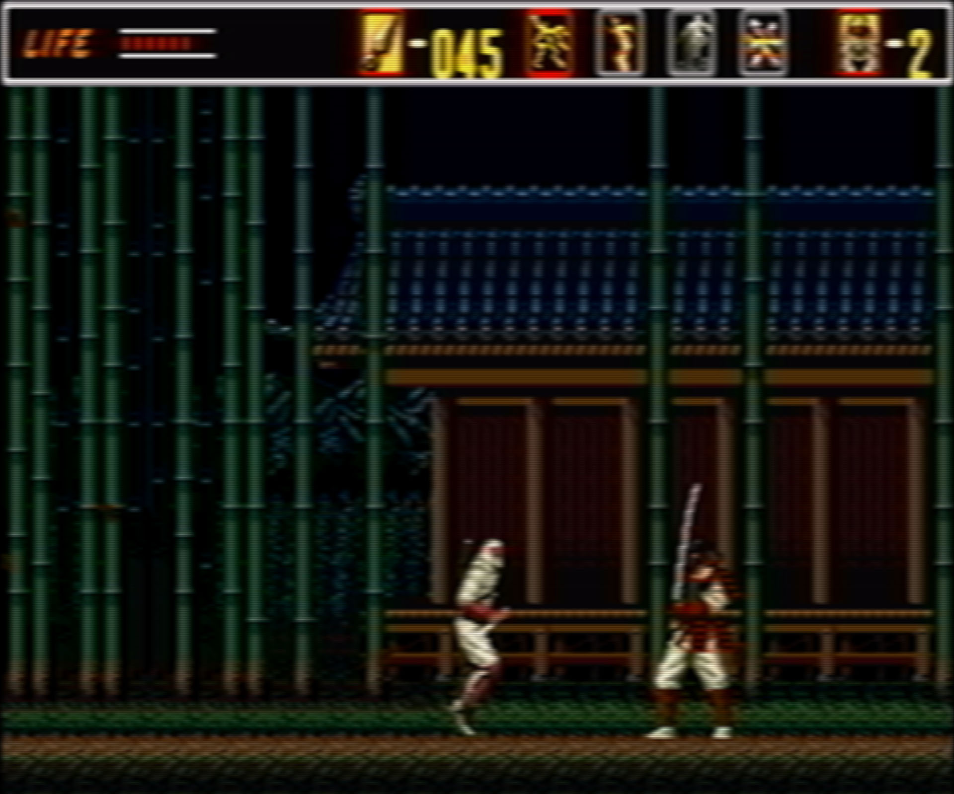
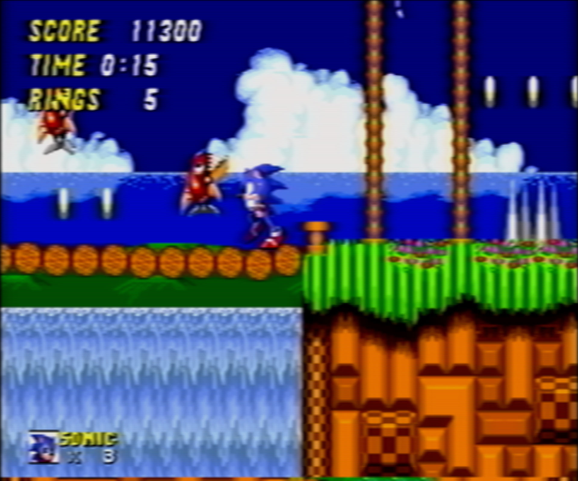
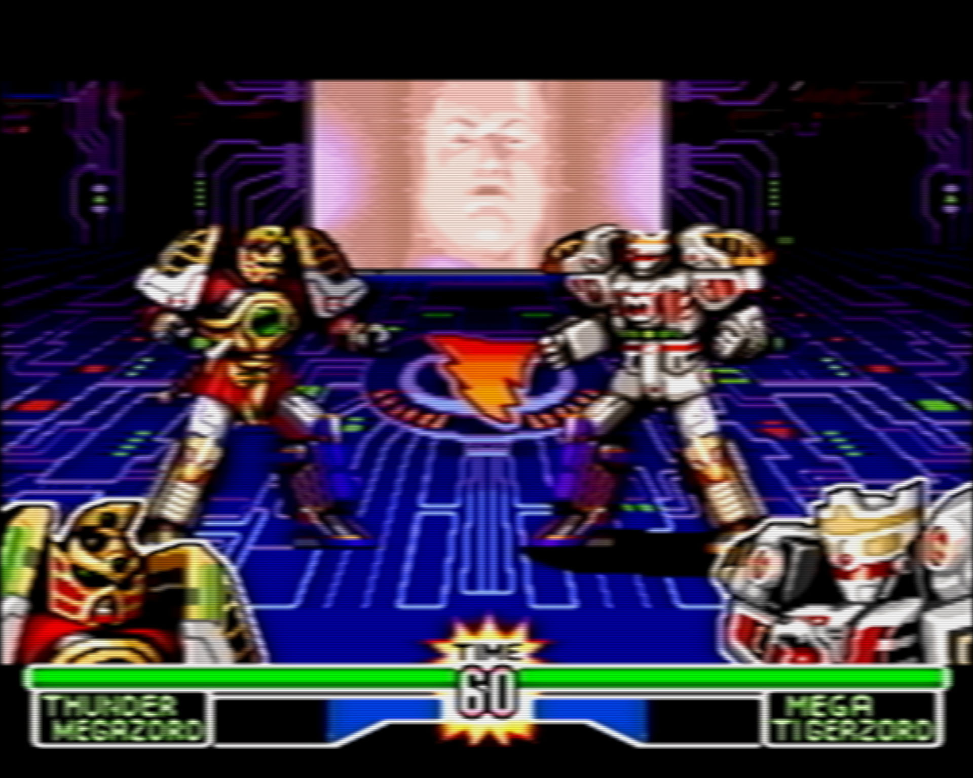
Some Pictures (click on the Pictures to see the details like scanlines!):
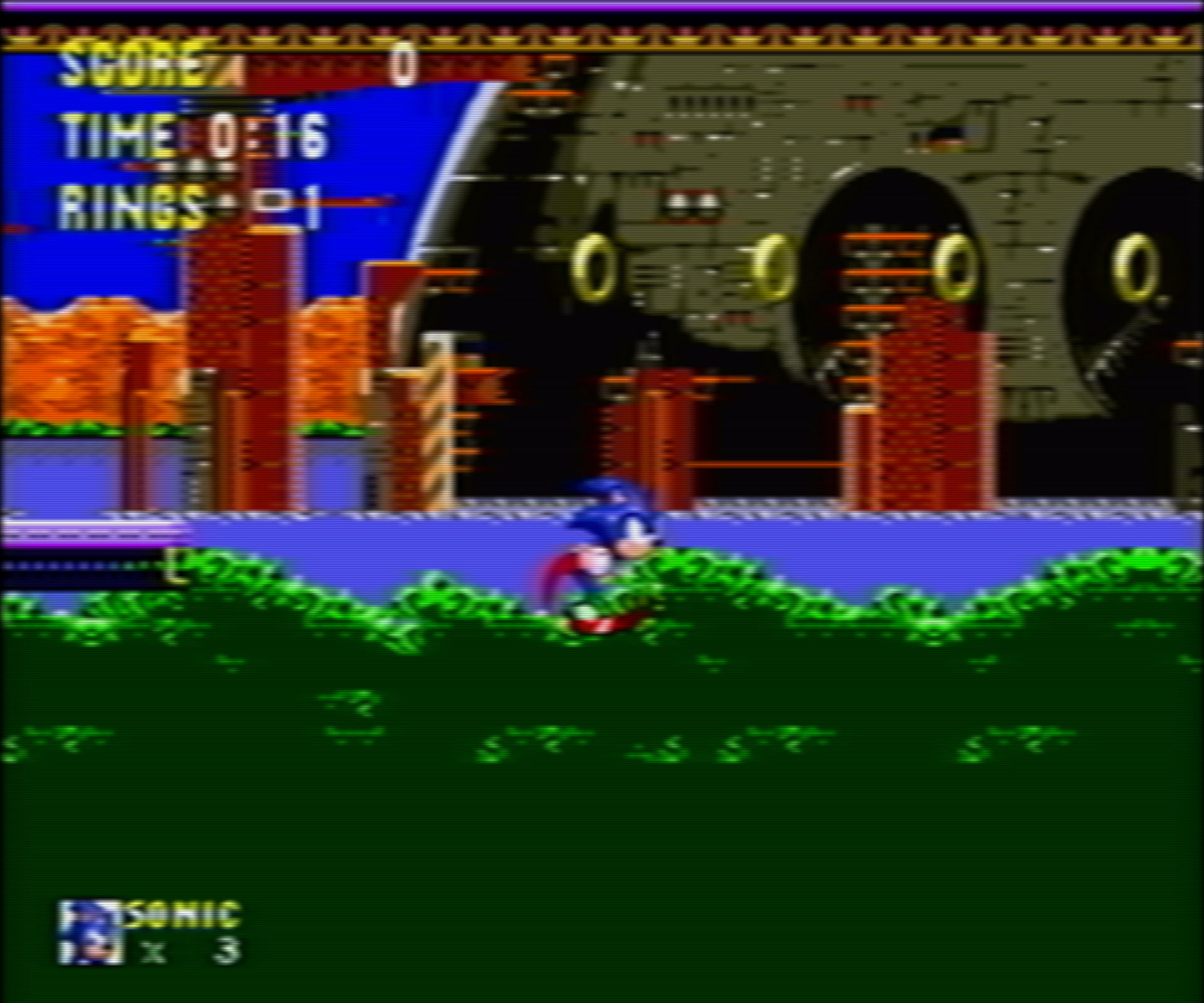
Sonic3Complete-181228-131907

Eternal%20Champions%20(U)%20%5B!%5D-181228-132252

Super%20Street%20Fighter%20II%20-%20The%20New%20Challengers%20(U)-181228-132705

Ninja%20Gaiden%20(USA)-181228-145059

Mega%20Man%206%20(USA)-181228-145853

Dragon%20Ball%20Z%20~Shinbutouden~%20(1995)(Bandai)(JP)-181228-150656

Revenge%20of%20Shinobi%2C%20The%20(W)%20(REV00)%20%5B!%5D-181228-151935

Sonic%20The%20Hedgehog%202%20(W)%20(REV01)%20%5B!%5D-181228-152407

Mighty%20Morphin%20Power%20Rangers%20-%20The%20Fighting%20Edition%20(U)-181228-150216

(pictures are highly compressed by photoshop, so you should go and play the games in motion)

have fun

4 Likes

Honestly, I tend to prefer the “How I remember it” shaders than pure accurate CRT ones. Not only are they more interesting to lookat from people (variances etc) but honestly there was so much variance in CRT’s picture quality that to rely on some by-the-books restoration isn’t necessarily the ‘ideal’ solution.

I totally see the effect you were going for here, and I like it. Personally I’d throw some Film Grain effect on it as I always played via RF back in the day, but otherwise, it’s golden.

1 Like

yeah, I remember magazin pictures in the 90s that had this look. Or the genesis/snes commercials on tv - it looks more organic than blocky-sharp and I honestly prefer the analog look

Sure, RF would look close to that. But the scanlines in those pics are wrong. Not only they are too small, they are also unevenly distributed. That’s not how old TVs looked.

1 Like

Do you click on the pictures and look at the whole picture? Its very difficult to make accurate pictures from retroarch + shaders + photoshop (high compression) but the scanlines are definitely evenly (in retroarch). I love to have my scanlines small, because I think it looks more like old PAL-CRT-patterns on “higher resolution” :rofl:

here u can see an uncompressed picture directly from retroarch:

https://www.bilder-upload.eu/bild-b56b21-1546362316.png.html

By the way: I play real 4K (4096x2160) on my samsung 43" curved 4k tv and it looks amazing :star_struck:

None of the CRTs I ever owned were this blurry, even through composite. Not even the crappy 19" Sanyo CRT I recently had was as blurry as some of these shots.

The problem with “CRT shaders based on how I remember it” is that memory is notoriously inaccurate, and your memory is almost certainly wrong.

There is most definitely something wrong with the scanlines; you’ve got maybe twice as many scanlines as should appear when displaying 240p content.

I’m not about to go on another crusade, though. If this is how you enjoy playing retro games, good for you.

2 Likes

harsh words man - but I respect your opinion. I like it more soft than crisp. For me crisp looks to blocky and unintended

So long as this isn’t being passed off as an accurate representation of what a CRT looks like, the only thing that really matters is whether or not you enjoy it.

Objectively, the contrast around highlights is reduced by the excessive artificial blur/smoothing, making the image somewhat dull and lifeless in comparison to what a CRT looks like. It’s the contrast between adjacent light and dark colors that makes the highlights “pop;” this is lost when the colors are smeared together too much. In some of your images, things which are clearly supposed to be in the “foreground” instead appear to recede into the rest of the image as a result of this. The apparent “depth” of the image is reduced.

The scanlines in your images can’t possibly be what the artists intended because sprites were drawn with scanlines in mind, and CRTs would always draw the same number of scanlines when displaying 240p. You’ve got what looks like 2x the number of scanlines in your images.

These are just my observations/opinions. If you enjoy the look you’ve created, that’s all that really matters!

1 Like

Ive uploaded a video from my shader setup with sonic 3 complete: youtube

recording is directly from retroarch - the source was in 4k and youtube compressed it in full hd. So the scanlines are even less visible (i don’t like em big @Nesguy :laughing: )

Update: 4K is now available on youtube. Here the second video with Sonic 2

and btw I share @Squalo’s opinion on this topic and love his presentation:

2 Likes

I think it looks pretty great in motion - extra-double-super props for using Sonic 3 Complete too.

‘if’ you were able to halve the scanlines, I think that would take it to the next level - but either way I think it does have that sort of soft “Video” signal quality to it.

1 Like

I would die to play Sonic Mania Plus on this shader setup.

@SkyHighGam3r I’ve tried all sorts of things with this setup but I always go back to the current compilation. I don’t know - it looks even in youtube (4k) more washed out and less stunning than the real deal on retroarch and bigger/less scanlines would definitely destroy the look (in my opinion):

original shader setup vs bigger/less scanlines (use the 25 % zoom feature on the screenwebsite to compare them - or not :wink:)

Yeah, the scanlines are too thin. I currently have a CRT TV (A 27’ Sony Trinitron) and the scanlines should be at least twice as fat. Also, they should be a bit more noticeable. Lastly, the image is sharper on the CRT, it’s not as blurry with composite but maybe it is with RF.

2 Likes

you can go to overlays and simply activate thicker scanlines if u prefer. its not that big of a deal.

but as I say, it’s a question of ‘religion’. I don’t like my picture been distracted to much with scanlines, espacially because I don’t remember scanlines to be so present back then. scanlines make the illusion of sharpness but in reality u see less from the picture. You know, you can go to the art museum and say the mona lisa is to blurry - it is what it is (my opinion). And again - I don’t come from a country with NTSC-CRTs like america, I come from germany with PAL-CRTs. We had 50hz with a bigger resolution and our experience back then was slidely another - especially because every tv has it own scanlines/patterns and I never use RGB (with crisp graphics). I used first RF then Component.

This is a misconception. Scanlines don’t cover up any of the image. In 240p, every line is displayed, with every other line in the raster being skipped. You’re still seeing every line output by the console.

Pixel artists most certaintly took scanlines into account when drawing sprites, and by altering the number of lines you’re no longer seeing what the artist intended.

In reality, scanlines restore the sharpness of the image since they allow for finer details to be drawn- see this quote on the “half dot technique” (emphasis added)

Some graphic designers toyed with these specificities and mastered the 0.5 dot technique. The word “pixel” translates in Japanese to “ドット” (”dot”). It seems that Hiroshi Ono (AKA Mr Dotman) was the first to use that word to describe his work, talking about dot-e (ăƒ‰ăƒƒăƒˆç””, the “e” is the same as in “Ukiyo-e” and means picture) and dot character (ăƒ‰ăƒƒăƒˆă‚­ăƒŁăƒ©ă‚Żă‚żăƒŒ or ăƒ‰ăƒƒăƒˆă‚­ăƒŁăƒ©) in the February 1983 issue of Namco NG. “It’s a technique where by slightly changing the color of surrounding pixels, to the human eye it looks like the pixels move by around 0.5 pixels.” explains Kazuhiro Tanaka, graphic designer on Metal Slug (1996). His colleague Yasuyuki Oda adds that “Back in the old days, we’d say [to our artists] "add 0.5 of a pixel”, and have them draw in the pixels by taking scanlines into account. But with the modern Full HD monitor, the pixels comes out too clearly and too perfectly that you can’t have that same taste.“

source: https://vgdensetsu.tumblr.com/post/179656817318/designing-2d-graphics-in-the-japanese-industry

because every tv has it own scanlines/patterns

This is also a misconception. Every CRT TV displays the same number of scanlines when displaying 240p.

It’s not just that the lines are too thin in your shots, it’s that you have what looks like twice the number of scanlines as should be present when displaying 240p.

You likely don’t remember scanlines being so prominent because:

A) memory is notoriously inaccurate

B) lossy video signals (such as composite or RF) will make scanlines less noticeable due to the bleed, bloom and blur that they introduce into the picture

C) CRTs that aren’t properly calibrated (too much contrast, brightness, etc) will reduce the prominence of scanlines

1 Like

I don’t think even RF is that blurry, but “that’s how I remember it” :wink:

:rofl: it’s like a taste-war: red is better than blue!!! I don’t like blue for god sake! :joy: and belive me @Nesguy you will never be scientific enough with your opinion, because every eye, every tv, every brain is a little bit different. Hell, even cables differs for many people


but I understand now, blurry is a very insulting word in the modern retro scene - like “plastic bomber” in the case scene xD

I’m not talking about subjective opinions. You make several factually inaccurate and misleading statements, which I replied to above.

2 Likes

what ever man, your the scientist :rofl:

No need to get defensive. You did ask for feedback, after all.

2 Likes

No, I respekt your opinion and I will research the topic some more - because its very interesting (on both sides). My shader setup is directly from my memory with some tweaks, that I thought would be nice to have. But no, its definitely not accurat and never will be - but I love the analog artstyle anyway


1 Like